Category Archives: Peer Design Review

Sythesis Design Review (Eun Jae)

Synthesis Review Observations – Wed. March 31

The Sai Ying Pun Wet Market proposal presented by Eun Jae, Colin and Galym was very comprehensive. Their overall success lies with their simple approach at the problems presented within the program and site. They have successfully achieved a complex idea in a simple form while adding details to provide sophisticated design elements. This being the last review before the final, the only areas that need tinkering are the details. Their grand schemes, gestures and ideas are well represented in drawing, design, and model.

Continue reading Sythesis Design Review (Eun Jae)

DD Review: Amanda

Amanda and her partner Natalie designed their project to address the two sides of DUMBO. On the one side they saw the commercial shops and retail stores adjacent to Jay and Front street. On the other side are Vinegar Hill and the developing naval yard. The site is the divide between these two sides so they wanted to find a way to emphasize a path through the site to create a connection between these opposite sides.

Their formal geometry sets up a large building that extends diagonally across the site. Their goal is to incorporate the entire program into one form. Two directions of circulation invite people into the site to engage with the separate parts. One sends people through the site to the opposite side. The other breaks off from the main path to take people through the project program like the market. I thought that this path was not as successful as the one that projects pedestrians through the project. The entrance to it needed to be more clearly defined through some sort of projection or recession on the lower floor. The uniformity of the facade made it look slightly more corporate than what I think Amanda and Natalie wanted it to be. Beginning to push and pull the facade, designing entrances and circulation towers could make the project read better from the street as a building that pedestrians are supposed to engage with on more than just the ground level.

The critics’ biggest comment about their project was that it doesn’t communicate the different parts of the program successfully. They had successfully promoted a movement through the site but the circulation path that is supposed to bring people inside was not as clear as it should have been. The result is that it becomes hard for users to know what is happening on the floor above them and they become disconnected from the activities happening on the upper floors.

The critics spent  the conversation questioning the decisions behind the master plan and the layout. It seemed as though the formal geometry was chosen arbitrarily and the critics stated that the shape weren’t doing much to help them. Each programmatic element is unique and right now it doesn’t seem that they are being treated in a unique way specific to them. I thought that the idea behind one building was done well but the autonomy of it all lost the idea of the mixed use program.

Jamie suggested two different ways of going about the next steps in the project. The first was that Amanda and Natalie keep the autonomy that they had set up. He wanted them to design some object could unify the two sides of the site, that at the moment were treated in the same way. Jamie suggested that they design a masonry object that crawls up and across the building, tying in the ground plane with the height of their project.

The other way that Darla and Jamie suggested that they could take the project was to create an aggregate of program which might better distinguish the programmatic pieces better. In doing this they would need to establish some set of rules that would make it easy for them to create an individual identity for the program. Both the north and south facades were treated in the exact same manner, which brought up questions about the thermal performance of the design as well. Because of the two conditions created by the sun, I think that it would be better to take the latter of the two options presented by Jamie and Darla and create a hodge podge of material and structure. Out of the two opposite poles I think that the mixture of program would work better and be more interesting than the single unifying object.

The other part of the project that needed to be developed more were the circulation towers. I think that the location of them made sense where the project kinks and turns, but the treatment of them needs to better developed. Right now they are just large glass atriums that do not really have any program in them besides circulation. Sandra suggested to populate them maybe with a winter garden for the residences. I think that if they want to keep the size of them the same they could even put more retail within them. The storefronts could read from the street as well which might help to bring people upward through the building. However, I think it would just be better to shrink the size of them and use them only as vertical circulation, and make them only glass on the top to let light through the atrium to the ground floor.

As far as the presentation goes, I was really impressed with the amount of drawings and the model that they had. The renderings were really nice and I think communicated the project the best. But they hardly referenced them in the presentation! I think that for the final, limit the amount of plan drawings you have. They’re all pretty much the same give or take a few pieces and they are hardly ever talked about in the critique. This would open up a lot more space for drawings that communicate the idea of the project. I noticed a couple times during the presentation where they were looking for drawings that weren’t there so were forced to reference the plans, not the clearest way of communicating an idea.

Critique of the Critique

The critics’ comments fall mostly into the industrial and inspired realms. They questioned the efficiency of their pathway to achieve a connection between both sides and the formal language that they were establishing their building. They wanted to see more development of the elevations of the building.

Design Development Peer Review: Bryan Benaim

Design Development Peer Review

Designers: Bryan Benaim and Josh Horenstein

Bryan and Josh’s project stated its intention from the beginning of bridging together the two neighborhoods on either side of our site: DUMBO and Vinegar Hill. By creating a pathway and a central outdoor pedestrian hub between the two areas that each can converge upon, I think the team was able to successfully achieve this goal in the broadest sense. However this hub/courtyard was still very underdeveloped. They need to specifically program the center plaza in order to draw people directly into this space and sell the idea more. They began to express this when they mentioned the link between their buildings (as displayed in three small diagrams that got lost among their drawings), but they failed to represent that in any other drawings and the idea was a bit lost. All of the jurors were also questioning why Josh and Bryan decided to confine their buildings to the middle of the site, when so much other real estate was available on the lot.

A stratification of programs was also placed in the market, Bryan’s building that he chose to focus on and design further. The lower level was explicitly for market and retail stalls, the middle level was exclusive to dining areas, while the top level was designated for cafes. To supplement the original idea of bridging different groups together, Bryan created a bridge-ramp system to gradually transport people up from the courtyard or down from the parking garage. This ramp has progressed and begins to work a little better by blurring the separations between inside and outside.

In the Schematic Review, Juan stated that Bryan had found this anecdote that can carry his project in the ramp, but he hadn’t yet taken it to its limit. Can this incline plane that goes back and forth be the actual market rather than be something that is imposed on its exterior? Juan uses the example of Rialto Bridge in Venice in which the building itself is the bridge. Program is expressed along the bridge to motivate people to continue across it. This can be a major driving force behind Bryan’s entire market. Bryan definitely advanced his design to encompass these ideas more. By incorporating program into his bridge-ramp system, his upper two levels engaged the public a lot more and offered a motivation for people to become involved in the market. However it still leads to a less important program element that hasn’t been developed yet – the parking garage.

While the exterior on the lower level also does a lot more to draw people in, there’s only a small number of shops for the public to partake in. Scott suggested programming more of the buildings flanking his market to expand his market on the lower floors. This leads back to a critique given by Rebecca during Josh and Bryan’s Schematic Design. The other buildings in the proposed master plan other than the ones that were being focused on were hugely underdeveloped. The first floors and forms of each building should be designed at least to a schematic level. This gives Bryan and Josh the ability to influence and control what another hired architect would be designing to some degree. This can also tie into Bryan’s design of the market. Bryan should be designing much more of the buildings to the right and left of the market, at least on the ground floor and facades. Expanding the ground floor of his market would add much more retail and shop space for the market. Since he is using the Chelsea Market as a precedent, his design should attempt to convey the same grandiose feeling that it does. It spans an entire city block, while his market spans smaller than one-quarter of the block.

One of the biggest questions being focused on during the review was whether Bryan’s structure of his market would work or not. V-shaped columns hold up his floors, yet the V’s don’t line up at all. One side of the V carries the entire weight of the columns above it while the other side carries virtually nothing. Flipping the V’s on every other floor would certainly work better and create an interesting pattern for visitors moving up from floor to floor.

The drawings that Bryan and Josh chose didn’t do the best job at illustrating their ideas. The renderings chosen by Bryan seemed to be taken from another site altogether – they looked as if the site was on a beach somewhere. By putting in sufficient context to the background and adjusting the pavers on the ramps, it may look less like a boardwalk and more like the actual site. In the schematic review, one of the reviewers specifically mentioned the absence of another drawing when Bryan and Josh were talking about the planning of their central courtyard and the outdoor movie space it can create. Although they had expressed an earlier iteration of that drawing in a previous review that didn’t apply as much to the current review, it still would have been nice to communicate their idea, especially since a critique from this review also mentioned programming the plaza more. Past iterations and process drawings can be a useful tool in conveying ideas and programs. Overall I think Bryan and Josh did a good job at verbally expressing the concept behind their design, but it didn’t visually carry through all the way in their drawings. Focusing on the drawings that tell their narrative would be a better idea for the future.

Critique of the Critique

Critics: Christine Gorby, Sandra Staub, Scott Wing and Malcolm Woollen

The jury seemed to stem from the industrial world when discussing Bryan and Josh’s project – as should be expected from a design development review. They were focused on the clarity, efficiency and reality of the project more than anything, especially from a developer’s perspective. Once these changes are made to their design and the drawings begin to fully represent the ideas put forth, I think the conversation will start to shift to the inspired world and begin to talk more about the art behind their architecture.

DD Peer Review: Mike Lindenmeyer

EVALUATION

Mike and Torin’s project revolves around the incorporation of two primary design ideas: “temporality”, as in non-permanent fixtures, and “kinetics”, as in movable elements, all to establish a hub for the arts and food scene of Dumbo, Brooklyn. The design looks at the existing industrial aesthetic of Dumbo as well as the heavy indie culture present in the area and incorporates these ubiquitous themes into their proposal.

Temporality, being one of their primary motivating design ideas, Mike and Torin decided to employ food trucks, movable art installations, and two variations of dynamic building pod units which can be assembled into endless arrangements including ice rinks, theaters, etc.

To further emphasize temporality, the team took steps towards making the lower level(s) of their building have different degrees of permeability which increases based on the buildings’ position on the site. Permeability eases access into the central courtyard where temporality, in the form of building pods, art installations, and food trucks, takes place.

The team’s second motivating idea, kinetics, overlaps extensively with the first. Because of the transient nature of their central courtyard, where endless activities and conditions are possible, the aforementioned building pods, art installations, and food trucks are encouraged to be shifted and manipulated depending on the events taking place.

It’s clear that Mike and Torin’s project is highly sensitive to the interests of the youthful, indie residents of Dumbo, Brooklyn. The biggest strength of Mike and Torin’s project are the endless opportunities available in this highly customization scheme; an aspect worthy of recognition. The initiative this team took in developing creative temporal strategies (i.e. manipulation spaces) should be applauded.

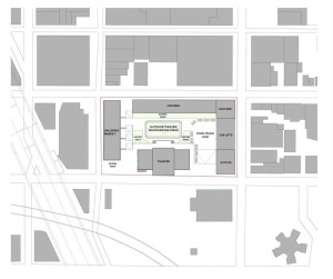
Additionally, this project raises thoughtful questions about the importance and the necessity of a hub in Dumbo and reacts accordingly. The motivating ideas are legitimate and the scheme is responding to a worthy concern which is both laudable but not too ambitious. The design development phase of this project has taken great strides since the schematic design review, fixing some of the design flaws that were present in the first scheme such as the hydraulic elevator stage area. The general organization of the proposal, having the majority of program (though permeable on the ground level) organized around the perimeter is a strong move because it allows for a variety of events to take place in the center. Additionally, setbacks like the one at Jay Street allows for ease of entrance at critical entry points. The logic behind this organization is well defined and allows for efficient circulation.

12312312312

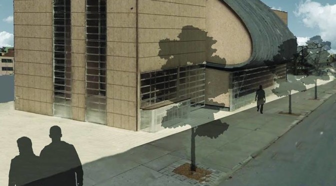
On a master plan level, this scheme works, however the relationship between Mike and Torin’s buildings, needs revising. There is simply a lack of cohesiveness in the design language from one building to another. Mike’s theater anchored by two boxes, and Torin’s curved gallery (akin to the Law building on campus), simply do not work together to create one unified, architectural design. However, simple moves may ease the tension between these two competing designs. One such move may be get rid of the boxes adjacent to Mikes design and bridging the gap between the gallery and the theater.

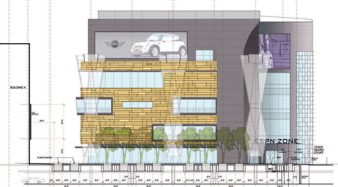
Upon closer analysis of the theater proposal, one cannot help but note the bold move that is the graceful, Frank Ghery-esque curve to define the, orchestra, balcony, foyer, and stage areas. However, Mike’s need to account for other programmatic necessity such as the restrooms, box office, and storage, etc. means that he has tacked on two wings to the theater which heavily clash with the formal curve. As a result, the boxes are drawing more attention to the design than the curve itself.

CRITIQUE OF CRITIQUE

The jurors comprised of professors, Darla Lindberg, Jamie Cooper, Reggie Aviles, and Sandra Staub. The majority of the jury harped on mostly the same couple of issues: The need for Mike and Torin to make one cohesive project, 2) the awkward boxes flanking the curve of Mike’s theater. Darla in particular noted that the boxes adjacent to Mike’s theater stood out more than the curvaceous theater itself, quite the opposite of what Mike intended.

Playing off of this idea, Jamie cooper added that there was an urgent necessity to create a language of either horizontality, verticality, curved elements, or linearity. Adding to this, Cooper noted that the boxes really missed an opportunity to emphasize Mike and Torin’s motivating idea; temporality.

Reggie had more specific comments concerning the curve of Torin’s gallery, noting that the gallery does not have to curve because of the site’s slope, something that may lend some flexibility to the team when they go back to revise their schemes.

Sandra reinforced these ideas once again by emphasizing the need for the team to work together. Her main point was that Torin and Mike’s project, while having strengths on their own, do not speak the same language, and therefore break the consistency of ideas they had to begin with.

DD Peer Review: Selina Bitting

Selina and Hajir presented “The Link” as a holistic community solution for residents and employees of the DUMBO neighborhood. Their creation of a large mixed-use building utilizes the layering of multiple different programs in a structure that occupies the northeast corner of the site. Public plaza space mediates the relationship between this large structure and the theater/market and subway entrance on the other side of the site. The two claim that the plaza space is split in use – one side to embrace the kinetic flow of pedestrian commuters and shoppers and the other to serve as auxiliary static space to the adjacent mega structure.

Having been exposed to the teams project before, I am relatively aware of what the goal of the project is. However I felt the presentation of their ideas could have been marginally stronger in order to convey the purpose of their design choices to external viewers, especially in the ordering and organization of programmatic elements.

In presenting the variety of uses and spaces incorporated into the building, the dialogue jumped between Selina and Hajir as they attempted to showcase what they were describing by pointing to both drawings and the model.

The critics immediately requested further explanation of the organizational logic. I believe that the development of the team’s layering diagram could be extremely useful in simply conveying their design ordering strategy. The image that they used to show their analysis of pedestrian movement and transportation access could easily justify their ground level program choices, as well as serve as a very clear graphic to alleviate the difficulty of describing a complex project.

In light of this, I am in agreement with the critics that this is a very successful proposal. For such a large-scale project, the team has come very close in many different instances in providing a solution for the DUMBO community. Due to this, the critics were largely on board with the layered architectural vocabulary that the two proposed. With the acceptance of the large formal strategy, the jurors focused on specific functional and organization issues.

One theme of the critique was the emphasis on the vertical connection between layers. With such strong horizontal movement created through long layers paralleling the ground, the cohesive integration of the contrasting vertical movement is crucial to the development of the scheme, especially where providing access to different levels is also providing access to different programs. Therefore, the role of the vertical circulation spaces is incredibly important. Developing a hierarchy and separation of entrances to different levels and programs while retaining a universal functionality for all uses is necessary, albeit very difficult.

This can be instrumental in solving the economic sustainability issue to which Mehrdad spoke. Although he had no problem with the design mixing luxury and affordable housing, he highlighted the importance of incorporating this choice into part of the architectural vocabulary. The two can play off of each other and create a unique dichotomy while coexisting within the same structure. Since the only connection between these two is the vertical circulation space, one way this can be achieved is through the manipulation of entrances, lobbies, and access to each floor through material choices and sizes of space. Scott and Mehrdad highlighted some of the layering problems present in the design such as the apartment level. Reorganizing access to these layers could be key in developing functional circulation that solves the day-lighting issues of the current design.

The remaining majority of the critique focused on the relationship of the site design and composition in relationship to the proposed buildings. The team’s model was incredibly successful in conveying their image of how the site functioned as an entity of the DUMBO neighborhood. It displayed the “great level of specificity” which Christine complemented them for. The critics believed the west side of the site to appear disjointed from the entire proposal, largely due to the individual nature of the market/theater and subway entrance. The boundaries of pedestrian space that these two formed seem too loose, resulting in a large amount of plaza space, which may not serve any specific purpose. I believe that if the team were to combine the theater, market and subway entrance into one structure it would assist in delineating the public space into a more orderly formation. The two structures could serve as bookends for the site, compressing the central interior space. This more static space would be contrasted by the highly kinetic action occurring at the terminating corners of the site, which would be filtered into the multiple uses of the program.

Mehrdad also called for a potentially more uniform representation of the collective idea. He claimed that if a layering strategy is the project’s driving conceptual force that it should also clearly influence the formal site organization. Although I feel that this may have been a useful tactic for the conception of a scheme, I believe that the neutrality of the negative space in Selina and Hajir’s design functions well as with the complex buildings. The potential for a layered site design is there, but in a limited capacity. Only a very subtle layering would maintain the hierarchy of site and structure evident in the current proposal. A highly literal representation of layering with the remaining space may loose the finesses that the project exhibits in order to contrast the complexity of the nearby structures.

Critique of the Critique 

The three critics (Scott, Mehrdad, and Christine) were essentially in agreement about the criticism of the project. The initial comments focused on the formal arrangement of the project but then moved towards the civic roles and responsibilities the project held. While I agreed with many of the suggestions about the formulation of the site and building, I believe that because of incredibly complex nature of the project, addressing all of the different issues and creating a beautiful, functional, proposal is nearly impossible with such a small team. The later portion of the critique was focused largely on technical and functional details of the project. These comments very appropriately address some of the most significant design challenges that the team faces. Mehrdad called for a straightforward mapping of strategies for the problem that is the driving idea, which will exhibit the group’s refinement of the program so that multiple different spaces can function utilizing the same structural, mechanical, and egress systems (to achieve a true harmony between inspired, civic, and industrial orders). I believe it is useful for Selina and Hajir to aim for this clarity and refinement, which will truly strengthen their already advanced project.


Photo: Selina and Hajir