
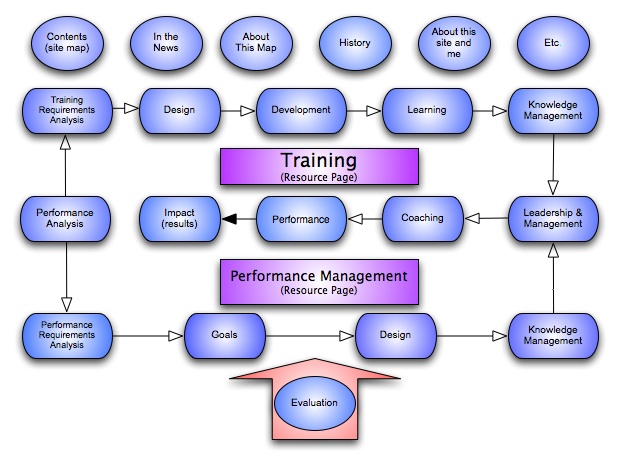
I’m actually a big fan of diagrams (maps, family trees, bar charts) but I’ve always found the standard concept map (like the one below from Wikipedia) a little confusing

Click Image to Enlarge
This is one of those concept maps where all the arrows are labeled with the relationship. Someone asked a linguistics group if they felt that the arrows should be labeled or not, and I do say not, but maybe not for linguistic reasons.
Normally when I create a diagram, I don’t label relations per se, but just for a mini experiment, I redid a concept map in two versions, one my way and one like a classic concept map, labels and all. I noticed some things that made me understand why I don’t like to label arrows/lines.
- The big one is that I think that I (and most natural map readers) are trained to infer relationships from the connecting lines/arrows. Only the labels on the objects matter. The labels on the arrows are redundant.
- Not just redundant, but distracting because they take up space in the diagram and interfere with my ability to process the concept map as a whole architecture. This is important for a diagram like a family tree where you track lines to find your first cousin.
- Not just distracting, but conflicting. In the Wikipedia concept map (of what a concept map is), the arrows are the same, but the labels may differ. I am receiving conflicting input on whether the relationship is the same or different.
- I’ll also note that there is a conflict in classic concept maps on whether shapes change depending on object properties. Normally I assume that if a shape has the same format, it’s the same kind of object. But if labels are different, I can’t make that assumption. Do I have to infer from the text? and how?
P.S.: I did find an example with different shapes but arrow labels. I think the shape cues makes it much easier to understand what’s happening.
I have to say that not all concept maps have labels on their arrows
- http://classes.aces.uiuc.edu/ACES100/Mind/c-m2.html
- http://www-personal.umich.edu/~jmargeru/conceptmap/types.htm
- http://www.nwlink.com/~Donclark/map.jpg
At least I am not alone on this one. I am curious if that person was able to complete the research on arrow labeling….
Post Script
The link from D. Stong goes to a research paper describing the “rules” for making a concept map including the labels on the connections. It may be good theory, but I’m still not sure about the design aspect.
It’s good to hear a different point of view.
I admit I’m very visual, but I believe that part of the design process is to minimize the verbage needed. I also come from a field where we use specific graph types for specific uses. A syntax tree ≠ a syllable diagram, but neither have much in the way of words.
A point that Ruben Puentedura made about comics is that most are drawn in such a way so that transition words are minimized (e.g. “Meanwhile” for a big switch in scene which is simultaneous).
Concept maps may be a little different in that you could be capturing any concept (or are you capturing the semantics of any noun?). Hmm now you have more more convinced I like my label light diagram 😉
It’s all good food for thought.
Gee, I always like the labels. It helps me understand what the person who created the map was thinking.
My problem with them is the need to two-way labels. Most often, you need two. For example
causes/is caused by
Talk about noise! Maybe technology can help here with rollover labels, a switch to turn them on and off, etc.
I’ve also seen some rubrics for assessing the “strength” of a concept map that includes how the labels are done, so some people must value them.
Different strokes for different folks.
Excellent observations Elizabeth. I have trouble with the concept map you display here, and for many of the same reasons. I think this particular example suffers from being poorly planned as well as being full of noise. There’s a similar example in a PDF at http://is.gd/xHDB Figure 1. seems to be the same map as this, only arranged to facilitate understanding. The labels are still noisy, but aren’t quite as irritating.
I enjoy your analysis. I rarely get so far as to be able to put into words what’s wrong. I usually just shudder with feelings similar to vertigo, and move on. Too bad Hitchcock didn’t do a movie called ConceptMaps.