Jacqueline Reid-Walsh
A short time ago I had the privilege of working with Dr. Sarah K. Rich, Director of the Center for Virtual/Material Studies, and Dr. Clara Drummond to examine the materials of two books from two different periods, one composed totally of fabric and the other of early modern paper. I have been struggling to answer questions about the materiality and the interactive affordances of the two books by using a light box and magnifying glass, which was only partly satisfactory. Dr. Rich used a powerful microscope that allowed us to see the threads distinctly. Her analysis of the threads explained questions about the interactivity of the materials in the books published some 150 years apart.
The much more recent book is intended for babies and toddlers. Called What is this? What is that (1905), it is the second book in the series of Dean’s rag books published until the second world war. The books are described as being composed completely of rag for durability, safety and cleanliness for baby and caretaker (Cope and Cope, 13) and the logo on the book claims that the books were “quite indestructible.” The artifact is smooth to the touch, soft and very pliable, reminiscent of a cambric shirt and I was curious about what type of cotton was used.

While the weave of the material is suggested to the naked eye, under the microscope we could see how the material is composed of loose weave cotton thread. We could even see the pattern of the threads which are in a plain weave, crossing over and under, with the longitudinal warp and the traverse weft clearly visible. What was also apparent was that the threads are of different widths and that the space between the threads is about the same as the width of the threads themselves.

Another question I had was how were the colors were applied to the fabric? Was there any pigment or were they printed directly on the material? How was this achieved? According to Dr. Rich the method of color printing was coal tar dye. There are eight colors used, most are distinct, but as seen in the microscope enabled photograph, the orange is created from layering yellow with red. This demonstrates how the material was run through the rollers multiple times (Cope and Cope, 14). The green color is vivid but unlike the paint of the period there is no arsenic. Indeed, the colors are safe as the company claimed. Dr. Rich said that the smooth surface, so attractive even after all these years, is created by starch or by ironing.
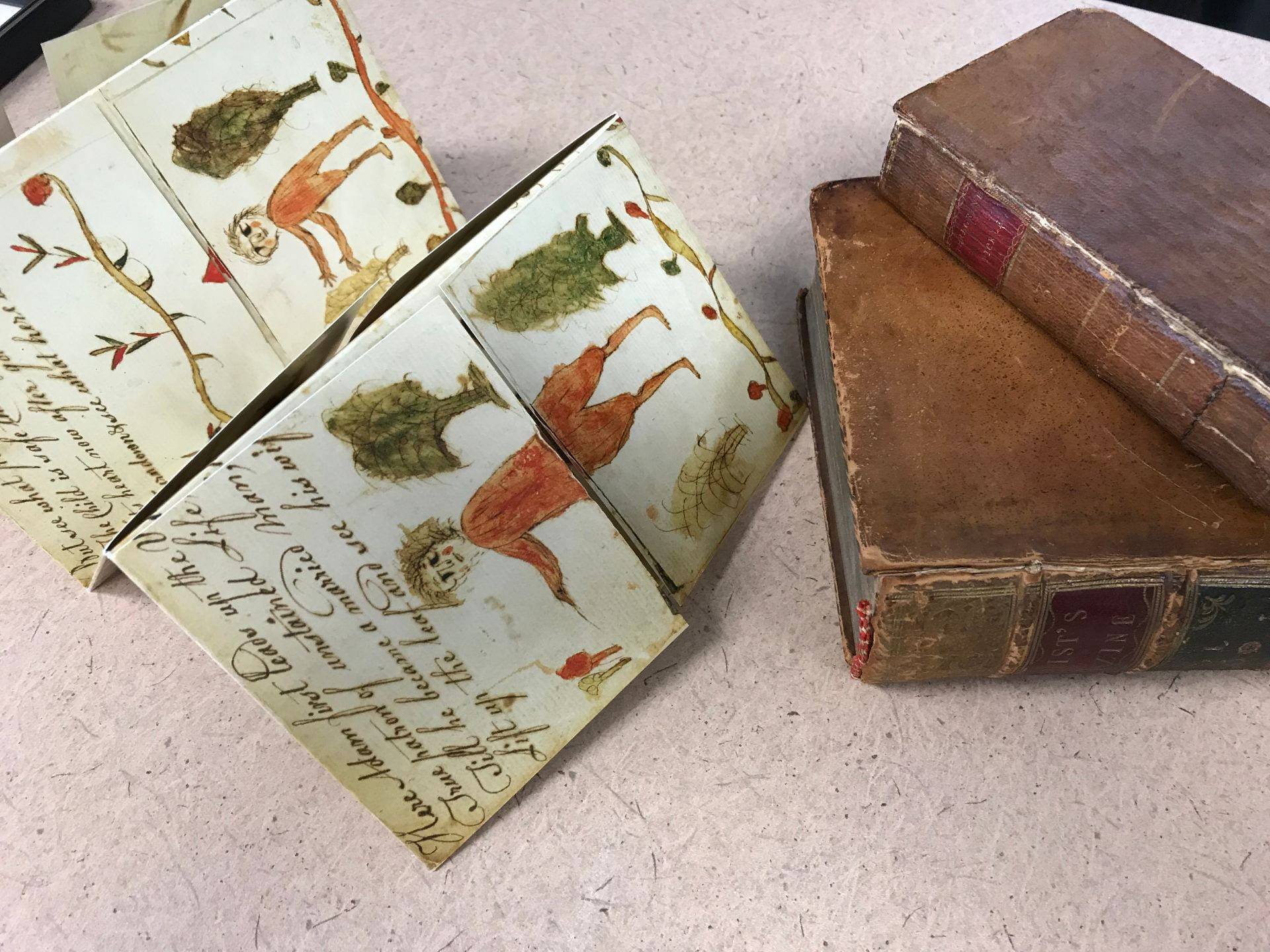
The Beginning, Progress and End of Man (circa 1650)
By comparison, the much older object a religious turn-up book called The Beginning, Progress and End of Man circa 1650 and it is composed of paper. However, paper of the 17th century is not made of machine wood pulp as is modern paper but of linen rag. The difference between early modern paper and modern paper is obvious even to the touch of an interactor such as myself when working first with a facsimile and then the original. The facsimile feels smooth while the original feels soft but with an almost invisible texture that provides some substance. According to Bill Minter, the senior conservator at the university, this softness is due to the material itself which has not been treated.

Looking at the object through the microscope it is apparent to the educated eye that the linen was made of flax. Under the high magnification the fibres look like miniature bamboo with horizontal notches. The color is yellowish.

Comparing the cotton rag book to the paper book made of flax, I wonder what is distinctive about these materials. The cotton rag book is very supple so the pages can be folded or rolled without harm. The flax paper book has more substance but is not stiff like modern paper so the flaps can be easily lifted up and down and stay in position when placed. Looking up flax in both a general and an academic source I learn that in Western countries textiles made from flax are called linen and that while linen fibres are stronger than cotton they are also less elastic.
There is quite an extensive article on Wikipedia on flax with some cited sources at https://en.wikipedia.org/wiki/Flax#History. According to this article, flax fibers taken from the stem of the plant are two to three times as strong as cotton fibers. Additionally, flax fibers are naturally smooth and straight. Europe and North America both depended on flax for plant-based cloth until the 19th century, when cotton overtook flax as the most common plant for making rag-based paper. The article goes to explain that flax fiber is extracted from the bast beneath the surface of the stem of the flax plant. Flax fiber is soft, lustrous, and flexible; bundles of fiber have the appearance of blonde hair, hence the description “flaxen” hair. It is stronger than cotton fiber, but less elastic.
This information is supported by an academic article by Helmut Becker called “Growing and Hand Processing Fibre Flax and Hemp for Hand Papermaking” (2008). Becker draws on the work of Tim Barrett who has extensively researched both oriental bast fibres and western bast fibres like flax and hemp. They are fascinated by the quality and permanence of early handmade papers and try to make contemporary paper that has the same qualities. In terms of interactive properties of the material, Becker refers to the work of Douglas Howell who created successful, creative three-dimensional paper artwork stemming from his experiments in pulping raw fiber flax (Becker, 3).

Comparing the photos of the cotton and flax fibres under the microscope helps explain my questions about the materiality and the affordances of the interactivity of the materials in the books published some 150 years apart. I am struck in both cases how the books were not intended for an elite market but for middle and lower class audiences — babies in the case of the Dean rag book — and in the case of the turn-up book part of the “cheap’ or popular print culture of 17th century England consumed by a wide audience of people old and young. That these books have survived in very good condition through the intervening years is largely due to their material as well as their careful preservation in special collections. They provide a glimpse into how the playful literacies of earlier centuries were able to be achieved, and provides a topic that needs further examination.
References
Becker, Helmut, “Growing and Hand Processing Fibre Flax and Hemp for Hand Papermaking.” Presentation at the International Conference on Flax and Other Bast Plants, Saskatoon, Canada, July 21-23, 2008. https://www.academia.edu/19693013/Growing_and_Processing_Fibre_Flax_and_Hemp_for_Hand_Papermaking
Cope, Peter and Dawn Cope. Dean’s Rag Books and Rag Dolls. London: New Cavendish Books, 2009.
“Flax,” Wikipedia. https://en.wikipedia.org/wiki/Flax