Forms and Formats: flaps and folds—making meanings

Gettysburg college. Photo courtesy of Bénédicte Miyamoto

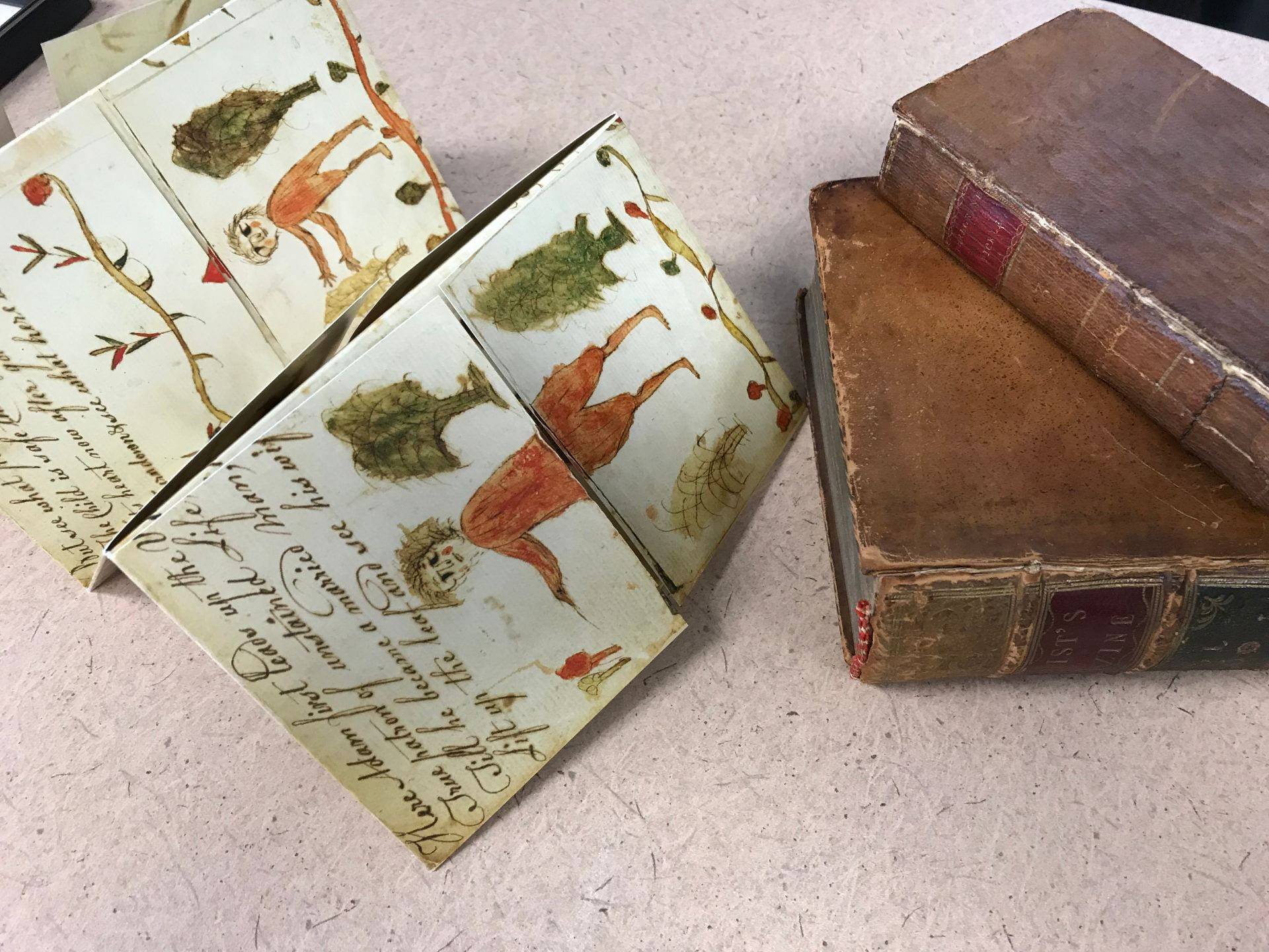
Last week I presented at a conference hosted by the East-Central Chapter of the American Society for Eighteenth-Century Studies in Gettysburg. The town and especially the college are exquisite. The conference theme was “Crossroads and Divergences” and my paper was part of a focused panel called “Folds and Formats: Fitting Knowledge to the Page.” The moderator and organizer was Bénédicte  Miyamoto who is an Associate Professor at the Université Sorbonne Nouvelle – Paris 3. The other presenters were Dr. Faith Acker, a research fellow at the Folger Library, who presented a fascinating paper entitled “Shaping Shakespeare’s Sonnets: Folds, Formatting and Paratexts from 1599 to 1790” and Professor Eleanor Shevlin from West Chester University who presented a provocative paper called “ A Matter of Formats: Genre Interplay and Remaking Marketplace Attitudes.”  My paper examined the folds and flaps in both the strip format of the 17th century British The Beginning, Progress and End of Man, and the booklet format of the 19th century Metamorphosis, or a transformation of pictures.   My aim was to contribute to the panel theme about folds and formats in terms of two questions in particular. They were, “Were content and format closely intertwined?” and “How did printers, engravers, or book sellers experiment with new forms and folds of publication with what results.” ?

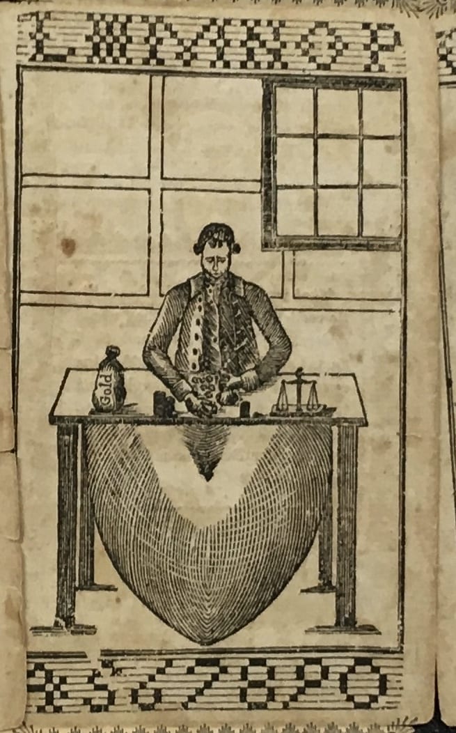
In the 20 minutes allotted I did not progress much beyond showing images, sharing the questions, and handing out facsimiles for the audience to play with and perhaps speculate with. I shared that my answer to the two conference questions was a resounding yes. Regarding the first question, the format I argue makes or enables different kinds of content, the images and verses, to appear in different orders as they are manipulated by the reader -viewer-player or interactor.  Regarding the second question, in respect to the strip format, the printers used the wood blocks in unusual ways by placing them under the flaps or over the joins made by the closed flaps. (See https://blogs.bodleian.ox.ac.uk/theconveyor/2017/02/06/transformations-in-print/1-adam_trans/

and

https://blogs.bodleian.ox.ac.uk/theconveyor/2017/02/06/transformations-in-print/3-mermaid_trans/)

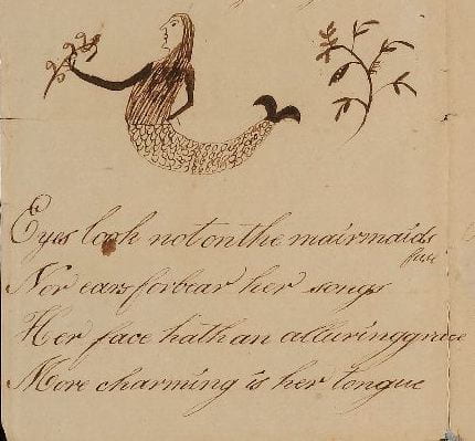
In the discussion after the facsimiles were distributed, one participant, a co-presenter, was intrigued by how the inner images under the flaps form a secret or private space that is  only revealed when the flaps are lifted (Shevlin remarks, Oct 26, 2019). This perceptive insight draws attention to what images are not immediately apparent but hidden beneath the flaps. The mermaid, eagle with child, heart as money bag and skeleton only appear when the double transformation has occurred by lifting both flaps.  Is there a quality that draws them together in this secret space? Or, since the double transformation is achieved in different ways in each panel: in the first two panels this is achieved by turning the top flap up and the lower flap down, while in the last two panels the flaps are usually turned in reverse order, does the pattern of revealing serve different functions? Moreover, in all seen versions, whether 4 or 5 panels in the printed versions and perhaps even more in the homemade texts, the order of these key images remains the same.

Looking at the first and last images for example further questions arise. With the first panel, could the hidden mermaid be a lure for the implied male viewer? (the verses suggest so). Yet, the mythic mermaid by her positioning under Adam/ Eve has a hidden connection with Eve. On the one hand, Eve is created by lifting the top flap of Adam’s torso–perhaps enacting as it were the biblical origin story. On the other hand, by the mermaid’s placement under both biblical figures she may suggest an alternate origin story for women. What would female viewers think?

(See https://sites.psu.edu/learningasplaying/2018/02/16/mermaid-at-the-centre/)

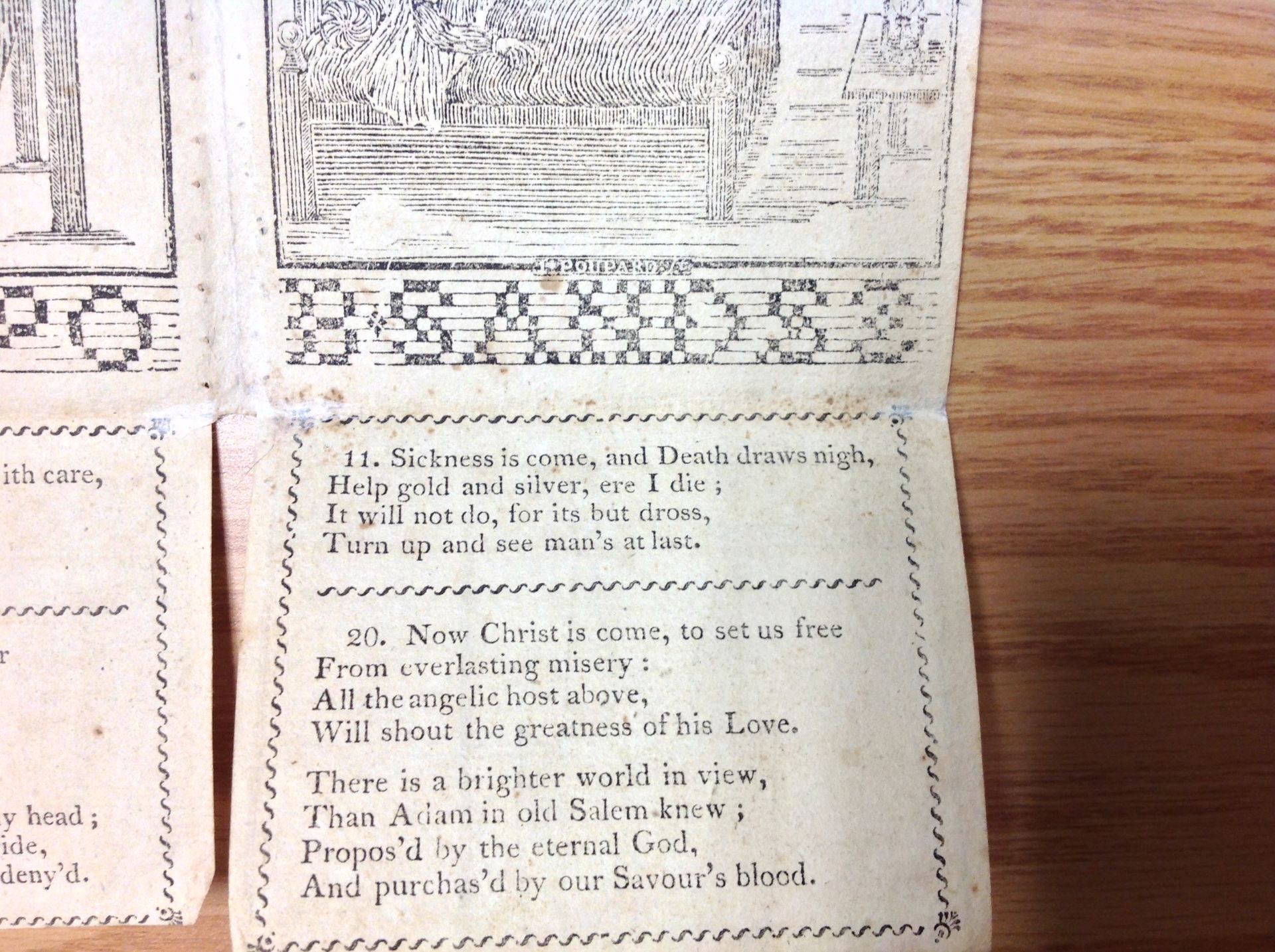
With the last panel, could the contrast between the richly garbed man and his naked skeleton be intended to be a moral shock as well as a conventional memento mori? The first and last images form stunning contrasts and unless the strip is refolded so they are juxtaposed sit at opposite ends of the text.

For their part, the two middle hidden images seem to serve a linking narrative function to me. The eagle with baby and the young man’s heart that chases gold are linked to the final image of the rich man/ skeleton tying these three episodes together. Child, youth, age and death –the stages of man.

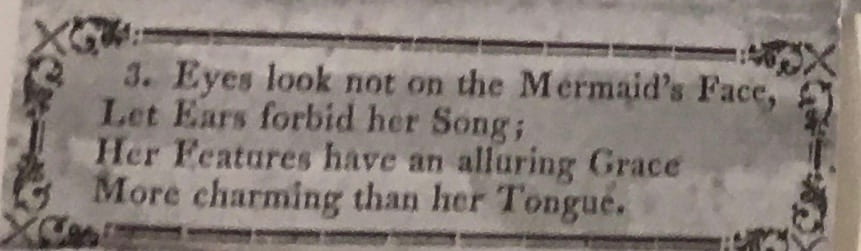
I have been discussing the images when the flaps are lifted in the intended order following the instructions. When we disobey the directions and turn contrarywise, we discover incongruities not referred to in the verse, like the merman and a monster made of the lion and eagle in the opposite manner to the Griffin. Yet due to the design and way the text and images are formed, no matter a reader-viewer-player’s patterns of engagement, the inner, hidden images remain

photograph courtesy of Bénédicte Miyamoto

The Mystery of Eleanor Schanck –was she British or American?

By Colette Slagle and Jacqui Reid-Walsh

Because we devoted the last blog to the interconnections between marking samplers and metamorphoric books we decided to examine more closely two handmade metamorphic books made by girls.  While our next blog will examine the connections between stitchery literacy and a 19th century artifact made by a American girl Betsy Lewis, in this blog we examine a late 18th century artifact made by Eleanor Schanck and we hypothesize her nationality.

In 1777 Eleanor Schanck created and dated a four-part turn-up book now held at the Cotsen Library at Princeton University. This is one of the few known homemade turn-up books that can be confidently identified as girl-made, as most handmade versions are anonymous, making it difficult to determine their provenance. It is unknown if it was created in England or the United States. In this blog in order to answer this question, we compare Eleanor’s turn-up book to known published British and American editions.

The Cotsen catalog entry describes it as 1 sheet folded into 4 panels with flaps, written and drawn with pen and ink, measuring 27 x 37 cm.  When you interact with the object since there are no individual movable flaps, you can only lift the entire top part or the entire lower part.  Looking at photos, it is hard to determine whether it had been cut and then later reattached, or if it was always uncut.

The early date of this handmade text raises question about which versions of The Beginning, Progress and End of Man and Metamorphosis could have served as a model for Eleanor.  While the 17th century British religious turn-up book was published on occasion throughout the 18th century, the American Metamorphosis is believed to have been first published after 1775 (Hamilton, illustration 26).  We therefore compare Eleanor Schanck’s handmade manuscript with the 1650 British 4-part turn-up book printed by Bernard Alsop, the 1654 British 5-part turn-up book printed by his widow, Elizabeth Alsop, and a facsimile of the earliest known American Metamorphosis, printed circa 1775 in Philadelphia (Hamilton 25).  Important to note is that the 4-part American Metamorphosis is itself closely based on the 1650 edition, with the exception of one stanza, which we discuss below.

For the most part, Eleanor’s version is similar to the 1650 version, however one substantial difference is the mermaid verse included in each.

The mermaid verse in the 1650 edition is as follows:

“The Mermaids voice is sharp and shril

As womens voices be ;

For if you crosse them in their will,

You anger two or three.”

1650 The Beginning, Progress, and End of Man. Photo courtesy of the British Library.


Eleanor’s version is as follows:

“Eyes look not on the mairmaids fase

Nor ears forbear her songs

Her face hath an alluring grace

More charming is her tongue”

1777Adam first comes first upon the stage [manuscript harlequinade]. Photo Courtesy of the Cotsen Library, Princeton University.


Eleanor’s version seems closest to the mermaid verse in the 1654 edition:

“Eys, look not on this Mermaids face,

And Ears, forbear her song :

Her face hath an alluring grace,

More charming is her tongue.”

1654 The Beginning, Progress, and End of Man. Photo courtesy of the Houghton Library, Harvard University.


The mermaid verse in the 1775 American Metamorphosis version is also similar to the 1654 edition:

“Eyes look not on the Mermaid’s Face,

Let Ears forbid her Song ;

Her Features have an alluring Grace

More charming than her Tongue.”

Facsimile of c. 1775 [Metamorphosis] in 1958 Hamilton, Early American Book Illustrators and Wood Engravers, 1670-1870, figure 26.


While the mermaid verses are quite similar in both the 1654 edition and the 1775 American Metamorphosis, Eleanor’s is most similar to the earlier British edition.  For example, she uses “forbear” rather than “forbid” in the second line, “face hath” rather than “features have” in the third line, and “More charming is her tongue,” rather than “More charming than her tongue.”  For these reasons, we speculate that Eleanor was working from the British editions, not the American.

Another significant difference we noticed between Eleanor’s handmade text and the 1650 British edition was the spelling of the word “lyon.”  The only known printed versions of the text that also uses this spelling is a 1688/9 version owned by Anthony Wood and published by Dunster, held at the Bodleian Library, an undated 17th century version, held at Penn State, and an undated British edition, owned by a private collector.  Based on this circumstantial evidence, we think Eleanor was likely British.

Facsimile of 16XX The Beginning, Progress, and End of Man. Photo Courtesy of Penn State Special Collections.

1777Adam first comes first upon the stage [manuscript harlequinade]. Photo Courtesy of the Cotsen Library, Princeton University.


*For a discussion of Eleanor Schanck’s artistic style, please see 2017 Reid-Walsh, Interactive Books pg. 218-219.

Marking Alphabets in Samplers and Metamorphosis Books

By Jacqui Reid-Walsh and Colette Slagle

In our last blog, we observed that the alphabet border of the Metamorphosis text (particularly those written by Sands and illustrated by Poupard), resembled that of a sampler, noting that “the letter style is also ornate and appears ‘stitched’ rather than printed in the standardized letterpress style.”  Since then, we have been exploring this connection further, researching information on the history of samplers, marking, and—as Jacqui calls it—stitchery literacy (Reid-Walsh, Interactive Books 40).

Cynthia Cooper, the curator of textiles at the McCord Museum in Montreal, directed us towards The Workwoman’s Guide, an early nineteenth century needlewoman’s guide “for the inexperienced.”  It was written “By a Lady” and published in London in 1838.  Notably, figure 1 of the first plate depicts a model sampler used to exemplify different types of stitches that are used in marking linen.  The author states that “the sampler drawn gives an accurate idea of the canvass, and the shape of all the letters in the different alphabets” (5).

The Workwoman’s Guide, containing instructions to the inexperienced in cutting out and completing those articles of wearing apparel, &c., which are usually made at home; also, explanations on upholstery, straw-platting, bonnet-making, knitting, &c., By a Lady, London, 1838. Photo courtesy of Penn State Special Collections.

The various letter styles shown in the sampler are used for different kinds of marking from simple to ornate.  She notes, “The first alphabet is that in most general use; the second contains the small letters; the third is a correct representation of the Italian characters, which are much used for marking pocket handkerchiefs and other fine articles of dress; the fourth and last is quite a fancy stitch, and rarely employed” (5). Intriguing to our minds is the link between this Workwoman’s Guide and the 1814 Metamorphosis book published by Robert Porter with the subtitle, “also, an alphabet of large and small letters to aid females in marking linen.”  The Sands/Poupard versions only include “the first alphabet,” which has only uppercase letters, is the most commonly used for marking, and made of the simplest stitches (5).  By contrast, Porter’s 1814 version includes both this alphabet and the second alphabet The Workwoman’s Guide refers to, which “contains the small letters” (5).  Interestingly, the placement of each type of alphabet in the borders reinforces their function: the uppercase alphabet in the upper border and the lowercase alphabet in the lower border.  Although we have not seen every version of the Metamorphosis book, we are struck by how the lowercase alphabet only seems to appear in Porter’s version, where the specific aim is to teach girls how to mark linen.

The Workwoman’s Guide, containing instructions to the inexperienced in cutting out and completing those articles of wearing apparel, &c., which are usually made at home; also, explanations on upholstery, straw-platting, bonnet-making, knitting, &c., By a Lady, London, 1838. Photo courtesy of Penn State Special Collections.

The frontispiece of The Workwoman’s Guide provides an excellent example of this type of stitchery literacy being taught in the classroom.  The room is full of girls of varying ages and a young woman teacher sitting in the center, modelling how to measure and cut fabric.  The children are all busy working as well: sewing, cutting, and measuring fabric.  On the wall there is a prominently featured alphabet of capital letters.  This alphabet is immediately adjacent to the woman and girls who are modelling the sewing activity.  Higher up on the wall there are also several sheets with animals and accompanying text underneath, reminiscent of a bestiary.  These animals include a goat, camel, swan, dog, and owl.  The combination of the alphabet, the informational animal sheets, and the cutting and sewing of fabric emphasizes the pragmatic educational nature of the scene.

The Case of the Elusive “J”

By Colette Slagle and Jacqui Reid-Walsh1817 Metamorphosis; or, a Transformation of Pictures, with Poetical Explanations, for the Amusement of Young Persons. Photo courtesy of Penn State Special Collections.

This week we began engaging with the Metamorphosis texts differently—not as a set of narrative episodes directed by the panels, but as a literacy abecedary.  Instead of following the directives in the text to turn-up and turn-down the flaps, attending to the alphabet requires opening and laying out all of the flaps at once.  The alphabet is displayed horizontally across the length of the open artifact.  Interestingly, if you follow the directions in the text and turn the flaps up and down in the intended manner, the order of the alphabet is disrupted.  For example, in the first panel the letters revealed when opening the flaps read “A B C C D D” across the top, followed by “U V W X Y” across the bottom.

The letters are printed in the upper and lower border of the central images, but bear no obvious relation to the images or the accompanying verse. Although an alphabet is textual, in this case it is not printed by the metal type, but is part of the woodblock illustrations.  We ascertained this by comparing Sands and Poupard’s editions to G.S. Peters’ editions.  The images and alphabet remain the same across the Sands and Poupard editions, but when Peters changes the images in his editions, the alphabet also changes.

1831 (1960 facsimile) Metamorphosis; or, a Transformation of Pictures, with Poetical Explanations, for the Amusement of Young Persons. Photo courtesy of Penn State Special Collections.

We also noticed that the alphabet border resembles the style of a sampler.  For example, the letters are all capitalized and are on a faintly lined background.  The letter style is also ornate and appears “stitched” rather than printed in the standardized letterpress style.

1853 Sampler by Anna Timmis. M974.119.2.  Photo Courtesy of McCord Museum.

Some of the letters appear twice—one in a more basic style, and one in a more ornate style.  Curiously, not all of the letters appear this way, only C, D, I, and T have duplicates.  This partly seems to follow the sampler style which would sometimes duplicate the whole alphabet in capital letters.  We are still puzzled as to why only certain letters are duplicated in the Metamorphosis.  Perhaps it is only due to the allotment of space and the chosen letters are arbitrary.

Moreover, while there is a double “I”—one simple and one ornate—there is no “J” present.  The history of the English alphabet is complex and the development is not perfectly linear. According to E. Jennifer Monaghan in Learning to Read and Write in Colonial America (2005), the authors of spellers “differed about the treatment of the consonantal i and u (which eventually became the j and v of the modern alphabet)” (216).  Interestingly, the Metamorphosis has both the letters “U” and “V” but no “J”.  While no “J” is listed in the alphabet, it is used in the text: “There nothing could their joys controul” (emphasis added)—even more interesting is that it is used in the same panel that the double I (and absent J) appears.

1817 Metamorphosis; or, a Transformation of Pictures, with Poetical Explanations, for the Amusement of Young Persons. Photo courtesy of Penn State Special Collections.

The inclusion of a secret alphabet hidden inside the flaps may have been intended for utilitarian purposes, indeed, an 1814 edition of the text printed by Robert Porter makes this clear through the subtitle: “also, an alphabet of large and small letters to aid females in marking linen.”  At the same time, however, there could be a more playful option.  One possible educational game that could emerge from the object would be matching some of the letters to the images in the text when all of the flaps are open.  For example, “A for Adam or Apple,” “E for Eve, Eden, or Eagle,” “L for Lion,” “G for Griffin,” “S for Serpent,” etc.

We then began to question if there were any possible image connections with the missing letter “J.”  We did not find many, but one possibility is that the empty scales featured in the third panel with the wealthy merchant could be read as an allusion to the “scales of justice,” particularly as the verses in the fourth panel condemn his greed.

1817 Metamorphosis; or, a Transformation of Pictures, with Poetical Explanations, for the Amusement of Young Persons. Photo courtesy of Penn State Special Collections.

Comparing Two Metamorphosis Books 1810 published by Wiatt and 1811 printed by Rakestraw

By Colette Slagle and Jacqui Reid-Walsh

At the beginning of this school year, Jacqui and I wrote a blog in which we compared the 1810 Metamorphosis book printed by Solomon Wiatt and the 1811 Metamorphosis book printed by Jonathan Pounder (held at the Bodleian Library).  Penn State Special Collections recently purchased an 1811 Metamorphosis book printed by Joseph Rakestraw.  Today, we decided to revisit the 1810 Metamorphosis book held at Penn State, and compare it to the newly purchased 1811 Metamorphosis book, due to the close proximity of their publishing dates and locations.

The 1810 version was published by Solomon Wiatt at No. 104, North Second Street, Philadelphia, PA.  The 1811 version was printed and sold by Joseph Rakestraw at No. 248, North Third Street, Philadelphia, PA.  These two addresses appear to be only one street apart from one another.  The similarities between the two versions are striking; however; they are not without differences.

The images in the main text of both versions are identical, though the images on the verso differ.  In Wiatt’s 1810 version, there is an image of a man seated in a chair and handing a little boy a book, and an image of a woman in chains in prison.  In Rakestraw’s 1811 version, there is an image of a woman beneath a tree with a reclining African American man beside her, and an image of a couple fleeing.  The title pages also both feature the same image of a man sitting underneath a tree.  According to Welch, Wiatt’s 1810 version is the first one to feature this image (392).

Verso of Wiatt’s 1810 version (top) and verso of Rakestraw’s 1811 version (bottom) (Special Collections, Penn State Libraries)

Interestingly, Rakestraw’s 1811 version and Pounder’s 1811 version are completely identical in the images they use, including the extra images on the verso.

Verso of Jonathan Pounder’s 1811 version. (Bodleian Library, Oxford University Vet. K6 f.92)

The text in Wiatt’s 1810 and Rakestraw’s 1811 is also identical, with only a couple of minor differences, likely due to typographical errors (i.e. the occasional missing comma, and the misspelling of “Saviour” as “Savour” in Rakestraw’s 1811 version).

Misspelling of “Saviour” as “Savour” in Rakestraw’s 1811 version. (Special Collections, Penn State Libraries)

The biggest differences, however, were not in the images or the text.  The most striking difference is the size of the paper.  The 1811 version printed by Rakestraw is visibly larger.  It measures approximately 14 ¼ inches x 5 ¾ inches, while the 1810 version published by Wiatt is approximately 13 ½ inches x 5 5/8 inches.  This means that the difference in length between the two is about ¾ of an inch, and the difference in width is about 1/8 of an inch.  While the widths of the two texts are very close in size, the lengths are significantly different.

Wiatt’s 1810 version (top) and Rakestraw’s 1811 version (bottom). (Special Collections, Penn State Libraries)

Another interesting difference between the two are the borders used in each version.  In the 1810 version by Wiatt, when the flaps are closed, the borders around the text are straight and rectangular, except for the set of verses numbered 7 on the top flap of the third panel.  Here, the border is a wavy line rather than a straight line.

Wiatt’s 1810 version (top) and Rakestraw’s 1811 version (bottom). (Special Collections, Penn State Libraries)

When the flaps are open in the 1810 version by Wiatt, they all have wavy borders around the text, matching the 1811 version by Rakestraw.  The only difference between these two versions when all of the flaps are open is the dividing lines between the original verses and the added verses.  In Rakestraw’s 1811 version, all of the dividing lines are wavy, matching the borders that surround the text.  In Wiatt’s 1810 version, however, the dividing line has a different design, with the exception of the top flap on panel one featuring sets of verses numbered 13 and 2, which strangely matches the wavy dividing line of Rakestraw’s 1811 version.

Wiatt’s 1810 version.  The wavy dividing line featured on the left matches the wavy dividing lines used in Rakestraw’s 1811 version. Special Collections, Penn State Libraries)

We have enjoyed comparing these two texts and going forward we are excited to look at other versions of Metamorphosis books that are presently being catalogued at Penn State. With the help of curator Jose Guerrero, Jacqui was able to locate a few more versions.  In addition to the 1811 version, there are 1815 and 1816 versions, both also printed by Joseph Rakestraw.  This means that Penn State now holds editions printed by Rakestraw from 1811, 1814, 1815 (a hand-colored version), 1816, and 1817, which we are excited to compare when we return in the fall.