ArcGIS Online Map Viewer Analysis Tools Review
Tool Name: Drive-Time Buffer
Description: creates polygons around a point indicating how far of a drive or walk it would take to reach it
Entry by: Nate Vincent
Findings/summary/reflection:
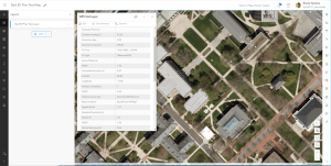
Time  management is an integral part of commuting, especially in one of the largest campuses in America. At Penn State, thousands of students take a class in The Forum during their early years for required classes such as STAT 200 or MATH 110. However, it can be confusing for a first-year student to navigate their way across campus and estimate the time it would take in this new environment. In GIS, Drive-Time Buffers allow the user to set proximities around a point to show how long it would be to travel to a point. Proximity buffers such as Drive-Time are available on ArcGIS Online. Note: I had to use the Map Viewer Classic to set it up because Map Viewer did not let me create a compatible point.

I first searched up the address of the Forum in the search bar found at the top right, it does not take you directly on top of the building, but you are able to drag the point to it. I clicked the underlined “Add to Map Notes” found within the pop-up menu and renamed it to “The Forum” and selected Change Symbol to turn it into an academic icon. Then, you click Analysis (found on the ribbon), click Feature Analysis, then under Use Proximity, click Create Drive-Time Areas. Make sure your selected point is the renamed Map Notes point layer. Since most students who travel to classes walk, you should click the Driving Time drop down and select Walking Time. You are free to skip to Step 4 and rename the layer, unless you would like to set a Barrier Layer for another analysis. After you select Run Analysis, you can change the Symbology by clicking Change Style, or the shapes icon under the layer in the Contents Pane. Color and Amounts (Color) and the theme High to Low is the most appropriate since we are trying to show the different ranges of time it takes between each value created in the Analysis. This is where customization can come into play, and you as the user can decide which colors appear best in the Symbols option. I chose a symbol that starts with tan being the closest time to walk to The Forum, then progressively becomes a darker red as you are moving away because those areas take much longer to get there. You are also able to change the ranges of the walking time by selecting Classify Data. Of course, there are more capabilities than this when it comes to buffers, but this is a good first step to learn how buffers work in ArcGIS.

In my first attempt to create a proximity buffer, I found it hard to create a point on the map that can be used for the analysis. However, after searching up a YouTube video, I was able to create one through the Map Notes option. At that point, it was just deciding the ranges of time for students on campus, which could be refined with classifying the data. While I found it interesting that I could create these time buffers with driving and walking, there should be an option for biking and scooters as well, as there are hundreds used on campus. Because each person has different levels of speed, depending on their ride and their ability, ArcGIS should have an option for average speed. We can figure out this average speed through surveys sent out by email, and then we can figure out the average time it takes for bikes and scooters as well.
ArcGIS Online Map Viewer Analysis Tools Review
Tool Name: Find Centroids
Description: Finds the center of each feature
Entry by: Nate Vincent
Findings/summary/reflection:
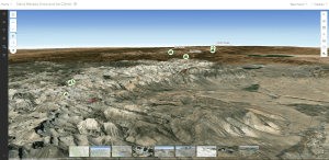
A centroid is the center of a polygon, line, or multipoint feature. While it has no official use, users can add centroids to their maps for their desired purpose. I decided to create centroids for every county in PA, just to see where the center of each were. To do this, I went on https://www.pasda.psu.edu/uci/DataSummary.aspx?dataset=24 and downloaded the shapefile. I inserted it into my map, clicked Analysis and searched for Find Centroids I used my PaCounty202303 layer as the input layer, then renamed the result layer to Centroid of Each PA County. Here is the resulting map:
I found it interesting where the center of each county was because in most of the counties, the central point is not contained within a city. In the case of Centre County, the centroid is over Bald Eagle mountains, and the closest town is Bellefonte.

Nathan Vincent is a Sophomore from the Lehigh Valley majoring in Geography in the college of Earth and Mineral Sciences. Nathan’s interests include Land Use, Transportation, GIS, and Information Technology. Nathan has been working at the Donald H. Hamer Center for Maps and Geospatial Information since April 2023.