Tag Archives: Passion

Hidden Mother

Last Saturday, I decided to go visit the Palmer Museum of Art here on Penn State campus. While I had gone once before last semester, the exhibitions are constantly changing. It just so happened that one of the exhibitions was called Hidden Mother. I found this slightly unnerving exhibition both symbolic of the everlasting relationship. And since it is almost Mother’s Day, I thought it would be interesting to blog about this exhibition.

Screen Shot 2015-04-16 at 10.24.22 AM

This exhibition portrays a bunch of pictures that were taken in the nineteenth-century. All of these pictures contain a child and his or her mother who is hidden or partially hidden from the picture. And there is some interesting information as to why these photos were taken in this way. In the nineteenth century, the child mortality rate was much higher than today. Therefore, it was a common occurrence to have portrait of the child in his or her early years as a commemoration in case the child did die. And because painting would be both costly and time consuming, photography was the best option. However, unlike the cameras today, taking a photo in the nineteenth century still required a length of time to complete. And in order to capture a clear photo, the subject needed to stay still – through the use of things like pedestals and braces. It was here that the problem arose. More often than not, infants and toddlers would not be able to stay still. Therefore, the mothers were enlisted to both stabilize the child as well as soothe them during the photography session. And to keep the mother out of the picture, the mother was either covered in a veil or out of the photo range. Yet, despite the attempts to cover the mother, these photos still have their haunting images – a feeling that the exhibition attempts to show.

When I first saw this photograph, I was taken back by the black ‘space’ behind the child. At first glance, it just seemed as if the photograph went wrong in the process, but a closer look revealed the black veil that was covering the mother. Especially for this photograph, the child looks almost sinister sitting on the veiled mother with a slight frown on her face. Another photograph I had seen showed the picture of the mother and her child – but her face was scratched out. Another photo showed a child in a carriage with the mother covering her face behind the carriage. There were funny pictures as well as ones that sent shivers down my back.

But despite it being slightly creepy at times, I thought that the theme of the hidden mother really rung true in reality. No matter what age you are, you mother is always there for you to lean on and trust. She was the one that gave you the feeling of safety and support as a child. However, she doesn’t come out and brag about her sacrifices, nor does she demand repayment. Instead, she is content to be in the background/shadows. In addition, by having the face covered, all of the photographs presented at the exhibition become more general and makes it easier for the viewers to relate to – each photo can represent everyone. The shrouded mothers are symbolic of all the mothers in the world.

Street Art

In this week’s Passion Blog, I wanted to look into the topic of street art. When these two words come up, I think of the name Banksy, an English graffiti artist who leaves behind satirical stencils.

The first time I heard about this person was during my sophomore English class. My teacher, in an attempt to show the class how different mediums could be used to advocate something or to get across a message, spent a great amount of time talking about a variety of artists. Thus, my goal today is to look at a few of his works of art that he left behind in various places and try to understand the underlying message.

The first stencil is one what many Banksy fans would recognize. It is the girl with the red, heart-shaped balloon. In a simple glance, you might think that this picture is really simple and just a nice picture. However, there can be a hidden message inside. First of all, notice the words at the right hand side of the photo. It says: “there is always hope”. We can probably infer that the phrase s talking about the picture. The picture is a young girl who has her hand stretched out towards a heart shaped balloon. Notice how the balloon is the only thing that has color. Everything else is black or gray, including the background that the stencil is on. This is drawing attention to it, and perhaps there is a deeper meaning behind this balloon. The red color could mean how important this balloon is. The heart shape can mean a variety of things. It can mean love, trust, innocence, or perhaps dreams. The action that the girl is making is another interesting point to notice. She is reaching out her arm, but it is not clear is she is reaching out to grab at the balloon, or letting it go. This open-ended painting allows for the viewer to try imagining the meaning, and thus gets them to think about the issue at hand. Screen Shot 2015-04-07 at 8.35.18 PM

http://people.southwestern.edu/~bednarb/su_netWorks/projects/jle/balloon.jpg

The other piece of artwork by Banksy that I wanted to take a look at is the painting about a painting. This one is slightly more humorous and light hearted, though it is still possible to get an underlying meaning out of it. Take a look at the picture below. This painting was snuck into a museum and laughs at the pricing of artwork. As you can see, the artwork with a stick figure drawn on it does not seem to be some sort of fancy piece of art. The amount of money for it would raise eyebrows for some. In fact, even the painting itself agrees, as it is portrayed leaving over the frame and exclaiming, “you have got to be kidding me”. In a way it is kind of funny. There have been some paintings where I was really surprised at how much people are willing to pay for some paintings. Thus, I think this is a perfect representation of the slightly silly art market.

Screen Shot 2015-04-07 at 1.44.04 PM

http://artpolitica.com/wp-content/uploads/kiddingme2.jpg

Photography

While there are unique features in painting, sculpting, or building, there is something slightly different when it comes to photography. Why would I say that? Think a little about it. How long might it take for an artist to paint on a canvas? Hours? Days? Weeks? How about sculpting? Or how designing a building? All these types of art require time. Time to focus on the topic. Time to organize one’s thoughts. Time to take a step back and come back later without the worry that the inspiration will change. But when it comes to photography, time can sometimes be a jerk. If you happen to miss that one moment, you’ve lost the opportunity. Perhaps the object has moved on. Perhaps the lighting has changed. Perhaps it’s just not your day. Sure, the newly bought cameras and other technology may compensate by allowing you to take multiple pictures in a short amount of time, but that doesn’t mean a foolproof plan. Sometimes it’s that one moment that you happened to capture on a small square screen will be your masterpiece. This idea was what drew me to do a little research on a few award winning photographs that have been submitted and chosen from a variety of places, ranging from the National Geographic to Sony’s annual photo competition. Take a look.

Screen Shot 2015-03-25 at 8.50.55 PM

The first photo is called “The World as Seen from the Outside.” What really caught my attention was the photo’s accurate portrayal of the lives of the modern day man and woman. Suit and tie. Coming back from work. Time restraint. Fast food. Isolation. Social media as life. Being from a family that places heavy importance to eating together, this picture shows a gloomy contrast to what I think of as happiness. Somehow, seeing this portrayal of life makes me feel pressured. Is dinner soon going to be defined as sitting alone at a fast food booth with a big mac, large French fries, and a medium sized drink? Is the only company going to be the phone in your hand or the music coming form your ear buds? Can that be considered a healthy lifestyle? A happy one?

The next photo is called “The Mask of Society.” Truthfully, I didn’t see any deeper meaning behind this photo. Instead, what drew me in was the mask and the lady next to it. While I do not know the details behind this photo, I imagine the photographer setting up the camera in front of the woman and taking shots as she prepares the mask for display. The darker more calm colors seemed to be the perfect fit for this type of setting. The woman with a slight frown and bright red lipstick seems to fit in with the settings perfectly as well. As for the mask, perhaps it means something important. And judging by the details and jewels that adorn it, this is no simple mask. There’s a high craftsmanship for it and an aura of elegance and coldness from it.

And the final photo attracted me because of the colors and, upon closer look, the subject matter. I loved how most of the picture is filled with the blue nets. It seems to swallow up the viewer. And the four workers are in the midst of this huge mountain, calmly doing their part of the work. Somehow, it just takes my breath away.

So, what do you think about these photos. Are there any photos that come into your mind that you would regard as breathtaking, meaningful, or just plain funny?

Abstract Painting

One type of artwork I feel that I must talk about is abstract art – or more specifically, Abstract Expressionism. It feels like whichever art museum I go to, there is always a section of the museum that is dedicated to the abstract. There, you can find the canvases that contain random shapes in a random order or a canvas that is composed of solely one color. And it’s also where you can find the canvases that are filled with drips of paint splattered here and there. For this blog, I decided to look at a painting made by the famous Abstract Expressionist Jackson Pollock, a man who revolutionized what painting meant. If you take a look below, the painting that is shown is called Number 1, 1950 (Lavender Mist). It’s a 221 x 300 cm canvas that features the drip style of art. Supposedly, the inspiration to creating such a painting came from the Accabonac Creek in Long Island. When creating this, Pollock had taped the canvases onto the floor of a barn and splattered house paint onto the canvases. According to museums, through the flicking of Pollock’s wrists and unrestrained movement, the splatters on the canvas have an “all-over” style that doesn’t give the viewer a certain place to focus their attention. Instead, the whole painting is important.

Screen Shot 2015-03-16 at 1.42.03 PM


When I first saw this painting, I wasn’t sure what to think. For me personally, I prefer to have the theme or motive of the artwork to be obvious and easy to find. However, with this painting, it’s much harder, if not impossible, to understand what the painting is about. There was no focus point – everything seems to be very similar. I wasn’t sure what I was supposed to get from the painting. Other questions rose up as well. Why did Pollock call his painting Number 1, 1950? Was it a date of when he painted this? Was “Number 1” supposed to signify his first drip style painting? Why was it also termed “Lavender Mist” when where wasn’t any Lavender paint used? All I saw was black, white, blue, and silver. What about the word “mist”? What did each strand of paint mean? Why was the black paint usually in thicker bands than other colored paint? What is the correct way of viewing the painting? There were just so many questions that I had about the painting. When I saw painting, I was reminded of a book I read one time, where one of the characters uses his hamster to win first prize at an art show. He dips its paws in paint and lets it scurry around on a piece of paper. Then, he cuts off the corner of the paper that looked the messiest and submits it to the art show. I’m pretty sure that Jackson Pollock was famous for a reason. And I’m pretty sure that anyone or anything can create a famous painting. So I wonder – what am I not seeing in this painting? Is there something that is hidden within the splatters of paint?


Resources:

“Active Expression.” Head for Art RSS. Head for Art, 8 Mar. 2010. Web. 16 Mar. 2015.

“Number 1, 1950 (Lavender Mist).” Explore This Work. National Gallery of Art, 2014. Web. 16 Mar. 2015.

Passion Blog #6

Once again, it’s time to write in my Passion Blog. Today I would like to share with everyone a painting that I found online while doing my weekly art research. While this painting may not be the most well known nor the best drawn in the world, I would dare to say that it is special in it’s own way.

Screen Shot 2015-03-04 at 11.11.16 AM

When I first saw this picture, I was amazed at the scenery the artist chose. This painting pictures a snowy landscape, possibly located in the forest or woods. And while this obviously wasn’t exactly in the middle of nowhere (you can tell by the bridge in the center of the painting), there’s no one except a deer present. At this moment, the feeling given off by this painting is sort of an isolated feeling.

Another thing that I really liked about this picture is the colors used. Everything is toned down. There are no flashes of green or red that stand out to you. Rather, all the colors are paired with either white or black. When looking at this piece of artwork, I felt a sense of calmness wash over me. And adding to that, there seems to be three layers that were painted, each with its “own color”. The first layer was the deer and the bushes next to its feet and on the opposite side of the painting near the bottom. The next layer that I saw was the waterfall, the three large trees, and the mini trees that hugged the two sides of the picture. The last layer was the group of trees in the distance – they were more of a purple color and created a misty/fogginess image. This further created the isolation feeling.

But I would say that the most impressive aspect of the painting was the detail. When presented with nature and a lot of trees and bushes, it would be tempting to just paint everything one color and be done with it. However, it felt as if everything was given the utmost attention to. The deer had a variety of shades ranging from black to white to gold to brown. The trunks of the three large trees looked as though they were made of real bark that had cracks and bumps over it. And the bushes seemed to have been made of hundreds and hundreds of individual leaves. And what really impressed me was that the author even took into account the snow that might have fallen onto those leaves and had painted tiny specks of white on top of the bushes.

Overall, this was really well painted. And if you hadn’t noticed already, a man by the name of Peter Longstaff painted this work of art. His specialty was painting everything using his two feet, because he had been born with no arms. Despite the tragedy of his fate, due to the drug called thalidomide once used for morning sickness, he was able to make such a wonderful picture for us to enjoy. I really thank him for that!

Resources:

West, Angela. “The Amazing Art of Disabled Artists.” Webdesigner Depot RSS. N.p., 16 Mar. 2010. Web. 05 Mar. 2015.

Architecture

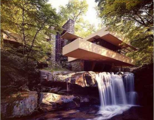
For this week’s blog, I wanted to stray a little further from the standard idea of what is considered art. After all, there wasn’t a specific medium that must be used. And since we are studying in PA, I thought it would of interest to find a work of art in this state. That’s how I came to research about the architecture Frank Lloyd Wright’s Fallingwater. In general, this blog will be focused more on the building itself rather than my thoughts.Screen Shot 2015-02-26 at 12.16.44 PM  Screen Shot 2015-02-26 at 12.16.15 PM

Here’s a background on this building. Located in Run Mill, PA, this building was first built to be a vacation house for Edgar Kaufmann and his family. At that time, Wright was unemployed and when Kaufmann approached him, he jumped to the opportunity. Fallingwater, as suggested by the name, resides somewhat in the woods and is located over a stream that eventually becomes a mini-waterfall. Now, this well known building is a museum. It is the only major house designed by Wright that is open to the public to view.

According to Wright, Fallingwater is a building that brings together man and nature. It suggests the possibility of living in harmony with the world around us and of appreciating the waterfalls, the forest, and the cliff on which the house was built upon.

While I wasn’t able to visit this site, I did do a bit of research on the exterior and interior of Fallingwater. The building itself is made of stone pieces that have a varying degree of thickness and length to create an aesthetic effect. From the outside on the trail, it is hard to see the building because the trees are blocking the view. However, upon rounding a corner, the building steps out into full view in an attempt to wow the viewer. In addition, there is a huge separation between the noise from the outside and inside of the house. From the outside, you can clearly hear the rushing sound of the waterfall just below the house. (However, it is interesting to note that from the balcony, you cannot see the waterfall itself. This was to make sure that this spectacle was not daily seen and would maintain its grandeur.) From the inside of the house, it is mainly quiet and serene. The center point was the fireplace what was carved from a boulder and had a spherical kettle that could swing above the fire. Also, Wright sometimes bent the structure of the house to incorporate the surroundings in an attempt to show harmony of man and nature. For example, a ceiling structure went around a tree that was growing there. The hallways had the boulder in the corner. The ceilings were either open or covered with glass. And finally, an open staircase led down directly to the stream under the house.Screen Shot 2015-02-26 at 12.16.37 PM

Wright himself carefully designed everything ranging from the foundation to the furniture and art of the house. The main theme was to have different layers that sometimes protruded from all sides and to have a sense of the horizontal and vertical feel. As stated before, the outside of the building showed the different pieces of stones. In addition, the different floors of the building crossed each other so there were terraces that protruded outwards on all sides – there weren’t the normal four sides of a building present. As for the furniture, many tables had a smaller foundation/support and an overlarge top. Artworks were often simple sculptures.

Overall, after looking through all the pictures and reading about Fallingwater, I would definitely say it is worthy to be called a work of art!

Resources:

“Fallingwater: Extraordinary Beautiful Waterfall House in Pennsylvania By Frank Lloyd Wright | Home Reviews.” Home Reviews. Home Reviews, 2011. Web. 26 Feb. 2015.

“Fallingwater | Home.” Fallingwater. Western Pennsylvania Conservancy, 2015. Web. 26 Feb. 2015.

Videoteca Pretérita. “Falling Water Frank Lloyd Wright.” YouTube. YouTube, n.d. Web. 26 Feb. 2015.

“The Persistence of Memory”

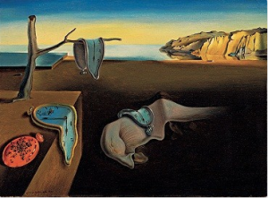
If I were to describe my week, it would be “busy”. Insanely busy. Thus, I decided that for this blog post, I would find a piece of artwork that focused on the aspect of time. Which lead me to finding about this painting by the Spanish artist Salvador Dali called The Persistence of Memory. At a first glance, I would say that this painting is rather interesting. It raised a lot of questions. What did the melting clocks mean? That time is limited? And why do the cliffs in the background seem to stand out so much? What is the red oval in the in the far left corner of the painting? What are the small, black dots on it? How about the figure in the middle? Is it a horse? A rock? A bush? These questions essentially led me to do some research.Screen Shot 2015-02-19 at 3.17.01 PM

According to legomenon.com, the artist himself described it as “hand-painted dream photographs” (Shabi). This relation of the artwork and dreams seem to make sense. If we look at the painting, we can see different things that could suggest a setting of a dream. First of all, the melting clocks are unrealistic. There is a random hard thing in the top left corner that looks like a metal table in the middle of what seems like a deserted area. There’s a weird object in the middle of the painting that isn’t quite an object or a living organism. However, there’s a part of the painting that is rooted in reality – most of the objects are easy to be identified. The cliffs in the background are detailed and the shading is good. Thus, we can conclude that the painting is stating something about reality versus dreams.

Thus, we can look at the main symbol being used: clocks. Supposing that this painting is in a dream, we can say that the clocks (or time) are melting. However, in reality clocks are hard and do not yield to pressure. Perhaps what Dali wanted to state that time is soft or weak when in the dream state. If taken literally, the painting can mean that when in dreams and separated from reality, time doesn’t mean anything – it is slowly fading into nothing. Another piece of evidence to this idea is the red object in the bottom left corner. Upon further inspection, we can see that it is another type of clock – probably a picket watch. The black dots on the watch are ants. By placing ants on the watch, it makes it seem as though time is decaying and slowly wasting away.

Another aspect of the painting is the contrast between the meaning that the painting is showing and the title of the painting: The Persistence of Memory. If time is wasting away, then why would memory be persisting and never dying? Perhaps this a satire what Dali was using, to further emphasize that memory and time are twisted in the dream world (or the mind where dreams occur) and that perhaps memory isn’t everlasting and correct.


Resources:

Shabi, K. “Salvador Dali Persistence of Memory: Meaning of the Melting Clocks.”

Salvador Dali Persistence of Memory: Meaning of the Melting Clocks.

Legomenon Online Literary Journal & Magazine, 29 May 2013. Web. 12 Feb.

2015.

Artwork at Work

For this week, I wanted to deviate from the normal definition of “artwork”. Since the last two blogs featured artwork that was just looked at for fun, I thought that perhaps I could show how artwork can be used for a more active purpose and the extent to which they might be or might not be useful. As you can see below, this time I am focusing on two different advertisements.

Screen Shot 2015-02-12 at 12.31.49 PMScreen Shot 2015-02-12 at 12.32.34 PM

Let me give you a brief introduction for the advertisement on the left. It is a National Geographic 3D crocodile ad that was posted at the bottom of an escalator in Brazil. The words on the top are translated to be: “Ready for an adventure through the Brazilian forests? Wild world with Richard Rasmussen.”

The advertisement on the right is a lot easier for us to understand – this was painted on the set of stairs and was advocating for the movement for more disability friendly buildings.

When I first saw these two advertisements, I must say that I was surprised. Unlike more advertisements I had seen before, these two certainly caught my eye. However, I would say that one is much more effective than the other in multiple ways.

For the National Geographic advertisement, I would say that the main function of the ad is to shock people and thus leave an impression on their mind. This part was very well done. By having the advertisement being 3D makes it stand out – who wouldn’t notice a really realistic looking crocodile at the bottom of the stairs? In fact, when I first saw it, I had thought that it was real. Having the crocodile poking out of the water as if it was about to launch itself at you certainly guarantees that the advertisement won’t be forgotten. However, there were a few things that could have hurt the advertisement’s purpose. First of all, I kind of feel that this scare is a little bit too much. Because it is at the bottom of the escalator, some people may be paying attention to what is at the bottom, especially if there happens to be people in front of them. The shock of being faced with a 3D picture of a dangerous creature could lead to them jerking back and possible stumbling/tripping. If this does happen, it would be hard to have a good impression. In addition, when reading the translation, it was hard to understand what the advertisement was about in one glance. Was it promoting the TV show? Was it promoting touring the Brazilian forests? Was it advertising the Rasmussen man himself? Overall, I would say that this advertisement was too eye catching and wasn’t as effective as it could have been.

On the other hand, I thought that the artwork of Mt. Everest was really effective in communicating the message. First of all, the purpose was clearly stated: building more disability-friendly areas. I thought that it was a brilliant idea to put the ad on the stairs – a place that posed a challenge for some. In addition, by having Mt. Everest looming so high up, even if it was someone that didn’t mind stairs, all of a sudden it seems a little harder.

Personally, I would say that sympathy would work more effectively than shock or fear in an advertisement. What would you say?

Pictures from: http://www.dailymail.co.uk/travel/article-2572059/The-National-Geographic-3D-crocodile-escalator-advert-Brazil-thats-TOO-realistic.html

Artist’s Drawing of an Artist

After last week’s famous “Starry Night” piece of artwork, I thought about focusing on a different type of art – one that is simple and easy to understand. After doing a little bit of research and browsing through quite a few good art websites, I decided on one of Pawel Kuczynski’s drawings. Unfortunately I couldn’t find out the title of this piece.

Screen Shot 2015-02-04 at 2.58.51 PMhttp://www.artfido.com/blog/paintings-that-will-make-you-question-everything-wrong-in-this-world/

And while I would really like to have given you a short biography on him, his webpage is in polish…so I am going to focus more on the drawing itself. But I’ll just leave you with one thing I do know about his artwork: they are meant to make you think a deeper and pay attention a little more to the world around you.

I would say that the thing that first captured my attention when I was scrolling through a pile of pictures was the contrasting colors. In the sea of brown stands a huge puddle of sky blue and hidden in the background is a pool of red. It made me wonder: why that choice? Looking at the scene being depicted, the brown does seem to fit in. A person is dead – nothing to be happy about. But that leads to the question about the blue and the red. Why does it seem like the dead man and his last moments seem to be the most interesting out of all there is to offer in the world? I think that there are many interpretations. One possible way to look at this is that Kuczynski is commenting about the life of the artist. It always seems that artist never really gets appreciated for anything he does until he’s dead. Suddenly, the prices increase sharply and everyone’s fighting over the last of his art. But what about the artist? Instead of getting that reward, he or she usually dies penniless. Another way of looking at this artwork focuses on the spilled paint itself. Looking closer, you can see that the blue paint is like the image of the sky. Perhaps Kuczynski was saying that unlike most of the men in suits, it is the artist that is able to appreciate the beauty of the world around them. Hence, the contrast between the paint and the dreary surroundings. Another, somewhat similar, interpretation is that Kuczynski was mourning over the loss of another artist. Must the artist die in the middle of the road to catch someone’s attention? Perhaps he was in the middle of painting the sky and fell. But rather than attention towards the artist who was trying so hard to bring something valuable in people’s lives, everyone is focusing on the spilled paint.

But of course, any of these ways of looking at this drawing can be what Kuczynski was aiming for. Hey, maybe all of them are correct in one way or another. What do you think this painting represents in relation to our modern day society today? Why is the background brown? Why is the artist seen in such clothing in comparison to everyone else? Why is everyone looking away from him? Why the sky?

Starry Night


Screen Shot 2015-01-28 at 10.37.42 AM

http://legomenon.com/starry-night-meaning-of-vincent-van-gogh-painting.html

Painted in 1889 by Van Gogh, Starry Night was one of the first pieces of famous art that I came to know. I remember having to draw make a replica of this artwork with oil pastels in middle school for an art project and later on getting a puzzle set of this picture. However, with the many times I have come into contact with this piece of artwork, I have never really thought much about the meaning behind it all. Thus, I thought it was only appropriate to do a little bit of research.

First, a little about the artist himself. Van Gogh is known to be slightly on the crazy side. Everyone knows of the incident of him cutting off his ear after a fight. According to sources, Van Gogh was in a mental asylum when he painted this depiction of the landscape he saw through his window. Van Gogh was also known to be an Impressionist. For those that aren’t very familiar with this term, Impressionism was a movement in the field of art that was characterized with sketch-like features with bright colors. The brush strokes were in some ways unprofessional, and the paintings during this movement often the artist’s impression of everyday life.

As for the impressions left on the viewers, there has been a mixture of feelings and attempts to decipher Van Gogh’s masterpiece. Some say that the painting had a religious intent. They claim that the stars represented religion and the cypress tree as him, a shadow trying to reach for the stars. Others went on even further and noted the number of stars (eleven) as a symbol of Joseph’s eleven brothers from the Bible, who didn’t appreciate what Joseph had to offer – just like how Van Gogh’s Impressionism and actions got him placed in an asylum. While all these theories seem viable, it is impossible to really tell what Van Gogh was thinking at this time.

To me, however, this painting represents something different. When I first looked at the Starry Night, I was amazed at the strokes that Van Gogh used. While the piece looked slightly messy. Unlike what I was used to seeing, the brush strokes were broad and there wasn’t much small details. Buildings seemed like they were painted with four of five strokes, and the trees were just lumps in the distance. But at the same time, it was this lack of detail that made it so exciting and new to me. Rather than carefully mixing the colors, Van Gogh used the contrast of the different hues of blue to depict the wind, the sky, and the hills. Individual strokes seems to blend in with each other to make up something much more spectacular. Another thing that caught my attention was the tall, brownish-black mass that rose up to the sky in the far left side of the painting. I couldn’t tell at first what it was – all I knew was that it made me feel a little uncomfortable. It seemed so out of place in the picture and had no identifiable form. This form added to the mystery of the painting, and led me wonder what could be out there under the starry night.


Resources:

Samu, Margaret. “Heilbrunn Timeline of Art History.” Impressionism: Art and

Modernity. The Metropolitan Museum of Art, 2014. Web. 26 Jan. 2015.


Shabi, K. “Starry Night: Meaning of the Vincent Van Gogh Landscape Painting.”

Starry Night: Meaning of the Vincent Van Gogh Landscape Painting.

LegoMenon, 3 June 2013. Web. 28 Jan. 2015.