In order to understand complex interdisciplinary topics, we use a visual summary approach to create an illustrated taxonomy of a selected domain of literature. A visual summary allows readers to view and compare the topics contained within a large set of literature quickly and efficiently. We rely on the fact that diagrams are well-suited for describing, communicating and summarizing large amounts of data. They retain the information about the topological and geometric relations among the components, allowing humans to search, recognize and infer information more efficiently than pure textual representation.
How are they made?
Visual summaries are created by an iterative review process that identifies categories in the literature of a given research area using a modified affinity diagramming approach.
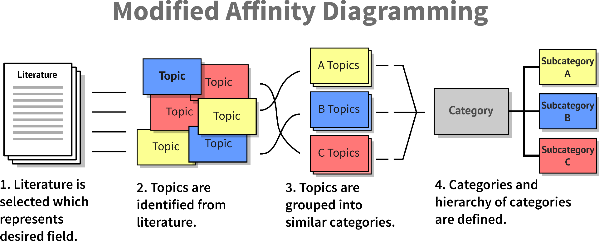
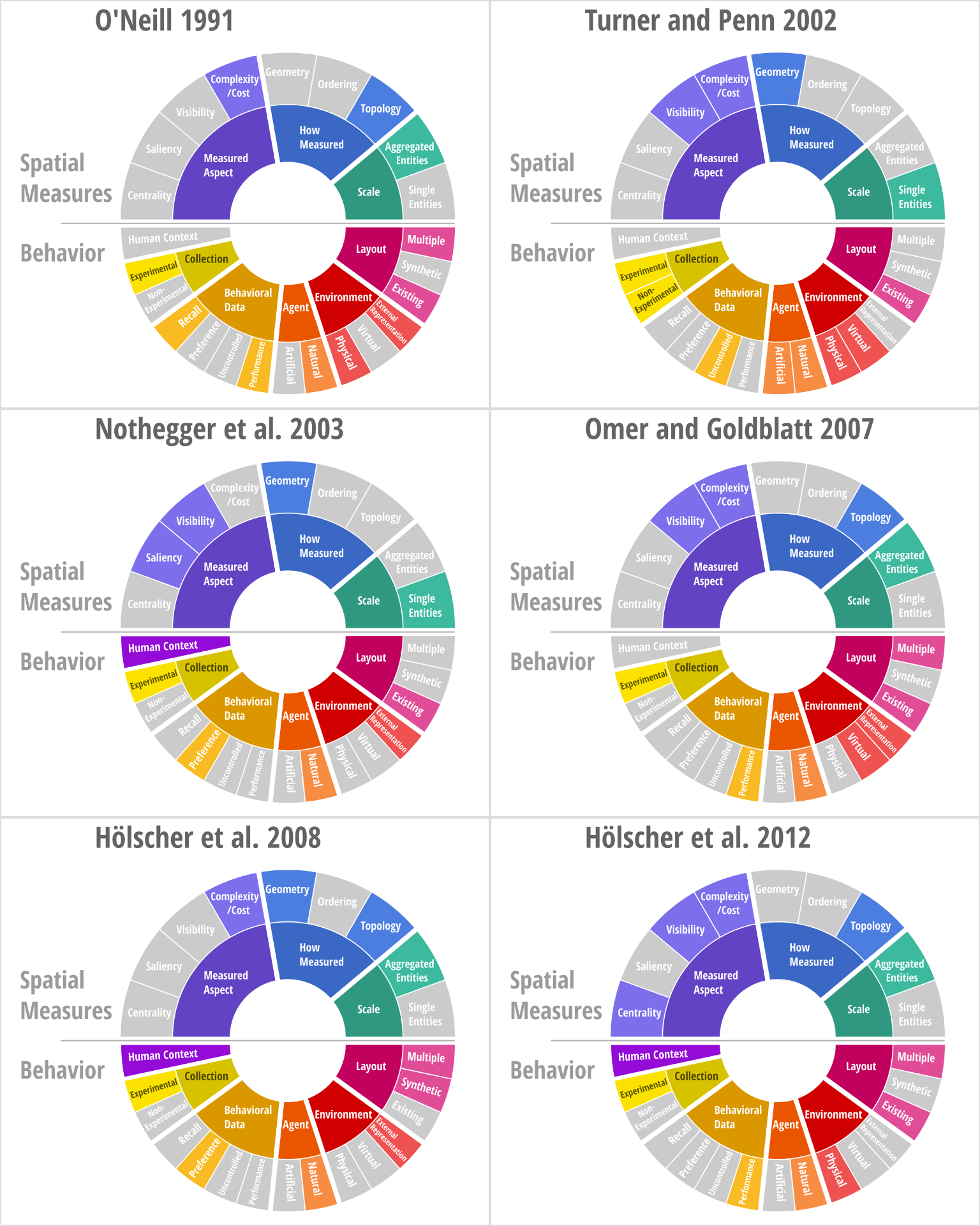
These categories are then tested and refined iteratively in a rigorous review process using inter-rater agreement, and visualized using a visual summary diagram. A visual summary for spatial measures and human research is pictured below.

For each piece of literature, the visual summary can be recreated, and the categories present in that paper highlighted. This reveals the context-relevant topics within the paper at a glance: