
Well-designed, one-page websites require disciplined and distinctive storytelling. They reject the confines of traditional website design –– which largely mimics print conventions –– and elevate web-native experiences like interactivity and responsiveness. While one-page websites can hobble Search Engine Optimization (SEO) efforts and are arguably ineffective containers for robust and differentiated content, they offer powerful ways to engage viewers in immersive narratives. Let’s take a look a closer look at three exceptional one-page sites.
Pomorilla | An Animated Pizza Site with Pizzaz (Sorry. :/)
An Italian pizza restaurant, Pomorilla celebrates the pie lifecycle (pie-cycle?), from naturally leavened dough to carefully selected ingredients and, finally, the dreamy consumption part. The eatery’s one-page website employs three shapes, each of which corresponds with the form a pizza takes at various milestones in its journey, from raw to cooked. Crust-colored, 1980s-inspired circles, triangles, and squares boogie in the background as a viewer scrolls down the page. Additionally, an overlaid dough-like blob contorts itself as the story unfolds. The property’s warm, four-colored palette, hand-drawn imagery, and patchwork fonts convey a thoughtful wackiness. Like a spirited weirdo, this is the kind of joint you want to get to know.
What’s most striking about Pomorilla’s one-page website design is that it effectively spotlights the brand’s values, character, and offering without the aid of polished food photography. It beckons joyful eaters who appreciate thoughtful, unfussy craft.

Me Too Rising | A Data Visualization and Resource Site
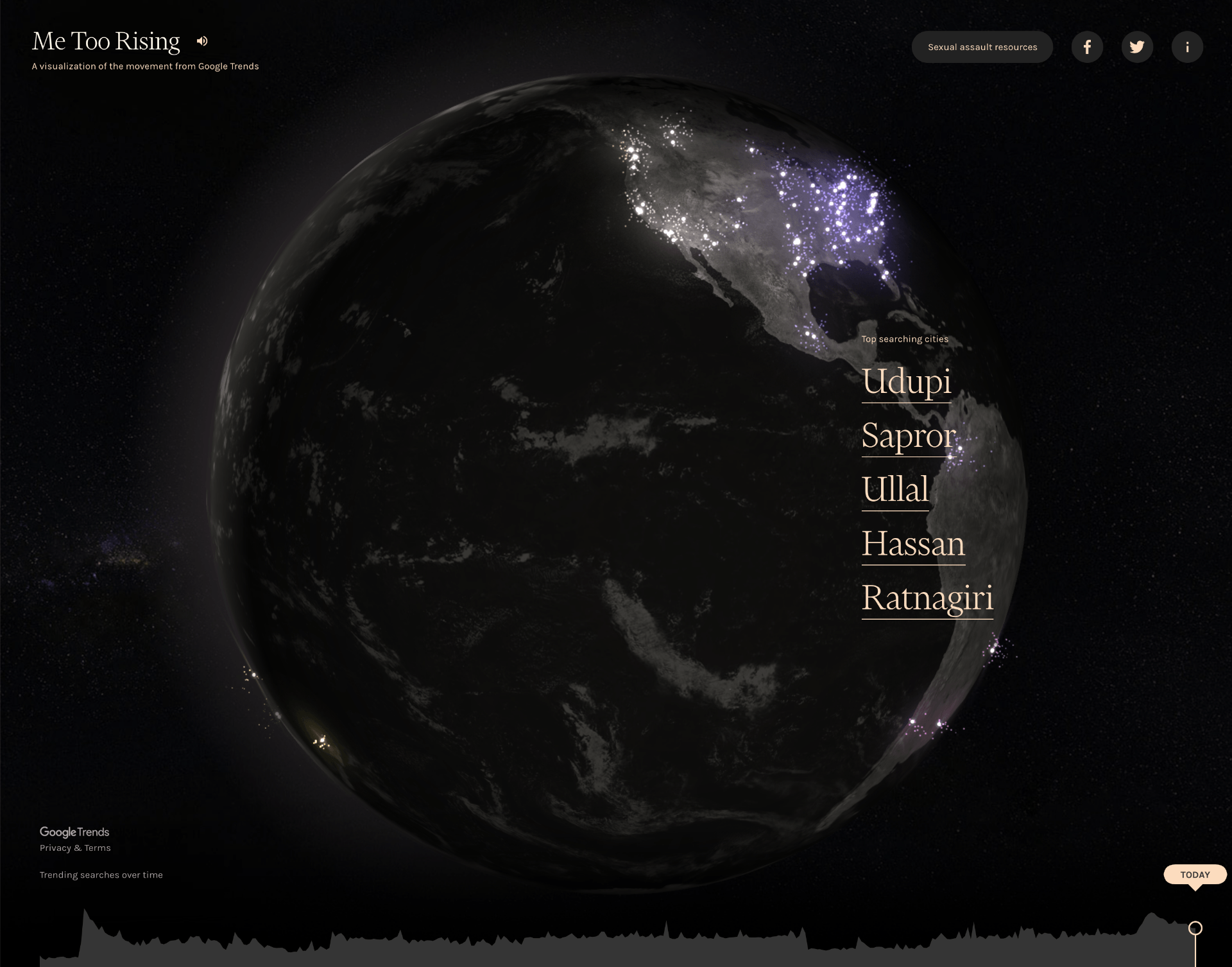
Me Too Rising is a one-page visualization of the global Me Too movement, a social justice campaign dedicated to helping sexual assault survivors heal. Once the site loads, a cream-colored, serif font quote appears on an expansive black background. It reads, “What would happen if one woman told the truth about her life? The world would split open.” Murial Rukeyser’s words slowly fade and reveal a rotating planet Earth, from which animated points of light float toward space; these illuminations correspond with real-time site users. The header includes links to sexual assault resources and social media channels, and the footer displays site traffic trends.
The one-page website’s somber darkness is offset by a choral soundtrack and ember-like animations that evoke momentum and possibility (think: the weight and hope associated with a candlelight vigil). Its imagery is reminiscent of NASA’s galleries, which highlight earthly and space-related phenomena. Me Too Rising’s design effectively accomplishes two things: it demonstrates the movement’s breadth, and it compels viewers to access trauma support. As it does not define the whats and whys of Me Too, the property is intended for survivors already familiar with the campaign.
Ueno | A 3-D-Modeled Interview Microsite
Ueno is a full-service creative agency working on highly visible digital products, brands, and experiences. The firm’s pedigree naturally attracts heaps of talented prospective workers; therefore, to give candidates a taste of the Ueno culture, a one-page, interactive interview property was erected.
As a viewer enters the site, they immediately encounter birds chirping and animated characters inviting the prospect to begin the interview process. Once the viewer consents to the interview, they are greeted by intentionally cheesy video game music and dropped into a brightly colored office-scape dotted with various workers. The only action permitted is clicking on one of the illuminated characters, reminiscent of Lego Minifigures sans legs. Once clicked, the viewer (represented by a hot dog !!!), embarks on a choose-your-own-adventure chat experience with each Ueno employee and eventually the big boss. Once the final chat closes, the viewer is prompted to visit the ‘Careers at Ueno’ page.
The site clearly serves a singular audience: people interested in applying for a job at Ueno. Its design deftly showcases the agency’s creative and technical acumen, as well as the brand’s personality: hilarious, overachieving, and familial.


Design to Watch
The one-page website is a flexible, multi-sensory storytelling medium that has the power to share well-organized information in imaginative, 21st Century ways. Its impact on website design principles is something to watch. Keep those eyes peeled, creatives.