You can see Anna’s Power Point presentation here.
Category: Uncategorized
5 Steps for Logo Design Process
In this post, I’d like to share the story from my personal experience as a freelance digital artists.
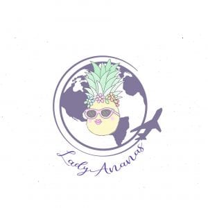
Last month I started working on a brand-new project. Lady Ananas is a travel agency offering individual tours for couples, moms and their babies, as well as organizing weddings abroad, bachelorette and corporate parties, and many more.
I’ve been working on creating a logo and building a website for them for about a month. While the website is still in progress, the logo is finally done. Even though design of the final product itself didn’t take much time, it was still a long process. I decided to share some of the things I learned while working on this specific project with a specific customer. Here are 5 steps for logo design process.
1. Always start with research.
Get to know the client’s business. Do not underestimate this step.
2. Talk to your client.
Ask your client to tell you (in writing) how they imagine their logo, what colors they prefer, what images/words/symbols they want to include.
Here, if they tell you that they don’t know how it should look like and this is your job to create something cool – great! This is what you want. It is much easier for you to start visualizing without any “destruction/tips from the outside”.
In my case, the client said what colors they would like to see in their logo and that they want an image of “a female pineapple”. That means that they want the name of their agency directly reflected in their logo. Since “Lady Ananas” literally translates as “Lady Pineapple” they wanted to see animated pineapple in their logo.
3. Draft production.
Conceptualize ideas and make decisions on the possible design direction. Once sufficient time has been spent on research and sketching, the draft production process begins. Instead of using your sketchbook and pencil, start using Adobe Illustrator and Photoshop.
In my case, the client liked a couple of my logo ideas but they wanted me to expand the idea of a “Lady Pineapple” because my ideas only had a minimum gender details on the pineapple. So they asked me to draw it again from the scratch with more details based on images they provided. After a few tries, they picked the pineapple they liked and we started choosing background and text font. Long story short. I did around a hundred of variations. Some of them are shown below. Finally, they confirmed one design and picked what they liked.


4. Simplicity.
Is the design simple and clean enough to be easily recognizable? Is it not too distracting, or confusing? Do not overdesign!
Guess what happened after I designed that logo for them? In a week or so, they realized that their idea now seemed too childish and corny for their agency. And all of these details would be smashed in an official document or a website.

They apologized and asked me to go back to my initial MINIMAL ideas. I wasn’t disappointed. Yes, I spent too much time. But I was HAPPY! Because I want to be proud that this logo was designed by me. Besides, it is not in my style to have thousands of details in a single logo. It does not look professional to me. So I was happy to go back to my first ideas. We picked one and I started experimenting on it. But this time, I was the one “commanding the parade”. No background in a circle. No funny letters. No shadows. Minimal amount of details on the pineapple. And the logo was done and approved IN ONE DAY!

5. Delivery
According to Dwuser.com:
Once the client is happy with the resulting logo, the designer will produce a variety of file types that can be used for various outputs. Important file types include EPS, JPEG and possibly TIF in certain circumstances. Some clients may also need a black and white version of the final logo. A separate simplified version may be needed in situations in which the full-size logo is highly detailed and does not scale down well. Trying to anticipate all possible needs of the client can be advantageous, preventing the need for corrections and revisions in the future. Upon delivery of the final files, it is time to think about employing the logo on marketing materials and promotional products.
Download Full Presentation in PDF format here


Final Master Bedroom Sketches (SketchUp Pro 2018)
After a few minor revisions and adding some missing components, here is how the final sketch looks like (click on each individual picture to expand it or view the gallery through the slideshow below).


Project 3 | Possible World
Since I consider interior design as one of the possible future career paths I wanted to connect this project with designing an interior. My Possible World focuses on the creation of a small immersive environment such as an interior design of my living room. I decided to start with not so much of designing but copying an existing room in my house. Of course, the environment is simplified and many objects have similar but not the same structure (such as piano, spiral staircase).
Here is the picture of my living room vs. the rendered Maya image.


In Maya, I modeled the environment and its materials, textures, lighting and movement of a camera through space. First part of the project was to create an environment. The material and textures include laminate, wood (piano, coffee table, stairs, plant), carpet, leather and others. Doors and windows with blinds are png images inserted into the walls. I learned how to use bump mapping to create a realistic textures of leather and carpet.
Bump mapping of leather texture(alpha gain = 0.1, picture with inverted in Photohop colors)
Bump mapping of carpet texture (alpha gain = 0.8)

Second part was to create a simple rigged entity. In my case, it is a butterfly. Even though I learned how to use Blend Shapes, I used Expression Editor (Windows->Animation Editors->Expression Editor) for rigging the wings.
Left wing (I played around with each wing separately).
Note: These functions are made only after creating additional attributes in the Channel Box (Edit -> Add Attribute) , such as in my case Wiggle, WingSpan, and CycleTime.
math function = sin

Right wing

The first couple of seconds of the animation shows randomized motion of the butterfly which is also done using Expression Editor.
random function = noise

For the light, I used one light source – point light with intensity 1000 and retrace shadows.


After organizing lighting and movement of a camera through space, I created a small animation of two butterflies flying in my living room.
Unfortunately, I could not batch render an entire animation. After rendering first 50 frames, which took about 2.5 hours, I calculated that I would need 50 hours to render my 1000 frame movie. To demonstrate some of the textures, I rendered a few separate frames.
At the frame 1, we can see closely the butterfly wings and piano keys with their reflected shadows.

At the frame 322, we can see the spiral staircase materials and textures (and the realistic shadow on the wall):

At the frame 460, we can see the carpet and coffee table textures:

In order to see the carpet little better, I removed the coffee table:

At the frame 562, we can see textures of the plant (leaves, pot, crust, dirt) and the nice shadow on the wall:

At the frame 835, we can closely see the leather texture:

I also rendered a few other random perspective views to have a better understanding of the room layout and some other textures.

