First Steps in 3Ds Max 2017 – Polygon Modeling

I’m happy to realize that I’ve made some progress learning 3Ds Max and working on the first steps of my interior design project.

So far, I made the first floor plan by extruding the walls and then cut holes for doors and windows using Boolean compound object.

Now, let’s go little deeper into the process. Before actually cutting these holes, I need to make polygons “legal” (in 3DS Max polygons are not supposed to have nested holes in them and are supposed to have only 4 sides without any weird surfaces and faces) by adding new edges with the Cut tool and correcting topology with QuickSlice tool.  So, the polygon mesh has to be clean!


After these steps have been done, I go ahead and prepare Boolean subtraction operands (an operand is an object that participates in a Boolean operation) which in this case are boxes that cut holes in those walls for doors and windows.

After a lot of prep steps have been done (very important not to skip anything) I am ready to cut these holes with Booleans with just one step. But again, we need to make sure all boxes are converted to Editable polies (by converting one box and attaching all other ones to it). Then, we create Boolean compound object, click on Add Operands and under Operand Parameters choose Substract. Boom!

After boolean is done, it’s aways better to save as a new file and give it a new name in case I want to go back and edit the object in the future. Then, I convert an entire floor plan to the Editable Poly (which makes the boolean permanent) and save again as a finished product.

Now I can finally go ahead and add doors and windows.

Living Room & Kitchen: Two Spaces Become One

The living room is perhaps one of the most important rooms in our homes. A lot of modern houses nowadays follow the idea of making a living room combined with the kitchen and dining area.

Firstly, the undeniable advantage of kitchen combined with a living room is space for the expansion of the usual meeting of households at the dinner table. Second, a living room gets much more daylight thanks to the kitchen windows. Third, while cooking at the kitchen, a mom, for example, is always free to communicate with other family members who are constantly in the field of view. Fourth, it is much easier to host large parties or family gatherings. And last but not least, in combination with the successful design the unity of kitchen and living room would substantially transform the interior, fill apartment with comfort, and contribute to its functionality.

Below is the slideshow of screenshots of the living room combined with the dining area model made in SketchUp. (Please note the walls and furniture are white which means that color or texture is undefined as of now).


After combining the kitchen I made before with this model of the living room space, we get the final sketch. Below is the gallery of the final combo screenshots.

Kitchens: Good Memories and Healthy History

Intro

Growing up, the kitchen was a place where my mom and I connected. Kitchen was the place where I used to eat breakfast every day before going to school. At the end of the day, we ate dinner and drank a cup of tea sitting at the tiny dining table. Our kitchen was tiny but it made great family memories. There is just something about being in the kitchen that makes the world a better place. When I’m in the kitchen all the worries of the day disappear.

Useful info

The crucial point I would like to make is that kitchens are bacteria hotspots, and if not kept in a good state of cleanliness, can be harmful for people. Many people believe that kitchen interior color choice should be anything but white since white shows all possible spots, dust and dirt. Besides, it is probably the most frequently visited place in the whole house. However, I would go opposite – make it white and see how clean and fresh your kitchen looks. And again, it is not just my personal preference. John Riha, who has written seven books on home improvement, claims that white kitchen has a healthy history:

Roll back a few years to get a handle on white’s popularity. In the 1920s and ‘30s, white was about the only color offered by manufacturers. To paraphrase Henry Ford, you could have your choice of any color at all, as long as it was white.

That made sense. White was associated with sanitation and health, and to a population not far removed from a deadly worldwide flu epidemic, household cleanliness was all-important.

Times have changed, but white’s healthy glow endures. Dirt just can’t hide in an all-white kitchen. (www.houselogic.com)

He also points out that white is affordable color: “And because it’s a standard color for any manufacturer, it’s your ally: You’ll find white cabinets, tile, counters, faucets, sinks, and appliances to fit any budget”. Besides, white kitchens create even bigger visual space. So altogether, it is a lot of pros in white.

Solution

This picture is the source of my inspiration which is taken from v-boos.ru – the website of Russian interior designer Vera Boos.

The kitchen in my house model is a spacious functional place which is used not only for cooking and preparing food, but also for frequent family gatherings. I want to make sure that it has plenty of space for the families with more than 1 or 2 kids. It has a kitchen island which functions as an additional surface for cooking and the table for the quick family meals (like breakfasts). It has a big window in front of the sink, french doors (backyard entrance), and lots of lighting. It also has built-in appliances, and lots of kitchen cabinets for storing. Cabinets should be high gloss white combined with elegant wooden gloss (unfortunately, SketchUp cannot show this kind of reflective surfaces).

REFERENCES

Riha, John. “Why White Kitchens Stand the Test of Time.” Houselogic, HouseLogic, 14 Dec. 2017, www.houselogic.com/by-room/kitchen/why-white-kitchens-stand-test-time/.

Boos, Vera. “FavoHouse.” VBOOS, v-boos.ru/wp/2017/02/15/favohouse/.

Dreaming in White in a Dream Master Bedroom

Intro

When it comes to home decor and bedroom styling I think it’s the best if the room presents clean, fresh atmosphere and provide a good air flow. My personal experience tells me that the bedroom is the most intimate and relaxing spot in the house. It is extremely important that my bedroom space corresponds to my mood. The master bedroom interior should be rather the place where people can blank their minds and forget about their daily routine. Whether a person shares his/her bed with the partner or does not, there should not be any mental activities as people go to the bed. Relaxation, pleasure, and refreshing are the things coming in my mind when I think about going to the bed. And therefore, a suitable bedroom interior should help us to shut the brain down and turn our unconscious self on. That’s when dreams come to the play.


Some Things to Think About Before Getting Started

According to www.psychologytoday.com,

We spend our days gathering information, some of it we would like to keep, most of it we need to discard. If we do not clear out our mental storage space regularly we risk saturating our brain with too much useless trivia. In order to fully process this information, we need to shut our brain down; disconnect it entirely from the outside world.

While scientists still do not know much about why or how we dream, an interior designer’s concern is to make sure that people spend a third of their lives sleeping being in a comfortable pleasing atmosphere. And the color choice is the first thing an interior designer should think of while making the master bedroom interior for dreaming and not for sleeping.

For me, the choice is obvious. A white on white room is timeless. And it’s not just a personal preference. White color is both blank and rich, it fills mind and space at the same time. It symbolizes purity, goodness, heaven, light, innocence and spirituality. It is a perfect color for relaxing, emptying the mind and diving right into the dream world. Pizzetti Design says

White interiors can bring you peace, tranquility, relax, but also, with the right pop of colors and contrast, they easily become versatile, alive, energetic. Not to mention that they make the room look bigger, spacious and airy.


Even though white itself is a pretty complete color, I agree that adding some spots of bright color can’t hurt. Especially if combined with simplified geometric shapes and lines, it makes an amazing effect of spaciousness in the bedroom.


Solution

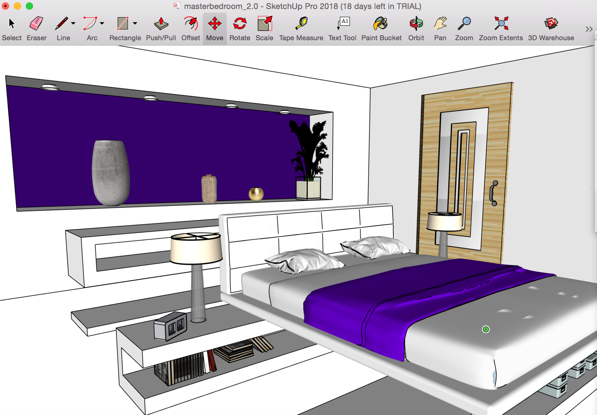
Elegancy of my master bedroom contemporary interior design is in color choice (white with some accents of rich deep purple), simple shapes, functionality and spaciousness. All together it is a design in minimalist geometric style. Furniture, including the bed, shelves, and desk, are designed to create interesting negative open spaces. There is no nightstands next to the bed since it stands on the horizontal shelf units which function as both nightstands and bed pedestal. The master bedroom has a walk-in-closet and master bathroom (not yet completed).

I used SketchUp Pro 2018 to complete the sketch of my idea, as well as a lot of pencil/charcoal on paper.


REFERENCES

Wenk, Gary L. “Sleep and Dreams.” Psychology Today, Sussex Publishers, 7 Feb. 2011, www.psychologytoday.com/blog/your-brain-food/201102/sleep-and-dreams.

Posted on March 26, 2014 at 7:20 am. Written by Pizzetti Design. “Dreaming in White: 10 Stunning White Interiors.” PIZZETTI DESIGN, 8 July 2014, www.pizzettidesign.com/dreaming-in-white-10-stunning-white-interiors/

Scott, Elaine, and John O’Brien. i.pinimg.com/originals/1b/bb/2f/1bbb2ffdb2552f729e9b13b1785e91f7.jpg.

Floor Plans Sketches

These are the sketches of the floor plans I made completely from the scratch. Some of the room dims will probably be changed as I go deeper into the design process.


These are the screenshots of the first floor plans made in AutoCAD 2017. (I probably have tons of technical drawing mistakes since I’m still new to these concepts… so please don’t be too hard on me.)


Thesis Statement

Interior design is a very broad field which embraces a great deal about art, culture, social tastes, lifestyle choices, and more. It involves everything from the planning and organization of space and lighting to the selection of materials, textures, furniture and accessories. In most cases, modern interior design modeling is based on both 2D (image) and 3D (space) modeling in frames of a very limited real estate. Functional approach based on economy and convenience became key points. Thus, the first step for an artist (interior designer) is to create a successful 3D interior model which will be as much functional and convenient, as aesthetically pleasing.

Semiotic Square (Leading to the Thesis)

The semiotic square is a graphic representation of the deep structure of a semiotic system. In other words, it helps artists to figure out their ideas for a project and becomes the beginnings of a thesis. I will be creating an interior design project based off of the semiotic square shown below.

My main goal is to create a 3D interior design of a 2-story house (or a 3D model of a fully designed interior) with everything inside of it designed totally by myself. This will definitely involve 2D and 3D modeling concepts, as well as learning new softwares and incorporating existing drawing skills and knowledge of some other 3D softwares.

Anything is Sculpture

In response to Rosalind Krauss’  Sculpture in the Expanded Field.

I found this essay quite hard to read, but the main idea of this essay raises a very important message that needs to be understood.

Rosalind Krauss, the art historian, published an essay, “Sculpture in the Expanded Field,” in which she defined the structural parameters of sculpture, architecture, and landscape art through the precise diagram. Through this diagram, she defines what sculpture is and shows that “sculpture is rather only one term on the periphery of a field in which there are other, differently structured possibilities” (Krauss 38).

Written in 1979, this essay explains that looking back over the previous century the definition of art and sculpture has become much broader. Krauss claims that the traditional logic of sculpture transformed into something different. Instead of making something pretty “logical” or narrative-based, sculptors are able to express their own personality and convey their voice in their work.

Sculpture after the Post-modernism period became something way more different from what it was before. Not only Duchamp’s Fountain started an era of unpredictable sculptures and installations. This is where the term ‘combination of exclusions’ comes into play. She is talking that a sculpture needs a landscape or some other context to be viewed, as in Robert Smithson’s Spiral Jetty or Robert Morris’ Green Gallery Installation.

Robert Smithson. Spiral Jetty. 1969-70

Robert Morris. Green Gallery Installation. 1964


Just like in Cromar’s Foreword, the main message is that sculptors should kill the boundaries that divide our conception of sculpture because basically anything could be named sculpture. And this statement can (and should) be applied to all other artists, including digital artists.

Power to the People

Play can only happen when people feel they have control over their lives. We can’t be free agents if we’re not free.

– Bruce Mau

In response to Manifesto of An Incomplete Manifesto for Growth by Bruce Mau

This manifesto by Bruce Mau has to be one of the best manifestos I have ever read. It is super easy to understand and get inspired by. Being a designer, Mau embraces a new way of thinking about design, and perhaps life in general. Not only it can be applied to design, but I think to the majority of other professional fields and business too.

 Slow down.

Forget about good.

Don’t be cool.

Ask stupid questions.

These are four things that may seem pretty confusing and unmotivated at the first glance. But they are opposite. “Don’t be cool” is my favorite out of these four. “Cool is conservative fear dressed in black. Free yourself from limits of this sort” – isn’t it genius? Why are we always trying to be cool? I think staying ourselves – that’s what makes us being real cool. WE LEARN by asking stupid questions, slowing down, making bad experiments, breaking and crushing, which is non-replaceable experience in our lives.

Allow events to change you.

Begin anywhere.

Keep moving.

Think with your mind. Forget technology.

Explore the other edge.

Power to the people.

I think it’s so powerful I am about to print it out, frame it, and put it on my desk. These simple things should be always reminded of. Moreover, this list should be open so each person can add to it and get the most out of it.