Penn State

Since this will be the last post of RCL (who’s cutting onions), I thought it would be fitting to write about Penn State.  The goal of many of my previous posts was to reveal that landscape architecture is everywhere; exploring a campus so familiar to all will be a walk in the park (pun intended)!

First, like take a trip back to the 1850’s.  As many of you know, we were once a farming school named The Farmer’s High School of Pennsylvania (which might explain why we’re in the middle of nowhere).  Fun fact: Old Main lawn was once a potato farm!  This institution greatly embodied democratic ideals, as each state was given a land grant in order to further education in practical domains such as agriculture, industry, and engineering.  And the name “high school” back then had a meaning other than a brick prison intended for droning lectures and mundane box-checking–it was a place to seriously learn useful skills and knowledge.

Image result for farmer's high school of pennsylvania
Farmers High School of Pennsylvania. Via explorepahistory.com

With the turn of the 20th century came much change in regards to societal ideals, which would be translated to many, if not all, aspects of life.  Along with the introduction of the first women’s art class, our first intercollegiate football team was brought to fruition.  In terms of shifts in design approach, the World’s Columbian Exposition served as the basis for many beaux arts and neo-classically styled buildings such as the Carnegie building and the Schwab Auditorium.  In addition, the campus would be organized into disciplinary quadrangles (ie. the arts in north, liberal arts centralized, etc.) which aimed to connect students with knowledge.

Image result for penn state campus map
Campus buildings organized by disciplinary quadrants. Via sites.psu.edu

After the second world war, there was an influx of G.I.’s arrived along with their families.  This, along with the introduction of the G.I. Bill, exponentially increased the number of classrooms and housing needed to accommodate the population.  Inspired by Le Corbusier’s City of Towers, buildings like Chambers or Hammond would manifest the effectiveness of mass production.

Jumping to the 21st century, there has been an increased emphasis on the importance of inclusivity and diversity.  Our campus embraces these ideals through lots of interstitial spaces and green spaces for students to gather.  Another way this is achieved is through strategic placement of streets, sidewalk, and roads for accessibility.  The HUB serves as a place for many student activities and is accessed by many via the scenic Shortlidge Mall.   Every place on campus is not only a place for students to pass through, but a place with opportunity for interaction with and connectivity to other students and human capital.


American Suburbs

Suburban life in America is so common:  52% of us live in suburban developments.  Many of us would recognize the cookie-cutter houses and neatly maintained lawns as “home”, but what many don’t know is how they came to be.  Suburban areas were a response to an objection of urban life.

Many people didn’t like how crowded the city was.  One single park in the middle of a metropolis wouldn’t change the unhealthy living conditions children were growing up in.  It was decided that the city was no place to raise a family, especially with the crammed living space, economic struggle, and the mentally taxing nature of the two combined.  The suburbs would be characterized by being a commuter county (still reliant on city), with a rich residential life featuring houses with ample space in between and lots of green space for outdoor life.

One suburban community worth mentioning is Riverside, Illinois.  It was designed by the famous Frederick Law Olmsted, landscape architect of Central Park, and Calvert Vaux, a British architect and landscape planner.   The amoeba-like shape of the neighborhood juxtaposes the straight railway connected it to the city in order to emphasize the informality of the suburbs compared to the city.  Such organic shape also allows curved roads that give a sense of ease rather than business.  To diminish the presence of roads, houses are set back, roads are sunken, and there are no sidewalks, as everything must be clean.  Lastly, public green spaces are stretched out to accommodate increased outdoor life.

Image result for riverside illinois aerial
Aerial view of Riverside shows contrast between organic layout of the community and the linear organization of surrounding neighborhoods and railway. Via LandSat

Another interesting suburban development is Radburn, New Jersey.  The goals of this project were to #savethebabies from the automobile usage that increased greatly in the industrial revolution.   This community was also the spawn of a failed Garden City (read my last post on City Reform); there was not enough space for an agriculture belt and therefore crashed the stock market due to lack of industry base.  The Radburn prototype featured cul-de-sacs that consisted of houses facing inwards towards a common green space in order to provide easy access to verdure, and shifted focus from roads and cars to home and green.  In essence, this design promoted a green community through interstitial spaces.

Image result for radburn new kersey suburbs
Plan for Radburn. Via zoningthegardenstate.wordpress.com

Both of these developments strive to improve the well-being of citizens through community-oriented outdoor life.  As someone who grew up in the suburbs, I can attest that suburban life definitely has advantages over city life.  I am a 5-minute walk from two beautiful parks, and we are close with neighbors who also frequent the surrounding green spaces .

City Reform

This week, we will take a look at three different historical approaches to city planning that each aimed to addressed different issues and inevitably had drastically different outcomes: the City Beautiful Movement, the Garden Cities of Tomorrow, and the City of Towers.

The City Beautiful Movement was greatly inspired by the 1893 World’s Expo in Chicago, which built upon the city’s neo-classical architecture to create white facades that would hide the lesser attractive reality of the city’s state.  In this period of American history, there was an influx of people moving into cities, resulting in dirty, crowded placed that made living conditions unpleasant.  With the increased population came the decrease of public spaces for people to enjoy.  Hence, the City Beautiful movement introduced a network of green spaces, a railway to improve circulation and connectivity, and roads extending from a civic center.  Though effective in addressing aesthetic appeal and physical needs of a city, this movement failed to address social and economic issues that would arise in the future.

Image result for chicago world fair 1893
Chicago World’s Fair in 1893 featuring a “utopian” city. Via architecture.com

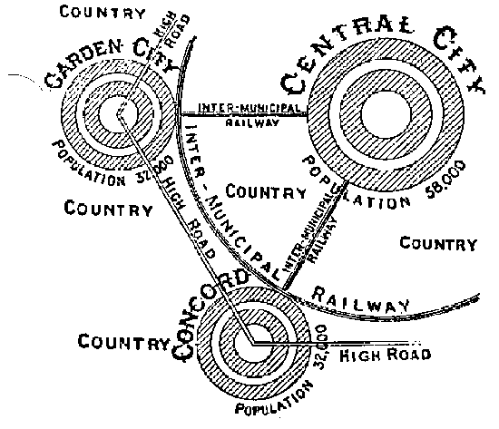
The Garden Cities movement was established by Ebenezer Howard, a British urban planner.  It aimed to provide a place to work, live, and play by combining the advantages of both town life and country life.  In essence, it would be a self-sustaining community.  An ideal Garden City would limit its size in order to reduce the density often found in towns, and it would be connected by train to ensure economic success. Additionally, a sense of place would be emphasized through neighborhood and community pride.  This would also be encouraged by the many spacious parks meant for the community.  The downside of this approach was that it was not applicable to existing cities; it was a model that could easily be replicated, but would mean relocation or square one for many.

Image result for garden city movement
Howard’s plan for a Garden City. Via alchetron.com

The last city reform movement we’ll look at is Le Corbusier’s City of Towers.  Le Corbusier was a French-Swiss architect famous for what we consider now as modern architecture.  His idea of the City of Towers stems from the human need for three things: sun, space, and verdure.  With the advance of technology that allowed the construction of skyscrapers, le Corbusier suggested that the “towers” be set on stilts so that the ground had more room for green space.  The criticism he faced surrounding this fell heavily on the need to remove low-income area housing or “diseased quarters” as they called it.  This raised debate surrounding who gets to decide on affairs that would displace people.

Evidently, city planning is more complex and multi-faceted than one would initially think.  Each of these movements, though benign in intent, had set backs that would not allow their development.  Even today, it is difficult to find existing or future solutions to city planning that address all concerns for all people.

English Landscape School

Last week, we talked about how the French Renaissance influenced our preference on landscapes aesthetics today.  This week, we’ll be looking at another huge influencer of our modern landscapes:  the English Landscape School.

Image result for english landscape school aesthetic
Typical English Landscape School aesthetic. Via Khan Academy

In order to understand why the English Landscape School was born, we must look at the historical context.  This was around the time Henry the VIII separated from the Roman Catholic church to create the English Church.  In doing this, he confiscated a lot of land and created the “landed gentry“, a social class that is defined by land ownership.  These people were upper-middle class who would have found the offered financial incentive appealing.  This influx of new settlers stripped the land of trees and vegetation, leaving a rather grey, barren, and ugly landscape.

Image result for pussain english landscape school
“Landscape with Travelers Resting”, Pussain. Via The National Gallery, London

Poets, painters, and philosophers began placing emphasis on picturesque landscapes, using nature as a prime source of inspiration and focus for their work.  This caused a shift in the attitude towards nature: people started to respect nature, even if it’s aesthetic is influenced or manipulated my humans.

The biggest characteristic of the English Landscape School is it’s preference for “idealized” landscapes–where picturesque landscapes are seemingly natural but were engineered by humans–vs. humanized landscapes wherein human interference is obvious.  The results were vast voids of green carpet, rolling hills, and paths that created a sense of longing by not allowing people to directly walk into the beautiful landscape they saw.

One of the most prominent figures of the English Landscape School is Capability Brown (his birth-given name is Lancelot).  He has done so many projects that he is practically the face of the English Landscape School; and his works, the face of England’s countrysides.   His signature features include winding bodies of water, (fake) ancient ruins or monuments, ha-ha ditches, clusters of trees, and big open lawns.  Again, the idea was that the landscape would look as natural as possible, but would be tailored to enhance human experience.

Capability brown landscapes to visit
Blenheim, Oxfordshire, designed by Brown. Via countrylife.co.uk

Because Brown has transformed close to two hundred landscapes, his style spread throughout the country. With this came the widening of canals and roads, which promoted international growth, trade, and globalization. His distinctive style is seen in English literature as well. Some of his works are sets for Downtown Abbey and Jane Austen’s Pride and Predjudice. Generally speaking, his unique approach to nature has inspired modern designers to think in similar ways. The ideology of the idealized nature aesthetic and simplicity and elegance of designs has been replicated and emulated in designs across the country and even internationally.

The French Renaissance

Today, let’s time travel around 500 years ago.  I know, history is boring, blah blah blah, I get it.  That’s what I thought too, before learning about how the French Renaissance influenced our landscapes today.  Think of any modern landscape (park, memorial, a place on campus, or even your own backyard.)  It probably has neatly trimmed plants arranges in neat rows or something of the like.  But the ideal, widely-recognized “neatness” of modern landscapes has to come from somewhere, right?

Image result for typical american backyard"
Familiar front yard of typical household. Via Better Homes and Gardens

Most people have heard of Renée DesCartes, the French philosopher, mathematician, and scientist who gave birth to the “Cartesian” way of thinking with the infamous quote, “I think, therefore I am.”  The Cartesian Self is the separation of mind and body (wild tangent, but please watch The Matrix), which implies that humans are masters of everything around them.  This new way of thinking gives humans a controlling hand in nature, and results in the intense manipulation and exploitation of nature.

This is why a lot of French Renaissance landscape architecture features moats and large, flat bodies of water in non-organic shapes like rectangles; intricately maintained parterres and shaped vegetation; and elements arranged on an axis, pointing to monumental structures.  Let’s take a look at two famous sites from the French Renaissance.

Vaux le Vicomte is a hot spot for tourists.  Built in 1661 for Nicholas Fourquet by Andre le Notre, this summer home is a sight to see with many typical features of the French Renaissance.  In the picture below, it’s easy to see the intense control of nature through the expansive parterres flaunting sharp, clean edges with intricate designs, and multiple pools and fountains.  Everything is built on an axis, resulting in neat bilateral symmetry and heavy emphasis on the actual house.  All these elements together bring a dramatic flair to the estate, as it was a party house and it was practically illegal to be boring in the time period.

Image result for vaux le vicomte"
Vaux le Vicomte. Via The Wallstreet Journal

After this successful project, Andre le Notre went on to design Versailles for the Sun King (Louis XIV) who obviously wanted to assert his dominance as a ruler.  Imagine the estate above, but times ten in every aspect…including the control of nature and want for dominance and power.  Along with the precisely trimmed patterns of green, the orderly placed trees, and large pool of water are several design choices that scream for attention.  Among them is the impressive fountain engineering, which used 250 pumps to shoot water upstream into the chateau with 500 feet of vertical elevation in order to supply over 1400 fountains for 130 years.  If that doesn’t show an overwhelming control of nature, I don’t know what will!

Image result for versailles"
Versailles. Via CNBC

Memorials

Last week, we learned about the landscape architecture behind places for entertainment, such as parks, resorts, and amusement parks.  This week, let’s take a look at memorials.

Many of us have visited New York City.  This past semester, I got the chance to go with my program for the first time to explore various projects around the city.  We visited many sites, the most memorable being Ground Zero and the Irish Famine Memorial.  These two places hold very special meaning and evoke emotions separate from those we feel on a daily basis.

Ground Zero remembers the biggest terrorist attack in American history: 9/11, a terrible tragedy.  In place of the twin towers are two deep-sunken footprints.  Looking down into an expansive black void creates a somber atmosphere.  Additionally, the rushing water add a calming and reflective effect.  Lastly, the names of those lost in the attack are inscribed around the footprints in order to give the space personal and tangible connection.  Further off the site is the World Trade Center Transportation Hub, a big white building that looks like a dove, symbolizing peace.

Image result for ground zero"
Ground Zero Memorial. Via Wikimedia Commons

Probably less well-known is the Pentagon Memorial, built for the third plane that crashed that day.  It is much more of a contemplative space rather than a tourist’s destination.  Each person that died in that attack has a bench in honour of them,  each with their own reflecting pool and light illuminating their name.  Benches that face the building represent people who were inside the Pentagon, while benches turned the other way follow the path of the plane.  The emotions drawn from this memorial are so strong due to the design-based symbolism.

Image result for pentagon memorial"
Pentagon Memorial. Via Washington City Paper

Before joining this major, I had no idea landscape architects were behind these memorials.  Along with memorials, landscape architects design other commemorative landscapes like cemeteries, monuments, and historic sites.   The Martin Luther King Jr. Memorial.  The Washington Monument.  The Vietnam Veteran’s Memorial.  All these expressive places are carefully designed by landscape architects to influence human experience.  And these places are the strongest example of how humans can be connected to a space through memory and emotion.