At A Crossroads

This painting is a classic display of affection– a man and woman are clearly in a loving embrace, yet, for some reason or another, something is amiss. The man, gently cradling the head of his lover, is subtly tugging away the white band the woman is wrapping around his bicep. The woman, staring back up at him, is shown with a face of confliction, eyes soft when looking into his, yet still seen with a frown. Her hands, desperately tugging at the white cloth hanging off of him, are struggling to tie it against him as he pulls it off. Viewers, I introduce to you the heartbreakingly beautiful painting, A Huguenot (A Huguenot on St Bartholomew’s Day), painted by John Everett Millais.

In 1572, an event that came to be known as St. Bartholomew’s Day massacre resulted in the deaths of a group of people called Huguenots (French Protestants). Because of the Huguenots’ religious beliefs, they were massacred and killed in various parts of France. The only escapees were the ones choosing to wear white armbands, which allied themselves with the Roman Catholics, shielding themselves from danger by showing Roman Catholics symbols. Prior to this, the Huguenots were gaining a large influence in France during the sixteenth century, with displays of their faith becoming more and more open which in turn, led to the rise of Catholic hostility. Eventually, this rise in hostility led to actual violent conflicts known as the French Wars of Religion.

Image of St. Bartholomew’s Day Massacre, Wikipedia

Knowing this, the title of the painting is very clearly representative of the man in this portrait, a young lover separated from his partner due to his religious beliefs. The young woman can be presumed to be a catholic, desperately trying a last ditch effort in order to let her love live. However, it is in vain, as no matter how much they may love each other, his duty is to his beliefs, which are set to end his life. His last chance at living, yet he gently tugs it away and instead focuses his last moments on the face of his significant other.

Little symbols throughout the painting only serve to amplify the gut wrenching scene. The dark colored clothing of the couple represents the grim reality of their relationship, doomed to end short. Especially the prominent dark colors that surround the man, also possibly hinting at his future death. The light colors popping out are reserved for the woman’s face, the white cloth, and the flowers to the left of the painting. The woman’s light face likely alludes to her survival, and to emphasize her gentle nature in their relationship. The light colored cloth clearly represents the last string of hope, the final plan to live, that is going to be cast aside. As for the flowers, they have been identified as Blue Canterbury Bells, which symbolize constancy and faith.

My final thoughts are really left in shambles. In their last moments, all he wanted was to be with her, and for her, her conflicting desperation of wanting him to live and wanting to respect his wishes are very real and very painful. It’s so beautiful to see, but also very sad. I don’t think I would be able to choose what he did. What do you think? Would you stand by your beliefs, even if it meant leaving your loved ones behind and possibly risking your life?

Sources:

  • https://www.arthistoryproject.com/artists/john-everett-millais/a-huguenot-on-st-bartholomews-day/
  • https://useum.org/artwork/A-Huguenot-A-Huguenot-on-St-Bartholomew-s-Day-John-Everett-Millais-1852
  • https://www.thehistoryofart.org/john-everett-millais/huguenot/

Comparative Essay Outline

Some Questions and Clarifications!

  • In the outline on google docs, the outline was in the format of roman numerals! However upon repasting into the blog text, there is no way to add in roman numerals in the same way that was formatted before, so I left it how it is.
  • I’m using the block method and I wasn’t sure if the four sets of A claims were per artifact (4 claims for the first, 4 four the second, 8 total) or if it was split between the artifacts (2 for the first and 2 for the second). Therefore, I stuck to the former and in case it was 2 and 2 instead of 4 and 4 I can get rid of some of the weaker points
  • What can I do to make this essay more conversational? 
  • I’m having trouble finding reception/context for the first artifact– is what I currently have enough? If not, what is recommended?  
  • One of my biggest issues is trying to shorten things down. Any tips or suggestions on areas that can be condensed? 


Overview:

Similarities– Usage of dark colors, physical representation of a pile of cigarettes, white wording choice. 

Differences– ambiguity vs. representation of people, target audience, specific messages


    1.  Intro
      1. Attention-Getter: What does cigarette smoking mean to you? It may be hard now to imagine the appeal of cigarettes, yet for people 30-40 years ago, cigarettes were all the rage. 
      2. Identify Artifact: The World Health Organization reported steep inclines in cigarette smoking from the early to mid 1900s, with declining rates only following decades later. To combat this, the WHO released a series of posters to promote anti-smoking, and would continue to be a driving force behind the anti-smoking movement for years to come, including making publications delving into economic issues of smoking as well. 
      3. Thesis: From a poster in 1985 to a publication cover in 2023, both stand to represent a very prevalent simple message– smoking ruins lives. 
      4. Preview: Through the visual rhetoric lens and representation lens, I will not only reveal how and why these mediums are so effective, but re-emphasize the very real and heavy consequences these artifacts continue to remind viewers of. 
  • First Set of Arguments (First Artifact) 
    1. Claim (1): The color choice in the poster inclines viewers with a smoking addiction to self-reflect and those without to empathize with the cause and take action. 
      1. Evidence: The poster is presented in black, white, and gray of various shading. In the bottom half of the poster lies an oval pile of cigarette buts with the underside of a pair of shoes sitting in the middle. At the very top of the poster lay words translated from Russian, “Even the best cigarettes can be your tomb…” 
      2. Reasoning: The color choice emphasizes the seriousness of the topic at hand. Especially the color black, which is strongly associated with death, and allows for the reader to stop and re-evaluate the impact of smoking on their life or the lives around them. 
    2. Claim (2): The angle of the shoes presented (soles) rather than a person or even the top of the shoes 
      1. Evidence: Sitting atop the pile of cigarettes lay a pair of shoes. Originally it gives off the impression that the shoes are on top of the pile, however, the view is of the bottom of the shoes, giving off the impression of being buried by the cigarettes. 
      2. Reasoning: The lack of indication over who exactly the shoes belong to push to a more inclusive audience. There is no discernment over age, gender, race, etc. This allows for more people to connect to the image, and either see themselves in it or someone else. Quite literally “picture yourself in someone else’s shoes”  
    3. Claim (3): Large pile of cigarettes emphasizing the damage of an accumulation of habit, not just one but a whole entombment. 
      1. Evidence: From the angle of the image, it is evident that the bottom of the shoes are surrounded by this large pile of cigarettes, meaning that there is an endless amount building up from where we can see. 
      2. Reasoning: It is easy for someone to forget that a single cigarette does so much damage. But when combined into a large pile like what’s pictured, it begins to become clearer just how much one adds into two, which turns into days and years and piles on piles of damage.
    4. Claim (4): White lettering of the caption, “Even the best cigarettes can be your tomb…” contribute to a highlighted point. 
      1. Evidence: The usage of white coloring to highlight parts of the caption of the poster draws the reader’s attention from the contrast of the background. 
      2. Reasoning: The color white in this case serves as not just a highlighter but as a representation of clarity. The color white is symbolic for certainty, and here it is to draw attention to the finality of the decision to smoke. 
  1. Second Set of Arguments (Second Artifact)
    1. Claim (1): The usage of children appeals to the empathy in people and draws attention to the issue at hand. 
      1. Evidence: The publication cover includes not just one, but four different children who look to be a mix of frustrated, tired, and helpless in front of their bowls of cigarettes. 
      2. Reasoning: Using the representation of children is deliberate in focusing viewers emotion and alertness to the topic. When children are involved, it implicates a serious matter and issue which allows for viewers to feel compelled to help. → Further reasoning would contrast this to previous artifact in which no representation focuses on a different type of audience
    2. Claim (2): The inclusion of bowls of cigarettes similarly help to visualize the disgust and issue with the increase in usage of cigarettes. 
      1. Evidence: The previous artifact showed a pile of cigarette butts while the second artifact shows bowls of cigarettes and smoke, almost as if it were a substitute for cereal for these children. 
      2. Reasoning: Seeing children be left with nothing but cigarettes as food not only helps to re-evaluate personal decisions (if children shouldn’t put this into their body why should I) but to understand that buying cigarettes furthers the tobacco plant industry which are replacing crops for actual food for these kids. 
    3. Claim (3): Also similar to the previous artifact, the dark colors are heavily condensed on the clothing of the children. 
      1. Evidence: While slightly different, there are a lot of generally dark colors used for the clothing of the children, with another dark background to set the tone of the message. 
      2. Reasoning: While not completely black and white like the previous artifact, the continual inclusion of dark colors to symbolize seriousness and imply danger are effectively reused here. 
    4. Claim (4): White wording once again points to an emphasis on the message. 
      1. Evidence: The white wording reads “World No Tobacco Day 2023 / Grow food, not tobacco.” 
      2. Reasoning: The message itself is not directly attacking just cigarettes like the previous artifact did, but still in the realm of smoking usage. The white words once again stand out from the dark background like the previous artifact, and while both are different messages, the overall effect of stopping and re-evaluating what to do moving forward still occur. 
  2. Conclusion
    1. Restate thesis: While in two different time periods and for slightly different focuses, both the 1985 poster and 2023 publication cover serve as important mediums to promote the change of a healthier lifestyle in favor for not only self, but for others as well.
    2. Why this act of civic engagement matters: Ultimately, there were multiple differences between these two artifacts, with the first focusing more on the self-implications of smoking and the second on the damaging effects to communities with the rise in tobacco products. Yet in their differences, there are similarities– both working to better the lives of people caught in the tumultuous whirlwind of smoking. This awareness that continues to spread today is not only shown to be necessary, but life-changing.

Nature Bleeds

Chances are you’ve definitely seen this painting before, but did you know that there is not only one, but four other renditions of the same work by the same artist? Arguably as notable as da Vinci’s Mona Lisa, The Scream by Edvard Munch is a sight to behold. And it’s no wonder why it’s so iconic— it really screams self-expression from every angle! (That was my best attempt at a pun and a dash in one. Please spare me the laughter.) 

Despite its odd art-style, the painting itself is quite a simple one. The background contains the bridge upon which the subject and two other figures stand upon, some sort of lake, and a sky of swirling orange and yellow hues. The actual subject seems to be an androgynous figure, dressed in dark colors with their hands held against the sides of their head, mouth wide and agape. 

So let’s cut to the chase— what exactly is going on here? Most would originally think with the title of The Screami that the scream in question is referring to the primary subject in the artwork. However, according to Munch, The Scream is related to a scene he had experienced. In his words, he was walking along a road with two friends when the sun went down— suddenly Munch was overcome with melancholy as the sky turned a bloody red. He stopped and looked over the railing as the red skies hung “like blood and sword.” His two friends he was traveling with continued forward as Munch stood there and “felt a vast infinite scream [tear] through nature.” 

That means the figure in the painting is Munch himself. And the scream isn’t coming from him at all, but rather from nature. Thus, The Scream isn’t an actual vocalized scream, but a sensation coming from somewhere internal. Then what is with the subject’s strange pose? Although I couldn’t find a solid answer on that question, the only possible explanation I could come up with is this: the figure is covering their ears from the “scream.” Unable to handle the overwhelming anxiety and terror of the unknown, the only thing the subject can do is cover their ears and hope for the best. At least, I think so. This painting doesn’t exactly scream the answers to it (I am so sorry. This was written running on 4 hours of sleep please spare me.) 

Four versions of The Scream from left to right: Edvard Munch, The Scream, 1893, oil, tempera, and pastel on cardboard, 73.5 x 91 cm (The National Museum of Art, Architecture and Design, Oslo); Edvard Munch, The Scream, 1895, pastel on board, 59 x 79 cm (private collection); Edvard Munch, The Scream, 1895 (signed 1896), lithograph (MoMA, photo: Steven Zucker, CC BY-NC-SA 2.0); Edvard Munch, The Scream, 1910, tempera on board, 66 x 83 cm (The Munch Museum, Oslo)

 As for the four renditions, they don’t serve much purpose other than to boost Munch’s reputation. It represents not only his creativity, but also the willingness to experiment wit the possibilities of the renditions covering a variety of media. In my opinion, the four different versions each serve as a sort of different perspective upon the original. Similar to in class how different lenses reveal different takes of the same artifact, the different renditions represent alternate meanings to the first impressionable piece. 

To really wrap up, the screaming isn’t the sounds we hear but the friends made along the way. I can’t write puns. And if you’re hearing screaming from nature, maybe run away. And get help. That’s all. Goodnight

Sources:

  • https://www.edvardmunch.org/the-scream.jsp#prettyPhoto
  • https://smarthistory.org/munch-the-scream/
  • https://www.britannica.com/topic/The-Scream-by-Munch

Second Artifact Introduction

For my second civic artifact, I chose the image presented above. On World No Tobacco Day (May 31 2023), the World Health Organization (WHO) released this publication with this picture as the cover. For lenses that I will be using, I will stick to the two previous ones that I had mentioned: visual rhetoric and representation lens. 

To recap the visual rhetoric of the previous artifact, the first artifact analyzed the usage of color, image placement, and emphasis of the pile of cigarette butts. In the second artifact, I will compare that usage of color to the colors of the clothing the children are wearing, the placement of the wording, and the pile of cigarettes in front of them. 

For the representation lens, I covered in the first artifact how the ambiguous nature of the soles of shoes led to the universal connection to the poster. In the second artifact, I will recognize the representation and usage of children as opposed to the non-specific subject such as shoes. The point that I want to make here is that both appeal emotionally, while one is aimed at self-placement while the other is empathy towards others. 

Differences in each lens overall include the usage of children versus ambiguity, the placement of the cigarettes, the slogan choices, and the overall message between the two. To elaborate on that last bit, one is toward changing one’s own lifestyle while the other is changing other’s lifestyles in favor of the less fortunate (children). 

These similarities and differences both matter in the context that they both appeal to the overarching theme of anti-smoking, yet approach the matter differently. Both seemingly leave lasting impressions to lead to the same cause, but with different motivations behind them. 

(PS: Just as clarification, the next RCL post will be the post that will include the 2-2.5 page draft! This is just to introduce the next artifact and rough points). 


Source: 

Beginning Outlines

I. Intro
A. Attention-Getter: What does cigarette smoking mean to you? I hardly believe that the majority of people today look at cigarette smoking in a positive light. But how about people 30-40 years ago?
B. Identify Artifact: According to the World Health Organization, cigarette smoking had reached a steep incline from the early to mid 1900s, and it wouldn’t be until a couple decades later when it would start to decline. People living during this time likely had the notion that smoking was pretty much expected, as family, friends, coworkers, and others had probably also smoked. In order to combat this rise, the World Health Organization released a multitude of posters to spread awareness against the usage of cigarettes— one of which I will focus on in depth.
C. Thesis: Published in 1985 for the Russian people, this artifact serves to present viewers with an ultimatum: continue the habit and lead to the end of a life, or take the stand and fight for the end of addiction.
D. Preview: Through the visual rhetoric lens and representation lens, I will not only reveal how and why this poster was so effective, but re-emphasize the very real and heavy consequence that this artifact continues to remind viewers of.

II. First Set of Arguments
A. Claim: The anti smoking poster inclines viewers with a smoking addiction to self-reflect and those without to empathize with the cause and take action.
1. Evidence: The poster is presented in black, white, and gray of various shading. In the bottom half of the poster lies an oval pile of cigarette buts with the underside of a pair of shoes sitting in the middle. At the very top of the poster lay words translated from Russian, “Even the best cigarettes can be your tomb…”
2. Reasoning: The color choice emphasizes the seriousness of the topic at hand. Especially the color black, which is strongly associated with death, and allows for the reader to stop and re-evaluate the impact of smoking on their life or the lives around them. The usage of the color white also makes the cigarettes pop out from the otherwise dark poster, highlighting the subject at hand and keeping the image and thought of the source problem in the minds of the viewer.

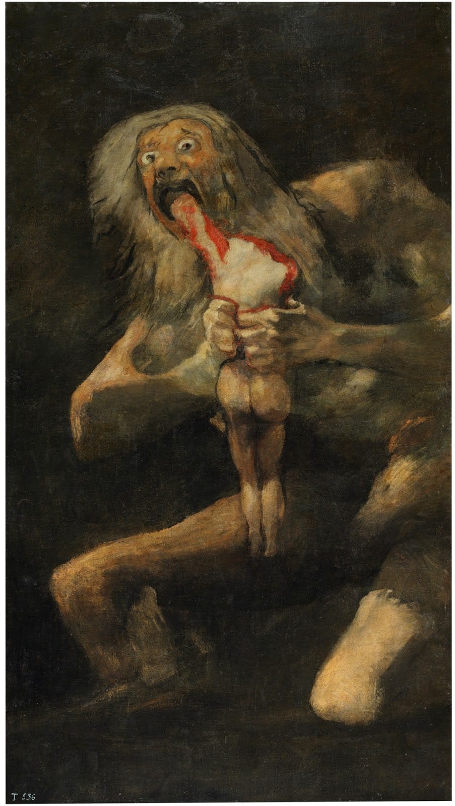
Saturn Devouring His Son

“Saturn Devouring His Son,” by Francisco Goya (1820)

This painting is not for the eyes of those with a weak stomach. To call this painting ghastly would be an understatement; if anything, this painting is borderline criminal. There’s a lot of questionable things going on here and honestly the background doesn’t really make it better; so let’s dive into it! 

The man, if you could even call him a man, is obviously named Saturn from the title, but who is he exactly? Well to put it simply– he isn’t a man, that’s for sure. This is the Roman God, Saturn, also known as Cronus in Greek mythology. A little fact about his backstory, he overthrew his own father to become an all-powerful ruler, only to find out that it was his own destiny to also get overthrown by his kids; Go-figure that your actions come back full-circle to haunt you. 

Insecure and worried for his power and position, Saturn decided to, well, eat his kids. Wouldn’t be my first reaction to learning my kids will overthrow me one day, but whatever floats your boat. It’s unclear which of his kids he is eating in this painting (he ate five out of the six, if you were wondering) but all that really matters is that he is graphically gnawing down on this poor God-child. Child-God. Or Goddess. Horrific. 

Don’t worry though! Remember how I mentioned he ate five out of the six? Well, the sixth child that survived was Zeus. Yeah, the thunder guy who rules over all the others in Greek mythology. He did what the prophecy foretold, defeated the child-eater (who is fed a poison that threw up all the children who are somehow unharmed and are just alive???) and happily rules over Olympus. Hooray!

Don’t feel better? Me neither. Let’s take a look at the choices this artist made!

Goya, the artist who made the first painting of Saturn eating his son, had a bit of a trademark for using a lot of dark pigments (and subjects) in his works. So much so, that the mural paintings that decorated his house became known as the Black Paintings. As you can see here, this pretty picture checks off both of those boxes. And aside from the literal interpretation, there isn’t much metaphorically to really delve into. Some art experts have theorized that the image may symbolize the autocratic Spanish state, “devouring” its own citizens; others view Saturn as representation of the French Revolution, or even Napoleon.

To really conclude, maybe don’t eat your kids to stop a future revolution. Anyways, I’m gonna go get dinner now. 


Sources:


An Ashy Afterlife

Translated from Russian, the words on this poster read, “Even the best cigarettes can be your tomb…” Created in 1985 by the World Health Organization for distribution in Russia, this poster shows a pair of shoes which extend above a pile of cigarette butts. While lacking in color and the presence of many objects, it effectively fills the viewer with a sense of dread. The question is why?

This picture can be broken down using a visual rhetoric lens as well as a representation lens. To start, the visual rhetoric lens emphasizes the grayscale shade, view of the bottom of the shoes, and the highlighted words. The grayscale sets the overall tone of the poster, the dullness of it all recreating the sense of depression and death. The black background especially adds to the effect, forcing the viewer to only look at the words and the image and nothing else. 

As for the angle of viewing from the shoes, it enables the viewer to find a connection to the poster no matter what age, gender, or race. Looking at the soles from underneath the shoes, it is harder to even determine what kind of shoe it is. This also works in hand with the representation lens. By lacking representation of any specific person, it inversely allows for representation of all. 

Finally, the elephant in the room (or poster), the cigarette butts. The only other explanation for the source of this message. For a smoker, it’s easy to forget that a single cigarette does so much damage. But when combined into a large pile like what’s pictured, it begins to become clearer how much damage they deal on your life. 

This picture heavily reminds me of the phrase “one-foot in the grave.” Combined with the text translation provided, that connection was meant to be purposeful. In a sense, it almost looks like the cigarette pile is a bridge or a path for these shoes and it’s nearing the end. End of life, but also in a better turn, and end to addiction and to the ruin of lives. 


Sources: 

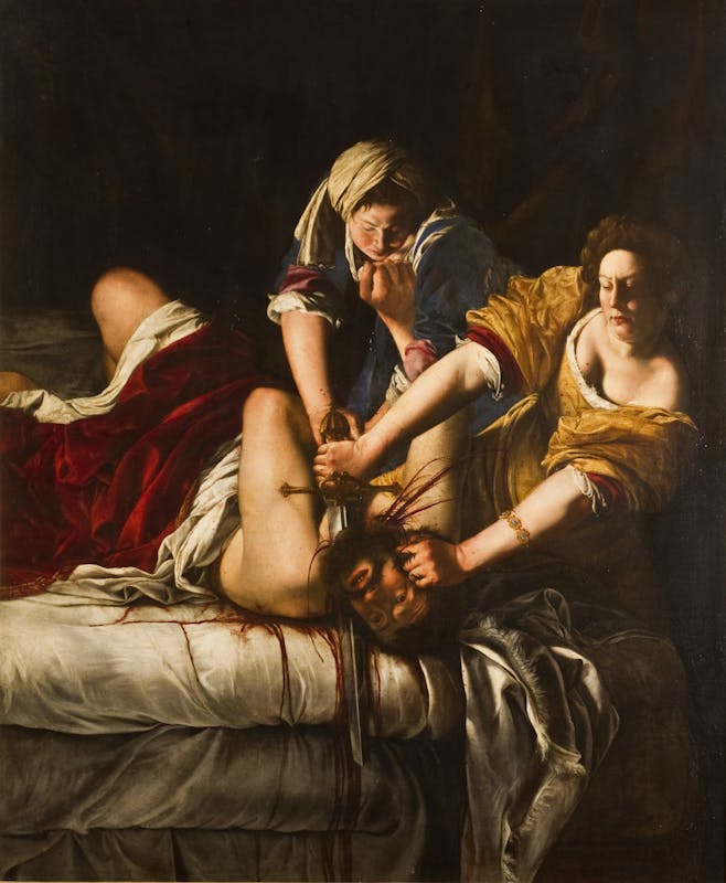
Judith Beheading Holofernes

Art piece done by Artemisia Gentileschi

It doesn’t require a keen eye to discern the key elements of this artwork. Blood, pain, determination, everything is practically served on a tray right there in the center. Yet, this painting depicts so much more than a simple murder, which we can understand using the visual rhetoric lens. I’ll attempt to not only highlight the key details in this painting but understand how this meaning changes with context. 

For starters, the lighting. The angle of the light seems to be coming from somewhere out of frame pointing down on the people in this image. In an otherwise dark and shadowed room, the light draws focus immediately on the entanglement of arms battling a losing (or in the women’s case, winning) battle. Interestingly enough, if you were to zoom in on any sections of this painting excluding the arms, it is essentially peaceful. The contrast of light and dark add almost a delicate air to the scene, with the focus of the arms pointing out to the tense situation. 

The second feature to highlight would be the color usage. The man in the painting is wearing white with red draped over him. The red covers a large enough space that it’s practically more alarming than the blood. At first glance, one might assume this white may symbolize purity, purity that is tainted by the overwhelmingly hot red anger of the women holding him down. Contrastingly though, the aggressor in this situation is represented in yellow, which is associated with light and life, energy and happiness, not the typical association with a murderer. As for the woman in blue, she rightly matches the symbolism, with blue linked to loyalty and stability. 

The story behind this painting goes as follows: Assyrian King Nebuchadnezzar sent his General Holofernes to capture Bethulia, a Jewish city. A woman named Judith decides that in order to save her people she must kill Holofernes herself. Wearing beautiful clothes, she goes out to seduce Holofernes, who has drunk enough wine to become drunk. After inviting Judith to his quarters and falling asleep on the bed, Holofernes is decapitated with his own sword, winning a decisive victory for the Israelites.

From this bout of information, the features that we highlighted earlier have changed. The red drape over the white cloth covering Holofernes doesn’t represent the plights of a victim, but the life of a sinner. He, the enemy, while pure in the fact that he is alive is overshadowed by his misdeeds, the blood that is on his hands as a General in a war. The ironic yellow on Judith is now a justified symbol of hope, of joy and happiness for the people she had saved. Even the lighting changes the mood of the painting, going from an almost downcast portrayal of a death to the anticipatory outcome in favor of the woman. 

(Left) Caravaggio, (Right) Gentileschi

The background context, while important to understanding the core of this painting, still does not cover the complete meaning of this painting. To switch it once again, we need to take a look at the artist herself, Artemisia Gentileschi. Keeping it short, Gentileschi was theorized to identify with Judith, which explains the difference in depiction of her artwork in comparison to another male artist’s of the same subject. Not only does she connect with Judith on a female level in a way that male artists cannot, but Gentileschi herself was a victim of rape and allegedly fought back her attacker with a knife. 

Once again the entire depiction of this painting transcends to a new metaphorical meaning. It becomes a woman fighting for her life, a woman fighting for the lives of other women. A dominating figure such as General Holofernes can symbolize many things— society, expectations, the patriarchy, general sexism, etc. Although, I concede that Holofernes is exactly what Gentileschi thought he was– ignorant. The physical embodiment of ignorance, blind to the changes and capabilities of the beautiful women who he never thought would kill him with his own power.

Sources:

  • https://www.artsy.net/article/artsy-editorial-judith-beheading-holofernes-art-historys-favorite-icon-female-rage
  • https://smarthistory.org/gentileschi-judith-slaying-holofernes/

Who and What is ‘Migrant Mother’?

Chances are you’ve seen this picture before in a US History class sometime in high school. But even if you haven’t, most can understand the general sentiment the image portrays. From a general perspective, one may notice the hardened face of a woman keeping her emotions at bay for the sake of the two children at her side, the only thing betraying her face being worry. Historical context isn’t even really needed for the general message, that this woman is not only worried but seemingly hopeless. 

So what exactly is going on in this photo? To understand we need to go back to the 1900s, during the Great Depression. Specifically the era of the Dust Bowl, when thousands of Americans were displaced, living in poverty and starving. In the southern plains, drought had ravaged the land with high winds picking up the dust from the ground, rendering the failure of crops and the death of livestock. Amidst all of this chaos lay the poor families that couldn’t afford to move anywhere, and without moving, were left with little to no food. Then comes photographer Dorothea Lange, capturing the iconic shot of a mother named Florence Owens Thompson. The picture became published in the San Francisco News and widely reprinted and reproduced on magazine covers, postage stamps, and others. 

Now knowing the historical context, the question becomes one of why. Why did this image impact the American public so heavily? What caused Thompson’s face to be reproduced on the covers of magazines? Analyzing this image using ethos, logos, and pathos, it can be concluded the impacts lie in a few simple factors.

For one, the usage of children definitely relates and draws the attention of many adults. This is a struggling mother, and thus a struggling family, all of which is a core value in American society. Another factor lies in the usage of black and white. While colored photographs didn’t exist back then, it still contributes to the overall effect of the image. If this family had been photographed in color, it very well could not have been as effective, especially if there was the usage of bright colors that typically signal positivity (like the color yellow) as opposed to black and gray, which is more somber. Finally, the posing of the woman relates to distress. These children are curled up into her side, while the only thing she can do to comfort them is to lend a steady shoulder. Her overall impasse and distant body language reveals her inner worry, defaulting to being a strong front for these kids in a time of distress.

From this perspective, it is easy to see how this image can front the drive to help people in need during the Dust Bowl. But further than that, it also empowers the people who are being affected by the Dust Bowl as well. With the publicity that it had brought, this woman was representing them, showing them that the only thing they can do during this hard time is to stick together, to stay strong, and to hold onto whatever is left of their lives in the fight to survive.

Sources:

  • https://www.history.com/news/migrant-mother-new-deal-great-depression
  • https://www.history.com/topics/great-depression/dust-bowl

Passion Pitches!

As the famous Shrek had once said, “Ogres are like onions,” in which the same can be said for people. Like an onion, I, myself, am a woman of many layers with hidden talents, interests, and passions. Choosing a single layer to represent myself would be an injustice to say the least, yet in the task of the impossible I have indeed been able to narrow down two possible topics for my blog. Of these, I hope they will do the job of both upholding my character, and the topics of which I strongly believe in.

One of the options I had picked out involved the stories and respective history of paintings, in which each week I would choose any type of painting, review and research the story behind it, and relate it to what it means to me.

“Ivan the Terrible And His Son Ivan” Painting by Ilya Repin

In this aspect of myself, it represents my love of art and humanity, as well as the passion of storytelling. The topic itself also provides versatility, in which I can connect the subject to presently relevant topics (like art being made by AI), as well as already established topics (such as historical movements).

The second option that I had finalized was the reviewing and ranking of each early 2000s Barbie movie on an S-F tier scale. Factors that would contribute to each ranking would include theme statements, characters vs. women in power, lessons to children, and stylistic elements.

Cover image of Barbie: Princess and the Pauper

This incorporates not only my childhood love of these early 2000s Barbie movies, but relates to bigger passion themes of feminism in the media. These topics are especially relevant nowadays, with headlines of the live-action Snow White and the already released Barbie movie being talked about in news outlets quite frequently.

As it can be seen, while one topic is certainly more “serious-looking” than another, both clearly have the capabilities to be thoroughly interesting as well as thought-inducing. Each equally contribute their own values and importance of subjects, and have the capacity to contribute a platform for deep conversation an debate. However, only one will make the cut, and the next blog will be the reveal on which one made it to the finish line!

Skip to toolbar