Overview
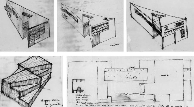
David Ackerman’s form from the fire station resonates from the extruded vectors from existing site context such as buildings and street orientations. Using three main vertices, the building developed into a series of regulated shapes that gave it distinction among its rectangular counterparts while maintaining relevancy to the site. The interior spaces are divided into public and private and then given geometry by continuing the designating vectors into the complex. Using this system, he extended the created form on the eastern side of the building to design the Monitor Museum. This gesture integrated the museum while allowing the privatized portions of the fire station to remain secluded.
Presentation of Work
The board was clean and efficiently used space. His most relevant drawings were centered on the board, which allowed for an easier read of his design intent. His conceptual diagram of a site map with three bright lines clearly demonstrated this, but considering its importance felt confined. Giving this powerful statement more room to breathe would help to ground his concept and therefore the rest of his drawings established by these controlling vectors.
Some of the line drawings were hard to read. The line weights could have used more contrast; the white paper of the board emphasized the outliers but any interior work required closer examination.
As for the student’s presentation, Dave was well prepared to present the process of his work and to showcase his current design. This was portrayed in his ease with interacting with his reviewers as well as addressing the drawings on his board when referencing any context in his speech. To improve his oral presenting I would recommend speaking up. His speech seemed muttered from speaking low and quietly, also making it difficult to hear (I must give some credit however because the reviewers also spoke very quietly so the critiques seemed very privatized).
The Project
The building has a very monumental quality to it. It is very capable to stand out among the rectangular and even curved buildings in the area. This strength was disregarded in the site’s own planning. Some of the topography lines appeared manipulated, however they did not display any of the intent expressed by the proposed building. Since vectors are such a strong element in David’s design, I’d recommend extending them to create pathways as well as manipulate the landscape. On Friday, our landscaping critiques emphasized this idea of dunes for projects that had strong lineal designs. I believe these could be introduced to Ackerman’s site plans. Either the dunes could be used as the linear pathways or in symbolism to the forms taken on by the building. Platforms could rise above indentations of the ground or created by intersecting pathways could show prominence of his idea to build from (and extrude) from linear conditions.
To further the intensity of the vector-al concept, this lineage could be expressed within the building so it is not lost upon entering. Structure could flow along the strongest length of wall to help preserve the original intent. A great example of this is from I. M. Pei’s National Gallery of Art’s East Wing. The corners that are hard to place program into could be used as open interactive spaces such as a lounge. It would increase the functionality of a sharp corner while also using the concept of these intersecting vectors that formed the corner, as the space is one of an integrated commons.
The strength of this concept is yet again promising as the availability to use the vector that formed the museum could be used to connect the public plaza to the Monitor Museum (as the critics also recognized). In David’s design, he restricted access to the museum to help initiate a pedestrian circulation that would bring the community into the fire station’s public side to access the museum. This intention was well thought out but not implemented. The idea of a progression through the spaces to integrate the public with both programs shows David recognized the client’s desire to reunite the community with its fire service. By creating a pathway directly from/to the plaza and the museum, both programs generate a larger interest and therefore the pathway (or vector) is also emphasized.
The Review
First comment: With any project that choses strong vectors, we must recognize that these indications of site may not always be there. Site Changes; taking lineage from another building or street may be lost when the street is manipulated or the building replaced. To create more independence from these exterior conditions, indication of the vector-al presence within the site is important. This comment was expressed through the entire session. David’s vectors are essential to his project, so emphasize them and make sure they cannot be denounced.
As the site itself develops, do not forget to also develop the spaces directly adjacent to the building produced, namely the plaza. The plaza itself is a space created by intersecting lines of roadway. It serves as a crucial space between public and private relations; the entrance to the site. Developing the programs associated with this space will help to further address how the rest of the land should be laid out.
“Use vectors to create pleasing spaces.” The reviewers now focused on the unusable spaces conduced by these vectors. Tight spaces within the angular conditions where the forms intersected are unwelcoming to both pedestrians and much use. By repositioning the separate forms to intersect at different points, the spaces could at least become more inviting even if retaining the same form.
David Ackerman’s reviewers focused most of their criticisms on the functionality of created spaces and the understated expression of his concept. The building’s shape indicates there is a strong underlying condition that influenced it, but the interior and the landscape both are ignorant of this expression.
Conclusion
David Ackerman’s presentation shows strong design intent. Although the concept needs further expression in later renditions, it was powerful at this stage and promises easily recognizable extensions from his current design. The building was well thought out, but lacked the power that the exterior conditions conveyed. Focusing on the strength of the vectors give to the exterior forms of the complex and integrating them with both interior and site context will strengthen and improve the intentions that brought the vectors into prominence in the first place.
Photo Credit: National Gallery of Art’s East Wing Imaginative Sketches by I. M. Pei
Megan, this is a wonderful review. Next time, try to categorize the criticisms of the project in the various orders of worth.