Success in architecture is more than a beautiful building, but a building that can also makes sense contextually in the site as well. The struggle of the Bushwick Inlet Site is creating a project that responds to both the urban grid and the fluidity of the park. John’s project places itself within the geometries of the site by extending 15th Street back through the site as it historically once was. This extension creates a triangle of site between 15th Street, Quay Street, and Franklin Street. By placing the fire station on this triangular site and aligning his apparatus bays with 15th street, the optimal drive through apparatus bay is able to be created. Remaining on the apparatus bay level are more public areas of program and fire safety specific programmatic elements. On the upper floor with a view looking down into the apparatus bay, the residential spaces of the firefighters have been placed. The Monitor Museum is placed beside the fire station on 15th street and Franklin Street with a public outdoor plaza completing the triangle. The geometries of John’s project in context with surrounding streets create a very interesting and contextual proposal.
Peer Critique
In reviewing John’s project based on the NAAB criteria, he had a very successful project. His project shows excellent design thinking and reasoning skills that are shown with great clarity in his drawings. His board becomes a very graphic element with bold colors that help to accentuate his main ideas. His models are beautifully crafted at two different scales to allow for a more detailed view of interior spaces, while also allowing the viewer to get an idea of the context of the project. His presentation was concise, but included all main points in order to give the juror’s sufficient background information to successfully review the project. John uses precedents for his bold move of the glass roof, but I feel that these precedents could be revisited. Further research into the precedent would allow John to give more consideration to the rational behind his glass roof. The hierarchy, circulation, and organization of the project are very thoughtfully considered. John’s use of historic maps allowed him to create a bold move in his project by re-extending 15th Street through the site. This extension also served a successful guideline for John in making the rest of his design decisions. The hierarchy in the layout of John’s project is also extremely successful with most consideration and importance given to the fire house on the main floor. The project reflects John’s view that the apparatus bay is the most important aspect of this project, however I think John does need to step back and re-evaluate the layout of his residential area. The circulation of the project is also well thought out, but it wouldn’t hurt to re-evaluate the current design to see if the response rate can be decreased in order to achieve maximum efficiency.
Critique of the Critique
The most actively involved critic during John’s review was Juan, who evaluated the project mostly on the inspired and industrial levels. John had an extremely successful, in that Juan went so far to call his project “remarkable.” Juan said that this remarkable simplicity, was a double-edged sword as less is more, or less could be bore. However, all critics agreed that the simplicity and the extension of the street, allowed John to create a new city block that responds extremely well to the surroundings. The multiplication of the corners on the neighborhood side makes great sense, however, it pointed out that the corners of the park side should not be identical as they are not responding to the same conditions. The structural integrity of the apparatus bay was also heavily critiqued as the columns are not consistently placed throughout the project. There is also a multidirectionality about the space, but John is choosing to emphasize only one direction, so that this requires greater emphasis. The glass roof of the apparatus bay that allows view in was seen by Juan as a great conceptual move as it creates a large island that attentively responds to the geometry of the site and fire station. However, the bedrooms looking upon this may not be ideal, as glass will become dirty extremely quickly, and the better view is across the inlet to the city skyline. Another critique of the project was the large height of the education and exhibition spaces that prevents better potential views for the upper floor bedrooms. In the critics eyes, there was a great need for further development in the surrounding site. The spaces between buildings are not large enough to welcome guests into the park. A sense of urbanism needs to be created between the buildings to welcome guests and offer an opportunity to “landscape the city.” Responding to the city and surrounding site, also needs to be addressed to the long façade on 15th Street. This is an opportunity for the directionality of the street and building to create a landscaping operation for the surrounding park as well.
At the schematic design level, it is not surprising the reviewers of the project were making comments based on the inspired order. It is still early enough in the project that larger design changes can be made without setting back the student to an extreme degree. The industrial order comments are also reasonable as this is the first time students are working with circulation, fire safety, and structural consideration in a studio project. The critics were all very excited by this project and offered a wide scope of comments for John to consider. The comments were polite, thoughtful, and unbiased, so that it was easy for John to respectfully answer their questions and address their concerns. I found it most interesting the the critics were so intrigued by this proposal that they continued to review the project after John walked away and the next board was being pinned up.
Suggestions for the Project
I would recommend you continue the columns throughout the length of the apparatus bay, but increase the width between columns and potentially consider adding additional support from trusses as well.
I would also recommend increasing the space between the Monitor Museum and Fire Station to create more pull into the park. Perhaps by revisiting the shape of the museum, you can create a larger plaza to the front of the project that assists in bringing more visitors into the park. You can always decrease the footprint of the museum by increasing the number of stories.
I also would be very wary of the back wall along 15th Street, since that is what is closest to park. Find an interesting way to make the landscape and architecture interact. This facade could be potentially all glass to allow park goers to see the Fire Station at work.
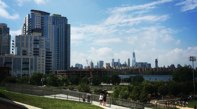
Bushwick Inlet Park Photo by John Shinogle
Addie, thank you for such a thorough review. Next time, try to incorporate the Orders of Worth analysis of the critique/review.