Category Archives: Peer Design Review

DD review for Paige Geldrich

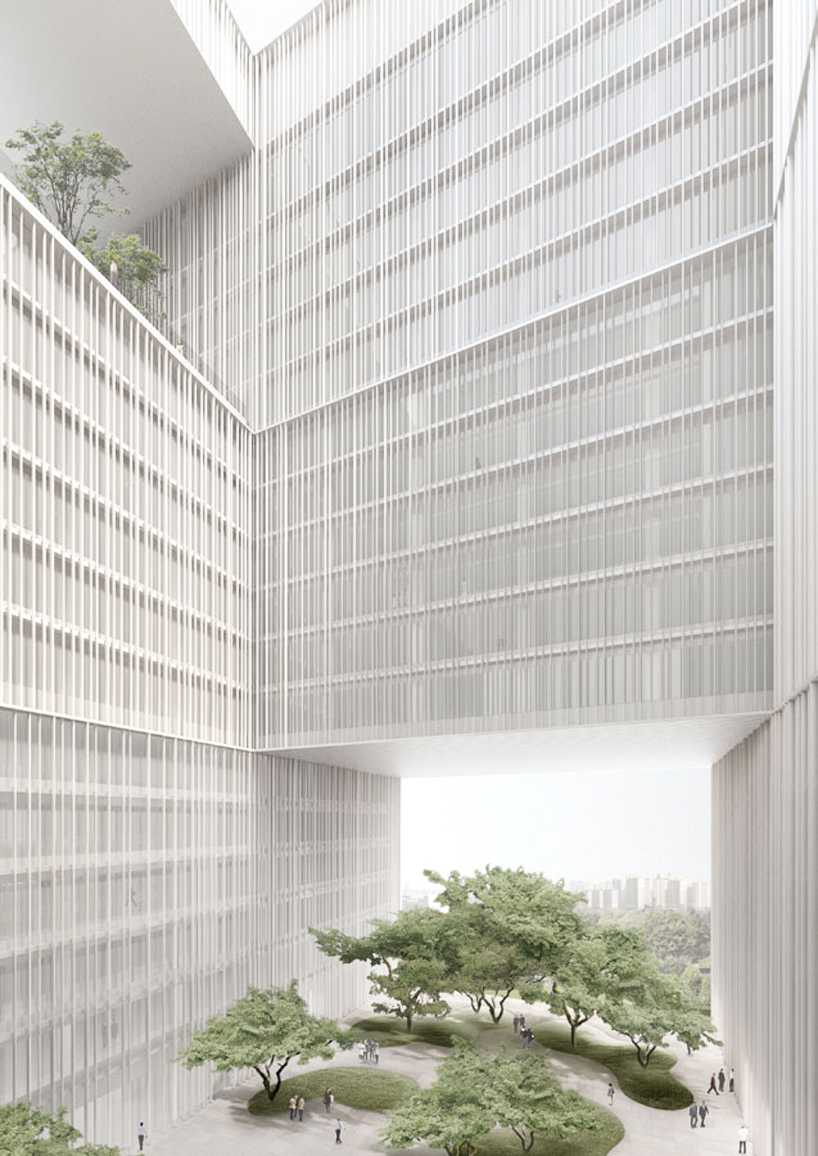
On Wednesday, I had the honor to review Paige Geldrich’s Design Development presentation. Paige’s project has a very strong concept of “bringing old and new together”, it is very interesting and makes lots of sense due to the historical aspect of our site in Brooklyn. In the project, Paige designed a building with two wings that are parallel to the street around the edge of the site, they meet at the corner of the streets where a symbol of collision—- an 80 feet tower stands. To illustrate the concept, Paige decided to use material as the main tool to present the connection between past and future. One of the wings is built in red brick which echoes with the existing old brick buildings on our site. The other one that built by glass refers to the new and the future. It provides a strong contrast with the brick wing and the site.

Facades: The building is very impressive. It’s easy to tell that Paige has developed a logical organization in the design process. One of my favorite parts is the glass facade that is divided by the gird of frames and has some brick element at the bottom. It looks neat, responds the concept and interacts well with the method of interior design: using grid as an organized way to define the spaces. On other facades, Paige continued with the method to combine the brick and glass together, however, the way of arranging the blocks of materials could have been more thoughtful. Due to the different characteristic of the two materials, it is necessary to find a hierarchy.  Right now it is a little hard for people to figure out the logic behind the composition.  In the presentation, the guests questioned about the combination of brick and glass. I personally do not agree with that. Around our site, there are some buildings built by bricks and glass. They obviously have developed their tone which is homogeneous but outstanding. So I think Paige’s design totally makes sense.

Form:  The arrangement of the massing is clear in this program. Height is increasing from the end of each wing to the eighty-feet-tall tower which emphasize the importance of the fire station. Moreover, some parts of the volume are cut out to create void spaces. It helps adding up the complexity and diversity of the building form. One thing I would suggest is to add up the height of the tower. Due to the width and the length of the building, the tower does not look as tall as it needs to be. As the building area is already large enough for all the program, adding up a smaller tower as a symbolic element might be a solution.

Programs: As I mentioned before, Paige used specific organizing grid to define the space within the wings. She reserved the brick wing with residential area and lounge area while the glass wing is occupied with the working area where the offices, maintenance area and apparatus bay located. She also came up with a sculptural and unique organization for the space in the tower. I think overall the programing works well, however, the following problems should be taken into consideration: 1. Will the height of the tower influence the speed of fire fighters to reach apparatus bay? 2. The project already has a very strong characteristic, the space inside the tower could be less sculptured, and a more flexible arrangement can make the movement smoother and can help to achieve a higher efficiency.3. Due to the plentiful of the space, the fire stairs and elevators can be set in somewhere reasonable instead of squeezing at the edge of the space.

Landscape: In the project statement, Paige talked about how the form of the buildings creates a frame that, along with the terraces and walk paths, encourages both firemen and other people to the public area along the water. I think her thought is great, however, it is not fulfilled yet in the shown design. The paths and landscape she has now is arbitrary comparing with the logical form of her building. The public space could be more coherent to the fire station and could be more welcoming by adding connections to the main streets.

Board: My favorite part of the board are the axons of the building. They are very detailed and well-made. By showing the shade and shadow, they tell a lot about the form of the building. I wish they could be larger and plays a more important role on board. The elevations and sections are beautiful as well, the line weight is appropriate and the textures are informative. It would be even better if Paige could add shadows as she did in the axons. It will definitely help the audiences better understanding her drawings. Moreover, the function of the area is only labeled on the first floor, to make the plans more clear, more dimensions and labels should be applied.  The text is a little bit too large comparing to the drawings and the project statement is not fitted in an organized way. I believe these are just some tiny flaws that would be fixed next time.

Development: Comparing to the peer review, Paige had a better communication of the tower geometry through the models. I really appreciate that she put many efforts on her model so it can provides another way for us to better read the design. The other improvement is the site plan, although there are some problems that need to be figure out later, the site plan she had this time is obviously more informative and detailed.

Presentation: Paige was a little nervous at the beginning of the presentation and was not presenting very fluently. However as she kept going she pulled it back together. The presentation was overall clear and to the point. When the guests were critiquing, she was focused and can respond quickly with logic. I think it’s is a very important characteristic for an architect because it should her ability of critical thinking and her own deep understanding to the project.

Conclusion: Paige did a great job in this presentation. I think the challenge for the following month is to figure out the best way to use the two materials. Overall, the project is very interesting and well designed!


DD Peer Design Review: Lindsay Krause + Balance

The Project: The central theme of Lindsay’s project is balance. Perhaps the hardest part of the current project is designing a project that is able to balance the very different aspects of the program, the natural landscape of the park compared to the urban landscape of Brooklyn and the high-stress work  environment next to the relaxing residential space. Lindsay attempts to create this balance and harmony within her project by incorporating biophilic design with various outdoor retreats into her space to create a relaxing space for the firemen. Natural daylighting is provided with large curtain walls and skylights.  Through the use of a grid, Lindsay creates a union between indoor and outdoor spaces with various open and semi-open gardens.

The Critics: Ute Poerschke, Sandra Staub, and Malcolm Woolen           Being Lindsay’s current studio professor, Malcolm had very little to say, but from my personal experience in class, Malcolm looks at projects from the industrial order with heavy emphasis on code compliance and efficiency. However, it was interesting to hear Malcolm ask his colleagues to speak more to the inspired order in referring to the design of Lindsay’s facade and consistency of columns.

Ute’s critique of the project came from a more inspired order with some references to the industrial order in terms of structure. Ute spoke very highly of the project’s organization in that the grid does a good job of weaving volumes and surfaces. Ute’s main focus was then on using this grid as a solution to other areas of concern in Lindsay’s project, such as structure and façade design. Currently, Lindsay has her columns designed as an afterthought as structural “I” beams enclosed in concrete. However, Ute suggests using structure to better emphasize her concept by creating thinner columns with more directionality to enhance the weaving pattern. Another area of concern is the design of the façade in respect to the lack of a main entrance. Ute felt that the circulation and composition of spaces between the museum, fire station, and courtyards were very successful, but there was little done to emphasize the main entrance to give it proper attention.

Sandra’s critiques appeared to be coming from an inspired and domestic order, with a more conservative view on the creation of new green spaces. Sandra felt very strongly (despite Malcolm’s claims of biophilia) that the creation of internal gardens within a building beside a park was extremely redundant, if they’re featuring the same plants. Sandra suggested opening up the interior central garden and connecting it directly to the outdoors to serve as a bridge between the natural and built. If Lindsay plans to leave the interior garden, this should become a winter garden with an entirely different collection of plants and greenery.

Peer Critique: Lindsay displays very strong design thinking skills with in her project. Through the creation of her grid, Lindsay is able to solve most design issues within her project by using the grid as a guideline and series of rules to follow. Lindsay is extremely thorough in implementing her grid and the presence of the square into all aspects her design, so that even her façade is based on 3 to 1 ration of the square. The grid also provides an excellent ordering tool for the hierarchy of the project that allowed Lindsay to create a very elegant series of built spaces and exterior courtyards.  Her project’s concept is very clear through her work in that her building speaks both to the urban grid of Brooklyn and the natural landscaping of the park.

The overall organization of Lindsay’s projects and programmatic layout are also very well planned, so that adequate circulation space is provided. In order to prove the efficiency of the design for emergency response time, a diagram of the firefighter’s path to the apparatus bay would be extremely beneficial. The building also lacks a sense of destination or arrival, there is no real main entrance. While Lindsay mentioned the idea of providing an entrance on each side, I believe that one side should be emphasized to create a sense of arrival and decrease the confusion of users and guests to the fire station.

Lindsay’s boards were very light and delicate with drawings that seemed to match the elegance of the project she described and designed. Her drawings can be clearly and carefully read due to proper use of line weights and poche. Her plans and sections both did an excellent job of showing the structure and scale of her project. Throughout her plans,the size of the grid varies with out little explanation, which does lead to discrepancy over how strictly the grid defines the interior spaces. In addition, a perspective would also be helpful to getting a better understanding the three dimensional qualities of the space. The site plan could also use a little more detailing in that it is hard to tell the difference between various rectangles, are they paved? Are they grass? Are these ramps or gathering spaces? Are they all at the same level or differing levels?

Precedents from Dan Kiley and David Chipperfield are clearly seen in Lindsay’s project. These projects have clearly helped to define her overall aesthetic and site planning goals.

Rendering by David Chipperfield Architects Seoul, Korea
Amore Pacific Headquarters- Rendering by David Chipperfield Architects
Seoul, Korea


Landscape Architecture by Dan Kiley Dallas, Texas
Fountain Place- Landscape Architecture by Dan Kiley
Dallas, Texas

In observing Lindsay’s presentation and hearing the feedback of the reviewers, I have several ideas that may help her moving forward towards her final project. In terms of the presence of columns and how they define her façade, I feel that the columns should be uniform around, even if the east and west elevations don’t have the same bay width. A sense of greater uniformity and consistency will be created by doing so. In terms of a main entrance, I feel that the east façade and the layout of the exterior courtyards lends itself to becoming a main entrance for the project and has the greatest potential of attracting people from the street. The south entry is integral to the relationship with the park; however, this entrance could be seen as more of a private entrance for the firefighters to use to access the park. If Lindsay should chose to open up the central garden to the park, she is then able to create an entrance on both sides of the central garden into her fire station. Finally the maintenance elevation allows a unique opportunity for a more adventurous façade, perhaps a green wall that wraps the landscape up from the park and brings it up on to the roof of the fire station. This would serve to enhance the presence of biophilia within the project and create more of seamless blend from interior to exterior spaces.

Image: James Marvin PhelpsBalanced Rock

Revitalizing Existing Infrastructures- The Critique of Rebecca Newburg

Respecting an urban proposition she suggests in her related works and theories, Becca has explored a redesign of existing infrastructure rather than a demolition and new construction. “There is no need for new buildings,” you might catch her saying. With the rise of a collective eco-conscious, and the increasingly evident necessity for sustainable thinking, Becca’s ecological strategy is more “a requirement than a choice.”

What was the quintessence of an under-cared industrial wasteland, the Greenpoint Bus Wash has been transformed into a multi-use, community oriented space, capable of becoming a node for a developing community, over an urban residue on a far street-side.

Further integration with the surrounding community was a forefront intention of the new design, with a redesign of the existing park space, whose circulation and pathways carry through the design of the structure to create an interwoven continuity of spaces. The jointure of several of the park paths, just to the east of the building’s centroid, creates a dramatic point of public access and becomes an anchor for the organization of public spaces. Lobby and other public-oriented space are compartmentalized about the dramatic intersection of pathways. Flanked to either side, the monitor museum and multi-use public space, ideally seen as a farmer’s market, stretch out toward the waterfront, while the Apparatus bay hurdles the streetscape. Thus, the poetry of the East River scenery complements the poetry of community and history, while the first responders are nudged against the community street-system, becoming most-accessible to its extents in the event of emergency.

What was taken into reconsideration by the critique was the arrangement of a second storey, private spaces for the live-in firefighters, whose personal quarters were arrayed into a seemingly efficient system of “locker spaces” at the interior of the building’s footprint, but could not receive adequate light, nor had any relationship with the outside. They were quickly called out to be psychologically uncomfortable. A suggestion and future ambition would be to relocate such rooms along the structure’s edge, the opposite condition of the existing central, interior concentration.

Structure was certainly a hallmark of the proposal, with additive trusses and pillars lining the exterior of the old building, creating both the aesthetics of an industrial colonnade and yet an impression of weightlessness. The roof and almost all structure would become dependent on suspension from a line of trusses, rendering all interior structure much more simplified. The opportunity allowed Becca to redesign more interesting roof structures, and act more independently of the pre-existing column grid, which in this iteration becomes more of a tool of spatial definition than of structural essentiality. The new structural system, alone, produced one of the most identifiable design schemes among the entirety of the studio.

So if interior conditions are new, and the structural system is new, what of the old structure is maintained in the new design? The shell? Or has the shell become more a symbolic element with minimized bearing on the totality of the new design? This idea, through different aspects and considerations was the forefront of the critique’s comments and concerns throughout the remainder of the session. Becca’s representations were more than adequate in explaining spatial configuration and design strategy, however, was not indicative of relationship between ‘old-and-new’ that seemed to be such an important aspect of the entire project. Critique Lisa Iulo recommended a more diagrammatic approach to plans and sections that clearly identified pre-existing structure from new structure, through different means of poche and hatching, better allowing for the dialogue to be displayed. Becca’s collages and graphic representations of her design’s aesthetic potential were also suggested to be reworked to better emphasize the dichotomy she has explored.

Through design, this dichotomy was suggested to receive better emphasis by rethinking the surrounding conditions, such as the streetscape, understood to be the intermediary between old and the new, hosting structures of all ages. Understanding how to better shape and confront the streetscape by better crafting its facades might be an opportunity to take advantage of.

Despite all the evident potential, and what seemed to be understood by the critiques as an attempt to respect and reuse existing conditions, the strongest comment in the entire critique was that Becca’s design approach was simply too modest. “It could be more assertive,” asserted Lisa Iulo. Without giving much explanation, the audience was left to mostly interpret and define modesty for themselves. Perhaps the modesty came from the organization of spaces? There was certainly a minimalistic approach in allocating compartmentalized spaces, with what seemed to me an evident interest in maximizing, the open, public spaces. Perhaps the formal relationship of such interior spaces were too literal, too orthogonal to the master shape of the pre-existing structure.

It certainly should have not been a critique on the building’s footprint, as such would be necessary to uphold the attention of adaptive reuse. Perhaps Lisa foresaw a potential addition, or a contrasting element for juxtaposition that would be capable of erecting this conversation of aesthetic duality, though it was evident such would not be Becca’s intention, as clearly she intends to make the most out of the existing footprint, only executing a slight modification to regularize one of the footprint’s corners that featured a skewed and formally awkward corner. In regularizing the shape, there is a clear intention of de-emphasis, and a clear emphasis on the interior reorganization. Despite the evidence, perhaps the idea was misunderstood by the critique. Even through the regularity of the floor plan, responsive to the existing condition, the sections and new structure certainly offered aesthetic interest, certainly captivating enough to passer-byers on the street. No neighboring building featured a colonnade of trusses and piers that so evidently helped to define interior space, and no other neighboring structure could feature such openness and relationship with the green environment around.

The best way for Becca to move forward, and perhaps ‘radicalize’ her proposal’ would be in needed reorganization of the second floor, thinking of how to welcome light and maximize the efficiency and psychological ease of such spaces, all working under a condition of structural independence she granted herself with her monumental truss system.

design development review: veronica landron

Veronica’s design for the Brooklyn Fire Station revolves around a geometric roof. The roof serves as a visual icon among the rigid rectangular forms in its context along a historically industrial waterfront. It offers a unique opportunity for structural flexibility for the large apparatus and other related program within. The roof takes a very interesting form because of its geodesic qualities, however, the current design does not take full advantage of the system the roof creates. To finalize the structure and cohesiveness of systems needed for the final design, Veronica should create a series of rules that will organize and bring unity to the roof structure and the program within the firehouse.

SUCCESS OF PROJECT

Veronica’s design for the firehouse is successful in engaging the surrounding environment with a geometric roof. The roof structure is clearly the most interesting part of this project. It attracts attention because of its visual uniqueness. For the specific program of a firehouse, this structure presents an opportunity because of the openness it allows for the apparatus. With less columns, there can be flexible interpretations of the space within the roof. The design does not yet take advantage of this flexibility to develop a relationship between the interior spaces and the roof.

One commendable aspect of Veronica’s project are her efforts with structural design. However, the efforts have produced 3 different structural systems that must be resolved into a clear structure. Currently, there are structural systems of walls, columns and the dome. These systems are conflicting. The critics suggest that the structural walls should not be necessary and are not in agreement with your concept. Also, the additional columns inside do not follow a structural logic.

In addition, the critics suggested that the structural idea is there but it needs to be carried out more rigorously through the programmatic organization. The dormitory is the current exception to the interior because it is on a diagonal. The firetrucks could also follow a diagonal logic with their circulation.  The relationship between the interpretations of the interior spaces needs resolution. These issues can be resolved through clarifying the structural system.

Overall, I think Veronica represented her ideas well. A strong element of this presentation is the use of models. The models are both effective to visualize the shape and test the structure. There was a strong analysis of precedent through the Geodesic dome and similar structures. Veronica has clearly explored various structural systems that could support her form. Her challenge now is to clarify her own design among these precedents.

With so much emphasis placed on the structural system, there was little feedback on her other systems, sustainability, and site design. It appears as if you have considered natural light and ventilation, and I would encourage you to reevaluate the other systems in collaboration with the structure.

CRITIQUE OF CRITIQUE

In the design development phase of design, the critique focused on the Industrial and Civic Orders of Worth. At this point, our designs have developed beyond the conceptual phase and the building systems take focus. There was a strong and immediate focus on the Industrial order. One of the major factors of evaluation was the roof structure. Acknowledging the geodesic nature, one of the first questions asked was the location of the utilities. The comments were related to the efficiency of the systems and organization of the program within the dome. Issues such as water runoff and column placement inside were brought up. The structural system was thoroughly analyzed in terms of its rules. The critics suggested that if something breaks a rule, it must be special. They said your design should follow its own rules that you must determine.

There was also a focus on the Civic order. The reviewer’s comments addressed legal and ethical obligations such as code and fire safety. Fire separation within such an open structure was brought up almost immediately.

They referenced the Inspired and Fame orders by acknowledging the value and uniqueness of the roof. The form gives the firehouse a unique public image. They addressed the Project element of design by offering advice to work through a model.  

SUGGESTIONS

To resolve your structural system, I would recommend using models to further explore either the roof folding down or columns. This will help you determine a structural and organizational logic to follow. Determine the hierarchy of your elements and stick to that hierarchy. The roof is the most important element, followed by the living quarters, the program inside and the entrance. The columns should have the same fold as the points you created at the end conditions. The main street facade would be more engaging to the passerbyers if it followed the natural geometries of the roof instead of having a flat surface.

In creating a uniform logic for the structure, this will also provide opportunity to resolve other systems. There is an opportunity to integrate this system with water-down and technical systems. Also, you could find additional ways to allow light and air in your building. One comment was that you should place additional skylights above areas that need it.

There is not a strong emphasis on site design in this project. I think there is an opportunity for you to continue the logic of your roof to create engaging spaces throughout the park. You could have a canopy that uses the same form as your building. You could also use your geometric pattern to create seating and circulation around your building. In developing the outdoor courtyards, you could continue the logic of the structure outside by revealing it.

The roof attracts attention because of its form, but also because of its materiality. I think you could use a material on the roof that utilizes the heat it attracts. In terms of sustainability I think you have made efforts to harness natural elements and you should continue to do so. Overall, I think you have a strong concept and developed system that with clarity will become a distinguished and comprehensive design.

DD Review – Ali Pugliese

Introduction of project:

As is known, our site has a unique corner condition, allowing people to decide to address it our not. Here, Ali’s proposed fire station design, occupies the corner and she situates her main entrance along Franklin Street, the busier of the two streets. She has also decided to stack the required program and to make her building less dense with this stacked program she has made the design decision to create interior courtyards, allowing for natural light to pass into interior rooms.

NAAB Criteria Critique:

Overall, Ali’s project meets most of the NAAB Studio Criteria in a somewhat adequate way, but there is definitely room for improvement in the areas discussed below.

Ali discussed in her presentation that she has several precedents, which do show up on her board, but the names escaped her at the time of presenting and they weren’t labeled. But, with these precedents Ali seems to have analyzed them closely, especially the one that she stated drove her project the most since she used this idea of the interior courtyards from the section she saw of this precedent. However, she should look back at her precedents a little more closely, which Peter Aeschbacher, one her guest critiques, suggested to do, and I agree with him. In that precedent which helped to shape Ali’s design decision to incorporate interior courtyard spaces, there are spaces shown in the precedent’s section that have double height courtyard spaces and there is no wasted space. Right now in Ali’s current design there seems to be spaces that aren’t working cohesively together in section or in plan as well.

Another critique that was made was that Ali’s site is underdeveloped. Here it seems that Ali has not met the NAAB criteria for site planning just yet, but I believe she can develop the site by working with these interior courtyard spaces as well. Maybe she can think about trying to bring about this idea of tying the inside spaces back to something that is happening on the exterior? I noticed on her site plan that she has something design near the edge of our site along the east river shore that she didn’t really talk about. I’m curious as to what that possible could be from the precedent picture near it, it seems as though it’s a concrete forum like space, which could work there but my question to Ali would be why is it in that location and what does she see exactly happening there? Here site layout is similar to mine in that, volumetrically we both have our fire stations occupying the corner and our monitor museums located a little further back in the site. She has also lined trees between the Monitor Museum and the fire station along Quay street, which I don’t think is the best idea since I believe it makes the site closed off for pedestrians to come wonder about. However, because of the volumetric layout of her site, she has created these different pockets in her site that can each be programmed with something different maybe? These are design decisions that Ali still has to answer.

I would say Ali’s plan works for the most part. There are some issues she needs to resolve which the critics had pointed out, which is to double check that her apparatus area does indeed work with the turning radius needed for a fire truck. Ali also mentioned that her apparatus bay is able to be driven though, but that isn’t isn’t clearly as there is that odd angle moment that makes it seem as though it isn’t a drive through area. Also, a good point brought up by the reviewers was why are her living spaces pointed toward the streets? The living space situation isn’t as important to work out at this point, in my opinion though as making sure her apparatus bay works. So if I were Ali I would focus on the apparatus bay more as that is the most crucial aspect of our program to get right.

Overall the way Ali communicated her design and what she is trying to do with her building was effective. I think her verbal presentation was more effective than her boards and what she said gave different platforms for the reviewers to go off from to help her strengthen her design in the next couple weeks.

Critique of the Critique:

I think both Peter and Juan were on the same page regarding Ali’s project. The main thing Ali should do before correcting anything mentioned above is to develop the architectural parti of her project. Juan and Peter think there isn’t one at the moment, but there is enough information and pieces developed in Ali’s project that there can be a parti developed. Ali should sit and think about what she ‘s trying to convey with her building. As mentioned she has all the parts including geometries, volumes, planes, etc. but they don’t intersect with one another cohesively yet. There are these “unexpected” instances that need to worked out as Peter put it; and the structure and elements that Ali currently have need to work together to formulate a story as Juan critiqued.

I believe that Juan and Peter were helpful. Although they seemed a little harsh with their choice of words, I think overall Ali got good feedback from them and hopefully can use some of it to further her project for the final review. Again, the way she presented her ideas verbally are what gave Peter and Juan platforms to build off of and points that will strengthen Ali’s project.

Orders of Worth Critique:

I believe the main area Juan and Peter focused on was the domestic area of the higher common principle in the orders od worth matrix. Ali needs to establish these guidelines for herself, which will be established through an architectural parti. With these guidelines she will then be able to have a sense of hierarchy within her building and all the pieces she has already will be able to hopefully come together into a more cohesive design rather a disjunctive one.

Conclusion:

Ali had an ok review overall. She has plenty of comments that the reviewers mentioned that she can work off of from the coming weeks. Ultimately, even if Ali doesn’t get to fixing all the “issues” and only fixes a few, she’ll have a good design for final review.


Photo Credit:

de Young Memorial Museum: San Francisco
Architects: Herzog & de Meuron