癒し系 – how to heal with Iyashikei

Introduction

OST-1

In a world where people are constantly busy, stressed, and agitated, it’s important to relax. And in a society where day-to-day life can suck the soul out of you, some need to return to a state of calmness so that they can face each day without feeling like total shit. The feeling of oppressive deadlines and stressful exams only get worse during times such as now, when finals week is at our door.

This is how the Iyashikei genre was born in the late 1990s in Japan. Literally meaning “healing kind”, it emerged in the aftermath of two devastating tragedies: the Kobe earthquakes and the Aum Shinrikyo subway gas terrorist attacks. Along with economic recession, these national traumas led to the idea of “calm” being marketable. It also coincided with the trend towards using technology for mood regulation. Ambient music and ambient literature has risen in usage and creation since the 90s as a result of this.

Non Non Biyori

Iyashikei also uses the Japanese concept of “mono no aware“,  a feeling characterized by the awareness of impermanence, to find beauty in any mundane situation. Iyashikei uses elements of nostalgia and melancholy to evoke emotions from the viewer. It also generally mixes in happy emotions to provide uplifting sentimentality for the viewer. Slow and steady, literature, music, and anime labeled as iyashikei often forgo any sort of tension, instead attempting to bring about an emotional catharsis for the consumer by creating a beautiful and calming experience. The goal of Iyashikei is to leave the viewer refreshed and a happier person as a whole.

Flying Witch

A Distinction

OST-2

When I say that literally nothing happens, you might be thinking of a episodic show like Friends or Seinfeld. They crack a few jokes, something dumb happens, and everything resets. But when I mean that there’s no tension in iyashikei anime, I mean that even comedic tension is often skipped. Rather than making a viewer roll on the floor in laughter, iyashikei intends to bring out a small smile or chuckle. Iyashikei chooses to focus on their setting and their characters, de-emphasizing the sense of narrative often found in other media. Of course, an overarching plot can be found, but it’s more about the journey than the destination.

Aria – the manga

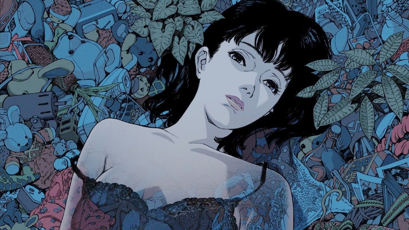
One thing that iyashikei anime does incredibly  well is the usage of colors. Color palette is extremely important, as it draws the “involuntary attention” of the viewer and immerses them into the landscape of the anime. By using bright and pleasing color palettes, the viewer’s eyes are relaxed. Even just physically, my eyes sometimes have to squint in order to make out things in a darker palette. Compare some screencaptures of iyashikei anime versus plot based anime/TV.

Tanaka-kun wa Itsumo Kedaruge
Non Non Biyori
Psycho Pass
Game of Thrones

Obviously in addition to beautiful visuals, it’s important for an iyashikei anime to have standout soundtracks in order to immerse the viewer into the anime’s universe. Hopefully you understand what I mean from all the OSTs I’ve showed you in between sections.

Lastly and perhaps most importantly, is how iyashikei paces itself. It’s slow. You would have to watch an iyashikei anime to understand it, but the reason why the episodes move slowly is to give the viewer time to breathe. Again, by slowing down the pacing of the jokes, the events, and the character interactions, iyashikei achieves its goals of relaxation and refreshment.

Unique

OST-3

I think that iyashikei is really interesting because it is uniquely a subset of Japanese media. No other country has the same kind of genre in its media. As the Japanese work-life balance stays so brutal, iyashikei media is coming out in greater numbers, and it’s interesting to see how this unique genre can say a lot about the society it comes from.

Non Non Biyori

It’s sort of hard to understand why someone would want to watch a show where almost nothing happens, but it’s a difference of cultures that is pretty cool and I hope I shed some light and interested you in the idea of iyashikei.

Tanaka-kun wa Itsumo Kedaruge

Thanks for reading!

Sources: (probably the only time you’ll ever see academic papers here)

Roquet, Paul. “Ambient Literature and the Aesthetics of Calm: Mood Regulation in Contemporary Japanese Fiction.” The Journal of Japanese Studies, vol. 35, no. 1, 2008, pp. 87-111.

Matsui, Takeshi. “Institutionalization of Consumer Needs: The Case of
the “Healing Boom” in Japan” 2008-01.

Some absolutely amazing essays on Reddit:

by /u/DrJWilson

by /u/Z3ria


eyes window soul

Today we’re going to move on from some of the more obvious stuff like fight animation and background scenery that immediately catches the attention of the viewer and move on to something that is crucial yet can go unnoticed pretty often. This is character design, and today we’re going to talk about one of the most standout parts of character design in anime: the eyes.

The problem that any creator of fictional stories has to face is to how to properly communicate the personality, the emotions, and the struggles that the characters face. In anime, animators can convey how the characters feel by manipulating the visual aspects of the show. And because anime, just like any other form of entertainment, is composed of tropes, eventually there are guidelines for a viewer to correlate physical appearance to personality.

Eyes make anime unique because they’re so varied and often are the focus of a shot when the character goes through some emotion. It’s important to note than other aspects of character design – clothes and hair especially, are also crucial. Also when I draw, eyes are the most fun to do because they can tell so much about the subject.

~~~~~~~~~~~~~~~~~~~~~~~~~~~~~~~~~~~~~~

How to Show Character

To show how eyes can shape a character, let’s take a look at an anime all about its characters: Hyouka

I just want you to look at the eyes of Chitanda (top) and Oreki (bottom) and you can instantly tell the difference between their personalities. Chitanda is enthusiastic, charismatic, and passionate. Oreki on the other hand, is downcast, tired, and just isn’t interested. Now how do their eyes portray this?

First, it’s easiest to spot out the angles of their eyelines. While Chitanda’s eyes are curved in an arc, Oreki’s eyes are shaped flatly and the entirety of his eye portrayed in a very linear fashion. Eyes that are wider towards the center and narrower at the sides and have a slanting outward or round shape like Chitanda’s usually show off a “soft” personality. This can convey things from how nice a character is to how naive they might be. In contrast, a slanting inward or level eyeline often portrays someone with a “hard” personality, which can mean things from cynical to even aggressive. The difference between a round eyeshape and an angled eyeshape is extremely easy to tell.

Additionally, Chitanda’s eyes just take up more space on her face and are positioned lower, and commonly shows innocence. Oreki’s eyes are higher up on his face and smaller in comparison.

In Hyouka, the design matches the personality of their characters – Oreki is passive and apathetic, only wishing to save his energy as he makes his way through high school. On the other hand, Chitanda is bright, curious, and innocent. Their relationship can be pretty easily discerned by this clip – you don’t need to know Japanese to see how they work with each other.

~~~~~~~~~~~~~~~~~~~~~~~~~~~~

Identifying the Antagonist

If you’ve ever watched a story with an antagonist, you’ve probably felt that feeling of “oh shit this guy is bad news” before. For animators, it’s a fine balance between making some normal looking guy suddenly become the main villain and making him a little too obvious.

I’m a good person that helped you haha 🙂

For this, we can look to Psycho – Pass, a story about the morality of a justice system that imprisons people judged to have high “Crime Coefficients” (those most likely to commit a crime).

Again, look at the difference of eyes in these two characters.

Notice again the difference in eyeshape. Akane Tsunemori (top) is a new police recruit, hoping to be able to reduce crime in her city. At the start, she’s extremely naive about the true inner workings of the city. Shogo Makishima (bottom) on the other hand is the main antagonist of the story, and is vastly more cynical and aggressive than her.

~~~~~~~~~~~~~~~~~

0 -> 100

Another way eyes can shape how we think of characters are how they change. In these two pictures Ryougi Shiki of Kara no Kyoukai has two very different sets of eyes that portray different things. In the first she has a staredown gaze with not too much expression in it – there’s no iris, simply a gradient of gray with a single reflection in her eyes. Compare this to when she’s using her abilities – her eyes burst with color and become extremely intense. Also, you can still tell what type of person she is if you look at her eye lines in the first picture – again it’s consistent with the usual guidelines.

I barely covered anything in this blog post about character design – there’s so much more I haven’t talked about, I don’t know and will probably never know. However, I hope that this helps you think about how any form of media uses its visuals to define its characters.

More Stuff:

https://www.quora.com/What-do-eye-shapes-mean-in-anime-and-manga

How to Draw Anime and Manga Eyes to Show Mood & Personality

BEAT THAT GUY UP!!!

I’m actually too lazy to talk about spoilers, so just assume that everything here is spoilers for everything. Be warned.

Let’s face it. Fighting is entertaining and can often make or break a show. One of the reasons I got into anime in the first place was because I thought the fights were amazing. Today I’ll be looking at how a show uses action scenes to elevate the anime it’s in. However, I’m only going to analyze the audiovisual aspects of the fights because while the other parts of the fight such as emotion, context, and stakes are important, ultimately that’s up to the anime as a whole and how it is written. I will, however, talk about how they portray those emotions through an audiovisual context. Of course these opinions are pretty subjective in nature but I feel that my preferences are shared by the majority of the others watching.

Choreography

I love, love, love fight choreography, and live action and anime can both excel at displaying how cool and powerful characters can be. Directors like Jackie Chan do some AMAZING things with their fight choreography, and have mastered the art of making fight scenes entertaining and fun to watch.

So to start off, generally fight choreography is terrible when you watch two buff guys just clashing weapons over and over again on the same plane. What elevates fight choreography is the variety that different techniques can produce in a fight, and how the fighters in question use their environment to gain the edge over their opponent.

So first, let’s watch one from the master, Jackie Chan.

This scene is so cool because Jackie uses every prop possible to fight with, creating a much more varied choreography that always feels fresh. The way he and his enemies interact with objects is eternally entertaining. If you want more info on how Jackie produces his fights, look on Youtube or in my more info section down below.

I think every good anime fight requires good choreography, and the final fight of Sword of the Stranger definitely delivers. Note again how they use their environment – snow, planks, ledges to straight up go for the kill.


https://www.youtube.com/watch?v=csvfN3rLos8

Samurai Champloo takes the rhythm of jazz into its fighting style, with its participants using the environment to interact. Additionally, the strikes perfectly use the idea of space – it always feels like if it were not for the dodges or blocks from the other fighter, that they would instantly be slashed. This idea of spatial relationships is crucial for fights.

Cinematography, Fluidity, and Pacing

The editing of a fight is CRUCIAL to how the fight feels and the impact of the blows. If you don’t believe me, watch how Netflix’s Iron Fist botches a fight scene with 56 cuts in a 35 second fight scene. (Since streamable shows up as really small, you’ll have to just go to the link. Sorry.

(https://streamable.com/cmctg)

Not only is this fight scene messy, chaotic, and I literally can’t tell what the fuck is going on, but it’s a supposed superhero versus a nobody. This fight should have never been this difficult for him.

Now cuts aren’t bad, and in fact, they’re essential, but good editing should not destroy the flow of movement in a fight scene. Here’s some fluid animation from Attack on Titan.

What I think makes this scene so nice is how there are very few cuts (this is the modified version, the original has two cuts showing Mikasa’s target), but also how cleanly her body moves along the walls and with her gear. The camera follows the character instead of mindlessly cutting around to destroy the fluidity of the shot.

Another amazing example of fluidity is the hallway fight scene in the fifth movie in the Kara no Kyoukai series. Here we see the main character, Shiki, effortlessly slicing her way through a horde of zombies. In the two shots of her running through them, the camera does not cut at all, instead following her figure as she dashes through the hallway.


Special Effects

There’s not really too much to talk about here, except that special effects can elevate a fight to the highest, and even cover up deficiencies in other areas of the fight. If you want anime fights to spark and glow, watch ufotable’s animation of Fate Stay/Night: Unlimited Blade Works.

While I find choreography and cinematography more important than the usage of special effects, no one can deny that this stuff is orgasmic for the eyes.

The Rule of Cool

So I’ve gone over important characteristics of any fight scene, but what makes anime fights so appealing? Probably the major advantage is simply that animation can get away way with way more than live action ever could, just by suspension of disbelief. Seeing live action characters acting out these scenarios would just look simply ridiculous.

For example, the 3 Dimensional Gear used in Attack on Titan is physically impossible and looked pretty dumb in the Japanese live action.

https://vimeo.com/149594621

(Go to 3 minutes for more exciting action)

And this fight would also look straight stupid in real life – two superhumans flying around at the speed of light with punches and light and debris everywhere. It’s completely ridiculous but in the context of the show, One Punch Man, it’s just a normal day. Also I’d like to note that the fluidity of the animation is amazing here.

If you weren’t convinced by the previous two fights, how about magical girls flying around pulling guns of varying size literally out of their skirts, shooting each others’ bullets out of the air, stopping time and using rifles to fight with in hand to hand combat. This is Puella Magi Madoka Magica, and the whole package is amazing.

Anime fights can be fucking ridiculous, but that’s what makes them so cool.

More Stuff on Fights:

https://www.youtube.com/watch?v=dT_7Fwplecw

Makoto Shinkai – Beauty Creates Emotion

Note: major spoilers for 5 cm/s, Minor spoilers for The Garden of Words and Your Name.

Shinkai’s Rise

LISTEN

Makoto Shinkai is a name you might have heard mentioned here or there, and for good reason. His most recent film, Your Name, has taken the film community by storm, most notably for its amazing visuals and beautiful music. Your Name follows a trend of just pure beauty that Shinkai has put out throughout the years. Here’s an example of how Shinkai elevates fiction over reality, from his 2013 film, The Garden of Words.

Yeah. When I first saw this album of pictures posted by zixyon on imgur, I could barely differentiate the anime world and the real world.

Shinkai’s films all contain or are focused around romance, and it’s fitting that he uses such breathtaking visuals to accompany a romantic theme. His goal in every movie is to explore the emotional connections that humans build with each other and scenarios that can change how we feel. He also heavily uses the idea of distance between people, whether physical or emotional. As I said with Satoshi Kon’s movies, one really just needs to watch one of his movies to get the full experience. Where Kon uses bombastic imagery and surreal plots, Shinkai uses subtle characterization and quiet human interaction. Scenes are often without dialogue, just body language and beautiful backgrounds.

More than anything however, Shinkai’s art creates awe. His long-panning shots over pastoral landscapes and shots of rainy cities are orgasms to the eyes.

Here are some examples:

https://vimeo.com/228661227

There’s a reason why Shinkai’s 2011 film 5 Centimeters per Second has been widely considered as 5 Wallpapers per Second instead. The sad song is even more powerful if you consider that the real life singer wrote it for his dead girlfriend.

https://youtu.be/c_fmGgA5ShY?t=10m2s

(skip to 10:00 for the scene if timestamp doesn’t work)

This montage scene from The Garden of Words is absolutely breathtaking and it tells so much about the characters with so few words.

Emotion of Color

LISTEN

Color in any form of media greatly changes how we perceive the emotions of the story. Here, we can see a shot that Shinkai essentially reused, except with a completely different color palette that corresponds with the themes of the anime.

Train in The Garden of Words

Train in Your Name

The tone of The Garden of Words is far more down to earth and subtle, with the focus on a schoolboy and a woman that skip school and work on rainy mornings together, both of whom have no idea of direction for their lives. It revolves about how they struggle to find themselves and thus the colors are more muted and earthy.

By contrast, the plot of Your Name is far more surreal, with a boy and a girl swapping bodies in their dreams, lends itself to a far more dreamy color palette. Shinkai portrays the magical realism setting perfectly with a blurred vignette and brightened colors.

In general, Shinkai’s color usage is visceral in evoking the emotion of the characters and the mood of the movie.

Shot Composition:

LISTEN

Every director uses shot composition in order to help the movie flow better for the viewers, and Shinkai also uses his shot composition to add on to the themes of his story. In 5 cm/s, the main character, Takaki, is stuck in life, forever in love with a girl that he was in a relationship in that moved away. He’s constantly thinking about her – every day, every night- which leads to the deterioration of his relationships (He shrugs off a girl, Kanae’s affection because he’s always thinking about Akari, the girl who moved) and eventually his spiral into depression at the end of the movie. It’s a movie with a lot more substance than I can just describe with one short analysis, but I wanted to impress you with how much thought Shinkai puts into his direction. From /u/nap682 on Reddit,

“The quadrant system I talked about shows Balance on screen in Act 1, the characters usually are equally on the right side of the screen and the left, and they move left and right equally. However, as the film goes on, Takaki shows up more and more on the right side of the screen, looking left. Now think of the movie like a book. since it’s Japanese, the story moves right to left. Takaki frequently is on the right side of the screen, looking left but rarely actually moving in that direction. He’s always looking for Akari in his future but she simply isn’t going to be there. An aspect that he refuses to accept so he remain stagnant on the right side of the screen. As comparison, Kanae has a similar issue but after she has her talk with Takaki about “only doing what you can”, her next scene is her running off screen to the left, moving on into her future. It actually isn’t even until the last scene of the movie in which Takaki moves off screen to the left, the railroad crossing, and that scene is very interesting in and of itself. Akari may or may not actually be there, but the important part to recognize is that Takaki turns backwards to the right to try and see her. He’s looking into the past. It is almost like the final trial of if he will move on with his life or run back into his past to search for Akari once again. But he no longer chases after her. He shows a bittersweet smile of accepting that the past is the past and he must continue on into the future, turns, and walks off stage left. And thus the movie ends with a somber piano. Now the piece itself might seem just plain sad but it has a minor pick up in pace periodically that I mark as those moments where, even though life is sad, you hold onto a happy thought long enough to push you through to the next chapter of your life.

I hope that you have been incentivized to watch some scenery porn, and encourage you to look for these kinds of directional tools in other media forms. It’s pretty cool.

References/Learn More:

Garden of Words pictures: https://imgur.com/gallery/VoxHX

Analysis of Your Name OP: https://youtu.be/oikCyrqFLso

Quadrant System:  https://www.reddit.com/r/anime/comments/33dqx9/wt_5_centimeters_per_second_a_story_of_longing/?st=j842eaoj&sh=6e634e37

Or just watch the damn movies.

Satoshi Kon’s Dreamworld

Note: contains major spoilers for Perfect Blue and Paprika, minor spoilers for Inception, Requiem for a Dream and Black Swan

Note #2: because I think music enhances the reading experience, I have taken some soundtracks from the relevant anime that could add to the mood or something like that. Also they give a better idea of what the film is like. I don’t know. Enjoy.

Note #3: This is by no means a comprehensive review of animation and cinematography. In order to get a full idea of what I’m talking about, just go and watch the anime. If you want to learn even more afterwards, then look at my links below – my objective is to introduce people to certain aspects of animation.

An Introduction

Music 

Satoshi Kon was an animator, film director, and screenwriter from Hokkaido, who died sadly in 2010 of pancreatic cancer at the age of 46, leaving behind five works of avant-garde audiovisual media.

While Satoshi Kon might not be very famous in the West, his cinematography and style has influenced some of the most famous contemporary western films.

In particular some scenes from his movies were straight lifted – Darren Aronofsky, maker of films such as Black Swan and A Requiem for a Dream purchased the rights from Kon’s Perfect Blue and used one of his scenes in Requiem for a Dream.

Aronofsky’s Black Swan also shares many plot similarities to Perfect Blue in transforming an actress’s life into a living psychological hell. A scene from Perfect Blue of the main character looking at her reflection in a train is also used in Black Swan.

Christopher Nolan’s Inception also includes a few scenes that seem to pay homage to Kon’s Paprika, which is also about a dream machine.

Is Inception a rip-off of Paprika?

Is Inception a rip-off of Paprika?

However, I’m not saying that Aronofsky and Nolan ripped of Kon, but Kon’s influence is undeniable across the world of film.

The Dreamworld

Music

Kon produced four movies and a 13 episode TV show, and all of them except one focused on the blurring between reality and dreams. This is where he takes full advantage of the animation medium, and where I believe he excels above all others. While Nolan’s Inception might be a mindfuck with all the changes in dreamworlds (note: I have not seen Inception, only clips and plot summary), I don’t think it can compare to what literally amounts to LSD trips.

The Youtube channel “Every Frame A Painting” has a great video on Kon (which I’ll link at the end, and probably tells this story better than I do), and he says “the opening four minutes of Paprika has five dream sequences, and every single one of them has a frame cut – by comparison the first fifteen minutes of Inception has four dream sequences, with only one match cut.”

Here is the opening in question (the only version I could find was subbed in spanish, sorry):

When I first saw this scene, I was stunned and confused. I had already watched a few of Kon’s earlier movies, so I knew what to expect, but I was not prepared for this. There are constant breaches in the barrier between dreams and reality, with people turning into cameras, dinosaurs, guitars, and dolls dancing in the streets. There are even more trippy scenes later – this parade scene is just a major WTF moment.

The scenes in Paprika are just so incredibly surreal that it’s absolutely impossible to draw the line between dreams and reality – the entire time they’re joined eternally together. Paprika also makes statements about the internet and our consciousness as humanity, statements that seem much more relevant as our lives become increasingly interconnected to the web.

However, as we’ll see with Perfect Blue, Kon’s techniques are not just for detailing a scientist’s LSD trips – he can create a variety of emotions, including terrifying the fuck out of us.

Music for this section: https://www.youtube.com/watch?v=EBxsRiG5eYU&feature=related

Perfect Blue is about Mima, an idol, and her descent into madness after she leaves the idol scene to become an TV actress and eventually gravure model. A stalker surfaces as pictures inside of her room are posted to the net and her every action is written in complete detail (such as how she gets off the train). She gets faxed paper filled with the word “Traitor”. Scenes become increasingly disorienting and insane as people around start getting injured – first, a man delivering fanmail gets severely injured from an explosive trap set up in the letter. Mima agrees to be fake raped in her TV show, but the scene is so graphic it’s hard to tell whether or not it’s real (and also gives Perfect Blue its R rating, it definitely deserves it) Eventually it’s impossible to tell the difference between dreams and reality again. At many points in the film an event might seem to occur in Mima’s life, only to be revealed instantly that it was part of her acting job. As people connected to her show “Double Bind” get killed off, and an imposter called Me-Mania that runs the stalker website claims that they are the real Mima and that the current Mima is a fake, Mima’s sense of reality becomes shattered. Loosely and confusing scenes are repeatedly shown as Mima’s life falls apart, and the audience begins to wonder what Mima’s brain is thinking. An alter ego Mima shows up in her idol dress

and begins to torment her endlessly during her production and in her daily life. It’s hard to show with clips just how disorienting this editing is – it takes a full watch to truly comprehend how disturbing it can get. (Also

Watch a clip of Mr Nerdista from YT explaining just how brilliant Kon’s editing is here. Only watch until 5:05 or just stop after he talks about Requiem for a Dream, because there are major spoilers in this video.

Why Anime?

People not accustomed to anime might ask why animation has any advantage over live action in this sense. Here I’ll quote Kon himself in an interview:

“I think editing for live action and animation share some similarities but are fundamentally different. If you show a photograph or a painting for five seconds, the volume of information is different. However you shoot a photograph or film, there’s a lot of visual texture, colour and extra information to take in. Whereas in animation, only what is intended to be communicated is there. If I had a chance to edit live action, it would be much too fast for audiences to follow. In animation, the audience understands this momentum.”

Because anime is essentially created from just the imagination of the directors and scriptwriters and artists, the options you have to display scenes are larger. Kon took advantage of this and cemented himself as one of the greatest anime directors ever.

Sources

Interview Source: http://www.midnighteye.com/interviews/satoshi-kon-2/

Paprika/Inception comparison: http://www.agonybooth.com/inception-ripoff-paprika-26479

Kon picture: https://en.wikipedia.org/wiki/Satoshi_Kon

Perfect Blue pic: http://blog.alltheanime.com/perfect-blue-horror/

Learn More – If you’re actually interested in anything I said

Kon in general: https://youtu.be/oz49vQwSoTE – pretty much this blog post, just better and in video form.

Perfect Blue is Scary: https://www.youtube.com/watch?v=MJmK5SOeQBc

Color Theory in Perfect Blue: https://youtu.be/2D9iZfedoiY

Perfect Blue Analysis: https://www.youtube.com/watch?v=3u1J3BIfwG4

Animation in Perfect Blue, getting down to the nitty gritty of frame time and art techniques: https://www.youtube.com/watch?v=zPbrjieNFtI

Interview with Satoshi Kon: http://www.midnighteye.com/interviews/satoshi-kon-2/

Making of Paprika Pt. 1: https://www.youtube.com/watch?v=hlHCdi6ASE0

Making of Paprika Pt. 2: https://www.youtube.com/watch?v=EFGa4tpM-iM

Paprika Analysis: https://www.youtube.com/watch?v=vwtSxbq8Hqo

Match Cuts: http://www.davidbordwell.net/blog/2011/05/25/graphic-content-ahead/


Animation and Cinematography

I am planning to write about animation and cinematography for my passion blog. I have always enjoyed watching anime and analyzing how characters and stories are portrayed by the usage of visuals and sound. I have already started my first blog post on the anime Ping Pong the Animation. Each blog post will generally look at one point of interest in an anime and talk about it in length, including pictures and clips of the show.

Another subject I will probably write about are the cinematographic techniques of Satoshi Kon, particularly his use of match cuts to blend dreams and reality.