APDEM803 L05 Business Demography Unit Summary

To: Dr. Alexis Santos

From: Ben Winston

Subject: APDEM803 L05 Business Demography Unit Summary

Date: February 14, 2018


The previous few weeks have served as an excellent introduction to business demography and have taught me how applied demographic tools and framework can be applied in the business world. I found the interviews with various alumnae to be relevant and interesting, and clearly see how their demography degrees led them from academia to business. As a professional at a political polling company, it is evident that these tools could aid me in my own line of work.

Business demography is a main application of demography in the professional world: it can be described as the application of demographic principles to inform corporate decision-making. Demographics inform companies’ understanding of their customers, targeting of new customers, and research on their customers.

The three business demography practitioners had a similar perspective on the demographic framework and applied demography but subtly different applications of it in their respective fields. Dr. Sturgeon uses demographic data with his company Demographic Intelligence, putting out fertility forecasts before the CDC to help companies predict and react to fertility data in nearly real time. Dr. Howard sells demographic data in a proprietary database at Infogroup to help non-profit clients fundraise most effectively and determine what demographic groups are most likely to donate to particular causes or respond to particular outreach efforts. Finally, Dr. Cameron works in higher education applying demographic principles to predicting how different groups of people might use his company’s service and enroll in school.

Each practitioner is helping companies increase their profits – whether by expanding their reach or platform, better understanding their target audience, or helping them more effectively reach consumers. Each practitioner uses data to accomplish these goals and takes an approach that recognizes and measures differences between demographic groups.

This application gels with how the field is described in the Swanson, Burch, and Tedrow article (1996) in a number of ways:

  • The authors describe applied demography as a field where, on the triple constraint perspective measure weighing accuracy, time, and resources (Rosenau 1981; Swanson 1986), applied demography sometimes accepts a lower performance specification because of time and resource constraints in pursuit of helping a client. All three practitioners here acknowledge that the type of demography they do may not hold up to academic standards or answer a question “just to answer it” as an academic might; instead, they look to help their clients to make decisions quickly and cost-effectively.
  • The article notes that applied demography focuses on the present and future, rather than the past (prediction, not explanation); each of the practitioners here are doing more than observing past behavior but helping clients predict consumers’ behavior in the future.
  • The article – written more than 20 years ago – noted a divide in the field between whether applied demography sees itself as a narrower field limited to estimates and projections, or a broader discipline that has a central role in public sector decision-making. My guess would be that the practitioners discussed here see applied demography as a broader discipline with a more active role in decision-making (though they work in the private, not public sector).
  • The article notes that applied demographers serve a specific client and use their data towards an actionable end. The three practitioners clearly help their clients not just understand their customers but make concrete decisions to reach them. Though it was not from the practitioner interviews, we practiced that type of work by suggesting how Lego could better target adult audiences domestically and abroad: suggesting concrete ways for them to engage more individuals on social media based on survey data.

Having been in the business world for a few years, I understand how these applied demographers bring a perspective that others don’t have. Grounding one’s insight in data is surprisingly rare, and being able to approach and solve problems from a demographic perspective is not something that a lot of people know how to do. Many business executives tend to rely on ‘gut instinct’ or ‘past experience’ rather than trusting data and analytics that demographers can provide.

Furthermore, applied demographers come ready with knowledge of tools and programs to help answer these questions: GIS, R, SQL, SAS, Tableau, and other programs. One of my goals coming into this program was to develop my technical skills in at least one or two of these programs. Those skills are not only highly marketable, but very useful in digging into and presenting data.

One example illustrates how these demographers’ work is different than what an academic demographer might do. Dr. Sturgeon puts out a birth forecast each year before the CDC, which has a year and a half lag in reporting those births. Clearly, the CDC’s estimate is going to be more accurate than Demographic Intelligence’s estimate: with the added certainty of 12-18 months of time and a more granular analysis, the CDC can arrive at a better prediction. Yet, there is clearly value in Demographic Intelligence’s early estimate. As Dr. Sturgeon says, they can sell that data to companies like vaccine makers or formula makers or diaper makers who want to quickly get a sense of how many people are born in certain geographies/demographic groups, even if not an exact number. Dr. Sturgeon sums up this tradeoff: “our goal there is really just to put out the best birth forecast that we can based on all the available data and a whole slew of predictors.”

The practitioners also warn of not letting perfect be the enemy of the good. In other words, you may have messy data, but you just have to do the best you can with it. Sometimes, you won’t be working with perfect datasets – there may be errors, omissions, repeats, and so forth. Still, while it is good practice to divulge any margin of error or assumptions to the client, you can still draw conclusions from messy data. Dr. Cameron describes this challenge in detail:

“So I would say that one of the most important things I learned, once I left academia, so to speak or once I got my degree and actually start working in the business field or in the business area was I really had to become more familiar with what kind of data is available and how best to work with that data. Because those different types of that and some of it’s pretty messy. And you find yourself spending a lot of time understanding the data that you’ve got and how to ask the best questions of the data and then how to draw out the insights you can get from the data.

[…]

The one area where I wish I could have gotten more experience is working with messy data. Because most of the data that we had available was pretty tidy and pretty clean data. It was already processed. It was set up to work fairly easily for a graduate student.But when you get out into the business world, you’re going to work with a lot of data that doesn’t want to cooperate very well, that has a lot of missing values, that the format is messed up. You have to reformat it. You have to manipulate the data quite a bit. And you find yourself spending more and more time getting the data into a place where you can actually begin to analyze it.”


In sum, this unit examined how three applied demographers have used their background and unique perspective to thrive in the business world, and have given me ideas for how this program could help apply to my field and beyond it.


References

Rosenau, M. (1981). Successful project management. Belmont, CA: Wadsworth.


Swanson, D.A., Burch, T.K. & Tedrow, L.M. Popul Res Policy Rev (1996) 15: 403.      https://doi.org/10.1007/BF00125862


Author Profile SRBE

APDEM803 Author Profile SRBE

My research question considers how Americans’ methods of commuting transportation have changed since 2000 and how municipalities can (or should) shift their resources to address these changes. I suspect there have been changes in how many Americans are taking public transportation, biking, or walking to work – and that these changes have come disproportionately in certain regions or among certain demographic groups. Yet, many cities fail to properly fund public transportation, bike lanes, and so forth, spending most of their resources on car commuters.

Both elements of this question require a demographic framework. First, I will use Census and/or ACS data to observe changes in commuting over time, broken down by demographic or geography. A demographic approach allows for an interpretation of this data in context. The second part of the question is an applied one: how should municipalities allocate resources based on these results? An applied demographic approach will allow me to make recommendations to this hypothetical ‘client’ based on the data.

I decided on this question after significant thought and online searching. I initially wanted to consider a topic relating to differences in partisanship over time by urbanity. However, I faced a challenge in accessing data that could answer such a question. Instead, I decided to work backwards: browse the Census website extensively until I found a topic that interested me, and one for which I knew helpful data already existed. Such a process was useful in this context as it allowed me to ensure that I had a proper dataset to answer my question. I recognize that in a real-world context, one does not always have the benefit of choosing a question where easily accessible data already exists, and applied demographers must instead locate (oftentimes messy) data that can answer a question posed by a client.

APDEM805 L04 Assignment

To: Dr. Alexis Santos

From: Ben Winston

Subject: APDEM805 L04 Assignment

Date: February 4, 2018


Following the instructions outlined in the  L04 lesson, I accessed by L02 spreadsheet with population data from the 2000 and 2010 census for Riverside County, CA. Next, I navigated to the American FactFinder website, searched for “Population Estimates 2015” with the geography “Riverside County, California.”  A top result was a table called PEPAGESEX which showed 2015 population estimates from the ACS. I clicked on that table, downloaded it in excel, adjusted it so that I was only viewing the age groups and total population estimate per cohort, and copied it into my spreadsheet. I then adjusted the salutation tab of the spreadsheet and file name, and saved.

APDEM 805 SRBE – L04 Assignment

To: Dr. Alexis Santos

From: Ben Winston

Subject: APDEM805 SRBE – L04 Assignment

Date: February 11, 2018


The blog entry below reflects upon the experience of completing the APDEM805 L04 assignment in early February, 2018.

The assignment was relatively simple: it required me to download a file from the Census website, format it in excel, and describe those steps in a technical paper. Given the simplicity, the greatest challenge in completing the paper was expanding on the process beyond the one-sentence description. I aimed to describe each of the steps I took, but in retrospect, I would have done two things differently. First, I would have gone into more detail. Second, I would have tailored the writing to a non-technical/uninformed audience.

Downloading, formatting, and writing about census data was not something I had done before. Therefore, completing prior assignments like the L02 assignment was a crucial introduction to this exercise. I had also never made a separate tab of an excel document into a “salutation” tab, so it was helpful to learn the standard of doing so, including documentation, date, and assignment name.

In truth, finding the correct population table on American FactFinder took a few minutes. My first couple searches proved fruitless – or did not contain data from the right year. But when I stepped back and searched for “Population Estimates 2015” with the geography “Riverside County, California,” the top result was a table called PEPAGESEX which showed 2015 population estimates from the ACS. From that point on, I did not have any major challenges in completing the assignment.

I believe this assignment was an important and useful step toward becoming comfortable finding, downloading, handling, and writing about census or ACS data. Of those four categories, I have encountered the biggest challenges in FINIDNG the right data. Once I’ve located the data I need, I feel as though I have a better grasp of how to use and discuss it. But I would appreciate continued practice in locating particular data sets on the census site.

SOC 573 Final SRBE

Drafting a proposal for my final report was a very important stage of this project. It allowed me to narrow down the scope of my ideas and focus on a particular topic with a particular goal. At this stage, looking for sources for my topic was less important, and I might not do it again – just figuring out the structure and aims of my paper was the main goal.

Creating a rough draft of my final report allowed me to do the data analysis and incorporate it into the paper without (yet) worrying about its implications or conclusions. I was able to build a structure of the paper upon academic literature and newspaper articles and then use the data analysis to further those conclusions.

We did not complete the peer review process for this assignment: I neither reviewed another paper nor was given any feedback on my draft. Still, having the assignments spaced out over time forced me to do things ahead of time and not procrastinate too badly.

I’m both proud of and somewhat frustrated by my final paper. I think the scope was a bit too broad – there would be endless literature on the subject and endless analysis I could do – I feel as though I only scratched the surface. Furthermore, I’m a bit frustrated that I have not yet developed sufficient data analysis and mapping skills to do a true deep dive into the data, run regressions, things like that. And I found some DC data inaccessible at the zip code level; I should have worked from the census tract level from the start. Still, I think the paper does well in addressing the prompt and adding to the discussion.

If I were to do this again, I would do more work on the front end to determine what data I could find and work with, before making wild assertions that I didn’t have the data to prove. In other words, I’d find an interesting data set, then analyze it and build conclusions around it, rather than having a hypothesis and trying to prove it with data that may or may not exist.

One challenging aspect of writing this paper included finding relevant academic literature to a phenomenon that is fairly recent and still ongoing, and very local. There is research on gentrification broadly and on Washington DC broadly, but little other than news stories about what is going on right now, right here. I was able to find some recent books and articles by using the LionSearch function and Penn State libraries, as well as Google Scholar, but not as many sources as I would have had I picked a more historical topic.

Another challenging part of this paper involved handling data from different sources. Some data sources provided numbers at a zip code level, while others provided it at the census tract level, and others provided it at neither. This made integrating all the data into one analysis very difficult.

SOC573 Final Paper: The Impact of Gentrification in Washington DC

The Impact of Gentrification in Washington DC

Washington DC serves as our nation’s capital and a setting of great cultural and political importance. But despite its outsized role on the cable news networks, its 650,000 residents are frequently overlooked or ignored – not least by the founders of our government, who denied Washingtonians any voting representation in Congress.

DC is not a titan in terms of population: it barely makes the list of the largest 25 cities in the United States. Still, its demographic profile is noteworthy and the change it has undergone over the past generation merits study. The following paper analyzes demographic trends in Washington DC with particular focus on the process and impact of gentrification. It finds that DC’s population has changed in its age and racial composition, with most new residents being younger and white. Furthermore, it finds that residents in mostly white neighborhoods tend to own more valuable houses and have higher levels of educational attainment. It concludes with a discussion of steps that can be taken to acknowledge and begin to address the effects of gentrification in the city.


Demographic Profile of Washington DC

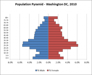
Washington DC is a city of over half a million people: 601,723 in the 2010 census, and estimated at 647,484 by the American Community Survey in 2015. It has an interesting population structure, shown in Figure 1 below. Thanks to a robust labor market in the government, politics, consulting, and law sectors that attracts people of young working age (20-40), DC has a dearth of children, particularly of elementary school age, and a wealth of young professionals. Meanwhile, there are relatively few older working age individuals or retirees: as individuals have families and become more senior in the workplace, many choose to move out of the city to the suburbs or leave the government / government sector (and the DC area) entirely.

 Figure 1: Washington DC Population Structure

One result of this trend is that DC has an extremely low dependency ratio, both in terms of aged dependency and child dependency. As shown below, each of those figures is – by a wide margin – lower than any state in America (Howden and Meyer, 2011).

Table 2: Dependency by State

The sex ratio of the DC population is about 90, meaning that there are roughly 90 male residents per 100 females. As in most areas, there are more males than females at younger ages (0-9), but more females than males among seniors (65+).

As of the 2010 census, just over half of DC’s residents identify as black, 38.5 percent identify as white, and roughly 10 percent identify as Asian or other races. The Hispanic/Latino population is about 11 percent, though will not be considered a distinct race category for the purpose of this analysis.

 Gentrification

Gentrification is not a concept that has a strict academic definition. However, it is generally understood to involve “the movement of people with relatively higher socioeconomic status into distressed neighborhoods and the displacement—either through increases in housing prices or other means—of existing lower-class residents. In most, but not all, examples of gentrification in U.S. cities, the new residents are middle- or upper-class whites while those being displaced are lower income African Americans” (Sturtevant 2016). Prince describes gentrification from the African American perspective: “Gentrification means ‘not belonging’ in areas of the city that were once commonly known or frequently traversed. It is visiting elderly kin in neighborhoods that have become unfamiliar, witnessing the declining use of informal but cherished place-names for parks and communities in public discourse and the mass media, doing a double take while walking by the tanning salon that has popped up in your neighborhood or the drawing of racial battle-lines at the local, listener-sponsored, progressive radio station” (Prince 11).

In Washington DC, this process manifests itself in predictable ways: as new, higher-income, younger, and disproportionately white residents move into the city, many longtime (and disproportionately African American) residents have been pushed out. Gentrification has been occurring in the District for decades. Lloyd identifies the process as far back as the 1970s, when a crescent of neighborhoods surrounding downtown DC quickly experienced significant residential displacement and racial change whereby “single whites and white couples replaced black families” (Lloyd, 2015). In DC’s Shaw neighborhood (where I live), the population dropped from 78 percent black in 1980 to 44 percent in 2010 and surely lower today. Meanwhile, housing prices in Shaw jumped dramatically: the median price from $147,000 in 1995 to $781,000 today. Even adjusted for inflation, the average family income of Shaw residents nearly tripled from 1979 to 2010 (Gringlas, 2017).

DC’s status as a “federal city, a locus for rapid demographic change, and a major tourist destination” and its location bordering “the American north and south” and being both “at once a provincial small town and the anchor of a global metropolitan area” have contributed to its swift demographic transition (Prince 11). The demographic data shows this transition very clearly.

DC’s population rose from 1900 to 1950, hitting an apex of 800,000 residents. It fell gradually to below 600,000 in 2000, then rebounded to above 600,000 in 2010 – and has risen further since then (Sturvetant, 2016).

 Figure 3: Washington DC Population by Census Year, 1900-2010

The age structure of DC’s population has changed somewhat in recent decades, as shown in Figure 4. Since 2010, the population additions have come disproportionately from young children (0-4) and young working age adults (20-40), as well as some seniors (50-65).

Figure 4: Washington DC Population Structure, 2000-2010

Furthermore, the rebounding population since 2010 (+30,000) has come principally from new white residents (+50,000), while the number of African American residents dropped by nearly 40,000. A chart from CensusViewer.com helps identify exactly who the new white residents are: principally younger white individuals, ages 20-35 (CensusViewer, 2017).

Figure 5: Washington DC Population Change 2000-2010, by Race

Net Change, 2000-2010 Total White Black Asian Other Hispanic
+29,664 +50,286 -39,035 +5,779 +2,838 +9,796

 Figure 6: Washington DC Population Change 2000-2010, by Age/Race

Regionally, the DC Office of Planning notes that between 2000 and 2015, the population swelled particularly in a number of predominantly white neighborhoods: (a) Mount Vernon Triangle, (b) Capital Riverfront, (c) U Street, (d) Columbia Heights, (e) NoMa, (f) Logan Circle, and (g) Foggy Bottom (Office of Planning, 2016).

 Figure 7: DC Population Growth 2000-2015

Inequalities

A closer study of these changes yields troubling conclusions: there are great inequalities, driven by race, across the different regions of DC. In particular, predominantly black neighborhoods tend to have lower levels of educational attainment and lower median property values.

One methodological note: this report uses zip code level data to compare regions within DC, as such data was most easily accessible and manageable. It also relies on relatively straightforward comparisons and correlations. More detailed data (i.e. at the census tract level) would be preferable for a more granular analysis, and more complex statistical techniques (i.e. regression analysis) would eliminate many sources of error and spurious variables. A full map of DC’s zip codes is shown in Appendix 1.

At the zip code level, I grouped DC’s inhabited (500+ population) zip codes into three categories: mostly white (12 zip codes making up 32 percent of the population), mixed race (5 zip codes and 31 percent of the population), and mostly black (7 zip codes and 37 percent of the population).

There are differences in indicators between the groups. Zillow data on median home values by zip code reveals that houses in mostly white zip codes are over $200,000 more valuable than those in mostly black zip codes. In terms of educational attainment, an average of 80 percent of residents in mostly white zip codes have graduated college, compared to an average of 32 percent in mostly black zip codes.

Figure 8: Zip Code Groupings

Category Definition Population (2015) Proportion of City (2015) Median Home Value Non-Coll Grad Coll 

Grad

Mostly White 65+% White 201,966 32% $675,022 20% 80%
Mixed 30-65% White 193,964 31% $588,850 39% 61%
Mostly Black <30% White 228,296 37% $441,871 68% 32%

Simple correlations demonstrate the same point: race is a variable that is closely linked to educational attainment and home prices in DC. Without controlling for any other variables, the race of a particular zip code explains 80 percent of its educational attainment (Washington DC Zip Codes, 2017).

Figure 9: Educational Attainment by Race

And race explains nearly 40 percent of the median home value in a given zip code (Zillow, 2017).

 Figure 10: Home Values by Race

There are many other metrics that would demonstrate the inequalities between different parts of DC: housing values and educational attainment are but two examples. These differences have been magnified as DC’s racial composition has changed, and it will take a concerted, major effort to reverse these trends.

Policy Implications and Discussion

Prince writes that one of the first steps in addressing the negative consequences of gentrification is simply getting all parties to acknowledge the existence of the process itself. She says that many whites have “a tendency to minimize the impact of structural inequality in shaping their place in a changing DC. In this scenario, urban development is viewed as an outgroup of hard work and ingenuity. Conversely, those African Americans who did not purchase or renovate their parents’ homes or prevent crime from sucking the worth out of properties and the enjoyment out of city life, have failed to succeed in the game of modern, urban economic achievement” (Prince 32). So, publicizing conclusions of studies like this one are an important first step to reducing inequalities: gentrifying individuals need to recognize the consequences of the city’s demographic change.

Secondly, offsetting the negative impact of gentrification requires active efforts by policymakers and private businesses to devote resources toward underserved areas. Thankfully, there are signs that this is occurring. For example, Washington DC’s successful bikesharing network (Capital Bikeshare) was criticized early in its existence for locating its ‘docks’ mostly in well-to-do, gentrified neighborhoods. In recent years, it has made efforts specifically to expand into lower-income, traditionally African American neighborhoods like Anacostia. Said a recent press release, “the [eight] new locations will add to the 24 stations already serving communities east of the Anacostia River and connect with  parks, recreation centers, schools, retail establishments, and public transit facilities across these communities” (Bikeshare, 2017). And DC’s new Mayor has pledged to increase city resources in minority communities. In October of last year, she broke ground on a new retail and dining location in Anacostia, saying “this project is another sign of my Administration’s commitment to invest in supportive services and jobs in neighborhoods across all 8 wards” (Executive Office, 2016).

Thirdly, specific local laws giving longtime homeowners more of an ability to remain in their homes can prevent developers from buying homes and bulldozing them. Lloyd (2015) finds evidence that allowing families the ‘right of first refusal’ in selling their property – can be effective in slowing gentrification, though will not stop it entirely. These laws can be hit-or-miss; the Washington Post reports that a city policy designed to reduce gentrification, titled Tenant Opportunity to Purchased Act (TOPA), was designed to protect tenants from displacement but in actuality has not served residents’ best interests (Hauslohner, 2016). But local funding directed toward community preservation can help. According to NPR, federal block grants allocated to cities for community development work can fund affordable housing, improved infrastructure, and community projects. Since gentrified neighborhoods expand the tax base, they should draw higher levels of funding, and that funding should be put toward community preservation (Gringlas, 2017).

The city’s housing market is booming, and “even neighborhoods with the highest concentrations of poverty and crime – places once thought immune to the influx of newcomers – are being eyed by developers” (Gringlas, 2017). Gentrification can bring positive developments: in Shaw, “at least some of the improved resources and services such as lighting, a new library, and a renovated recreation center are welcome changes” (Gringlas, 2017). But city officials will need to continue to push to build affordable housing units, preserve existing low-income housing, and implement policies that benefit long-term tenants in order to slow the appetite for market-rate apartments in ‘trendy’ sections of the city and allow long-term residents to remain in their homes.

References

Capital Bikeshare. (2017).  “East of the Anacostia River Network Expansion.” Retrieved from:             https://www.capitalbikeshare.com/blog/east-of-the-anacostia-river-network-expansion


District of Columbia Office of Planning (2016). Population Trends. 2016, April 26. Retrieved from:             https://dme.dc.gov/sites/default/files/dc/sites/dme/publication/attachments/Office%20of%20Plann  ing%20Presentation%20for%20CSCTF%204%2026%2016.pdf


Executive Office of the Mayor. (2016, Oct 6). “Mayor Bowser Breaks Ground on New Anacostia             Development.” Retrieved from: https://mayor.dc.gov/release/mayor-bowser-breaks-ground-new- anacostia-development


Gringlas, Sam (2017, Jan 16). Old Confronts New In A Gentrifying D.C. Neighborhood. NPR. Retrieved from: https://www.npr.org/2017/01/16/505606317/d-c-s-gentrifying-neighborhoods-a-careful- mix-of-newcomers-and-old-timers


Hauslohner, Abigail (2016, Feb 6). Why a law meant to protect the poor from gentrification doesn’t really       work. The Washington Post. Retrieved from: https://www.washingtonpost.com/local/dc-         politics/why-a-law-meant-to-protect-the-poor-from-gentrification-doesnt-really-            work/2016/02/06/2a26f818-cc40-11e5-88ff-e2d1b4289c2f_story.html?utm_term=.52df1626195e


Howden, Lindsay, and Meyer, Julie (2011, May). Age and Sex Composition: 2010: 2010 Census Briefs.      United States Census Bureau. Figure 8: Age Dependency Ratios by State: 2010. Retrieved from:              https://www.census.gov/prod/cen2010/briefs/c2010br-03.pdf


Lloyd, James M. (2015). Fighting Redlining and Gentrification in Washington, D.C.: The Adams-Morgan         Organization and Tenant Right to Purchase. Journal of Urban History, Vol. 23 (6) 1091-1109.           Retrieved from:             http://journals.sagepub.com.ezaccess.libraries.psu.edu/doi/10.1177/0096144214566975


Prince, Sabiyha. African Americans and Gentrification in Washington, D.C.: Race, Class, and Social          Justice in the Nation’s Capital. Ashgate: 2014. Retrieved from:             https://books.google.com/books/about/African_Americans_and_Gentrification_in.html?id=XWlz            BAAAQBAJ&printsec=frontcover&source=kp_read_button#v=onepage&q&f=false


Sturtevant, Lisa (2014). The New District of Columbia: What Population Growth and Demographic          Change Mean for the City. Journal of Urban Affairs Vol. 36 , Iss. 2, 2014. Retrieved from:           https://doi-org.ezaccess.libraries.psu.edu/10.1111/juaf.12035


Tatian, P. and Lei, S. (2015, May 2). Our Changing City [Blog post]. The Urban Institute. Retrieved from                        http://apps.urban.org/features/OurChangingCity/demographics/#index


U.S. Census Bureau (2016). Race American Community Survey 1-year estimates. Retrieved from:             https://censusreporter.org/data/table/?table=B02001&geo_ids=16000US1150000&primary_geo_i            d=16000US1150000


Washington, District of Columbia Population: Census 2010 and 2000 Interactive Map, Demographic       Statistics, Quick Facts. CensusViewer. Retrived from:             http://censusviewer.com/city/DC/Washington


Washington, DC Zip Codes (2017). United States Zip Codes Dot Org. Retrieved from:    https://www.unitedstateszipcodes.org/dc/


Washington DC Office of the Chief Technology Officer (2017). Open Data DC: Census Tracts by          Population Change – 2000. Retrieved from: http://opendata.dc.gov/datasets/census-tracts-by-            population-change-2000


ZHVI All Homes (SFR, Condo/Co-op) Time Series (2017). Zillow Data. Data File. Retrieved from:             https://www.zillow.com/research/data/

Appendix 1: Washington DC Zip Code Map

SOC573 Demographic Report

SOC573 Demographic Report: New Zealand and Mauritania

Introduction

For my SOC573 midterm Demographic Report, I will discuss demographic trends from the countries of New Zealand and Mauritania, comparing and contrasting their population and other metrics.

New Zealand is a remote nation of just over 4 million people made up of two main islands and nearly 600 smaller islands. It is located off the eastern edge of Australia in the Pacific Ocean. A former British colony, it is a developed country, with a low and stable growth rate and a strong economy.

The Islamic Republic of Mauritania is a nation in northwest Africa about the size of Egypt, bordering Mali, Senegal, Algeria, and Western Sahara – as well as the Atlantic Ocean. Much of Mauritania’s land is covered by the Sahara desert, with the population concentrated in the rainier south and in the capital, Nouakchott. Mauritania is one of the least developed nations on earth, with few industries and little economic productivity. Mauritania’s population is nearly all Sunni Muslim and its legal and political systems are highly intertwined with religious customs (CIA World Factbook, 2017). Atheism is punishable by death (Ohlheiser, 2013). Demographically, Mauritania has a vastly different population structure than New Zealand, with a high proportion of youth and a sky-high fertility rate.


Data Sources

The data sources I relied on most heavily were the US Census’ International Database search (US Census, 2017) and New Zealand Ministry of Health Mortality Collection (Ministry of Health, 2014). The templates for population pyramids and formulas come from SOC573 class lecture notes.


Methods

I performed the following analyses on the data:

  • Compared basic population measures including population, births, deaths, net migration, growth rate, and population change
  • Discussed population density and distribution in Mauritania
  • Compared population structures, showing age cohorts by gender and population pyramids
  • Calculated sex ratios for the overall populations and each cohort in both countries
  • Calculated the dependency ratio for each country, as well as child and aged dependency ratios
  • Calculated the aging index in both countries
  • I hoped to standardize and compare mortality rates, but was unable to locate the necessary raw data, so settled for a comparison of New Zealand’s 2011 mortality with Egypt’s 2010 mortality


Data and Analysis

First, I compared basic measures of population and population growth, shown in Figure 1.

Figure 1: Basic Population Measures

Country New Zealand Mauritania
2016 Population 4,474,549 3,677,293
Births 59,377 113,555
Births per 1000 13.3 30.9
Deaths 33,201 29,602
Deaths per 1000 7.4 8.0
Net Migrants 9799 -3015
Net Migration per 1000 2.2 -0.8
Natural Increase 26,176 83,953
Rate of Natural Increase 5.8 22.8
Growth Rate 8.0 22.0
Population Change 35975 80938


New Zealand’s population is slightly larger than Mauritania’s. Though the countries have similar mortality rates (more on that below), Mauritania’s fertility rate is far higher, which makes its rate of natural increase higher, and overall growth rate higher.

New Zealand has a positive net migration. Mauritania has the opposite: unemployment, poverty, and drought have contributed to more people leaving the country than entering.

In terms of population density, New Zealand is denser than Mauritania in a relative sense: its population density is 16.9 persons per square kilometer while Mauritania’s population density is 3.6 persons per square kilometer. This shouldn’t come as a surprise: while New Zealand has its share of sparsely inhabited territories, much of Mauritania includes the Sahara desert.

Mauritania is broken into 12 administrative divisions, called “wilayah” (regions) and one capital region in Nouakchott. The distribution of Mauritania’s population is not evenly divided into the twelve wilayah; while nearly 1 million people live in the capital territory (numbered ‘10’ in the map below), other wilayah are sparsely populated.

Figure 2: Regions of Mauritania (Wikipedia, 2005)

In Figure 3, I compare population structures of Mauritania and New Zealand.

Figure 3: Population Structures

Mauritania New Zealand
Age # Males % Males # Females % Females # Males % Males # Females % Females
0-4 262,173 7.1% 257,839 7.0% 150,671 3.4% 143,573 3.2%
5-9 239,433 6.5% 237,145 6.4% 152,322 3.4% 145,033 3.2%
10-14 216,184 5.9% 216,710 5.9% 149,817 3.3% 142,592 3.2%
15-19 191,732 5.2% 196,735 5.3% 153,671 3.4% 145,444 3.3%
20-24 165,728 4.5% 176,009 4.8% 158,361 3.5% 149,218 3.3%
25-29 141,130 3.8% 156,602 4.3% 151,107 3.4% 150,192 3.4%
30-34 118,873 3.2% 136,865 3.7% 142,703 3.2% 145,049 3.2%
35-39 99,916 2.7% 117,556 3.2% 137,399 3.1% 140,117 3.1%
40-44 79,280 2.2% 94,438 2.6% 153,261 3.4% 143,765 3.2%
45-49 66,147 1.8% 79,808 2.2% 161,200 3.6% 157,973 3.5%
50-54 55,995 1.5% 65,311 1.8% 151,879 3.4% 157,298 3.5%
55-59 43,536 1.2% 52,127 1.4% 138,926 3.1% 144,452 3.2%
60-64 32,836 0.9% 40,938 1.1% 116,455 2.6% 123,560 2.8%
65-69 24,851 0.7% 31,435 0.9% 106,015 2.4% 112,104 2.5%
70-74 16,401 0.4% 22,175 0.6% 77,648 1.7% 84,263 1.9%
75-79 9,788 0.3% 14,073 0.4% 56,144 1.3% 64,055 1.4%
80 + 6,774 0.2% 10,750 0.3% 69,142 1.5% 99,140 2.2%
Total 1,770,777 1,906,516 3,677,293 2,226,721 2,247,828 4,474,549


From this table, I have created population pyramids for each country independently, and then a comparison, Figures 4-5.

Figure 4: New Zealand and Mauritania Population Pyramids


Figure 5: Population Pyramid Comparison


The difference in population structures is stark. New Zealand is in the fourth stage of the demographic transition, with a stable and older population. Mauritania has a far younger population and far fewer people over the age of 40.


Next, I calculated sex ratios for the overall population and for each age group in each country.

Figure 6: Sex Ratios by Age

Age Group Mauritania New Zealand
0-4 101.7 104.9
5-9 101.0 105.0
10-14 99.8 105.1
15-19 97.5 105.7
20-24 94.2 106.1
25-29 90.1 100.6
30-34 86.9 98.4
35-39 85.0 98.1
40-44 83.9 106.6
45-49 82.9 102.0
50-54 85.7 96.6
55-59 83.5 96.2
60-64 80.2 94.2
65-69 79.1 94.6
70-74 74.0 92.1
75-79 69.6 87.6
80 + 63.0 69.7
Total 92.9 99.1


Overall, New Zealand’s sex ratio (99.1 males per 100 females) is higher than Mauritania’s (92.9 males per 100 females). As in most places, the ratios in both countries are higher for younger ages, with over 100 males per 100 females. Among the older age cohorts, there are more females than males, which is in line with what we would expect.

New Zealand has more males per female than Mauritania at every age cohort, particularly at middle ages (20-80). I would be interested to do further research on the cause of the lower proportion of middle-aged men in Mauritania – why is the sex ratio so low? There is also an interesting pattern for New Zealand: more men than women among ages 40-49. Again, I am curious as to why this is the case.


Next, I calculated dependency ratios and the aging index in each country, shown in Figure 7.

Figure 7: Dependency Ratios and Aging Index

Dependency Mauritania New Zealand
0-14 1,429,484 884,008
65+ 136,247 668,511
15-64 2,111,562 2,922,030
Dependency Ratio 74.2 53.1
Child Dependency 67.7 30.3
Aged Dependency 6.5 22.9
Aging Index 9.5 75.6


Mauritania’s dependency ratio is higher than New Zealand’s: over 74 people in dependency for every 100 total people, compared to 53 in New Zealand. There is a big difference in the source of the dependency, too. For New Zealand, there are 23 aged dependents and 30 child dependents per 100 total people, in line with what we expect for a developed country. In Mauritania, there are an incredible 68 child dependents per 100 people but only 6.5 aged dependents, due to the lower life expectancy.

New Zealand has a much higher aging index, as well: there are nearly 76 aged persons per 100 people, compared to only 9.5 per 100 people in Mauritania.


Next, I tried to calculate standardized mortality rates. However, I had issues finding data: the latest mortality data by age from New Zealand I found was from 2011, and I could not find any mortality data by age for Mauritania. (In the introduction, I list the overall death rates for each place as of 2016).

The table below shows the mortality rate by age for New Zealand, acknowledging the data issue in that the population numbers are from 2016 and the deaths by age from 2011. This discrepancy introduces some level of error into the data.

Figure 8: New Zealand Mortality

New Zealand Population (2016) New Zealand Deaths (2011) New Zealand Death Rate
0-14 884,008 404 0.46
15-19 299,115 174 0.58
20-24 307,579 222 0.72
25-29 301,299 176 0.58
30-34 287,752 204 0.71
35-39 277,516 264 0.95
40-44 297,026 440 1.48
45-49 319,173 611 1.91
50-54 309,177 865 2.80
55-59 283,378 1231 4.34
60-64 240,015 1709 7.12
65-69 218,119 2177 9.98
70+ 450,392 21605 47.97
Total 4,474,549 30,082 6.72


Due to the lack of data from Mauritania, I could not standardize the death rate to compare it with Mauritania. Based on what we know about the age structures of each nation, however, it’s not hard to speculate as to what it would look like. Mauritania’s overall death rate is low: just 8 deaths per 1000 persons, similar to New Zealand’s. However, its population is far, far younger. If we were to standardize the mortality rates, we would see that Mauritania’s mortality rate was much higher than New Zealand’s.

For the purposes of demonstrating the standardization technique, I calculated the standardized death rate for New Zealand against the Egypt data I collected from the SOC573 L04 assignment.

Figure 9: Direct Standardization, New Zealand Mortality

Egypt Population (2010) New Zealand Death Rate Expected Deaths
0-14 26540641 0.0005 12129
15-19 8283777 0.0006 4819
20-24 8680365 0.0007 6265
25-29 7555592 0.0006 4414
30-34 5903610 0.0007 4185
35-39 4572046 0.0010 4349
40-44 4342340 0.0015 6433
45-49 3930060 0.0019 7523
50-54 3399267 0.0028 9510
55-59 2690964 0.0043 11690
60-64 1945888 0.0071 13855
65-69 1423229 0.0100 14205
70+ 1971216 0.0480 94558
Total 81,238,995 0.0067 193,935.69
Standardized Death Rate 2.39


Egypt has a much younger population (though not as young as Mauritania’s), so applying New Zealand’s death rates makes Egypt’s expected deaths just under 200,000, which is far less than the actual number of deaths in Egypt in 2010: nearly 500,000. The standardized death rate is just 2.39 if New Zealand had Egypt’s population structure.

I also used indirect standardization, estimating the mortality rate for New Zealand assuming it had the same death rates as Egypt in 2010.


Figure 10: Indirect Standardization, New Zealand Mortality

New Zealand Population Egypt Death Rate (2010) Expected Deaths
0-14 884,008 0.0019 1672
15-19 299,115 0.0007 214
20-24 307,579 0.0009 277
25-29 301,299 0.0010 304
30-34 287,752 0.0013 371
35-39 277,516 0.0018 509
40-44 297,026 0.0027 815
45-49 319,173 0.0053 1676
50-54 309,177 0.0092 2842
55-59 283,378 0.0161 4559
60-64 240,015 0.0250 6002
65-69 218,119 0.0322 7031
70+ 450,392 0.0985 44370
Total 4,474,549 0.0060 70641
Observed deaths 30,082
Standardized Mortality Rate 0.43
Indirect Stand. Rate 15.8


With Egypt’s death rates, New Zealand would have had over 70,000 deaths rather than the roughly 30,000 it observed. New Zealand’s death rate would have been 15.8 deaths per 1000 persons.


Discussion

Despite their similar overall populations, New Zealand and Mauritania are very different countries demographically and are trending in very different directions. New Zealand’s population is stable, with a reasonable growth rate and slowly increasing population. Mauritania’s sky-high fertility rate is driving a population boom that far outpaces net out-migration and a high standardized mortality rate.

The high proportion of children in Mauritania offers both an opportunity and a challenge. If the nation were able to properly educate, feed, and house the large cohort of young people and slow the fertility rate for the next generation, it could progress to the third stage of the Demographic Transition and benefit from the Demographic Dividend. In other words, when this huge cohort of young people becomes of working age, Mauritania would have the opportunity to lower its dependency ratio and boost its economic production thanks to the higher proportion of people in the labor force.  A World Bank Report titled “Africa’s Demographic Transition: Dividend or Disaster” points out that many African nations are in a similar boat, in a position where unchecked population growth could spell humanitarian disaster but prudent government policy could “transform the population […] into a health, educated, empowered labor force that can contribute to real and sustained economic growth that lifts people out of poverty.” (Canning, Raj, and Yazbeck, 2015).

Unfortunately, a positive transformation seems unlikely. Mauritania’s fertility rate shows no sign of slowing down, and the Mauritanian government has not moved aggressively to combat it.  According to the World Bank Report, Mauritania is among the countries with the least access to and use of contraception in Africa. Women are denied access to education and labor force participation, in part due to the religious nature of government and society. The nation imports about 70 percent of its food, and does not have the ability to produce much food itself. And Mauritania has few prospects for economic development, without high-tech industry (or industry at all) and with over half its population living in poverty, as of 2011 (Kesterl-D’Amours, 2017). It is a bleak picture.

This comparison of demographic metrics between New Zealand and Mauritania has illustrated the vast demographic differences between nations of equal population on opposite sides of the world.


References

Canning, D., Raja, S., and Yazbeck, A. S. (2015). Africa’s Demographic Transition: Dividend or Disaster? World Bank Group. Retrieved from:             https://openknowledge.worldbank.org/handle/10986/22036


Kestler-D’Amours, J. (2017, September 18). An uneasy coexistence in the Mauritanian desert. Al-Jazeera. Retrieved from: http://www.aljazeera.com/indepth/features/2017/09/uneasy-coexistence-            mauritanian-desert-170911115143899.html


Mauritania regions numbered.png (2005).  In Wikipedia. Retrieved October 01, 2017 from:             https://en.wikipedia.org/wiki/File:Mauritania_regions_numbered.png


New Zealand Ministry of Health. (2014). Mortality and Demographic Data 2011. [Data file]. Retrieved     from: http://www.health.govt.nz/publication/mortality-and-demographic-data-2011


Ohlheiser, A. (2013, December 10). There Are 13 Countries Where Atheism Is Punishable by Death.    Retrieved from: https://www.theatlantic.com/international/archive/2013/12/13-countries-where-            atheism-punishable-death/355961/


United States Census Bureau. (2017). International Database (August 2017 Release) [Data file]. Retrieved   from: https://www.census.gov/population/international/data/index.html


The World Factbook 2017. Washington, DC: Central Intelligence Agency, 2017. Retrieved from:             https://www.cia.gov/library/publications/the-world-factbook/index.html


SOC573 Final Report Proposal

Final Report Proposal: The Impact of Gentrification in Washington DC

My SOC573 final report will analyze demographic trends in Washington DC. One of the most pressing issues in DC these days concerns gentrification: as new, higher-income, younger, and disproportionately white residents move into the city, many longtime (and disproportionately African American) residents are being pushed out by the higher cost of living, particularly housing costs.

My research question concerns the interplay of these factors: how has the demographic makeup of Washington DC changed over the past 20 years, and what are the consequences of these changes? I expect there to be an impact on housing costs (rising quickly!), educational attainment (increasing overall, but perhaps not in certain parts of the city), population distribution, healthcare/hospital access, and even public transportation (concentrated in the gentrified areas). Though perhaps less important, one particular interest of mine is on the availability of bike infrastructure: bike lanes and bikeshare stations, which have exploded in the past few years but tend to concentrate in the gentrified areas of the city. I may not be able to find data on all of these outcomes, but will see what is available.

I expect to calculate the growth rate, mortality rate, and fertility rate in DC over the past 20 years, figure out sex ratios and dependency ratios, create population pyramids, standardize mortality rates to compare to other states or cities, and display changes over time graphically using maps. I want to focus on race in particular, and how the racial makeup of the city has changed in the last two decades.

This analysis will rely on a substantial amount of municipal data, including population numbers broken down by gender, race, and age going back at least twenty years and the availability of city services in different parts of the city or in different years. The references below show three reports I have found that address or discuss some of this data. The first source, from DC’s Open Data site, contains the change in population by Census Tract from 1990 to 2000 by race and other variables. The second source, a report published by the DC government in 2016, contains a wealth of data on population trends, migration, income, mortality, fertility, and racial composition of the city. The final source is a Urban Institute blog called “Washington DC: Our Changing City,” which analyzes demographic changes in the city since 2000, including data on housing, crime, education, and more.

References

Washington DC Office of the Chief Technology Officer (2017). Open Data DC: Census Tracts by Population Change – 2000. Retrieved from: http://opendata.dc.gov/datasets/census-tracts-by-population-change-2000

District of Columbia Office of Planning (2016). Population Trends. 2016, April 26. Retrieved from:             https://dme.dc.gov/sites/default/files/dc/sites/dme/publication/attachments/Office%20of%20Planning%20Presentation%20for%20CSCTF%204%2026%2016.pdf

Tatian, P. and Lei, S. (2015, May 2). Our Changing City [Blog post]. The Urban Institute. Retrieved from                        http://apps.urban.org/features/OurChangingCity/demographics/#index


Author Profile SRBE

Who am I?

  • Native of Washington DC
  • Graduate of Washington University in St. Louis (2012)
  • Majors in Political Science and Psychology
  • Work in political polling, strategy, and research
  • Conduct strategic quantitative and qualitative research for campaigns, organizations, ballot measures, etc.
  • Worked at The Feldman Group 2012-2014
  • Currently, Senior Associate at GQR Research (2014-present)
  • Clients have included Senators Al Franken, Tammy Baldwin, Jeanne Shaheen, Maggie Hassan, Debbie Stabenow
  • Trained focus group moderator, 35+ groups moderated in over a dozen states
  • Interests outside of work/politics include playing and watching sports
  • Type 1 diabetic

Why did I enroll in this program?

  • Apply demographic skills and techniques to study of elections/electorate
  • Gain technical skills like GIS, R
  • Approach voting patterns from perspective of demography
  • Really miss the idea of homework
  • Strengthen connection to Penn State (girlfriend is PhD candidate)

Where would I like to be in 2 years? 5 years?

  • Shorter term (2 yrs):
    • Working at a job that combines passion for data/public opinion with interesting topic (politics, sports, consumer behavior)
    • Able to approach and solve problems as a demographer
    • Alternatively, starting point guard for the Washington Wizards
  • Longer term (5 yrs):
    • In an industry/field that I want to stay in indefinitely
    • At a company or organization where I’m comfortable and committed to, long-term
    • Alternatively, coach of the Washington Wizards