Speech Reflection

Sustainable Development Goals launch in 2016

Image from un.org

I enjoyed watching the speeches my peers gave and seeing everyone’s different methods of using imagery and voice. Reflecting on my own performance, I think that in general my use of images was kept to a reasonable level, allowing a viewer to focus on the content of my speech rather than what is shown on the screen. However, with the UN’s Sustainable Development goals image, there were more words there than should be which may potentially distract someone from the base content my speech covers and why the image is present in the first place. Performance wise, I think I had strong vocal inflection and pacing throughout the speech. There were times while recording where I stumbled on my words, but I found that exaggerating annunciation helps to make sure all the words I said were of equal flow and volume. I gave the speech in a more professional and deeper voice than I usually speak in, which I believe helped to establish and authoritative and knowledgeable tone. I do think that between “paragraphs” I could have taken longer pauses to establish more structed transitions, but the visual elements allowed for transitions to be presented as well. I tried speaking slower than usual, and I think that that helped in setting my tone and emotion in my voice.

From watching my peers’ performances, I think that I could use more structured and present hand gestures while speaking. By positioning the camera further away, some peers captured a wider image that allowed for full hand motions to be seen. I had always been taught to stay still while doing public speaking, but speeches with hand gestures seem much more relaxed and interactive than without. I also noticed my peers’ eye contact with the recording camera in their presentations. While I tried to look into the camera as much as possible, it was game of whether to look at my face in the recording or the camera above, since no matter where it didn’t seem like I was looking in the right direction. I also did not have my speech fully memorized, and needing to look down at the script several times severely hindered my ability to maintain constant eye contact. Content wise, my peers succeeded as expected, with well done analyses on their artifacts and chosen lenses. I think the strongest difference between everyone was performance style since everyone is a different person and therefore performs differently. Because we can put our personality into the presentation, it helps us succeed in presenting as we are rather than as something we are not. Overall, I found it very intriguing to watch my peers’ presentations and see how they interpreted the artifact and speech performance.

Rhetorical Analysis Draft

Commonly used by recent activists in spreading awareness of the dangers of climate change are simple designs with commonplace references. Often put in a humorous state, they are tainted with a harsh punchline that serves the true purpose of such designs. Through jokes with somber endings like these, advocates are warning of inescapable climate change and what effects it will have on our future. As the Earth warms each day, environmental activists are looking for ways to advocate for awareness sooner, and these artifacts quickly spread their message. While the issues of global warming are far more complex, these artifacts choose to simplify them so that they can appeal to a wider audience with quick consumption. The first artifact, a small sticker, uses commonplace and visual rhetoric with a dark joke to address the effect of global warming on people by using a very literal meaning. The second artifact, a digital poster featuring a melting Earth as ice cream, also employs commonplace with the pathos emotional appeal to address the issues of global warming and how harming it is to our planet. While they may look very different upon first glance, the two artifacts address the same issue by using similar techniques and rhetoric lenses, easily allowing for us as viewers to understand the true dangers of global warming.

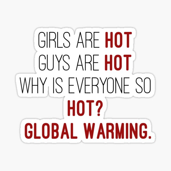
In its role as a humorous sticker, the first artifact combines elements of a joke and warning into its design, allowing for an effective reaction from an audience. Heavily popularized by younger generations, water bottle and laptop stickers are seen almost anywhere, and their intricate designs and short phrases easily capture the attention of surrounding people. Reading as “Girls are hot. Guys are hot. Why is everyone so hot? Global Warming,” this sticker hits quickly to its purpose: warning for the future of climate change. It begins with a commonplace lens that gets the viewer acquainted with the style of the artifact. Such phrases easily capture the attention of others and the double meaning of the word “hot” is what allows for the punchline to settle in. This sudden change in tone forces the mind to consider the reality of global warming and how prevalent it is in the current day. In conjunction with the common phrases is the use of visual rhetoric. The design of this sticker is incredibly simple: just text against a plane white background. The absence of other elements in this design allows for the attention to be focused on the words and content itself, rather than on other factors that might distract a viewer’s attention. This simplicity also allows for fast consumption of the material and makes the viewer quickly consider the double meaning of “hot” within the context of global warming. Through a commonplace phrase and a design with visual rhetoric, this artifact conveys a danger of global warming while maintaining its humor.

The second artifact uses similar devices to replay this message, but it is more strongly supported by commonplace references and pathetic design. This digital poster combines a nursery rhyme with the warning of global warming while adding an image that strengthens the message conveyed. With a melting Earth in an ice cream cone to the side, it reads “I SCREAM…but not enough.” It references the phrase “I scream, you scream, we all scream for ice cream” that is commonly sang by American children. Unlike the first artifact which used humor in its appeal, this artifact instead uses more emotion to develop its somber warning against global warming. The combination of melting ice cream that is the Earth with the phrase “but not enough” places a sort of guilt on the viewer, which forces them to reconsider their own actions and how they may be harming the Earth. Such an emotional appeal serves to easily catch the attention and feelings of viewers, which then allows for the message to be transmitted swiftly. With such personal appeal, this poster works in hopes of attracting the viewers to pursue more activities, to do more, in saving their planet from the state it is in. By exaggerating the effects of global warming, it puts in a worst case scenario mindset and attempts to inspire the viewer to act quickly and with passion. Through commonplace phrases and emotional design, this poster sends the message of global warming and encourages viewers to take action.

Speech outline:

Introduction with hook

Introduction with elements of appeal, purpose of artifact

Commonplace lens- how it is presented in the artifact, how it is successful in the artifact’s purpose

Visual rhetoric lens- how it is presented, how it is successful

Conclusion- connect lens to overall purpose

Conclusion with call to action

Rhetorical Analysis Introduction

Girls are hot. Guys are hot. Everyone is so hot! So I scream. You scream. We all scream for ice cream. But no one is hot enough to scream enough. Instead, we all give in to the damages of global warming. Through jokes with somber endings like these, advocates are warning of inescapable climate change and what effects it will have on our future. As the Earth warms each day, environmental activists are looking for ways to advocate for awareness sooner, and these artifacts quickly spread their message. While the issues of global warming are far more complex, these artifacts choose to simplify them so that they can appeal to a wider audience with quick consumption. The first artifact, a small sticker, uses commonplace and visual rhetoric with a dark joke to address the effect of global warming on people by using a very literal meaning. The second artifact, a digital poster featuring a melting Earth as ice cream, also employs commonplace with the pathos emotional appeal to address the issues of global warming and how harming it is to our planet. While they may look very different upon first glance, the two artifacts address the same issue by using similar techniques and rhetoric lenses, easily allowing for us as viewers to understand the true dangers of global warming.

Outline:

Introduction- introduce the artifacts, say what they are

Artifact One- explain lenses of the artifact, how it relates to sustainable ideas

Artifact Two- explain lenses of the artifact, how it relates to sustainable ideas, how it differs from artifact one

Both Artifacts- compare and contrast their methods and goals

Conclusion- call to action, again connect artifacts to central sustainability ideas

36 Creative Global Warming Awareness Posters - HongkiatHot Guys Stickers for Sale | Redbubble

Images from honkiat and redbubble

I Voted: A Reflection on Hunter’s Speech

Having been a proud wearer of this sticker from as early as 2012 (it was not ME who voted in those earlier years), I was pleased to see that someone had been able to take this artifact and reflect so deeply on its use in society. I find the variety of design in these stickers amusing and wonder whether those serve any additional purpose in conjunction with the phrase itself. I especially liked how Hunter began his speech by casually mentioning just how common these stickers are see and how widespread its users and audience are. By using an easy speaking tone and pace, he was able to build a personal connection with the audience right away, with the speech starting off as very conversational before transitioning into a more explanatory analysis.

As someone who has always been excited to vote, it didn’t occur to me for years that there are many more people who don’t necessarily believe that voting creates much change in our government. Hunter’s acknowledgment towards the large amount of the population who choose not to vote was highly effective in his argument towards how voting is a form of civic engagement, even if it doesn’t seem as if one vote can directly impact the choices of our government. Through his engaging presentation and evident knowledge of the subject, he provided both a formal analysis of how impactful the sticker is to viewers as well as an influence to vote, especially in a time so relevant.

With the task of voting being so important to the American identity and government interactions, I feel as though the sticker amplifies those feelings. It gives a sort of pride to those who wear it, showing that they can be proud of their duty that, when combined with many others, can create all sorts of change to our country and community.

Philadelphia's new 'I Voted' sticker narrowed to finalists

Elevator Pitch Artifact

Girls are HOT. Guys are HOT. Why is everyone so HOT? GLOBAL WARMING.

Imprinted on a small sticker, these words spark a reaction of humor tainted with a sense of worry. Popularized by the younger generation as decoration on reusable water bottles, stickers like this easily catch the attention of others and are growing to more commonly used to spread messages on activism. In this current time in which environmentalism is highly emphasized, a sticker with such a fun message easily pushes the concept into the consciousness of viewers. Through this creative representation, the image appeals to users and viewers and persuades them to be more conscious of the ongoing issue of global warming.

Through the lenses of visual rhetoric and commonplaces, we can analyze why such a sticker can have much impact in our sustainability practices. With a plain background, simple and thin font, and minimal colors; this visual rhetoric is able to place the entire emphasis on the message the sticker presents rather than on the design itself. Global warming is highlighted so that it hits with a surprise factor after the humor presented in the first three phrases, all very short and simple, which easily contributes to the fast consumption of this artifact. The description of attractive people as hot is a commonplace that has become so highly adapted in modern language that upon reading the phrases, it is one’s first thought that the stickers are referring to the looks of girls and guys. The use of the word hot with double meaning provides a humorous interpretation to the message of global warming, and with such a short message, the sticker remains memorable and allows for environmentalist ideas to spread amongst those who see the image.

With a short, entertaining message, this artifact encourages sustainable practices promoted by the UN while capturing the attention and likes of those who see it.

Hot Guys Stickers for Sale | Redbubble

Sustainability Artifact

A commonplace that is often used in advertisements for sustainability is the diagram of Environmental, Economic, and Social. This artifact combines three factors of life together through a venn diagram style and shows how together, they can create a sustainable living situation. Often drawn out with each category in a different shade of green, it allows the mind to automatically think of environmental protection and sustainability, since we tend to connect green to the outside and as admiration for our planet.

The goals between environmental and economic often deal with conservation, showing how we can grow the economy while also bettering the Earth. Many economic practices and conditions are harmful to the planet, and this goal tells that it can be possible to have economic growth while keeping the environment healthy. With environment and social, we are shown how advocacy for environmental protection is what allows for development in conservation. For economic and social development, the diagram shows how welfare and other eco-social policies can allow for development between people and in our society. When combining all these factors together, the diagram shows how environmental development and protection is the ultimate goal and that it is only possible when combining all these ideologies.

The rhetoric behind this artifact is given through its visualization, combining colors with pictures with shapes, which allows for viewers to more easily understand how the concepts are connected and how they can produce environmental sustainability. By taking three very large and broad areas and mixing them to result in one final goal, the diagram also shows how to reach the final goal, we must also act upon the smaller goals between the subjects. It shows how environmental development can only be done with developments in the social, economic, and environmental fields, and that when considering these factors all combined, sustainability is possible and in our reach.

Skip to toolbar