Today I am going to review some designs that are grid-based, as well as designs that break the grid.
Grids are an easy and effective way to display media, whereas straying from that idea can be sometimes very appealing.
Successful Grid-Based Designs

The website associated with Popular Science Magazine, as seen above, uses a grid-based design that is simple, yet effective for a site that publishes articles on a consistent basis. One can see that the main article they want to be seen is represented by the largest photo to the left, the picture of corn. Then, the following important articles are shown in a column to the right, three in a row. This is very effective in drawing the user’s attention to the the most substantial content, which is the magazine’s articles.
The overall vibe of the website is very clean and organized, similar to that of a science-based magazine. The font is mostly all the same, serif font, to represent a more serious style. The colors are just black, white, and reddish, keeping in line with the simple design. The focus is on the content, and not on the design itself.
I believe this design is successful because the website is based on scientific articles, which should be taken a bit more seriously. The web designer/s successfully accomplished that idea by simplifying the design, cleaning it up, and using very few colors. Everything seems within reach and very easy to navigate. From a web designer’s perspective, I think it is a great website that perfectly serves its purpose of providing the public with thoughtful, science-related articles.
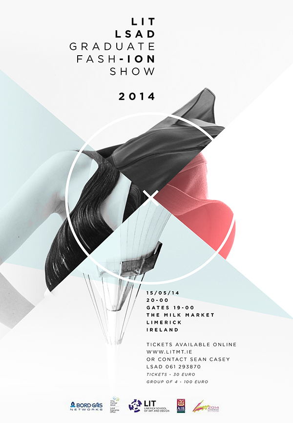
Breaking the Grid

I found this poster, created by Sinéad Foley, advertising a graduate fashion show at LIT Limerick School of Art and Design. It shows off obviously all of the necessary information for someone to attend the event, but it also provides a pleasant visual representation of the fashion show’s vibe.
I love the colors and symmetrical, yet circular design of this poster. It is abstract and yet clean feeling, and shows different textures that may be associated with fashion. a woman’s hair is shown on the left, a flowy fabric on top, a different colored fabric to the right, and(from doing some research on the event setting) the top of a tent that covers The Milk Market in Limerick, Ireland.
The circle and ‘x’ in the middle give a minimalist and abstract feel, while the colors used are pretty light and muted. This creates the feeling of maybe an upscale, cool vibe for the show. The text is all black with regular and bold font, all sans-serif. This also contributes to a minimalist feeling, as well as makes it easy to read the important information.
This design is successful in conveying the fashion show’s theme, as well as the time and place for the event. It breaks the typical grid one might see in a poster, and does it effectively. The content is simple to read, and is very pleasing to look at.
From a designer’s point of view, I think Sinéad did a really great job on this design, and I believe her goal of creating a useful and visually appealing poster was definitely met. Her use of drawing a person’s attention to the abstract image in the middle in order to peak their curiosity to read the event details was a great idea, and I obviously fell for it when I was drawn in by the piece initially.
Ineffective Designs

A web design that I do not like is of Zara’s website, for the world’s largest apparel retailer. This site allows customers to browse and purchase apparel from the retailer, Zara. The categories are listed on the left and the background changes repeatedly, from photos with text, to videos. Each background has a different hyperlink associated with it, bringing the customer to a different page each time.
The overall mood is pretty simple and neutral, with some random font styles here and there. For the most part, the text is black or white, and the site feels minimalist yet chaotic at the same time. Though Zara is considered “fast-fashion,” the website feels like it is trying to be more high-end and editorial.

Honestly, I cannot stand this website.
It uses a very large grid layout, and sometimes ignores the grid layout. Shopping on this site is almost impossible, because just to see the items, one is required to scroll endlessly down an infinitely long page. The images are too big and do not fit in the window all at once, and the filtering system does the bare minimum. Then sometimes the preview of a clothing item is a video, which slows down the page.
I would really just prefer a simple grid layout, with simple, thumbnail-sized images of the apparel. ASOS does this very well, along with H&M.
From the perspective of the designer, I can see that they were trying to go for an editorial, sleek look. It also seems like they were trying to be unique with some of their choices, from the giant images to the background videos. I admit that it is visually appealing, but the functionality is just not there.
For a website to make sales, it needs to be actually usable and simple for the customer to view and purchase items. When the design gets in the way of practicality, I consider it to be unsuccessful.