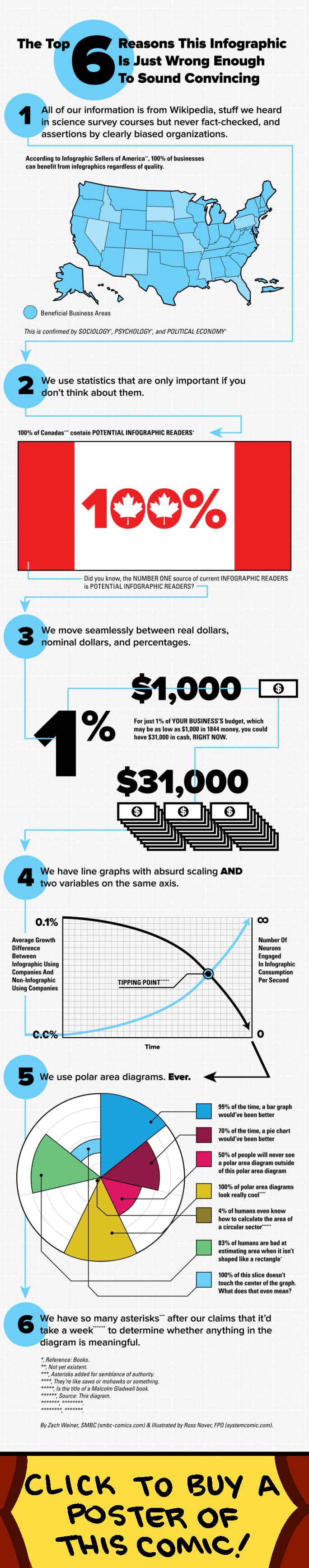
I am a visual learner and love graphics. My State Politics students learned quickly that I am a huge fan of descriptive maps of the states and other useful graphics. But, like any statistic, infographics can have a dark side. This was recently highlighted by a cheeky, but informative, infographic about misleading infographics from Saturday Morning Breakfast Cereal (see below). The graphic demonstrates how images can be used to mislead viewers by overselling conclusions drawn from data. This reminded me of a classic little book that all first year grad students should read: Darrell Huff’s How to Lie with Statistics. The point of the book is that statistics can easily be misused either purposefully or accidentally to oversell conclusions.
Overselling our work either with statistics or graphics is particularly problematic when many people seem to accept any finding as hard fact, as long as it is preceded by the phrase “a study showed.” Think about it. How many times have you had a conversation with someone that went something like this: “I am no longer eating X. I saw a documentary/news article/blog talking about how X leads to Y.* In fact, there was a study that found X caused Y to happen.**” Or perhaps more relevant to political scientists, “I read that there is a gene that makes you a Democrat…” Of course, that this raises another commentary all together on scientific/statistical literacy and media portrayals of science, but there is similar concern with infographics.
As Huff pointed out in 1954, it is quite easy to manipulate graphical displays of data to oversell a point. Granted, such graphics can be supremely informative and educational, but there is a burden on the creator to be honest about how data are displayed and potentially interpreted. This is not to say that there is malicious intent behind all un-informative graphics. But it is to say that scientists need to be careful when crafting them, so as to not mislead our audiences. Or, as Deroy Peraza puts it, to prevent the possibility that “by overemphasizing a truth, you create a lie.” Of course, this is not easy to do. In fact, even when we are really careful, information can still be interpreted incorrectly.
Fortunately, the internet holds both caution and promise for data presentation. While it is impossible to clean one up once it spreads throughout the web, there is more opportunity for others to comment and call BS if something is amiss. Of course, the ideal is that consumers should be more discerning of these graphics, but I do not know if that is realistic. Without scientific training, it can be really difficult to sort through research findings and pull everything together. Heck, WITH scientific training it is still difficult. So I think this puts the burden on us as scientists to use tools like infographics to present findings in a useful way, but to be careful in their presentation and avoid overselling our results and thus “creating a lie” from truth.
For a great guide on both bad infographics and how to make good ones see this post and the interview with Deroy Peraza.
* Y = (insert terrible outcome).
** n=10, p<0.10, low power. No mention of 25 other studies that studied similar outcomes and have conflicting results. No meta-analysis available.