Incorporating visuals is a very helpful way to get your point across in a presentation. In this weeks reading, we look at what can make a good graphic, and what not to include in a graphic. Some of these are tips on how to make your graphic stand out, how to introduce and explain your graphics. The use of fonts in certain situations is important as well. Below, I will discuss some of my thoughts.
The most important thing for graphics I want to talk about is Step 1 of how to incorporate visuals. This is to “Label, number, and title every graphic”, which I believe is the most important component of a visual outside of the data itself. The labels, number and title makes it easy for us to read the graphs. If it weren’t for all the labeling, we wouldn’t be able to interpret the data. With these labels, titles, and numbers, we can use the graphs to make assumptions and conclusions from the data.
Another important part to me was the reading “The science behind fonts (and how they make you feel)”. One thing it talked about was the importance of proper layouts. In the article, it talked about how one group of people were given a letter with a bad layout, and one group with the good layout. The people that had the good layout, read the page better because it made them feel better while reading over the page.
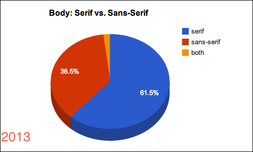
Another point the article went over was how to better design your content with fonts, and the first step was to choose an anchor font. I didn’t know until this reading, there are 4 main fonts that I should be using…Serif fonts for more formal situations, sans-serif fonts which are more playful and used for digital situations, script fonts for bodies of letters, and finally decorative fonts for headings. Below is a graph showing the use of serif vs. sans-serif in the body. It seems that the professional serif font is used more often which I would have guessed, but you always need to make sure that you are using the right font in the right situation, or else it could give someone the wrong message….
Earlier in the reading, it says “thou shalt not comic sans” and I have an example of how using that font can make people feel a certain type of way. Back in 2010, Dan Gilbert, the owner of the Cleveland Cavaliers, a professional basketball team in the NBA, sent a note after losing his best player. He later sent out a letter to the fans showing his anger toward the situation, and saying how he didn’t need the player. The worst part of all of this, that everyone that’s a fan still remembers today is his use of comic sans font in his letter to the fans as you can see below. Outside of the word choice that was poor and distasteful, people still mocks him about his font choice to this day, so this just shows how choice of font can change the perception of how some see you.
So, as you can tell, not all fonts are appropriate in certain settings, and you have to make a smart choice for your fonts to make sure you give the right impression. Also don’t forget about the importance of graphics, as they can help convey data easier to an audience.


![20 Essential Employee Feedback Statistics [2023]: Employees Want More Than Just Performance Reviews - Zippia](https://www.zippia.com/wp-content/uploads/2022/02/benefits-of-employee-feedback.jpg)