By

Blog Post 8

Dear Blog,

Today I read a very informative article about adding visuals to a report. I often forget to consider adding visuals to my writing, and when I do I often am not sure how to add them. This article gave me a lot of good advice that I would like to share with you.

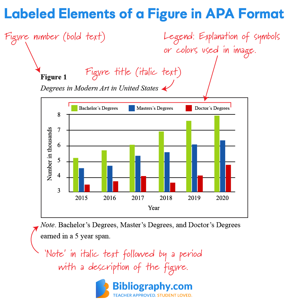
The first piece of advice was to label, number, and title my graphics. This one is something I often forget to do, but it is common practice to make sure your graphics make sense. This picture gives a visual example of how to label a graphic in APA format:
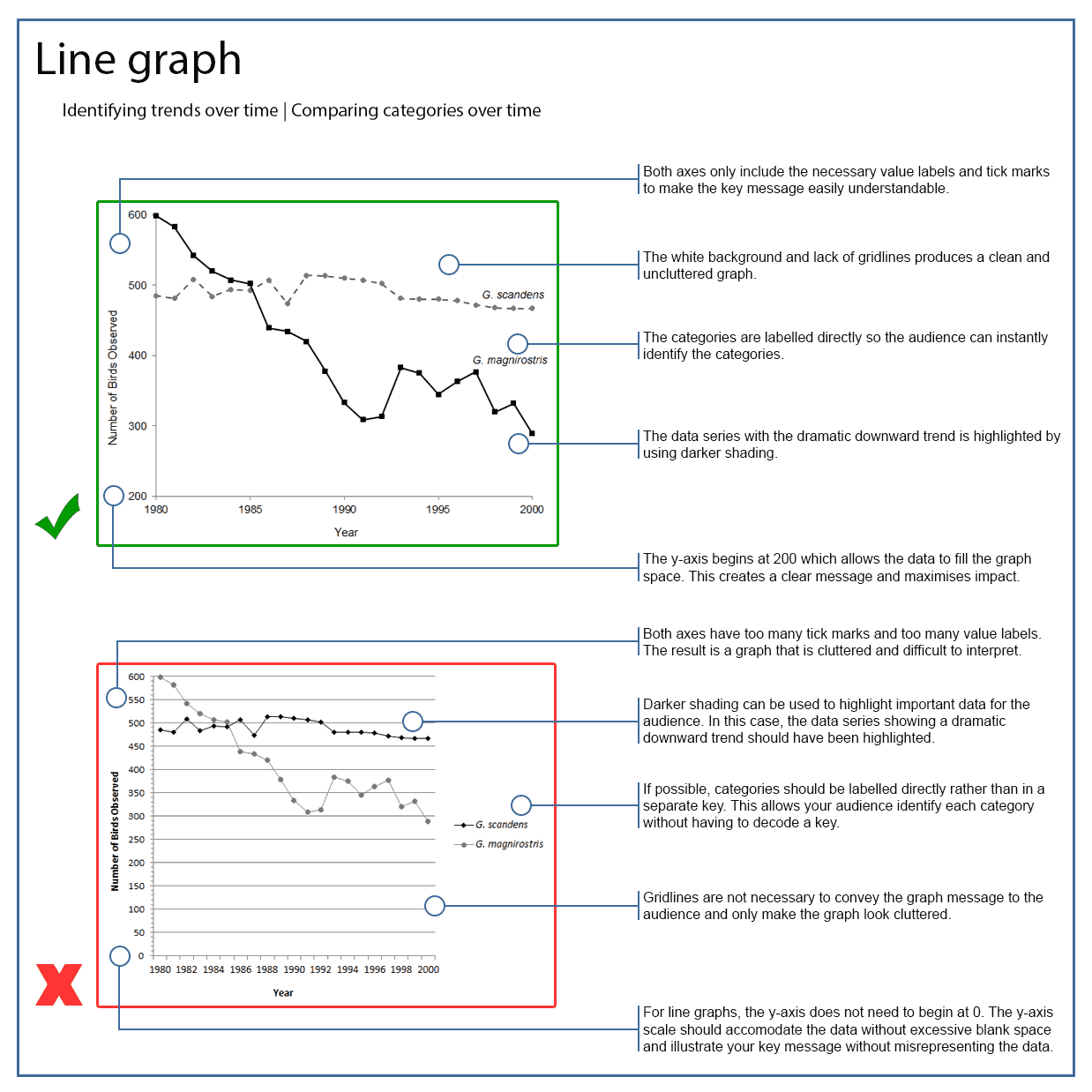
I found a picture that also describes how to properly label and place information on a line graph so it is clear and easy to read:
Their next piece of advice is to place the graphic in the right spot. I often struggle to decide where to put a specific graphic, but good placement is definitely important to make sure it is relevant to the current topic. It is also important to keep the overall layout looking clean and easy to navigate.

The next piece of advice was to explain each graphic. This is actually something I do very often. I think explaining the relevance of your graphics is important for them to have any actual meaning. We are also told to explain where each graphic comes from unless we make it ourselves. This one is important because if you do not explain where it originates from, it could be considered plagiarism. Explaining the source could also inform readers about any potential bias or misinformation the graphic could have. This article explains more about how to properly cite your graphics:

https://mytext.cnm.edu/lesson/chapter-7-integrate-visuals-and-apply-design-principles/#:~:text=Here%20are%20a%20few%20tips%20to%20keep%20in,graphics%20in%20nearby%20text%20preceding%20the%20graphic.%20


We are also told to make our graphics stand out. I often do not look to hard at graphics myself unless they seem interesting to me. If your graphic has important information that you want your reader to see, it is important to make sure they read it by peaking their interest enough for them to pay attention to it. This article talks a little more about considering your audience and their interest:

https://pressbooks.pub/coccoer/chapter/creating-and-integrating-graphics/#:~:text=Keep%20the%20following%20in%20mind%20as%20you%20consider,graphics%20fit%20within%20normal%20margins.%20…%20More%20items


The last advice I was given is to make my graphics easy to find. Sometimes it Is easy to miss graphics when they are hidden away on the side of the page or in the bottom corner. I often put my graphics right below the paragraph that explains them, so the reader sees them right after they read the context behind the graphic. This last article gives several more tips about how to use graphics and which ones to use depending on the information: https://pressbooks.bccampus.ca/communicating/chapter/chapter-31/
 

By

Blog Post 7

Dear Blog,

Today I read a very interesting article about how people read content online. It peaked my interest, and I thought A blog post would be the perfect spot to talk about it since you are all (probably) reading this online.

They first talk about how people have a habit of skimming through writing while reading it online. I personally have a bad habit of doing this. I found this article about how to prevent your readers from skimming so much: https://irisreading.com/how-to-speed-read-without-skimming/.

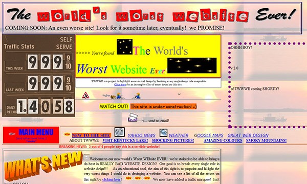
The article also talks about the appearance of our writing. They say the appearance of our entries should be just as interesting as our writing. I definitely agree with this point. When I open an article and I dislike the font or the page layout, I often won’t even bother to read the first sentence. This article talks about how to edit the appearance of your writing or website to make it more pleasing: https://www.bing.com/search?q=how+to+make+your+online+writing+appearance+better&cvid=3110f56c8f0b46f3898a809bdefaa4af&gs_lcrp=EgZjaHJvbWUyBggAEEUYOdIBCDgzODBqMGo0qAIAsAIA&FORM=ANAB01&PC=LCTS. I also found a good example of a website I would immediately close because of the layout:

Another piece of advice they gave us was to make our big points first. This way, readers will read the important parts first. It will both gain their interest in your writing and will also get the point across before they stop reading if they end up finishing the article halfway through.

The article also advises to talk to the reader by addressing them as “you” or “we.” This forms a connection between your writing and the reader. This article lists a few more ways to connect with readers through your writing: https://thewritepractice.com/connect-with-readers/.

It is also recommended to use clear word choices that would be understandable to almost everyone. This makes your writing much more understandable. This part stood out to me because I often find myself trying to use more complex words in my writing. While it may sound smarter, it can also make your writing difficult to understand for the average person. Here are a few examples of complex words that can be reverted into simpler words:

The next advice is to keep paragraphs short and focused, and even add in a one-sentence paragraph every so often. The article also reminds us to use bullet points, headings, links, and bold words when needed. This is a good reminder because I often forget to add anything other than normal text to my writing. I am going to try to incorporate this advice in my future blog posts, and I hope to better hold you’re attention while doing so.

By

Blog Post 6

Dear Blog,

Today I read an insightful article that offered some good advice on how to recover from making mistakes in a job interview. I am what I would call a social klutz. With internship interviews and career fairs looming near in my future, I have been stressing because I have no doubts that I will have at least a few verbal slip-ups or weird fidgety habits that I forget to hide. I found a few articles that have given me advice on how to avoid making mistakes, such as this one from job hunt: https://www.job-hunt.org/avoid-interview-mistakes/. Beth Herring talks about several ways to recover from and make up for the mistake.

The first advice she gives is to apologize. I believe this is the most important way to recover, because it shows self awareness and a willingness to recognize one’s mistakes. People tend to be very forgiving when offered a sincere apology. Her second piece of advice is not to dwell on it. This can apply to a mistake in any area of life, because dwelling on a mistake can lead to making many more. Her third piece of advice is to think on your feet and come up with an excuse for your mistake that makes you look better. For example, if you forget a list of references or resume, you could tell them you wanted to wait to first know more about what qualifications and experience they are looking for. Her last piece of advice is to fix the mistake when you realize you are doing it. She explains that fixing the mistake immediately is better than feeling bad about it once the interview is over.

If the mistake is big enough to warrant one, the article also advises us to include an apology in a thank-you email or even a handwritten note. I found a good template for one of these messages:

I believe I would use a handwritten note. This article talks about the merits of both a handwritten note and an email: https://www.terrastaffinggroup.com/resources/blog/post-interview-thank-you-email-or-handwritten-thank-you-note/#:~:text=Sending%20both%20an%20email%20and%20a%20handwritten%20note,back%20to%20the%20forefront%20a%20few%20days%20later. They also give some examples where both would be acceptable. I think they make you more memorable and show you put effort and care into it as opposed to copy pasting the same email to all of your interviewers. This last article gives some advice on what you should and should not do in a handwritten thank you letter to your interviewer: https://www.indeed.com/career-advice/interviewing/handwritten-thank-you-notes-after-interview.

Skip to toolbar