
In this current era of web and app development, there exists a higher standard for a human-friendly user experience. In order to accomplish this, developers use psychology to layout their applications in a way that aligns with habitual behavior while navigating not only the internet, but the world around us. For the most part, this has resulted in digital experiences that are smooth, elegant, and easy to navigate, but there exists a movement that uses these same principles for deceitful purposes.
In response to these aforementioned designs, Harry Brignull, a British user experience designer with a doctorate in cognitive science, coined the term “Dark Pattern,” which he describes as “tricks in websites and apps that make you do things that you don’t want to do, like buying or signing up for something” (Brignull). He created his own website, “darkpatterns.org,” in order to call out companies that use this deceptive design language. There are many various dark patterns in existence that trick users in various ways, whether it be popups that make someone turn off their adblocker or an ad disguised as an element on the site it is hosted on. However, I’d like to focus on completely different design, as depicted in the below image from “uxdesign.cc.”
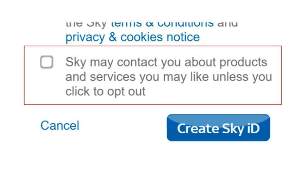
When signing up for a certain online service, it is very common to see an box to opt into an email list for that company. Sky, the company in question, is very aware of this trend and how people have become used to ignoring the box so their inbox doesn’t get flooded with promotional emails. Therefore, they make the user have to check the box to opt out of their email list service instead of opting in. Though it is just for an email list and not something incredibly drastic like a premium subscription, Sky has done something quite devious. Since they know how the user typically behaves with an opt-in check box, they deliberately went against human habits to trick them into signing up for their mailing list. This falls under the category of dark patterns Brignull describes as a “bait and switch” when the user “[sets] out to do one thing, but a different, undesirable thing happens instead” (Brignull). In this case, the user wanted to opt out of the email list by ignoring the check box, but instead got opted in.
Since dark patterns are about as new as the psychological-centered design and development movement itself, it’s hard to say what the future holds for them. In an internet where certain corporations try to extract as much personal information from their users as possible in order to create curated advertisements, UX designers could come up with more subtle and intricate ways to manipulate people into making decisions that they otherwise may not be comfortable making. However, I have faith that activism and policy could work to solve this issue in many countries and will allow this era of design to work as intended: elegant, streamlined, and psychologically friendly.
Sources:
https://www.darkpatterns.org/types-of-dark-pattern
https://uxdesign.cc/dark-patterns-in-ux-design-7009a83b233c
https://www.darkpatterns.org/
The concept of making deliberately user-UNfriendly software also becomes apparent when trying to delete an account or unsubscribe. Infopackets.com dsicusses the inability to delete the Facebook app on certain phones, particularly Samsung models. Most of the time, all a user is able to easily do is disable the app, not outright delete it. While Facebook shouldn’t be able to collect data from users when in the disabled state, it still might raise concerns.
And even when you delete an app or disable it, your account still exists on the web. Have you ever tried to outright delete your Facebook or Instagram? In the case of Facebook, trustedreviews.com distinguishes between deactivation and deletion: deletion being the permanent option of the two. Adding the extra step makes it just a little more difficult to delete your account, and just a little more likely that you’ll keep your account, or keep it deactivated so you can activate it again later. Personally, I experience a more extreme anguish over unsubscribing to emails. I used to work as a cashier, and the store I worked for required me to sign up for their promotional emails. Once I quit, I figured I could unsubscribe. To my horror, instead of a simple unsubscribe button I would have to call the store’s help line to stop the emails. I had called the same number on behalf of customers, and in no way was I willing to go through being on hold for that long again. This is just another example of making things essentially more difficult on a user to get our money, or our data, or whatever that corporation might want.
Reference: https://www.infopackets.com/news/10484/truth-behind-undeletable-facebook-app
https://www.trustedreviews.com/news/how-to-delete-facebook-account-2950145