Pop-up activism: pop-up against coronavirus

Pop app libri animati” is an ongoing initiative undertaken by the Fondazione Tancredi di Barolo, jointly formed by Professor Pompeo Vagliani and Professor Gianfranco Crupi. The multipronged initiative that covers research, conservation and educational outreach is  supported by local and regional governments and La Sapienza University in Rome.

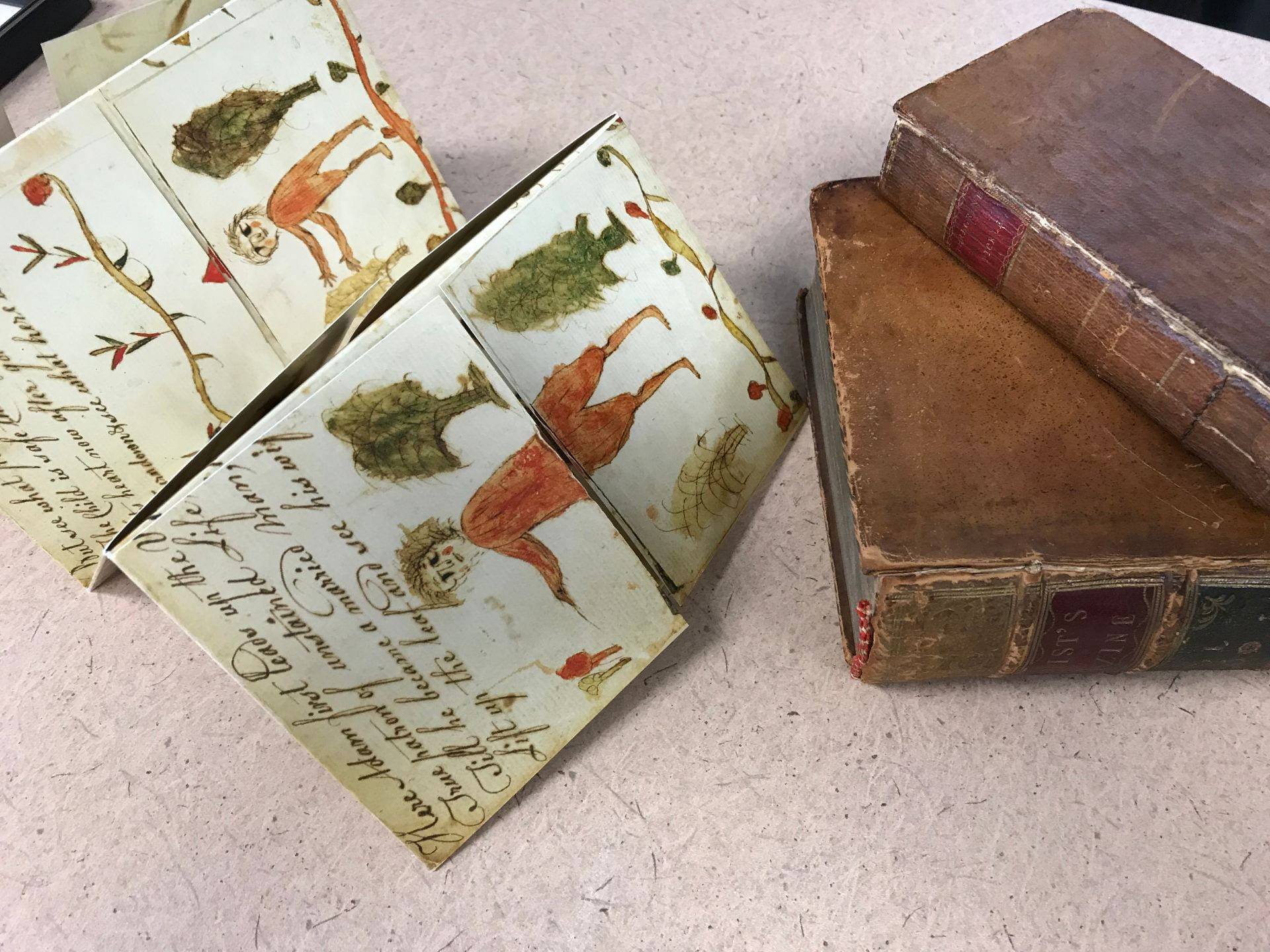
The foundation has an impressive collection of movable books in Italian and different languages across time including some spectacular and little known ones even to specialists in the field. In 2019 they held an exhibition in two locations, Rome and Turin.  It was called Pop-App. Science, art and play in the history of animated books from paper to app.

This link shows a virtual tour of the impressive objects, organized in rooms based on genres and introducing to non-European viewers Italian movables:

https://www.pop-app.org/visita-alla-mostra-di-torino/

The follow up event was an international conference scheduled for Feb. 27-28 in Turin Italy. It was cancelled abruptly by the start of the onslaught of the coronavirus. Intrepidly they turned their attention in two directions. Professor Crupi is spearheading the English translation of the collection of essays based on their curated exhibit in 2019 in Rome and Turin called Pop-App. Science, art and play in the history of animated books from paper to the app, which will soon be available on their website. Professor Vagliani has turned his attention away from scholarly investigation of the pop-up books to activism with children who are housed inside for long periods due to the outbreak of the corona virus.

When I was in contact with Professor Vagliani to inquire how they were faring, on March 18, 2020 he wrote back to describe his new initiative. He stated that while they are waiting to be able to reprogram the various initiatives, they have started a collaborative venture between Italian designer Massimo Missiroli and Chinese artist Guan Zhongping to entertain and instruct children through the medium of movable books:

Meanwhile we started, in collaboration with pop-up designer Massimo Missiroli, the initiative “Pop Up against the coronavirus” which aims to involve and raise awareness among children and schools on knowledge and prevention of the virus through the educational and creative potential of movable books. […]

The project consists in making available online downloadable models and tutorials to create animated tables and small pop-up books from home that have as their subject fantastic stories against the virus or insights on prevention practices. All materials made so far can be downloaded at this link https://www.pop-app.org/costruisci-il-tuo-pop-up-contro-il-virus/

He goes on to describe the work of Guan Zhongping in China:

The idea stems from a similar experience promoted in China by animated book expert Guan Zhongping, involving pop-up designers, families and children in isolation at home during the epidemic. Photos and videos of pop-up products made in China are available exclusively on the pop-app site: https://www.pop-app.org/pop-up-contro-il-coronavirus/.

Since I am on the Foundation listserv, I received notice of further collaboration with Dutch pop up designer Paul De Graaf who has devised a pop-up mask (not medical). In addition to imaginative adapting of fairy tale and folktale figures of witches, intrepid child heroes a magic cloud and magic cow, there is rendering of life for children today. This includes a model of living under quarantine in an apartment with balconies.

Download the color template “Quarantine pop up card”

Download the black and white template, to be colored

This link to their YouTube page shows 84 animations of selected books–some from the collection but notably and importantly including books from the activist project “Pop-up against coronavirus:”

https://www.youtube.com/channel/UCGR7kP3lbJZ8NCZJRcQjT3w

This includes tutorials such as the evokingly entitled – Tutorial “Pop up contro il coronavirus” including that of a mask. The templates for making pop-ups are available in three languages: Italian, French and English and the logo is “united even from a distance.”

When I went to the emerging page devoted to the children’s artworks, I saw a jack in a box hero.

I am awed by the resilience and creativity of the foundation in this extremely difficult time for Italy and by the power of transnational collaborations that are occurring across Europe and oceans.


A Movable (book) feast

Jacqui Reid-Walsh and Julie Porterfield

On November 6, 2019 Julie Porterfield and I offered a master class about early movable books in the Mann Assembly  Room connected to Special Collections at Penn State University. The event was called “Self-fashioned reading with foldout books” and we were invited to do so the Committee for Early Modern Studies.   I in particular was thrilled since I was going to do a sharing of my passion for early metamorphic and harlequinade books with the objects themselves –not just images as is more usual!  Moreover, I was doing so in a “rare books” space that the librarians and curators use with their classes. I have been there before as part of a class activity or for a reception but never the “lead” role!

Julie and I met beforehand  to prepare the feast of books for the master class’s dinner party theme. Prior to the planning visit, I utilized my research account and the University Libraries’ online catalog (The CAT) to request potential movable books to include in the feast. Once on site, Julie pulled each of the requested books for review. We reviewed each volume for fragility, uniqueness, and its ability to exemplify the larger historical narrative of movable books. We also agreed on handling procedures for each selected item, as they varied based on fragility. Julie recorded each selected volume, and agreed to make them available in the Mann Assembly Room on the day of the event. On the day of the event, she also made available book cradles and bone folders to aiding in handling the delicate flaps of the movable books.

When the day came, I arrived early to special collections and tracked down Julie who was already in the spacious room with a number of (not too heavy) large tables and stackable chairs that may be arranged as needed.  I surveyed the space and tables and decided to take the event in an informal direction. Instead of lecturing and showing the materials with Julie it occurred to me that since we were a smallish group and we were all going to be allowed to handle the material since Julie was supervising their handling, why not aim for a more interactive approach? Since the tables could be put together I thought why not employ the metaphor of a dinner party with the books as a visual and tactile feast! We moved four tables together with their chairs and then laid out the materials around the large tables by groups based on date and type: the homemade manuscripts were one, the 19th century American Metamorphosis were one, the 18th century theatrically based harlequinades were one, and the place of honor was the 17th century Beginning, Progress and End of Man.  Every chair had an object or two for a guest to examine/ play with placed on the appropriate support with tools as necessary.

Ready for the guests


Julie sat at the side with the book trolley and I stood at the front with facsimiles in order to show the objects and demonstrate their movability. Julie put up on the large screen the image page from the website “Learning as Play” that I have developed with special collections. By putting up the image page, everyone could see materials from other libraries that we obtained permissions for digitally photographing and reproducing on the site.  To provide context for my oral presentation we put up on the screen the earliest known Beginning, Progress and End of Man (1650) held by the British Library and attached to a page in folio that is part of the famous Thomason Collection of British Civil War documents. The aim was that in in addition to seeing and touching the items in front of them, during the course of the feast the members of the party would move around the table to see and touch other items.


The event was a joy. When everyone entered they sat with an object. I stood by the screen and moved around to point out the sets of items that I was talking about and demonstrating their movement with facsimiles.

Bill minter examining the Beginning, and Dr. Professor Robin Thomas listening

Reflecting on the event, I talked a bit too long, and the guests were too polite to move much when I was speaking. Afterwards though  we all mingled with the objects and talked animatedly learning from one another. Most of our facsimiles of a 19th century homemade Metamorphosis were given away.

The movable (book) feast was deemed a success by all!  I look forward to co-hosting another one with a different kind of movable book!


Forms and Formats: flaps and folds—making meanings

Gettysburg college. Photo courtesy of Bénédicte Miyamoto

Last week I presented at a conference hosted by the East-Central Chapter of the American Society for Eighteenth-Century Studies in Gettysburg. The town and especially the college are exquisite. The conference theme was “Crossroads and Divergences” and my paper was part of a focused panel called “Folds and Formats: Fitting Knowledge to the Page.” The moderator and organizer was Bénédicte  Miyamoto who is an Associate Professor at the Université Sorbonne Nouvelle – Paris 3. The other presenters were Dr. Faith Acker, a research fellow at the Folger Library, who presented a fascinating paper entitled “Shaping Shakespeare’s Sonnets: Folds, Formatting and Paratexts from 1599 to 1790” and Professor Eleanor Shevlin from West Chester University who presented a provocative paper called “ A Matter of Formats: Genre Interplay and Remaking Marketplace Attitudes.”  My paper examined the folds and flaps in both the strip format of the 17th century British The Beginning, Progress and End of Man, and the booklet format of the 19th century Metamorphosis, or a transformation of pictures.   My aim was to contribute to the panel theme about folds and formats in terms of two questions in particular. They were, “Were content and format closely intertwined?” and “How did printers, engravers, or book sellers experiment with new forms and folds of publication with what results.” ?

In the 20 minutes allotted I did not progress much beyond showing images, sharing the questions, and handing out facsimiles for the audience to play with and perhaps speculate with. I shared that my answer to the two conference questions was a resounding yes. Regarding the first question, the format I argue makes or enables different kinds of content, the images and verses, to appear in different orders as they are manipulated by the reader -viewer-player or interactor.  Regarding the second question, in respect to the strip format, the printers used the wood blocks in unusual ways by placing them under the flaps or over the joins made by the closed flaps. (See https://blogs.bodleian.ox.ac.uk/theconveyor/2017/02/06/transformations-in-print/1-adam_trans/

and

https://blogs.bodleian.ox.ac.uk/theconveyor/2017/02/06/transformations-in-print/3-mermaid_trans/)

In the discussion after the facsimiles were distributed, one participant, a co-presenter, was intrigued by how the inner images under the flaps form a secret or private space that is  only revealed when the flaps are lifted (Shevlin remarks, Oct 26, 2019). This perceptive insight draws attention to what images are not immediately apparent but hidden beneath the flaps. The mermaid, eagle with child, heart as money bag and skeleton only appear when the double transformation has occurred by lifting both flaps.  Is there a quality that draws them together in this secret space? Or, since the double transformation is achieved in different ways in each panel: in the first two panels this is achieved by turning the top flap up and the lower flap down, while in the last two panels the flaps are usually turned in reverse order, does the pattern of revealing serve different functions? Moreover, in all seen versions, whether 4 or 5 panels in the printed versions and perhaps even more in the homemade texts, the order of these key images remains the same.

Looking at the first and last images for example further questions arise. With the first panel, could the hidden mermaid be a lure for the implied male viewer? (the verses suggest so). Yet, the mythic mermaid by her positioning under Adam/ Eve has a hidden connection with Eve. On the one hand, Eve is created by lifting the top flap of Adam’s torso–perhaps enacting as it were the biblical origin story. On the other hand, by the mermaid’s placement under both biblical figures she may suggest an alternate origin story for women. What would female viewers think?

(See https://sites.psu.edu/learningasplaying/2018/02/16/mermaid-at-the-centre/)

With the last panel, could the contrast between the richly garbed man and his naked skeleton be intended to be a moral shock as well as a conventional memento mori? The first and last images form stunning contrasts and unless the strip is refolded so they are juxtaposed sit at opposite ends of the text.

For their part, the two middle hidden images seem to serve a linking narrative function to me. The eagle with baby and the young man’s heart that chases gold are linked to the final image of the rich man/ skeleton tying these three episodes together. Child, youth, age and death –the stages of man.

I have been discussing the images when the flaps are lifted in the intended order following the instructions. When we disobey the directions and turn contrarywise, we discover incongruities not referred to in the verse, like the merman and a monster made of the lion and eagle in the opposite manner to the Griffin. Yet due to the design and way the text and images are formed, no matter a reader-viewer-player’s patterns of engagement, the inner, hidden images remain

photograph courtesy of Bénédicte Miyamoto

The Mystery of Eleanor Schanck –was she British or American?

By Colette Slagle and Jacqui Reid-Walsh

Because we devoted the last blog to the interconnections between marking samplers and metamorphoric books we decided to examine more closely two handmade metamorphic books made by girls.  While our next blog will examine the connections between stitchery literacy and a 19th century artifact made by a American girl Betsy Lewis, in this blog we examine a late 18th century artifact made by Eleanor Schanck and we hypothesize her nationality.

In 1777 Eleanor Schanck created and dated a four-part turn-up book now held at the Cotsen Library at Princeton University. This is one of the few known homemade turn-up books that can be confidently identified as girl-made, as most handmade versions are anonymous, making it difficult to determine their provenance. It is unknown if it was created in England or the United States. In this blog in order to answer this question, we compare Eleanor’s turn-up book to known published British and American editions.

The Cotsen catalog entry describes it as 1 sheet folded into 4 panels with flaps, written and drawn with pen and ink, measuring 27 x 37 cm.  When you interact with the object since there are no individual movable flaps, you can only lift the entire top part or the entire lower part.  Looking at photos, it is hard to determine whether it had been cut and then later reattached, or if it was always uncut.

The early date of this handmade text raises question about which versions of The Beginning, Progress and End of Man and Metamorphosis could have served as a model for Eleanor.  While the 17th century British religious turn-up book was published on occasion throughout the 18th century, the American Metamorphosis is believed to have been first published after 1775 (Hamilton, illustration 26).  We therefore compare Eleanor Schanck’s handmade manuscript with the 1650 British 4-part turn-up book printed by Bernard Alsop, the 1654 British 5-part turn-up book printed by his widow, Elizabeth Alsop, and a facsimile of the earliest known American Metamorphosis, printed circa 1775 in Philadelphia (Hamilton 25).  Important to note is that the 4-part American Metamorphosis is itself closely based on the 1650 edition, with the exception of one stanza, which we discuss below.

For the most part, Eleanor’s version is similar to the 1650 version, however one substantial difference is the mermaid verse included in each.

The mermaid verse in the 1650 edition is as follows:

“The Mermaids voice is sharp and shril

As womens voices be ;

For if you crosse them in their will,

You anger two or three.”

1650 The Beginning, Progress, and End of Man. Photo courtesy of the British Library.


Eleanor’s version is as follows:

“Eyes look not on the mairmaids fase

Nor ears forbear her songs

Her face hath an alluring grace

More charming is her tongue”

1777Adam first comes first upon the stage [manuscript harlequinade]. Photo Courtesy of the Cotsen Library, Princeton University.


Eleanor’s version seems closest to the mermaid verse in the 1654 edition:

“Eys, look not on this Mermaids face,

And Ears, forbear her song :

Her face hath an alluring grace,

More charming is her tongue.”

1654 The Beginning, Progress, and End of Man. Photo courtesy of the Houghton Library, Harvard University.


The mermaid verse in the 1775 American Metamorphosis version is also similar to the 1654 edition:

“Eyes look not on the Mermaid’s Face,

Let Ears forbid her Song ;

Her Features have an alluring Grace

More charming than her Tongue.”

Facsimile of c. 1775 [Metamorphosis] in 1958 Hamilton, Early American Book Illustrators and Wood Engravers, 1670-1870, figure 26.


While the mermaid verses are quite similar in both the 1654 edition and the 1775 American Metamorphosis, Eleanor’s is most similar to the earlier British edition.  For example, she uses “forbear” rather than “forbid” in the second line, “face hath” rather than “features have” in the third line, and “More charming is her tongue,” rather than “More charming than her tongue.”  For these reasons, we speculate that Eleanor was working from the British editions, not the American.

Another significant difference we noticed between Eleanor’s handmade text and the 1650 British edition was the spelling of the word “lyon.”  The only known printed versions of the text that also uses this spelling is a 1688/9 version owned by Anthony Wood and published by Dunster, held at the Bodleian Library, an undated 17th century version, held at Penn State, and an undated British edition, owned by a private collector.  Based on this circumstantial evidence, we think Eleanor was likely British.

Facsimile of 16XX The Beginning, Progress, and End of Man. Photo Courtesy of Penn State Special Collections.

1777Adam first comes first upon the stage [manuscript harlequinade]. Photo Courtesy of the Cotsen Library, Princeton University.


*For a discussion of Eleanor Schanck’s artistic style, please see 2017 Reid-Walsh, Interactive Books pg. 218-219.

Marking Alphabets in Samplers and Metamorphosis Books

By Jacqui Reid-Walsh and Colette Slagle

In our last blog, we observed that the alphabet border of the Metamorphosis text (particularly those written by Sands and illustrated by Poupard), resembled that of a sampler, noting that “the letter style is also ornate and appears ‘stitched’ rather than printed in the standardized letterpress style.”  Since then, we have been exploring this connection further, researching information on the history of samplers, marking, and—as Jacqui calls it—stitchery literacy (Reid-Walsh, Interactive Books 40).

Cynthia Cooper, the curator of textiles at the McCord Museum in Montreal, directed us towards The Workwoman’s Guide, an early nineteenth century needlewoman’s guide “for the inexperienced.”  It was written “By a Lady” and published in London in 1838.  Notably, figure 1 of the first plate depicts a model sampler used to exemplify different types of stitches that are used in marking linen.  The author states that “the sampler drawn gives an accurate idea of the canvass, and the shape of all the letters in the different alphabets” (5).

The Workwoman’s Guide, containing instructions to the inexperienced in cutting out and completing those articles of wearing apparel, &c., which are usually made at home; also, explanations on upholstery, straw-platting, bonnet-making, knitting, &c., By a Lady, London, 1838. Photo courtesy of Penn State Special Collections.

The various letter styles shown in the sampler are used for different kinds of marking from simple to ornate.  She notes, “The first alphabet is that in most general use; the second contains the small letters; the third is a correct representation of the Italian characters, which are much used for marking pocket handkerchiefs and other fine articles of dress; the fourth and last is quite a fancy stitch, and rarely employed” (5). Intriguing to our minds is the link between this Workwoman’s Guide and the 1814 Metamorphosis book published by Robert Porter with the subtitle, “also, an alphabet of large and small letters to aid females in marking linen.”  The Sands/Poupard versions only include “the first alphabet,” which has only uppercase letters, is the most commonly used for marking, and made of the simplest stitches (5).  By contrast, Porter’s 1814 version includes both this alphabet and the second alphabet The Workwoman’s Guide refers to, which “contains the small letters” (5).  Interestingly, the placement of each type of alphabet in the borders reinforces their function: the uppercase alphabet in the upper border and the lowercase alphabet in the lower border.  Although we have not seen every version of the Metamorphosis book, we are struck by how the lowercase alphabet only seems to appear in Porter’s version, where the specific aim is to teach girls how to mark linen.

The Workwoman’s Guide, containing instructions to the inexperienced in cutting out and completing those articles of wearing apparel, &c., which are usually made at home; also, explanations on upholstery, straw-platting, bonnet-making, knitting, &c., By a Lady, London, 1838. Photo courtesy of Penn State Special Collections.

The frontispiece of The Workwoman’s Guide provides an excellent example of this type of stitchery literacy being taught in the classroom.  The room is full of girls of varying ages and a young woman teacher sitting in the center, modelling how to measure and cut fabric.  The children are all busy working as well: sewing, cutting, and measuring fabric.  On the wall there is a prominently featured alphabet of capital letters.  This alphabet is immediately adjacent to the woman and girls who are modelling the sewing activity.  Higher up on the wall there are also several sheets with animals and accompanying text underneath, reminiscent of a bestiary.  These animals include a goat, camel, swan, dog, and owl.  The combination of the alphabet, the informational animal sheets, and the cutting and sewing of fabric emphasizes the pragmatic educational nature of the scene.