Before I begin, I must make is clear that this advertisement is not a real billboard, but rather one seen in the episode “Garden Party” from the hit-TV comedy The Office. As we discuss the advertisement, and although it still can be dissected in detail, please keep in mind that the advertisement was meant as comedic relief.
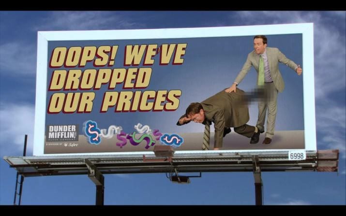
In the episode, Andy, the branch manager, created an ad campaign to promote the company’s new low prices on paper and paper products. However, after being posted for only a night, the billboards are vandalized. As Jim states, “if there’s an opportunity for a graffiti artist work in a phallic shape interacting with the artwork, it’ll happen. And Andy gave them that opportunity” (Netflix).

As you can likely see, there are many issues with the billboards. To start, anyone can interpret the billboards as inappropriate; even without the vandalism, they make the people looking at them a bit uncomfortable. Because of this, the advertisement fails to reach its intended audience. Andy makes it clear that he wants to show his possible future customers that Dunder Mifflin has lowered the price. However, instead of reaching out to companies that would want to buy from Dunder Mifflin, they only reach out to spray paint artists who are looking for an opportunity to embarrass someone. This then resulted in the goal of the advertisements being shadowed by the drawings.
Similarly, Dunder Mifflin’s billboards also fail at using ethos; they result in consequences that were not intended . By having these images, Dunder Mifflin does not make themselves credible on the market. I cannot imagine that a company would want to associate themselves with a supplier that produces inappropriate content. This can be seen in today’s world, as companies often fire employees who make inappropriate comments or posts on social media.

Finally, their use of logos is somewhat skewed. Yes, lower prices are a good thing. Nonetheless, they do not logically place their company’s logo. When you drive by the advertisements, there is a very slim chance you will be able to find the name of the company. In fact, they do not even state the product thats price was lowered. Logically, you would want to make your message clear and concise. For example, as seen in the image to the left, Staples clearly states their message as well as their address and company name. By making the message too concise, Andy only checks off one of the three things Staples does, causing confusion for the audience/consumers.
Although the billboards were meant as comedy on The Office, Dunder Mifflin can be criticized for reaching an unintended audience, failing to consider ethos, and incorrectly applying logos to their ad campaign.
I have to say that these ads were the last thing I was expecting t see when I clicked on the RCL blog, and I can say that I was pleasantly surprised. These ads from The Office never fail to make me laugh, and I thought that it was ingenious to use these for your analysis of a bad ad, as they certainly are terrible ads. Out of the many times I have seen this show and this specific episode, I can say that I never caught how bad the placement of their logo was, and I thought that was a perfect topic to bring up. These ads truly are terrible, and I think your analysis shows that even more than one might say after looking at the ads for the first time.