Korean webtoon “Cheese in the Trap” was an unintentional discovery of mine that had developed into a love.
I typically avoid dramas, even “K Dramas” (Korean dramas are regarded as the best drama genre by many), at all cost, because my usual interests are so far the opposite (murder/crime stories, slice of life, action). I know the gist of drama stories: Girl meets boy, some sort of romantic tension happens, someone cries, they get together, it was meant to be. Given that’s how I feel, I have no idea why I clicked on Cheese in the Trap… but needless to say I was taken by surprise, not only by the story progression, but more interestingly, the art progression.
For starters, I’m going to be a little bit rude, and say that in the beginning the art was not impressive. Everyone has certain styles and accentuation that they prefer, and I admittedly have some pretty strong preferences. In particular, the hair was the first thing that got me:

It’s just so big on everyone’s heads. It’s too much. The black haired character, his hair is larger than his face. Their skulls must go pretty high up or else they all need to stop volumizing their hair. Are their foreheads just huge? It didn’t bother me by midway through the first season of comics, but I can hardly look back at the early works without cringing. Looking at early chapters, I can’t even imagine how I focused on the story and not the little parts of the art that bothered me. But, that is precisely the kicker about this comic: The reader can watch the artist, Soonkki, grow like no other comic.
I’ve read a LOT of comics in my life, of all varieties and purposes, but none stand out as much to me in terms of art progression than Cheese in the Trap. In most respects, truly, the art was objectively good from the very beginning. The anatomical understanding of the human body, the proportions, even the clothing was always well-drawn. But, when it came to the faces, frankly I felt bothered. (Like I said, this means nothing as to whether or not this art is “good”, but simply what do individuals prefer more when looking at art).
Being that this is a drama, there was a special lack of quality facial expressions which in turn affected how much I loved the comic. Side problems were things like the hair, the eyes, the face shapes, things that were core to Soonkki’s style. But, in the end, the facial expressions were what played the biggest role in my adventure with this comic artist. As I’m sure it is easy to understand, if you were expected to feel pain or joy for someone who you’ve never met, the biggest influence would probably be their facial expression. Even if I so much as look at photos of people where some have pained expressions, I feel pain. That’s the same idea behind commercials for treating abused animals, etc. The communicable property is extremely applicable to emotion, and therefore vital to a comic series that relies on emotion to drive readership (it’s a drama after all). However, when I was reading the early pieces of Cheese in the Trap, I didn’t really see anything wrong with the facial expressions, mostly because facial expressions are so, so hard to draw and I didn’t have anything better to compare it to. For example, here are some early drawings:


Her mouth says sad, her eyes say… indifferent? But her eyebrows are like she is either sad or disappointed. It’s a little hard to figure out. The man on the right certainly isn’t any easier, that being said. It’s all a case of default expressions that are a devoid enough of emotion to guarantee it’s easy to draw without looking bad. It’s a safe bet for an artist, but therefore not an interesting or emotional one. Facial expressions are hard, that’s a given, but they are also so important to emotion. Without taking the risk and drawing something difficult, the reader is kind of left hanging while the characters cry and laugh. I assure you that these faces above well mimic the faces during tense moments in the comic, for the most part.
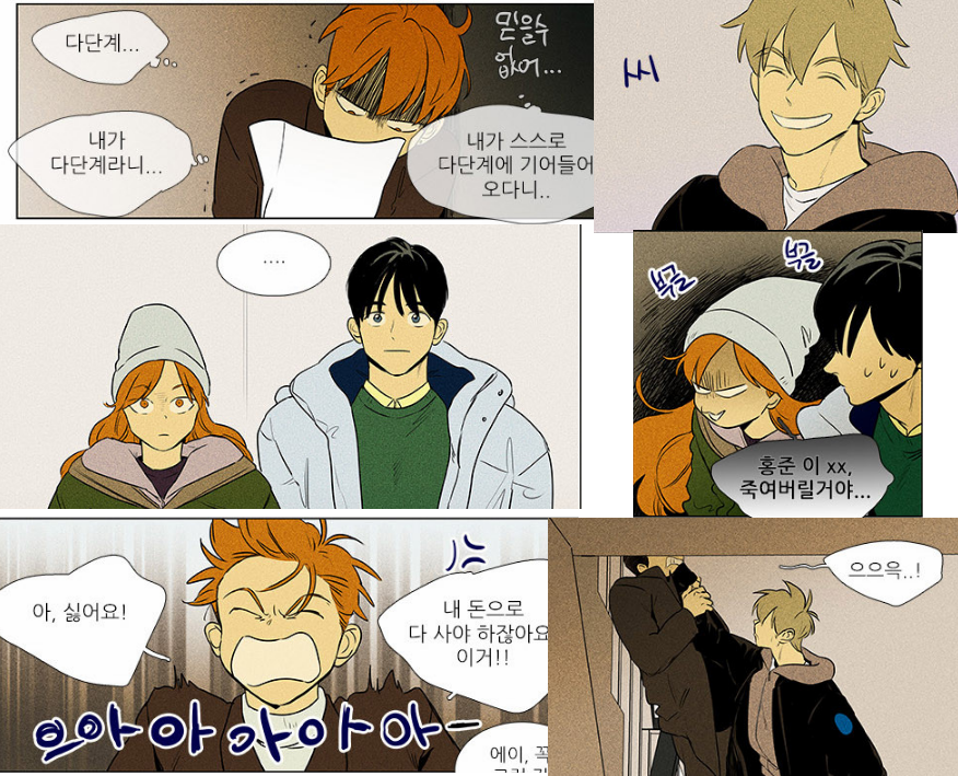
Let’s compare that to some of my favorite faces from season 4:


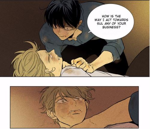
My all time favorite,
Look at Soonkki go. Can you tell how the art has changed throughout the few years this comic was made? In the older comic days, (which I apologize for not having more pictures of, but copyright issues get in the way) there were examples of happy people, sad people, scared people.
By season four, however, you don’t just see sadness. Like the in the panel just above this, that guy isn’t just sad because he has tears on his face. He’s a little bit angry. A little bit frustrated, defeated even. I like that face so much because it looks like the person who puts their hands up in the air in surrender during an emotional argument; they just want it to stop… you know what I mean?
It’s that ability to convey a mix of emotions that is so difficult to achieve, and yet Soonkki has not only learned the feat, but has mastered it. I hope you can see what I see, that comics carry not only story development, but artistic development, and sometimes that’s more effective than the words on the page.
Image sources can all be found on:
http://www.gramunion.com/tagged/Soonkki
