• Log In

Maps & Geospatial

  • Donald W. Hamer Center for Maps and Geospatial Information
  • Pennsylvania Early County Maps and Atlases
  • Map sets (Topographic, Road, Aeronautical)
  • People
  • Blog
  • Reports and Publications

Important Farmlands

October 27, 2025 by jcd5988 Leave a Comment

The newest display in the Donald W. Hamer Center for Maps and Geospatial Information showcases the various “Important Farmlands” maps in our collection. Created by the U.S. Department of Agriculture in the late 1970s and 1980s, these maps contain essential information about America’s most productive and valuable agricultural lands.

Video Overview


Image of Important Farmlands Display
Full display


Display Highlights

Important Farmlands Display
Entire Important Farmlands poster


This striking figure from American Farmland Trust was the impetus for the conservation framework the left side of the display highlights. Protecting land that is fit for agricultural production is crucial for both food production and the livelihood of many Americans. Once good, fertile soil is altered for uses other than agricultural purposes it is exceedingly difficult to restore to its previous condition. The maps featured on the display indicate precisely where those Important Farmlands occur.

Image of left column of poster
Left column of the poster


This section of the poster also showcases the three categories Important Farmlands fall can be grouped under: Prime, Unique and Additional, each of which serve key roles in crop production. The maps serve to delineate these categories to aid farmers and officials alike. The acreage of Prime, Unique, and Additional Farmland varies vastly from county to county due to climate, soil properties and topography among other factors. 

Image of "What is an Important Farmland?" section description


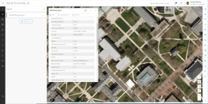
The center portion of the display is mainly dedicated to Centre County. There is zoomed-in snapshot of the immediate State College region under the full county’s depiction. There is also information regarding where Important Farmlands maps can be found within the library and online.

Image of center column of poster
Middle column of the poster
Image of right column of poster
Right column of the poster


The right side of the display features maps of Lancaster County, Philadelphia County, and of Warren County NJ, each of which showcase the different types and abundance of each type of Important Farmland on a county-level.


Here at the Donald W. Hamer Center for Maps and Geospatial Information we have spent the past few months compiling our research into an all-encompassing ArcGIS StoryMap that delves into extensive detail regarding the history, importance, uses, regulations and advocacy pertaining to the maps.

Maps and Geospatial Assistant Working on the StoryMap

Physical copies of Important Farmlands maps can be found in the Donald W. Hamer Center for Maps and Geospatial Information, or accessed online through Penn State Library’s Digital Collections or the BTAA Geoportal.

Important Farmlands StoryMap


Contributors 

Jeddiah Dreher (he/him) is a second year at Penn State majoring in Environmental Resource Management and minoring in Environmental Soil Science and Geographic Information Systems. His interests include ecology, soil science, conservation and GIS. Jeddiah has been working at the Donald W. Hamer Center for Maps and Geospatial Information since June 2025.

August Paterno (he/him) is a Senior at Penn State majoring in Geography and Economics. His interests include GIS, Urban Studies, and Econometrics. August has been working at the Donald W. Hamer Center for Maps and Geospatial Information since April 2022. 

Michael Coupland (he/him) is a third year Geography major at Penn State. He has been a Maps and Geospatial Assistant at the Donald W. Hamer Center for Maps and Geospatial Information since June 2024. His interests include human-environment geography, spatial statistics, cartography, and history.

Lucas Hower (he/him) is a fourth year at Penn State majoring in Geography with minors in Geographic Information Systems and Environmental Inquiry. His interests include landscape ecology, conservation, GIS and cartography. Lucas has been a Maps and Geospatial Assistant at the Donald W. Hamer Center for Maps and Geospatial Information since June 2025

Filed Under: Geospatial Information, GIS, Maps, Uncategorized

Civic GIS Data

February 24, 2025 by jec6235 Leave a Comment

In this blog post and display, we explore the various community data sources available for the Centre County area as well as the entire state of Pennsylvania. These data sources provide spatial, graphic, and written information about our communities. They can help us learn more about the mechanisms that drive our communities as well as show the spatial locations of buildings, transportation, and more. Overall, these sources are useful tools for both academic and personal research. 

This display specifically references resources relevant to State College including from the state government, the county, and the Centre Region Council of Governments. Beyond this, most city and regional governmental bodies provide publicly accessible GIS resources, and it is worth investigating the tools available for places you are interested in. 

Display of Sources

Video Overview

Online Resources

PASDA (PA Spatial Data Access)

PASDA is Pennsylvania’s official geospatial data portal. It is a useful tool that provides geospatial datasets in written form, map form, and more. The website holds an extensive range of GIS data, covering a variety of subjects. It is a great source to use when searching for spatial data for GIS projects and any other spatial needs.  

On the PASDA website homepage, someone can search for a dataset, or there is a list of data shortcuts to select from. Within those shortcuts, one can search for a specific topic, or one can browse the topics within that selected category. 

PASDA  Apps, Tools, and Data Shortcuts


DCNR Open Data (PA Dept. of Conservation and Natural Resources)

This site provides governmental GIS data from the PA Department of Conservation and Natural Resources. It is home to a wide range of GIS datasets that span the entire state of Pennsylvania. Like PASDA, DNCR offers a general dataset search bar as well as a helpful list of categories to choose from (shown on the right). PA DCNR applications are also included as ways to explore PA environmental topics.

DCNR Search Bar and Data Shortcuts


Centre County Open Data

Centre County Open Data is a great website to start exploring GIS resources. The website provides several categories of digital layers allowing users to easily access public data. The “Environment” tab has several hydrology maps such as the stream map, as well as visualizations of watersheds, lakes, and more. Additionally, maps of wooded areas, geology, and soil data are also available.

Political boundaries can be found under the “Boundaries” tab, ranging from parcels to election/voting districts to public services such as fire departments. The “Locations” tab is similar with point data instead of whole geographic areas, with things like specific voting locations or historic buildings mapped.

.
Centre County Open Data stream map example from the “Environment” tab


CCATP (Centre County Active Transportation Plan)

Centre County Active Transportation Plan details the Centre Regions efforts in reshaping existing pedestrian, vehicle, and biking infrastructure. The plan involved surveys across the region, with the quantity and scope mapped on the image to the left. The formal proposal of 2023 describes in detail the methodology and findings. The public engagement section includes the interactive map, where you can see participants’ recommendations at the location of the suggestion. This engagement dashboard combines map, chart, and data visualizations.

Map of the quantity and scope of the Centre County Active Transportation Plan


CRPA (Centre Regional Planning Agency)

The CRPA is the planning agency under the Centre Region Council of Governments which serves to unite the efforts of Municipalities and Townships of the region.  Their mission statement on their website explains the agency’s purpose: 

“The Centre Regional Planning Agency guides regional and municipal efforts to create and sustain a vibrant, healthy, and economically diverse community by providing professional land use planning services that educate and inspire people to make the Centre Region a great place to live.” 

The website has multiple services including links to relevant government resources such as the State College Borough’s planning and zoning website, other municipal agencies, and useful information on a number of topics we cover in more depth here.  

The Centre Region’s Comprehensive Plan for 2045 is still in the early stages of its development, however, community members can participate.  

CRPA: Demographic Summary

This resource from the CRPA provides demographic summary of Centre Region population and housing data. Beyond population data and predictions for population growth, the website details the changes in PSU enrollment with time as well as education overall. The website also has a housing map with resources on purpose-built student housing.  This summary report is using ArcGIS experience builder as a way to communicate and engage with topics of interest by the public.

Bar chart of the forecasted population of different areas in Centre County


CRPA: Centre Region Bike Map

This interactive map details bike routes in the Centre Region differentiated by their type and characteristics. The symbology allows users to clearly identify shared use paths, bike lanes, bike routes, and forest trails. The map also displays the location of bike repair stations and bicycle shops. In the downtown area the location of bike racks is displayed. While not present on this map, PSU also provides maps of the university bike rack locations.

CRPA interactive bike map


CRPA: Zoning and Overlay Districts

CRPA here provides the combined Zoning maps for all municipalities in the Centre Region including State College as well as Ferguson, Patton, Harris, College, and Halfmoon townships. This allows residents to see how land use is differentiated with what developments are permitted.  

CRPA interactive zoning and overlay districts map


Additional Resources

Display Case Resources

State College ArcUrban Resources

ArcUrban is a unique Esri GIS tool specifically designed for visualizing Urban Planning. The State College Borough uses this tool effectively to manage the large number of developments and projects across the area. The interactive map shows what new buildings or renovations have been recently completed, are under construction, or are in the earlier phases of approval and proposal. This tool is unique in that it represents with GIS what does not yet exist, mapping what’s to come for the town. Beyond this, the service lets the user interact with community data displaying population data such as neighborhood population changes, education, personal crime, density, vacancy rates, diversity, & more.

State College ArcUrban interactive map of new and potential buildings and renovations


Commonwealth of PA GeoData

This website offers access to a collection of state government spatial data and services. The website was formed through a collaboration between state agency partners. It provides a search bar that allows patrons to search for specific GIS datasets, and it provides categories of spatial data to choose from. This is another useful tool when one wants to search for specific governmental geospatial datasets and information.

PA GeoData Search Bar and Data Shortcuts


The GIS Guide to Public Domain Data ~ Kerski & Clark (eBook available)

This guide explains how to find good sources of public domain spatial data. It gives readers a step-by-step guide on how to search for, use, and analyze public domain GIS data. It also teaches readers about practical information such as copyrights, cloud computing, and more.

GIS Guide to Public Domain Data


Community Geography GIS in Action ~ Zanelli, English & Feaster

This book describes how one can use GIS to make a difference in their community. The book provides case studies of civic GIS data use as well as exercises and tips on how to use spatial data to help one’s community. It covers a variety of topics, including crime, pollution, water quality, community forests, and more.

Community Geography GIS in Action


Centre County, PA – 2013 Plat Book

Plat books such as the one in the display case show surveyed areas to scale with property ownership and the surveyed areas layout. These are useful tools made by public services or municipalities which allow developers and property owners to get accurate information on ownership and boundary lines.

Centre County Water & Sewer Study Update – 1988

This specific resource is a unique example of an informational document on a public project. It depicts both present water and sewage utilities, as well as future developments and improvements. Communicating projects is important for local governments, ensuring the public understands future construction of service changes.

Conclusion

Civic GIS data is a useful tool to learn more about one’s community. It provides people with a spatial perspective on municipal information at the city level, county level, state level, and more. With sources like the ones listed above, people can complete research about their communities for both personal and academic projects. 

The data sources in this blog post provide civic GIS data for State College, Centre County, and the entire state of Pennsylvania. Penn State students as well as interested community members can use them to gather civic information and learn more about the systems that run our communities. 

About the Authors 

Jennifer Chew (she/her) is a third year at Penn State majoring in Geography and minoring in Landscape Architecture and Spanish. Her interests include urban systems, social justice, GIS, and design. Jennifer has been working at the Donald W. Hamer Center for Maps and Geospatial Information since August 2024.

August Paterno (he/him) is a fourth year at Penn State majoring in Geography and Economics. His interests include GIS, Urban Studies, and Econometrics. August has been working at the Donald W. Hamer Center for Maps and Geospatial Information since April 2022. 

Filed Under: General Interest, Geospatial Information, GIS, Maps

The Cartography of Democracy: Harnessing PolicyMap’s Potential in Contemporary Political Research

September 11, 2024 by Tristian Schmidt Leave a Comment

Author: Tristian C. Schmidt, The Pennsylvania State University

Abstract: In this blog post, we embark on a journey through the vast landscape of geospatial data, focusing on the transformative potential of PolicyMap, a powerful mapping and analytics platform accessible through the Big Ten Academic Alliance (BTAA) Geoportal. PolicyMap is accessible through Penn State University Libraries Database subscriptions. By walking through a step-by-step example of analyzing the relationship between key demographic variables and electoral outcomes in the 2022 U.S. House of Representatives elections, we demonstrate how PolicyMap can help uncover hidden patterns and insights that traditional methods might overlook.  

We also explore the broader intersection of Geographic Information Systems (GIS) and political science, highlighting the growing importance of spatial thinking in understanding complex political phenomena. Along the way, we introduce readers to additional resources available, such as the BTAA Geoportal, Esri Business Analyst Web App, SimplyAnalytics, and Social Explorer, which can further enrich their research and analysis. By the end of this post, readers will not only gain practical skills in using Policy Map but also a deeper appreciation for the power of geospatial perspectives in political science research. 

In this blog post, I want to focus on one resource. PolicyMap – and show how it can enhance understanding for students and researchers in political science. By harnessing the power of geospatial analysis, we can gain new insights into electoral trends, demographic shifts, and policy impacts that would be difficult to discern from raw data alone. 

Discovering PolicyMap through BTAA Big Ten Geoportal 

The BTAA Big Ten Geoportal is a rich resource for geospatial data. To access PolicyMap, start by navigating to the BTAA Big Ten Geoportal homepage. Once there, locate the search bar and type in “PolicyMap” as one word. After entering your search term, take a look at the results that appear and click on the first option. For instance, this is an example title related to Economy data from PolicyMap.  

What is PolicyMap? 

PolicyMap is a powerful web-based platform that enables users to visualize and analyze a vast array of demographic, socioeconomic, health, housing, and other domains of data through interactive maps and reports. With an extensive library of over 50,000 indicators from hundreds of public and proprietary sources, PolicyMap provides unparalleled insights into the social, economic, and environmental factors shaping communities across the United States. 

One of PolicyMap’s greatest strengths is its ability to display data at various geographic scales, from the state and county level down to zip codes, census tracts, and even specific addresses. This granularity allows researchers, policymakers, and community stakeholders to examine spatial patterns and disparities often obscured in aggregate statistics. By layering multiple indicators on the same map, users can explore the complex interplay between different variables and identify areas of concern or opportunity. 

The potential applications of PolicyMap span a wide range of academic and applied fields. In public health, epidemiologists can map the prevalence of chronic diseases alongside data on food access, green space, and poverty to better understand the social determinants of health. Urban planners can use PolicyMap to assess housing affordability, transportation access, and environmental hazards when developing neighborhood revitalization strategies. Political scientists can analyze voting patterns, demographic shifts, and redistricting plans to study electoral dynamics and representation.  

In the following sections, we will walk through a step-by-step guide on using PolicyMap to analyze the relationship between demographic variables and electoral outcomes in the 2022 U.S. House of Representatives elections. By the end of this tutorial, you will have a solid foundation in navigating the platform, layering data, and interpreting spatial patterns to derive meaningful insights.    

Using PolicyMap for Political Analysis: A Step-by-Step Guide 

To demonstrate the utility of PolicyMap for political analysis, let’s walk through a specific example: analyzing the relationship between key demographic variables and electoral outcomes in the 2022 U.S. House of Representatives elections. The variables selected for this analysis have been carefully chosen based on their relevance to political science research and their potential to provide meaningful insights into electoral trends.  

Step 1: Define the Geographic Boundaries

For this analysis, we will focus on the U.S. 118th Congressional Districts within Pennsylvania, as well as the state’s county boundaries. Congressional districts are the primary electoral units for U.S. House elections, while counties play a vital role in administering state and local elections. By examining electoral outcomes at both the congressional district and county levels, we can identify patterns and trends that might be obscured when looking at larger geographic units.

To provide a clear visual context, we will also include the Pennsylvania state boundary in our maps. This will help users understand the spatial relationships between congressional districts, counties, and the state. By incorporating these different geographic units, we can gain a more nuanced understanding of the factors influencing electoral outcomes and how they vary across different scales of analysis within Pennsylvania. 

Step 2: Utilize Policy Map’s Multilayer Functionality

PolicyMap’s ability to overlay multiple datasets on the same map is a powerful tool for visualizing the relationships between different variables and identifying potential correlations. By activating this feature, we will gain a more comprehensive understanding of the factors influencing electoral outcomes. 

Step 3: Incorporate Key Demographic Layers

The following demographic variables have been selected for their relevance to political science research and their potential to shed light on electoral trends: 

  • Margin of Victory: This variable measures the difference in vote share between the winning candidate and the runner-up in each congressional district race. It provides insight into the competitiveness of each election and can help identify districts where outcomes were particularly close or decisive. In political science, margin of victory is often used as a proxy for electoral competition and can illuminate factors contributing to a candidate’s success or failure.  


  • Voting Eligible Population (VEP) Turnout Rate: VEP is a more precise measure of the potential electorate compared to the Voting Age Population (VAP), as it excludes individuals who are ineligible to vote, such as non-citizens and felons. By using VEP turnout rates, we can more accurately assess levels of political engagement across districts. Shading turnout rates by state allows for easy comparison of participation levels across different geographic regions. 

Voting Eligible Population (VEP)


  • Educational Attainment: Education is a key variable in political science research, as it has been shown to influence political knowledge, engagement, and participation. The percentage of the population with bachelor’s degrees is a commonly used measure, as higher education has been linked to increased incomes, political sophistication, and involvement. By including this layer, we can investigate whether districts with higher levels of educational attainment exhibit different voting patterns or turnout rates.   


  • Male to Female Ratio: The gender composition of a district can provide valuable insights into potential differences in political preferences and behavior between men and women. Political science research has consistently shown a gender gap in voting, with women tending to support Democratic candidates at higher rates than men. This demographic factor is particularly significant for the upcoming Presidential election in November 2024. According to current polling data and recent shifts in party affiliation, the male-to-female ratio in each district will likely play a crucial role in shaping electoral outcomes. By examining this ratio, analysts can better understand how gender dynamics influence voting patterns and potentially predict election results.


  • Median Household Income: Median household income serves as a crucial indicator in understanding a district’s economic landscape and its potential impact on voting patterns. This measure is more accurate than average income in representing a district’s economic well-being, as it is less skewed by extreme outliers. Consequently, it provides a better understanding of the economic conditions faced by the typical voter in each district. Political science research has consistently shown that income levels can significantly influence voting behavior. Higher-income voters often exhibit different political preferences and participation rates compared to lower-income voters. These differences can manifest in various ways, such as: Party affiliation, economic policy preferences, voter turnout rates, & engagement with specific campaign issues.  By analyzing median household income data, political analysts and campaign strategists can gain valuable insights into the economic factors that may shape electoral outcomes in different districts.

Step 4: Ensure Proper Data Representation 


To effectively communicate electoral outcomes and allow users to easily identify patterns and trends, it is essential to ensure proper shading and data representation for the 118th Congressional Districts layer. This can be achieved by selecting appropriate color schemes and classification methods that clearly visualize the margin of victory and other key variables.

Shaded by State


By following these steps and carefully selecting relevant demographic variables, researchers can use PolicyMap to create a comprehensive, multi-layered map that reveals patterns and correlations between socioeconomic factors and electoral results. This approach allows for a nuanced understanding of the complex interplay between demographics and political behavior, providing valuable insights for political scientists, policymakers, and engaged citizens alike. 

Final Output

The Intersection of GIS and Political Science 

In the realm of political science, Geographic Information Systems (GIS) have emerged as an indispensable tool, revolutionizing the way we analyze and visualize spatial data. By seamlessly integrating diverse datasets based on geographic location, GIS empowers researchers to unearth hidden patterns and relationships that are crucial for deciphering the complexities of electoral behavior and policy impacts. 

PolicyMap is a valuable tool for evaluating the equity and effectiveness of public policies. By visualizing the spatial distribution of policy outcomes, such as health indicators or access to public services, alongside political boundaries and demographic data, researchers can assess whether policies are reaching their intended beneficiaries and identify areas where targeted interventions may be needed. 

One of the most promising applications of GIS lies in the domain of electoral geography. By mapping variables such as voter turnout, demographics, and party affiliation, researchers can gain novel insights into the spatial dimensions of political participation and representation. This proves particularly valuable for understanding intriguing phenomena like the urban-rural divide in voting patterns or the nefarious impacts of gerrymandering on electoral outcomes. As they say, a picture is worth a thousand words – and a well-crafted GIS map can speak volumes about the state of our republic. 

As the political world becomes increasingly data-driven, the ability to leverage GIS for spatial analysis is becoming an essential skill for researchers, policymakers, and advocates alike. Those who can harness the power of geospatial data to generate insights and communicate compelling stories will be the ones shaping the future of our political landscape.   

The Future of Political Science: Geospatial Perspectives  

The BTAA Geoportal, and PolicyMap in particular, offers an accessible entry point for students and faculty looking to incorporate geospatial perspectives into their political science research. With its extensive data library and user-friendly interface, PolicyMap enables users to quickly visualize and analyze spatial patterns, without requiring advanced technical skills. 

Geospatial analysis is becoming increasingly crucial in political science research, as it allows for a more comprehensive understanding of political phenomena by revealing spatial patterns and relationships that might not be apparent through traditional methods. By incorporating GIS and spatial analysis, researchers can uncover hidden trends, identify areas of concern, and develop more targeted and effective policy solutions. 

As you embark on your own political research journey, I encourage you to explore the resources available through the BTAA Geoportal and experiment with using PolicyMap to examine your questions of interest. Whether you’re studying voter turnout, demographic change, or policy impacts, a geospatial lens can offer valuable new insights. For example, with the upcoming general election in November, you could use PolicyMap to analyze the spatial distribution of voter preferences, identify potential swing districts, and explore the relationship between demographic factors and electoral outcomes. 

By developing proficiency in GIS and spatial analysis, you’ll be well-positioned to make meaningful contributions to political discourse and to pursue impactful careers in fields like campaign strategy, policy analysis, and academic research. The spatial perspective is a powerful tool for navigating the complexities of modern politics – and with resources like the BTAA Geoportal at your fingertips, there’s never been a better time to start exploring. 

We encourage you to share your experiences, insights, and questions as you delve into the world of geospatial analysis for political research. By fostering a community of engaged learners and researchers, we can collectively advance our understanding of political processes and work towards more informed and equitable decision-making. 

Additional Resources 

Penn State offers several other valuable resources for political research, including Esri Business Analyst Web App;  which provides access to demographic, business, and consumer spending data that can inform campaign strategies and policy decisions; SimplyAnalytics (accessible through the Libraries Databases), a platform that allows users to create thematic maps, rankings and reports using extensive demographic, business, and marketing data; and Social Explorer (accessible through the Libraries Databases), a tool for visualizing and exploring demographic information and creating interactive maps. 

For those interested in learning more about GIS and spatial analysis in political science research, the BTAA Geoportal provides a range workshops, and support resources. Additionally, Penn State University offers courses and programs in GIS and spatial analysis, as well as opportunities for collaboration and mentorship with faculty experts in these fields. Relevant examples related to geospatial information and social science case studies can be located in the Maps and Geospatial: Case Study Applications Across Disciplines, Liberal Arts examples. 

Acknowledgments

The author would like to express gratitude to the Big Ten Academic Alliance and Penn State University for providing access to the invaluable resources available through the BTAA Geoportal. Special thanks to the developers and maintainers of PolicyMap, Esri Business Analyst Web App, SimplyAnalytics, and Social Explorer for creating powerful tools that are transforming the way we conduct political science research. The author also acknowledges the support and guidance of faculty mentors, professors, and colleagues who have fostered a passion for exploring the intersection of geospatial analysis and political science.

About the Author

Tristian C. Schmidt is a Political Science student at Penn State University specializing in international relations, nuclear theory, and the impact of emerging technologies on geopolitics. As Vice President of the Institute of Nuclear Materials Management (INMM) chapter at Penn State, Tristian demonstrates his commitment to arms control and non-proliferation. He also works at the Donald W. Hamer Center for Maps and Geospatial Information, further developing his skills in geospatial analysis and data visualization.

Tristian’s coursework and research explore the stability-instability paradox and its unclear implications for nuclear deterrence in the modern era. He is particularly focused on how artificial intelligence (AI) will reshape the geopolitical landscape and global security dynamics. Upon graduation, Tristian aspires to work with the International Atomic Energy Agency (IAEA) junior program in Vienna before pursuing a career as a Foreign Service Officer with the U.S. Department of State. There, he will apply his expertise to advance U.S. foreign policy interests and contribute to global peace and stability in an increasingly complex global environment.

With expertise in geospatial analysis, data visualization, and an understanding of AI’s impact on geopolitics, Tristian is uniquely positioned to make significant contributions to international relations. His leadership skills will undoubtedly lead to success in navigating the complex intersection of nuclear theory, AI, and global security.

Share Your Experiences 

We want to hear from you! If you have experience using PolicyMap, Esri Business Analyst Web App, SimplyAnalytics, Social Explorer, or other GIS tools for political science research, share your insights and stories in the comments below or reach out to the author directly. By exchanging ideas, we can collectively advance our understanding of political processes and work towards more informed decision-making.   

Filed Under: Geospatial Information, Maps Tagged With: elections, GIS, how-to, PolicyMap

Creating Spatial Data With the Bad Elf Flex GPS Unit

November 14, 2023 by Finan Turnage-barney Leave a Comment

Finding spatial data that is publicly available for niche subjects can be a difficult and time-consuming task. Using the resources available from the library along with software provided by Penn State it is now easier than ever to create your own spatial data. In this blog post we will be discussing what resources are available to library patrons at Penn State that enable you to create your own spatial data. The Donald W. Hamer Center for Maps and Geospatial Information in the Pattee Library at Penn State has a variety of GPS units and equipment available. We decided to use the Bad Elf Flex to create our own spatial data because it is easy to learn how to use, very accurate, and can be easily used with ArcGIS Field Maps. ArcGIS Field Maps is an app that allows the user to create points on a map using either their smartphone’s integrated GPS or a connected GPS unit. The Bad Elf Flex can be connected to any smartphone with Bluetooth and can easily be selected as the GPS position provider in the ArcGIS Field Maps app.

For more information on the Bad Elf unit and ArcGIS Field Maps See this former library blog post and Story Map from Bad Elf: 

    • Field Maps Introduction Post 
    • Guide From Bad Elf to Use Bad Elf Flex with Story Maps 

To show users an example of creating spatial data on your own, we used the Bad Elf unit and ArcGIS Field Maps together to create some arbitrary data about the ground cover types found on campus near the Pattee Library and Pattee mall. We also wanted to test the differences in accuracy between the Bad Elf unit and the integrated GPS within our cellphones. Before collecting any data there is a considerable amount of set up that needs to be done. First you need to create a feature layer in rc ArcGIS online that is appropriate for the data you want to capture (Point, Line, or Polygon) and decide what other information you want to record with that data. Then you need to set up ArcGIS Field Maps on a mobile device and connect the Bad Elf unit to your phone. These steps are explained in detail within the guide from Bad Elf unit linked above. After all this set up, you are ready to begin going out and sampling your data using the Bad Elf unit. 

There are some best practices that should be mentioned to create high accuracy data using the Bad Elf unit. First, we advise that you use the pole, or the tripod stands to elevate the GPS and provide stability (see image below). Additionally at each point where you are collecting data you want to place the GPS and ensure it stays steady so that the spatial error of the data recorded will be reduced. ArcGIS Field Maps provides a live reading of what the error is as you are taking the point and records the spatial error with the data as you create it. Once the GPS “settles” you will see the error stop going down and at this point you should collect the point and all the other information associated that you desire. You should avoid large physical barriers, like buildings or trees, between the GPS and the sky above as this disrupts the pathways that allow the Bad Elf unit to connect to the satellites above. We directly tested this in the data layer that we have shared below. 


A screenshot of the Bad Elf Flex Test Map we made while testing the Bad Elf unit.
A screenshot of the Bad Elf Flex Test Map we made while testing the Bad Elf unit. Click the image to go to the web map.

Here are some images of us collecting this sample data and what that data looks like on ArcGIS online after we have collected it:

          Finn holding the pole with the Bad Elf Flex unit on top on the Pattee Mall.                              Brady holding the pole with the Bad Elf Flex unit on top outside the Pattee-Paterno Library Collaborations Commons Entrance.                              Finn holding the pole with the Bad Elf Flex unit on top in the Thompson Hall tunnel entrance by the Sparks Building.

Overall, we found that creating spatial data with the Bad Elf Flex unit is an extremely powerful resource that the library has to offer. The process does require a bit of learning to set up and properly record data but works very well once the user is accustomed to the process. We recommend doing a few tests to ensure you have configured everything to your liking before spending lots of time and energy recording your data. To borrow the Bad Elf Flex unit and any of the other accessories available for spatial data creation come to the Maps and Geospatial center to learn more.

Here are the catalog links to the Bad Elf Flex and Tripod we used in this blog post:

    • Bad Elf Flex GPS Unit 
    • GPS Pole Used  

Fin is a fourth-year student at Penn State majoring in Geography and minoring in Soil Science. Fin has had multiple lab research positions where he has contributed to creating spatial data for forest biogeography and forestry research. Fin’s other interests include using drones to collect geospatial data, competing with the PSU soil Judging team and spending time outdoors. Fin has been working at the Donald W. Hamer Center for Maps and Geospatial Information since February 2022. 

Brady is a fourth-year student at Penn State majoring in History and minoring in Geography and GIS. Brady has been working at the Donald W. Hamer Center for Maps and Geospatial Information since August 2022. From August 2022 to February 2023, Brady worked as the Historical Aerial Imagery Bednar Intern at the Donald W. Hamer Center, where he created a detailed inventory of a large collection of historical aerial imagery in the library’s collection and created a Story Map highlighting the collection. Brady’s other interests include creating 3D models of terrain data and participating in Penn State Club Sailing.

Filed Under: Geospatial Information, GIS, Hiking, Maps Tagged With: ArcGIS Field Maps, ArcGIS Online, GIS, GPS

Esri Academy Training: ArcGIS Online Basics Overview

September 7, 2023 by ngv5032 1 Comment


Esri provides basic and free instructions for those who are new to ArcGIS Online through the training website. To access the training website, go to https://www.arcgis.com , sign in (If you are a Penn State Student, enter pennstate as the organization URL), go to the top right of the corner and click your Account, then click Training. From here, you can find free or paid courses for ArcGIS Online. Under the Getting Started heading, you can click to the right until you find the ArcGIS Online Basics course. Click Launch Course. 


The launch page of the ArcGIS Online Basics course, accessed by typing the course name in the search bar above.

You are greeted with an introduction to ArcGIS and presented with Goals and Software Requirements. Make sure you have an ArcGIS Organizational Account such as a user account (Penn State Students have access with their email). Once you have verified all of the information in the introduction, you can start on the first of four modules that are in this lesson. In each of the modules, you will be tasked with a quiz at the end. The first module introduces the ArcGIS Online components, which explains the different levels of sign in options such as public user, Organizational Member, or social login. It gives a broader definition of ArcGIS Online as a Software as a Service (SAAS) Model that allows users to create and share geospatial information to their organization through the cloud. 

In the second module, you will be introduced to the different content types on ArcGIS Online: Layers, Maps, Scenes, Apps, and Files. With layers, you will learn how there are Basemaps, which are static tiled layers that provide the geographical context for a map, as well as Operational Layers, which is the imagery or features laid on top of the basemap. Operational layers can be added from a local file or searched with ArcGIS to create a map that displays attribute info and has the potential to be spatially analyzed. After this, ArcGIS will showcase the layer types commonly used in their software: Feature Layers, Tile Layers, Map Image Layers, Imagery Layers, Elevation Layers, Scene Layers, and Table Layers. In this basic course, you only need to know these definitions and identify where they are found on the example maps that ArcGIS takes you through, but they are highly important because almost all maps use these layers in one way or another. To test your knowledge of Basemaps and Operational Layers, you are given a matching table with layers found on an example map to the right and need to match them with the layer function (Operational or Basemap, in this case). Once completed, the tutorial asks you to navigate to an example of an item found using the search tool. Once you find this map, you learn where to find authors, date, the sources for the layers, and the map itself. 

Module Three begins with explaining where layers come from, such as a file you upload, files already on ArcGIS, or a sketch. At this point, the module takes you around the Map Viewer and details how layers interact with the Basemap in the Sierra Nevada Mountains. After this, you will learn the different levels of sharing and the different scenarios where you need to change the share settings. It is a relatively short and simple module. 

An Oblique view of a Web Scene found in Module 4 of this course.
Make sure to turn off the “Only search in Penn State University” to access the training in Module 3


The final module gives the user insight to the capabilities of ArcGIS Online: Smart Mapping, Analysis, and Sharing. ArcGIS takes you to another training map, but this time it is a 3D Scene of the same mountains you previously looked at. This is when Groups are introduced, which help determine which level of sharing you should have based on the map’s purpose. In the case of the Sierra Nevada Mountains, you are shown the capabilities of creating a Web App, which provides users with greater interaction with a Web Map. You are tasked with creating and previewing an Interactive Legend app for hiking trails, which allows filtering of areas that are climbs or descents.

Once you complete all of these modules, you receive the ArcGIS Online Basics certificate.

Web Apps expand the capability of a map. An interactive legend allows the user to toggle between the different types of trails.

Nathan Vincent is a Sophomore from the Lehigh Valley majoring in Geography in the college of Earth and Mineral Sciences. Nathan’s interests include Land Use, Transportation, GIS, and Information Technology. Nathan has been working at the Donald H. Hamer Center for Maps and Geospatial Information since April 2023.

Filed Under: Geospatial Information, GIS, Maps

Upgrade a StoryMap with ArcGIS Image for ArcGIS Online

March 14, 2023 by Cormac Caughey Leave a Comment

This new StoryMap tutorial displays how to turn a digital image into a fully navigable Web Map within a StoryMap. This can be done thanks to Esri’s ArcGIS Image for ArcGIS Online extension.

Screenshot of the ArcGIS Image storymap tutorial

With this feature, any image can be turned into a Web Map to allow for more thorough storytelling and interactivity within a StoryMap. As illustrated in the tutorial, this is especially useful for creating more accessible digital maps without having to go through any large-scale georeferencing.

The below examples provide snippets of how online maps can be digitized and edited to be displayed within a StoryMap:

Screenshot of Sanborn Fire Insurance Map from June 1922, State College, PAScreenshot of Map of Harris County taken from the 1874 Centre County Atlas

Sanborn Fire Insurance Map from June 1922, State College, PA – from the Penn State Digital Map Drawer


Map of Harris County taken from the 1874 Centre County Atlas – from the Penn State Digital Map Drawer


Mac Caughey is an upcoming graduate at Penn State majoring in Geography and minoring in Environmental and Renewable Resource Economics. He is pursuing certificates in Geographic Information Science, Landscape Ecology, and Global Environmental Systems. Mac’s interests include environmental sustainability, conservation, and food science. Mac has been working at the Donald W. Hamer Center for Maps and Geospatial information since November 2021.

Filed Under: General Interest, Geospatial Information, GIS

New watersheds display in the Donald W. Hamer Center for Maps and Geospatial Information

February 17, 2023 by kpg5252 Leave a Comment

A new display has been put up in the Donald W. Hamer Center for Maps and Geospatial Information. This display, prepared by Maps and GIS Assistants, describes what a watershed is, the local watersheds in Pennsylvania, and watershed related public art called “Ridge and Valley” by Stacy Levy that is viewable at the Arboretum. This display includes watershed descriptions, selected maps, images, and a 3D printed model of the Spring Creek watershed, which surrounds State College.

The Main portion of the display are two large informational posters designed by Kevin Goldberg, one of the Maps and GIS Assistants, which contain text and images created by other Assistants. Various panels explain what a watershed is, the local watersheds, and introduce “Ridge and Valley” a sculpture created by artist Stacy Levy. The display case contains maps of the local watersheds, maps of the larger Chesapeake Bay watershed, and a 3D printed model of the Spring Creek watershed created by Historic Aerial Imagery Bednar Intern, Brady Watkins. Alongside the main display several relevant maps and resources are hung along the walls of the Center for patrons to enjoy.

Filed Under: Geospatial Information, GIS, Uncategorized

Review of Data and Workflows Extensions in ArcGIS Pro

October 1, 2022 by Ben Brosius Leave a Comment

As a continuation from one of our previous posts, some of our Maps & Geospatial assistants reviewed trainings in the ESRI training catalogue. This post will highlight training experience for some of the extensions categorized as Data and Workflows, specifically:
  • Locate XT
  • Workflow Manager
  • Publisher
  • Data Reviewer
More information on ArcGIS Pro extensions is available on the ArcGIS Pro page of the Maps and Geospatial: ArcGIS Pro guide.

Locate XT 

Locate XT is an ArcGIS Pro extension that extracts geographical data from unstructured text. Typically, unstructured text lacks organization and sequence—requiring reformatting for analysis. ESRI’s Mapping Locations from Unstructured Text training was used to explore the Locate XT extension. In this training, I was instructed how to use the extension to create a workflow that can be both reused for future unstructured text sources, as well as restructure text data from various sources at once.

Structured text is highly organized, sequential, easily navigable, and ready for analysis. This is the data you want to be using in analysis. Locate XT will instruct ArcGIS Pro what text to pull from various unstructured text formats including powerpoints, PDFs, emails, social media content, and more. The output can then visualize data patterns previously unseen by the lack of structure.  Not only does this extension provide a way to efficiently restructure unstructured data, the workflow can be customized further for specific attribute information. If wanting to learn more about Locate XT, this blog post by ESRI’s Avonlea Fotheringham goes into further detail.


Workflow Manager  

Workflow manager helps users streamline the process of producing content. This is done by the implementation of automation to simplify and manage location-based work. It helps organizations to lower operation costs while improving the quality and accuracy of data, as well as optimizing resource allocation and communication, and making processes more standard and repeatable.

The premise of the Workflow training and the software is to empower your workforce by making their tasks more organized and repeatable. It also makes it easier for management to review their staff’s work and find areas of weakness in system efficiency. It provides basic information on workflow manager detailing how one can utilize it to plan workflows.  


Publisher 

ArcGIS publisher is an extension for ArcGIS Pro and an important tool for sharing data. The ability for users to distribute maps is the key attribute of the software, and its most important utilization. This data can be shared over a multitude of software on multiple devices and can be published locally or over the internet. These published maps can also be viewed by patrons for free with basic ArcGIS applications such as ArcGIS Explorer available on mobile devices and personal computers.

Some other key features come from its support for PMF packaging which vitally allows map sharing to users who do not have downloaded the data which otherwise would be needed. It also allows for these shared maps to be stored and packaged in a wider variety of formats than traditional ArcGIS software. This includes its original format, industry-standard formats, or stored in a locked, highly compressed format.

This tutorial is called “Design and publish base maps” and in it you work with ArcGIS pro. While this tutorial is not directly about the publisher software, it does give you experience with publishing a map. In this you work as if you were a GIS specialist in Cambridge, Minnesota and it gives you more control over the appearance of your maps.  


Data Reviewer 

Data Reviewer is an important extension for ArcGIS which is key for information management and quality. This software is very important when dealing with data regardless of the level of experience and can be translated across very different scales. Data Reviewer simplifies and improves the quality control of data workflows which enables the delivery of geospatial data. The software is automated and is very useful for saving costs overall. Additionally, it helps users to be able to quickly and reliably find errors in their content. It reviews work and reports what is found.   

The Esri academy also provides a course that helps you to learn about Data Reviewer and its full range of functionality. This course is called “Managing Data Quality Using ArcGIS Data Reviewer” and it is broken into segments. Each segment has a summary of an aspect of the software, such as how to manage data quality, automate data validation, and resolving errors. Two of these segments include exercises along with the text, and all have quizzes. Finally, the course ends by awarding you a certificate for its completion.
      

Filed Under: Geospatial Information, GIS, Uncategorized

Review of Advanced Analyst Extensions in ArcGIS Pro

September 25, 2022 by Ben Brosius Leave a Comment

In an attempt to gain familiarity and offer insight on commonly used extensions of ArcGIS Pro software, Maps & Geospatial assistants explored instructional materials and trainings through the Esri training catalogue. This post will review some training modules for the extensions grouped as Advanced Analysis, specifically:
  • Business Analyst
  • 3D Analyst
  • Geostatistical Analyst
  • Image Analyst
  • Network Analyst
  • Spatial Analyst
More information on ArcGIS Pro extensions is available on the ArcGIS Pro page of the Maps and Geospatial: ArcGIS Pro guide.

Business Analyst 

There are a variety of key applications for ArcGIS’s Business Analyst software, but its main purpose is connecting users to tools for discovering what places and businesses will be most compatible. This is done through a form of site selection which allows for the user to apply a wide range of localized data, to map information such as household income, population age tables, educations, food security, and others. The extension allows users to pinpoint growth sites, manage expansion, and be confident in their plans and expenditure—knowing with concrete data what is probable to be successful and what is likely to be a greater risk.  Understand the market with the analyzation tools, then balance your network to help each location and territory manager succeed. Based on what you determine you can target ideal customer groups and confidently make decisions with information, as well as conveying their practicality with info-graphics to colleagues and business partners.  

Esri’s Business Analyst Pro Basics training is separated into a two-section course that includes written descriptions of the extension tools’ purpose, videos, and graphics to show its application, and quizzes to help check your learning. It includes a more in-depth exercise to see the principles in use where you use the Evaluate Site tool to analyze the demographics of Chatham, New Jersey to see its potential site for a grocery store. Finally, the course concludes with an evaluation that sums up the course.

ArcGIS Business Analyst Pro Essentials is an additional learning plan that includes multiple tutorials on the extension to learn more of what Business Analyst can do.


3D Analyst 

The 3D Analyst extension can help answer one of the most common questions dealing with three-dimensional geospatial scenarios—i.e., what is near what and what can be seen from where? Those two questions can be answered with 3D Analyst’s proximity and visibility tools. These tools can prove highly beneficial in careers such as GIS consulting, research, and more.  

The tutorial followed to explore some of 3D Analyst’s functionality in the real-world was ‘Exploring 3D Features Using ArcGIS 3D Analyst’, which consisted of two real-world applications along with some supplemental reading. In one of the scenarios, I used 3D Analysts’ proximity tools to determine the best urban concert venue with the least noise impact on nearby residential buildings. I converted 2D building data to 3D for visualization in a three-dimensional space, and then created a 3D buffer around the potential venues to understand the impact of noise from where the concert would be located. The proximity tools of 3D Analyst allowed me to see how noise pollution traveled from the venues and disrupted residential buildings unevenly. For the tutorial’s second scenario, I used visibility tools for bikers concerned about a construction project proposal disrupting a scenic cycling route. I then used the line of sight, skyline analysis, and sight line tools to determine where a cyclist would be able to see the construction and whether the project would disrupt their scenic views at key points along the path. This visualization of hypothetical, three-dimensional scenarios is a huge advantage for the world of consulting and research. 

The tutorial was straight-to-the-point and provided all of its required data and reading materials. As an introduction to the 3D Analyst extension, it is effective in showing some of the more common functionalities of the extensions’ tools.

For more information about 3D Analyst, Esri has many resources such as this page further detailing 3D Analysts capabilities and similar 3D Analyst training modules.  


Geostatistical Analyst 

The training seminar “Spatial Interpolation with ArcGIS Pro” gave an overview of ArcGIS Pro’s Geostatistical Analyst extension, along some examples of its tools in action.  

The Geostatistical Analyst extension was designed for spatial interpolation, i.e., estimating unknown values and quantifying their uncertainty. The extension tools are highly applicable and frequently used for environmental science, resource extraction, agriculture, and more. In the video seminar, spatial interpolation was used for scenarios such as determining seafloor temperature in the Bering Sea and lead concentrations in Mississippi soils. Both involved large datasets interpolated to more continuous datasets, then validated to see confidence in the output values.  

Determine what interpolation technique(s) work best for your data and desired outcome(s). These classification trees created by Esri offer multiple guides to help you and your data find the most appropriate interpolation method(s). Criteria that may matter for the selection of your interpolation method include predicted errors, number of predictions per location, level of assumption complexity, and more. Once interpolation is complete, multiple methods can then quantify prediction uncertainties. The statistical models and tools from Geostatistical Analyst include cross-validation and validation. For more on validation methods, check out this validation guide from Esri, similar to the classification trees mentioned earlier for choosing an interpolation method.

If you want to explore Geostatistical Analyst on your own, the Essentials of Geostatistical Analyst learning plan has several tutorials to learn the extension’s basics.


Image Analyst 

The tutorial for ArcGIS Image Analyst provides a lesson on how to utilize some of its primary functions.  Some of the most important features are the advanced image interpretation, exploitation, and geospatial analysis on an array of imagery modalities. Image Analyst, like Workflow manager, allows its users to automate certain processes for more efficacy, and for better repetition of results. Some of such options are feature extraction, image classification, multidimensional analysis, and change detection. 
All this is done by importing data, using different GIS features, viewing it through a multitude of displays, and extracting and editing the visualization. Finally, the software allows you to edit image classification results, change elevation and digital model values, and remove or add to the final imagery. Afterwards you can analyze with machine learning, multidimensional analysis, and change analysis.
Like network analyst, Image analyst has a similar video that is around an hour long. It shows some of the most important features of the software and demonstrates how different visualizations can be presented. Also demonstrated are the classification, analysis, and many other tools. The whole process can be followed on your own with the application. 


Network Analyst  

This Network Analyst tutorial demonstrates some of the practical uses for Network Analyst and the features of the software. Network Analyst helps users to plan transportation of goods, organization of movement, and structure the paths of vehicles. This is all done through the primary function of the software, its ability to help users make strategic routing decisions.
The primary goals that Network Analyst sets are for its user to be able to improve their customer’s satisfaction, increase efficiency, and allow operations of a company to increase in scale. The software highlights its wide variety of tools, while showing how users can easily choose which of those tools is right for them. With that, you can model paths, and share them across your organization.
             The tutorial is a video in which product engineers on the Network Analyst welcome team explain some of the software’s main features as mentioned above and show you how you can individually explore the product. While no project is included, you can follow along with their work and learn some key applications of network analyst.  


Spatial Analyst 

The Spatial Analyst software from ArcGIS has been one of the organizations’ important analysis tools for planners and GIS specialists. Its main functionality is to provide spatial modeling and visualization on maps. There are quite a few options for what the tool can be applied to, one of these is terrain analysis where you can find slopes, aspects, and contours of geographies, as well display the outcomes. Selecting locations, planning routes, and finding statistical data of an area over time are common tools important to all users, while organizations can access other specialized tools such as cost and risk estimation.
Esri’s Spatial Analyst tutorial is separated into four sections and includes written descriptions of its uses, videos and graphics to show how they are applied, and occasional quizzes to help check your learning. This is done to improve your knowledge of spatial analysis categories, teach you how to approach spatial analysis, and apply what you learned. Afterwards, there is a short project and a final quiz which will earn you a certificate.  

Filed Under: Geospatial Information, GIS, Uncategorized

Orthorectification of historic aerial photographs of National Parks for studies of landscape change

July 27, 2022 by nbp104 Leave a Comment

U.S. national parks are often used as reference conditions for landscape change ecological studies. National park landscapes are thought to exhibit ecological conditions and landscape dynamics similar to those found prior to significant European human influence (Piekielek and Hansen 2012). This is despite little quantitative data describing national park landscapes even throughout the fairly recent past, like the last 50-100 years. What historic observational data do exist about national parks are often limited to notations of a single species, at a single point in time, at individual and disconnected field plots like those captured in present day museum specimens. Instead the ideal dataset would be spatially continuous, cover decades to centuries with multiple observations and be of fine spatial resolution relative to many common and landcover dominant species (i.e. not satellite imagery with 30-meter pixels like the original Landsat missions). Tree core data, gridded field plots from recent comprehensive national park inventory efforts, as well as contemporary geospatial landcover datasets all offer important insight, but deviate from the ideal landscape change dataset (Figure 1). Fortunately, there exists an underutilized geospatial data resource covering many national parks – archival (i.e. historic) aerial photography that when analyzed alongside contemporary aerial photography offers promise of exposing national park landscape dynamics for decades. Historic aerial photography often covers park lands in their entirety (i.e. is spatially continuous), has a spatial resolution of 1-meter or smaller, and goes back in time to sometimes the 1920s or 1930s often with multiple observations up to the present. Historic aerial photography has been used in a few studies to study forest structure and land cover change (Bozek et al. 2019) as well as geomorphic and land use change (Fuerer and Vinatier 2018). Historic aerial photography may be the best data source available to study landscape change in U.S. national parks.


Figure 1. Properties of landscape change datasets

Preventing the widespread use of historic aerial photographs in studies of landscape change is that they often exist in analog form as film or prints preserved in the inaccessible and out of view archives of government agencies. Furthermore, even once digitized, historic aerial photography in their native analog or digital form contain geometric displacements, distortions and other feature inaccuracies that prevent them from being incorporated directly into contemporary geospatial studies that require a uniform spatial scale that results from the process of orthorectification. Softwares to perform this transformation are becoming more common and national parks present a robust test of these tools due to their extreme mountain terrain and often continuously forested landscapes. The present project used Glacier and Crater Lake National Parks as tests of the latest orthorectification softwares from Agisoft and ESRI during a sabbatical research experience in spring 2022.

Glacier National Park contracted its own aerial photography in 1968, collecting over 1,500 black and white single frame images of park condition at that time. Crater Lake National Park was covered in a 1982 color-infrared aerial photography mission run by the U.S. Department of Agriculture. Once digitized, orthorectified, mosaicked and inspected relative to contemporary datasets, historic aerial photographs provided evidence of landscape changes of interest to scientists and park managers including  conifer encroachment into lower elevations as a result of fire suppression (figure 2), changes in avalanche chute dynamics, the effects of large scale wildfire (figure 3), stream and river channel migration, evidence of low-density human development in the park periphery (figure 4), upslope movement of vegetation communities in response to climate change (figure 5), and lake status (i.e. frozen versus thawed) and extent, among other important ecological changes.

https://sites.psu.edu/mapsgislib/files/2022/07/CRLA_CIR_conifer_encroachment1982-2018sm.mp4

Figure 2. A natural color depiction of conifer encroachment into lower elevations as a result of fire suppression over the last 40 years in Crater Lake National Park. Initial conditions presented are 1982 and the image swipe presents landscape conditions in 2017.

https://sites.psu.edu/mapsgislib/files/2022/07/CRLA_wildfire1982-2017.mp4

Figure 3. Color infrared historic aerial photography show the effects of landscape scale wildfire in Crater Lake National Park. The initial conditions show a largely intact conifer forest in 1982 and the image swipe reveals the same forest almost completely gone by 2017.

https://sites.psu.edu/mapsgislib/files/2022/07/CRLA_human_development1982-2018sm.mp4

Figure 4. This natural color historic aerial photography shows low-density human development near Crater Lake National Park from 1982 to 2017.

https://sites.psu.edu/mapsgislib/files/2022/07/glacier_upslope_migration.mp4

Figure 5. This transition from a 2019 natural color aerial photography to a 1968 black and white photograph shows the upslope migration of conifer forests in Glacier National Park over this time-period as a result of climate change.

Historic aerial photography presents an ideal data source with which to investigate landscape change and dynamics in U.S. national parks.  That said, photographs from different flight missions and from different geographies present their own unique challenges to orthorectification. The deep canyons south and west of Crater Lake National Park exhibited photo shadowing that negatively affected the positional accuracy of the orthorectification result, whereas the steep rocky peaks of Glacier National Park did the same in that study domain and including mismatches at photograph seamlines.

Despite the challenges of working with historic aerial photography for landscape change studies, there exist few if any alternative quantitative datasets. Fortunately, the software tools to orthorectify historic aerial photographs continue to improve and become more user-friendly as well as perform better with respect to the horizonal positional accuracy and visual aesthetics of results.


References Cited.

1.Bożek, Piotr, Jaroslaw Janus, and Bartosz Mitka. “Analysis of Changes in Forest Structure Using Point Clouds from Historical Aerial Photographs.” Remote Sensing 11, no. 19 (September 27, 2019): 2259. https://doi.org/10.3390/rs11192259.

2.Feurer, D., and F. Vinatier. “Joining Multi-Epoch Archival Aerial Images in a Single SfM Block Allows 3-D Change Detection with Almost Exclusively Image Information.” ISPRS Journal of Photogrammetry and Remote Sensing 146 (December 2018): 495–506. https://doi.org/10.1016/j.isprsjprs.2018.10.016.

3.Piekielek, N.B. and A.J. Hansen. (2012). Extent of fragmentation of coarse-scale habitats in and around US National Parks. Biological Conservation 155:13-22.

Filed Under: Aerial Photography, General Interest, Geospatial Information, GIS, Hiking, Maps

  • 1
  • 2
  • Next Page »

Copyright © 2025 · Agency Pro Theme on Genesis Framework · WordPress · Log in