• Log In

Maps & Geospatial

  • Donald W. Hamer Center for Maps and Geospatial Information
  • Pennsylvania Early County Maps and Atlases
  • Map sets (Topographic, Road, Aeronautical)
  • People
  • Blog
  • Reports and Publications

Voter Boundaries as seen from Maps

November 4, 2022 by Tara Louise Anthony Leave a Comment

Gerrymandering is the act of drawing voting districts for unfair political gain. Gerrymandering marginalizes voters by packing them into a few districts or spreading them out so that their votes are diluted. Gerrymandering happens when a state goes through the redistricting process and draws new congressional boundaries.  

Some key methods of gerrymandering are detailed below: 

  • Cracking: splits a specific party or community’s population among several districts to reduce their presence and impact 
  • Packing: packs voters of one party or community into as few districts as possible to take their influence away from larger districts 
  • Prison-based: counts prisoners (who legally cannot vote) as part of the total population where the prison is located, giving districts with prisons more voting power 
  • Incumbent: designed by both parties to maintain the status quo despite what voters may want 

 The 2011 gerrymandered congressional districts were eventually determined unconstitutional by the PA Supreme Court in January 2018. Redistricting happens every 10 years after each census, meaning that the congressional districts have now been altered to reflect the most recent 2020 census. An interactive county-by-county view of these district maps can be found on Fair Districts PA. The final congressional Map for the 2022 Election can be seen below: 

Congressional District Map

Congressional District Map (Pennsylvania DOS Voting & Election Information) Source 

Despite the corrected gerrymandered districts from 2011, reducing and preventing gerrymandering is an ongoing fight that is still needed in PA. Fair Districts PA has several campaigns they are still advocating for creating fair voting in PA, as well as resources to learn more about the topic and why it is so important. 

The state of Pennsylvania has had a controversial history with political gerrymandering.  One of the most infamous congressional district maps in the Keystone state was that of 2011s. According to the Public Interest Law Center, PA’s 2011 redistricting map was “one of the top three starkest partisan gerrymanders in the country and the worst in Pennsylvania’s history”. Litigation was filed in 2017 that claimed the redistricting was unconstitutionally gerrymandered, followed by the Pennsylvania Supreme Court forcing a new redistricting map. A summary of the redistricting controversy can be found here.  

People have come up with several ways to combat gerrymandering and systems of dividing up districts that minimize bias, but like with most things, how we draw voting districts and what they mean is a complex and nuanced issue. You would imagine that a simple grid would be effective, but a grid ignores the fact that people are not evenly distributed across land, and that a grid can have its own biases. With this in mind, you can do a lot by going to the polls and voting for representatives who support voting reform, and join organizations that advocate for better, fairer voting regulations. 

Daves Redistricting is an informative interactive website that shows you all 50 states districts and evaluates them based on the redistricting criteria. It also then allows you to create your own districts for every state and upload them to the site. In one of my courses, we had an entire class period devoted to redrawing the Alabama lines to see if we can create a fairer map. 

Sources 

Ingraham, C. (2015, March 1). This is the best explanation of gerrymandering you will ever see. The Washington Post. https://www.washingtonpost.com/news/wonk/wp/2015/03/01/this-is-the-best-explanation-of-gerrymandering-you-will-ever-see/ 

Prokop, A. (2021, September 20). The redistricting wars. Vox. https://www.vox.com/22632427/redistricting-gerrymandering-house-republicans 

Scolforo, M., & Levy, M. (2018, February 22). GOP leaders request hold on Pennsylvania congressional map. AP NEWS. https://apnews.com/article/19775047dfc74fd4be82facd8042a211 

Washington Post Editorial Board. (2022, February 1). Opinion | This is gerrymandering at its worst. It doesn’t have to be this way. Washington Post. https://www.washingtonpost.com/opinions/interactive/2022/gerrymandering-examples-north-carolina-illinois-alabama-texas-how-to-fix/ 

Additional Resources: 

About Congressional Districts (census.gov) 

The House Explained | house.gov 

Gerrymandering (arcgis.com) 

The Problem | Fair Districts PA 

Young Adult Voter Turnout: Website has scale and interactive map features. 

How to vote in PA? 

  1. First Step is registration which can be done in 4 ways: online, by mail, in person at your county voter registration office, at PennDOT and some other government agencies. 
  1. Then you need to locate your polling place. This can be done at this website for Pennsylvania. 
  1. If you are a first-time voter, you need to produce a valid ID to be allowed to vote. 
  1. Finally, you need to show up on election day and cast your vote.  

 This post was compiled by Maps and Geospatial Assistants of the Donald W. Hamer Center for Maps and Geospatial Information. 

Filed Under: Uncategorized

Review of Data and Workflows Extensions in ArcGIS Pro

October 1, 2022 by Ben Brosius Leave a Comment

As a continuation from one of our previous posts, some of our Maps & Geospatial assistants reviewed trainings in the ESRI training catalogue. This post will highlight training experience for some of the extensions categorized as Data and Workflows, specifically:
  • Locate XT
  • Workflow Manager
  • Publisher
  • Data Reviewer
More information on ArcGIS Pro extensions is available on the ArcGIS Pro page of the Maps and Geospatial: ArcGIS Pro guide.

Locate XT 

Locate XT is an ArcGIS Pro extension that extracts geographical data from unstructured text. Typically, unstructured text lacks organization and sequence—requiring reformatting for analysis. ESRI’s Mapping Locations from Unstructured Text training was used to explore the Locate XT extension. In this training, I was instructed how to use the extension to create a workflow that can be both reused for future unstructured text sources, as well as restructure text data from various sources at once.

Structured text is highly organized, sequential, easily navigable, and ready for analysis. This is the data you want to be using in analysis. Locate XT will instruct ArcGIS Pro what text to pull from various unstructured text formats including powerpoints, PDFs, emails, social media content, and more. The output can then visualize data patterns previously unseen by the lack of structure.  Not only does this extension provide a way to efficiently restructure unstructured data, the workflow can be customized further for specific attribute information. If wanting to learn more about Locate XT, this blog post by ESRI’s Avonlea Fotheringham goes into further detail.


Workflow Manager  

Workflow manager helps users streamline the process of producing content. This is done by the implementation of automation to simplify and manage location-based work. It helps organizations to lower operation costs while improving the quality and accuracy of data, as well as optimizing resource allocation and communication, and making processes more standard and repeatable.

The premise of the Workflow training and the software is to empower your workforce by making their tasks more organized and repeatable. It also makes it easier for management to review their staff’s work and find areas of weakness in system efficiency. It provides basic information on workflow manager detailing how one can utilize it to plan workflows.  


Publisher 

ArcGIS publisher is an extension for ArcGIS Pro and an important tool for sharing data. The ability for users to distribute maps is the key attribute of the software, and its most important utilization. This data can be shared over a multitude of software on multiple devices and can be published locally or over the internet. These published maps can also be viewed by patrons for free with basic ArcGIS applications such as ArcGIS Explorer available on mobile devices and personal computers.

Some other key features come from its support for PMF packaging which vitally allows map sharing to users who do not have downloaded the data which otherwise would be needed. It also allows for these shared maps to be stored and packaged in a wider variety of formats than traditional ArcGIS software. This includes its original format, industry-standard formats, or stored in a locked, highly compressed format.

This tutorial is called “Design and publish base maps” and in it you work with ArcGIS pro. While this tutorial is not directly about the publisher software, it does give you experience with publishing a map. In this you work as if you were a GIS specialist in Cambridge, Minnesota and it gives you more control over the appearance of your maps.  


Data Reviewer 

Data Reviewer is an important extension for ArcGIS which is key for information management and quality. This software is very important when dealing with data regardless of the level of experience and can be translated across very different scales. Data Reviewer simplifies and improves the quality control of data workflows which enables the delivery of geospatial data. The software is automated and is very useful for saving costs overall. Additionally, it helps users to be able to quickly and reliably find errors in their content. It reviews work and reports what is found.   

The Esri academy also provides a course that helps you to learn about Data Reviewer and its full range of functionality. This course is called “Managing Data Quality Using ArcGIS Data Reviewer” and it is broken into segments. Each segment has a summary of an aspect of the software, such as how to manage data quality, automate data validation, and resolving errors. Two of these segments include exercises along with the text, and all have quizzes. Finally, the course ends by awarding you a certificate for its completion.
      

Filed Under: Geospatial Information, GIS, Uncategorized

Review of Advanced Analyst Extensions in ArcGIS Pro

September 25, 2022 by Ben Brosius Leave a Comment

In an attempt to gain familiarity and offer insight on commonly used extensions of ArcGIS Pro software, Maps & Geospatial assistants explored instructional materials and trainings through the Esri training catalogue. This post will review some training modules for the extensions grouped as Advanced Analysis, specifically:
  • Business Analyst
  • 3D Analyst
  • Geostatistical Analyst
  • Image Analyst
  • Network Analyst
  • Spatial Analyst
More information on ArcGIS Pro extensions is available on the ArcGIS Pro page of the Maps and Geospatial: ArcGIS Pro guide.

Business Analyst 

There are a variety of key applications for ArcGIS’s Business Analyst software, but its main purpose is connecting users to tools for discovering what places and businesses will be most compatible. This is done through a form of site selection which allows for the user to apply a wide range of localized data, to map information such as household income, population age tables, educations, food security, and others. The extension allows users to pinpoint growth sites, manage expansion, and be confident in their plans and expenditure—knowing with concrete data what is probable to be successful and what is likely to be a greater risk.  Understand the market with the analyzation tools, then balance your network to help each location and territory manager succeed. Based on what you determine you can target ideal customer groups and confidently make decisions with information, as well as conveying their practicality with info-graphics to colleagues and business partners.  

Esri’s Business Analyst Pro Basics training is separated into a two-section course that includes written descriptions of the extension tools’ purpose, videos, and graphics to show its application, and quizzes to help check your learning. It includes a more in-depth exercise to see the principles in use where you use the Evaluate Site tool to analyze the demographics of Chatham, New Jersey to see its potential site for a grocery store. Finally, the course concludes with an evaluation that sums up the course.

ArcGIS Business Analyst Pro Essentials is an additional learning plan that includes multiple tutorials on the extension to learn more of what Business Analyst can do.


3D Analyst 

The 3D Analyst extension can help answer one of the most common questions dealing with three-dimensional geospatial scenarios—i.e., what is near what and what can be seen from where? Those two questions can be answered with 3D Analyst’s proximity and visibility tools. These tools can prove highly beneficial in careers such as GIS consulting, research, and more.  

The tutorial followed to explore some of 3D Analyst’s functionality in the real-world was ‘Exploring 3D Features Using ArcGIS 3D Analyst’, which consisted of two real-world applications along with some supplemental reading. In one of the scenarios, I used 3D Analysts’ proximity tools to determine the best urban concert venue with the least noise impact on nearby residential buildings. I converted 2D building data to 3D for visualization in a three-dimensional space, and then created a 3D buffer around the potential venues to understand the impact of noise from where the concert would be located. The proximity tools of 3D Analyst allowed me to see how noise pollution traveled from the venues and disrupted residential buildings unevenly. For the tutorial’s second scenario, I used visibility tools for bikers concerned about a construction project proposal disrupting a scenic cycling route. I then used the line of sight, skyline analysis, and sight line tools to determine where a cyclist would be able to see the construction and whether the project would disrupt their scenic views at key points along the path. This visualization of hypothetical, three-dimensional scenarios is a huge advantage for the world of consulting and research. 

The tutorial was straight-to-the-point and provided all of its required data and reading materials. As an introduction to the 3D Analyst extension, it is effective in showing some of the more common functionalities of the extensions’ tools.

For more information about 3D Analyst, Esri has many resources such as this page further detailing 3D Analysts capabilities and similar 3D Analyst training modules.  


Geostatistical Analyst 

The training seminar “Spatial Interpolation with ArcGIS Pro” gave an overview of ArcGIS Pro’s Geostatistical Analyst extension, along some examples of its tools in action.  

The Geostatistical Analyst extension was designed for spatial interpolation, i.e., estimating unknown values and quantifying their uncertainty. The extension tools are highly applicable and frequently used for environmental science, resource extraction, agriculture, and more. In the video seminar, spatial interpolation was used for scenarios such as determining seafloor temperature in the Bering Sea and lead concentrations in Mississippi soils. Both involved large datasets interpolated to more continuous datasets, then validated to see confidence in the output values.  

Determine what interpolation technique(s) work best for your data and desired outcome(s). These classification trees created by Esri offer multiple guides to help you and your data find the most appropriate interpolation method(s). Criteria that may matter for the selection of your interpolation method include predicted errors, number of predictions per location, level of assumption complexity, and more. Once interpolation is complete, multiple methods can then quantify prediction uncertainties. The statistical models and tools from Geostatistical Analyst include cross-validation and validation. For more on validation methods, check out this validation guide from Esri, similar to the classification trees mentioned earlier for choosing an interpolation method.

If you want to explore Geostatistical Analyst on your own, the Essentials of Geostatistical Analyst learning plan has several tutorials to learn the extension’s basics.


Image Analyst 

The tutorial for ArcGIS Image Analyst provides a lesson on how to utilize some of its primary functions.  Some of the most important features are the advanced image interpretation, exploitation, and geospatial analysis on an array of imagery modalities. Image Analyst, like Workflow manager, allows its users to automate certain processes for more efficacy, and for better repetition of results. Some of such options are feature extraction, image classification, multidimensional analysis, and change detection. 
All this is done by importing data, using different GIS features, viewing it through a multitude of displays, and extracting and editing the visualization. Finally, the software allows you to edit image classification results, change elevation and digital model values, and remove or add to the final imagery. Afterwards you can analyze with machine learning, multidimensional analysis, and change analysis.
Like network analyst, Image analyst has a similar video that is around an hour long. It shows some of the most important features of the software and demonstrates how different visualizations can be presented. Also demonstrated are the classification, analysis, and many other tools. The whole process can be followed on your own with the application. 


Network Analyst  

This Network Analyst tutorial demonstrates some of the practical uses for Network Analyst and the features of the software. Network Analyst helps users to plan transportation of goods, organization of movement, and structure the paths of vehicles. This is all done through the primary function of the software, its ability to help users make strategic routing decisions.
The primary goals that Network Analyst sets are for its user to be able to improve their customer’s satisfaction, increase efficiency, and allow operations of a company to increase in scale. The software highlights its wide variety of tools, while showing how users can easily choose which of those tools is right for them. With that, you can model paths, and share them across your organization.
             The tutorial is a video in which product engineers on the Network Analyst welcome team explain some of the software’s main features as mentioned above and show you how you can individually explore the product. While no project is included, you can follow along with their work and learn some key applications of network analyst.  


Spatial Analyst 

The Spatial Analyst software from ArcGIS has been one of the organizations’ important analysis tools for planners and GIS specialists. Its main functionality is to provide spatial modeling and visualization on maps. There are quite a few options for what the tool can be applied to, one of these is terrain analysis where you can find slopes, aspects, and contours of geographies, as well display the outcomes. Selecting locations, planning routes, and finding statistical data of an area over time are common tools important to all users, while organizations can access other specialized tools such as cost and risk estimation.
Esri’s Spatial Analyst tutorial is separated into four sections and includes written descriptions of its uses, videos and graphics to show how they are applied, and occasional quizzes to help check your learning. This is done to improve your knowledge of spatial analysis categories, teach you how to approach spatial analysis, and apply what you learned. Afterwards, there is a short project and a final quiz which will earn you a certificate.  

Filed Under: Geospatial Information, GIS, Uncategorized

Orthorectification of historic aerial photographs of National Parks for studies of landscape change

July 27, 2022 by nbp104 Leave a Comment

U.S. national parks are often used as reference conditions for landscape change ecological studies. National park landscapes are thought to exhibit ecological conditions and landscape dynamics similar to those found prior to significant European human influence (Piekielek and Hansen 2012). This is despite little quantitative data describing national park landscapes even throughout the fairly recent past, like the last 50-100 years. What historic observational data do exist about national parks are often limited to notations of a single species, at a single point in time, at individual and disconnected field plots like those captured in present day museum specimens. Instead the ideal dataset would be spatially continuous, cover decades to centuries with multiple observations and be of fine spatial resolution relative to many common and landcover dominant species (i.e. not satellite imagery with 30-meter pixels like the original Landsat missions). Tree core data, gridded field plots from recent comprehensive national park inventory efforts, as well as contemporary geospatial landcover datasets all offer important insight, but deviate from the ideal landscape change dataset (Figure 1). Fortunately, there exists an underutilized geospatial data resource covering many national parks – archival (i.e. historic) aerial photography that when analyzed alongside contemporary aerial photography offers promise of exposing national park landscape dynamics for decades. Historic aerial photography often covers park lands in their entirety (i.e. is spatially continuous), has a spatial resolution of 1-meter or smaller, and goes back in time to sometimes the 1920s or 1930s often with multiple observations up to the present. Historic aerial photography has been used in a few studies to study forest structure and land cover change (Bozek et al. 2019) as well as geomorphic and land use change (Fuerer and Vinatier 2018). Historic aerial photography may be the best data source available to study landscape change in U.S. national parks.


Figure 1. Properties of landscape change datasets

Preventing the widespread use of historic aerial photographs in studies of landscape change is that they often exist in analog form as film or prints preserved in the inaccessible and out of view archives of government agencies. Furthermore, even once digitized, historic aerial photography in their native analog or digital form contain geometric displacements, distortions and other feature inaccuracies that prevent them from being incorporated directly into contemporary geospatial studies that require a uniform spatial scale that results from the process of orthorectification. Softwares to perform this transformation are becoming more common and national parks present a robust test of these tools due to their extreme mountain terrain and often continuously forested landscapes. The present project used Glacier and Crater Lake National Parks as tests of the latest orthorectification softwares from Agisoft and ESRI during a sabbatical research experience in spring 2022.

Glacier National Park contracted its own aerial photography in 1968, collecting over 1,500 black and white single frame images of park condition at that time. Crater Lake National Park was covered in a 1982 color-infrared aerial photography mission run by the U.S. Department of Agriculture. Once digitized, orthorectified, mosaicked and inspected relative to contemporary datasets, historic aerial photographs provided evidence of landscape changes of interest to scientists and park managers including  conifer encroachment into lower elevations as a result of fire suppression (figure 2), changes in avalanche chute dynamics, the effects of large scale wildfire (figure 3), stream and river channel migration, evidence of low-density human development in the park periphery (figure 4), upslope movement of vegetation communities in response to climate change (figure 5), and lake status (i.e. frozen versus thawed) and extent, among other important ecological changes.

https://sites.psu.edu/mapsgislib/files/2022/07/CRLA_CIR_conifer_encroachment1982-2018sm.mp4

Figure 2. A natural color depiction of conifer encroachment into lower elevations as a result of fire suppression over the last 40 years in Crater Lake National Park. Initial conditions presented are 1982 and the image swipe presents landscape conditions in 2017.

https://sites.psu.edu/mapsgislib/files/2022/07/CRLA_wildfire1982-2017.mp4

Figure 3. Color infrared historic aerial photography show the effects of landscape scale wildfire in Crater Lake National Park. The initial conditions show a largely intact conifer forest in 1982 and the image swipe reveals the same forest almost completely gone by 2017.

https://sites.psu.edu/mapsgislib/files/2022/07/CRLA_human_development1982-2018sm.mp4

Figure 4. This natural color historic aerial photography shows low-density human development near Crater Lake National Park from 1982 to 2017.

https://sites.psu.edu/mapsgislib/files/2022/07/glacier_upslope_migration.mp4

Figure 5. This transition from a 2019 natural color aerial photography to a 1968 black and white photograph shows the upslope migration of conifer forests in Glacier National Park over this time-period as a result of climate change.

Historic aerial photography presents an ideal data source with which to investigate landscape change and dynamics in U.S. national parks.  That said, photographs from different flight missions and from different geographies present their own unique challenges to orthorectification. The deep canyons south and west of Crater Lake National Park exhibited photo shadowing that negatively affected the positional accuracy of the orthorectification result, whereas the steep rocky peaks of Glacier National Park did the same in that study domain and including mismatches at photograph seamlines.

Despite the challenges of working with historic aerial photography for landscape change studies, there exist few if any alternative quantitative datasets. Fortunately, the software tools to orthorectify historic aerial photographs continue to improve and become more user-friendly as well as perform better with respect to the horizonal positional accuracy and visual aesthetics of results.


References Cited.

1.Bożek, Piotr, Jaroslaw Janus, and Bartosz Mitka. “Analysis of Changes in Forest Structure Using Point Clouds from Historical Aerial Photographs.” Remote Sensing 11, no. 19 (September 27, 2019): 2259. https://doi.org/10.3390/rs11192259.

2.Feurer, D., and F. Vinatier. “Joining Multi-Epoch Archival Aerial Images in a Single SfM Block Allows 3-D Change Detection with Almost Exclusively Image Information.” ISPRS Journal of Photogrammetry and Remote Sensing 146 (December 2018): 495–506. https://doi.org/10.1016/j.isprsjprs.2018.10.016.

3.Piekielek, N.B. and A.J. Hansen. (2012). Extent of fragmentation of coarse-scale habitats in and around US National Parks. Biological Conservation 155:13-22.

Filed Under: Aerial Photography, General Interest, Geospatial Information, GIS, Hiking, Maps

How to Plan an enticing first ArcGIS StoryMap

June 7, 2022 by Ben Brosius Leave a Comment

The process of creating your first StoryMap can be a daunting one. It may be easy to picture your finished story—but the involved planning, research, and content organization may seem so precarious that it overwhelms your ability to create an efficient narrative. Read further below for personal advice on how to not only efficiently guide your text, but also satisfy yourself and your readers with the final story — without stumbling too much.

Prepare, Plan, and Ponder

Read articles that offer advice on StoryMap planning, especially those written for beginning creators. This article from ESRI is an excellent beginning resource to read and describes a ‘formula’ to help maintain your story’s organization. Another (more amusing) piece to check out from ESRI is “How to make an awful ArcGIS StoryMap.” While it may not seem as initially useful, just knowing common StoryMap mistakes will allow your story to be more likely well-received! Following the advice from the first linked article, I came up with some basic questions to help attune my writing’s purpose and audience. Create some questions of your own to do the same, or feel free to build off some of my questions below.

  • Who do I want to read my story?
  • What do I want my audience to take away from the story?
  • How can I effectively guide my readers to understand the material?

Then, come up with some further questions to determine the most important takeaways from the narrative. These questions will make your readers’ more likely to understand the point of the story, as well as prevent yourself from becoming overwhelmed or adding too much content.

  • Why is the length of Pennsylvania’s impaired streams increasing?
  • Where is Pennsylvania’s current water quality issues stemming from?
  • What can be and has been done to counteract the effects of water contaminants?

With these questions, you will likely have a better understanding on the requirements and goals involved for your story. Now, piece all of this preparation content into an outline. Your outline can be drawings of the slides, a document with bullets, or anything else that works with your method of thinking and planning. Just try to use your previous questions to create some sort of visual guide, and you will be much better prepared to dive into the researching and writing.

My outlining process involved a rough sketch of individual sections or pages of my story, and which portions of my story I wanted to be interactive maps, static maps, images, or just text. The creation of my outline gave me a better sense of the time commitment involved and an idea of some specific features to include.

A rough outline of the slide design, fundamental question, and content for the StoryMap I created.
One of the outlines I drew up for my StoryMap to get a visual idea of the story.
Research and Resources

Research is crucial in the planning and writing of most (if not all) StoryMaps. If you do not have much experience gathering authoritative information, do not worry—there are many places to check out!

The number of accessible resources online and in libraries may seem overwhelming from a general search. However, while universities, governmental agencies, private research institutions, and more provide a majority of the accessible authoritative content, many of them also provide databases and search engines designed for efficient locating. Check out PSU Libraries’ Search, RefSeek, and CrossRef for high quality resources to use in your story.

The Penn State University Libraries’ Library Guides offers many valuable resources to begin researching most topics for a StoryMap. There are two library guides beneficial for StoryMap creation and research—the Geographic Information Systems (GIS) guide and the ArcGIS Online guide. The GIS guide can help with finding geospatial databases–from Pennsylvania, other states, and beyond the United States, along with insight on other subtopics. The ArcGIS Online guide has many instructional materials and resources on StoryMaps, alongside pages on other ArcGIS Online features.

If residing or focusing your story within Pennsylvania, the state’s official geospatial data depository (PASDA) will likely have the data usable for your narrative. PASDA receives its geospatial data from various governmental, private, and academic institutions.

The ArcGIS Online Content library also provides similar resources to PASDA, as well as beyond the scope of Pennsylvania. Before using ArcGIS Online resources however, investigate the data/item source to verify it is trustworthy to use for your story. A workaround is by using ArcGIS Online’s Living Atlas of the World, a library of authoritative and ready-to-use ArcGIS Online content from providers all around the world.

Detailing

Content housekeeping consists of describing items as they are created and published to the ArcGIS Online community. If creating an item such as a web map or instant application, there will be options to specify its item name, description, tags, credits, attributes, and more on its individual page.

Adding descriptive information to the items made for my StoryMap took much longer than I expected, so detail items as soon as its convenient to be thorough and prevent fatigue. While I knew that each web map or application I created showed its features on its individual page, I did not realize that each of these layers also had item pages in need of detailing! For example, the ArcGIS Online item page for one of my Web Maps had three layers of items that required descriptions—the initial Web Map, the individual Feature Layers making up the Web Map, and the individual layers making up each Feature Layer.

Hopefully, this post gave some insight on organization and planning for your first or next Story Map. While most of my advice deals with planning and steps not initially thought about, they impact the communication of your final product greatly.

Ben Brosius is a rising Senior Environmental Resource Management major under the Environmental Science option. He is pursuing minors in GIS and Watersheds and Water Resources. Ben’s interests also include environmental restoration, conservation, and education. He has been working at the Donald H. Hamer Center for Maps and Geospatial Information since January 2021.


Filed Under: General Interest, GIS, Uncategorized

An Introduction to ArcGIS Field Maps

March 14, 2022 by Cormac Caughey Leave a Comment

ArcGIS Field Maps is a mobile app created by Esri that allows users to collect data, view maps, and track their location.  Field Maps was created to merge the previous Esri field collection apps (ArcGIS Collector, Explorer, and Tracker) to create a more user-friendly and all-inclusive app. Field Maps is especially useful for individuals that perform field work and collect field data. Field Maps allows individuals to collect data directly from the field and automatically sync that data to maps in ArcGIS Online. ArcGIS Field Maps is able to be used with access through the Penn State ArcGIS Online account. 

Screenshot of the ArcGIS Field Maps login page

There are several different resources provided by Esri that can help users familiarize themselves with Field Maps. A compiled list of several of these resources is listed below:

ArcGIS Field Maps : ArcGIS Field Maps is a mobile field mapping tool that allows for data collection, map viewing, and location tracking. Field Maps is especially useful for  field collection, data editing, locating assets and information, and reporting on field work. 

Field Maps Quick Reference: This is a summarized reference guide that breakdowns what Field Maps is and all of the components within the app, including layout and functionality. The reference guide goes through the entirety of the Field Maps process from creating a map to analyzing field data. 

Try Field Maps: This site provides useful information and resources for getting started with Field Maps, including getting to know Field Maps, 5 things to trying Field Maps, and how to migrate from ArcGIS Collector, the previous ArcGIS mobile app. 

Field Maps Resources: Link to the several discovery paths for Field Maps, including what to try in field maps, how to collect data, and how to analyze data. Screenshot of the measure tool in the ArcGIS Online Field Maps app

Field Maps Migration Guide: This is an intensive summary of how to migrate from the previous ArcGIS mobile apps (Collector, Explorer, and Tracker) to Field Maps. 

Get to Know ArcGIS Field Maps (video): This video from ArcGIS introduces the basics to Field Maps. 

Introduction to ArcGIS Field Maps (video): This is a recording of the Esri Event introducing and explaining Field Maps. 

In addition to these resources, I have created a summarized tutorial on the basics of collecting data with Field Maps. This tutorial goes through the three main steps in using Field Maps: creating the map and feature layer, collecting the field data, and viewing the collected data in ArcGIS Online. In this example, I demonstrate how to create an editable feature layer that is used to collect field points that are then viewable in ArcGIS Online. This example only touches the surface of the capabilities of Field Maps, but is a great place to start to get to know the basics of the app.


Mac Caughey is a third-year student at Penn State majoring in Geography and minoring in Environmental and Renewable Resource Economics. He is pursuing certificates in Geographic Information Science, Landscape Ecology, and Global Environmental Systems. Mac’s interests include environmental sustainability, conservation, and food science. Mac has been working at the Donald W. Hamer Center for Maps and Geospatial information since November 2021.

Filed Under: Uncategorized

American Indian and Alaska Native Heritage Month

November 10, 2021 by orn5008 Leave a Comment

As we enter November, it is important to acknowledge and celebrate American Indian and Alaska Native Heritage month. Within our own map collection and within the Big 10 Academic Alliance, we have access to several maps and important historical information that highlights the Indigenous presence in the U.S.

The European settler’s concept of  ‘Manifest Destiny’ caused the pushback of Indigenous populations westward for several hundred years. There are two main ways the Europeans gained this land: treaties and cessions. This map of Pennsylvania depicts the alleged treaties in which the Native tribes ceded land to the settlers. It is very interesting to see some of the Indigenous place names, while we can also see some current day place names like counties.

Historical

This relief map by the U.S. Department of Interior and U.S. Geological Survey indicates the Native tribes residing in current-day Washington State. It was made in 1876. I think it is interesting to see the names Seattle and Tacomac, where the names of the cities come from.

This map highlights the Indigenous and French influence in the state if Indiana, as the name comes from the inaccurate term ‘American Indian’. There is also a map of ‘Indian’ treaties which opened up the land to settlers.


This historical map made in the late 19th century highlights the presence of Cherokee, Creek, Chickasaw, and Choctaw Nations in present day Oklahoma. It is important to note, however, that these four nations along with the Seminole nation were forced to flee their land east of the Mississippi River in 1938 during the Trail of Tears. This was part of Andrew Jackson’s ‘Indian Removal Policy’ and caused significant devastation. These tribes then settled in current day Oklahoma.


It is important to note that these maps were made by European cartographers, and the borders may be somewhat disputed. I would recommend clicking the in-text links in order to zoom in on these maps and explore further.

Another great resource, although not from Penn State or the Big 10 Academic Alliance, is Native Land Digital. They are a Canadian not-for-profit organization led by members of the Indigenous community as well as several Native contributors. According to their website, “Native Land Digital strives to create and foster conversations about the history of colonialism, Indigenous ways of knowing, and settler-Indigenous relations, through educational resources such as our map and Territory Acknowledgement Guide. We strive to go beyond old ways of talking about Indigenous people and to develop a platform where Indigenous communities can represent themselves and their histories on their own terms. In doing so, Native Land Digital creates spaces where non-Indigenous people can be invited and challenged to learn more about the lands they inhabit, the history of those lands, and how to actively be part of a better future going forward together.” On their interactive website, you can see different layers that include Native Territories, Languages, and Treaties around the world.

Although we mainly think about Indigenous people in current day North America, it is essential to think about native people throughout the whole world. Other indigenous tribes throughout the continents are highlighted in this interactive map.

Acknowledging the cultural significance and the hardship endured by these communities is the first step to a better future. There are other movements working towards equality, like LandBack, the Dakota Access Pipeline Protests,  as well as several initiatives for racial and economic equality.

Dall, William Healey, 1845-1927.,Powell, John Wesley, 1834-1902.,Geographical and Geological Survey of the Rocky Mountain Region (U.S.). (n.d.). Map showing the distribution of the Indian tribes of Washington Territory. https://quod.lib.umich.edu/c/clark1ic/x-000889503/39015091914450

Geological Survey (U.S.). (1902). Indian territory. https://collection1.libraries.psu.edu/cdm/ref/collection/maps1/id/30368

Landback. LANDBACK. (n.d.). Retrieved November 3, 2021, from https://landback.org/.

Public Broadcasting Service. (n.d.). The trail of tears. PBS. Retrieved November 3, 2021, from https://www.pbs.org/wgbh/aia/part4/4h1567.html.

Sheafer, P. W. (Peter Wenrick), 1819-. (1875). An historical map of Pennsylvania : showing the Indian names of streams and villages, and paths of travel : the sites of old forts and battlefields : the successive purchases from the Indians : and the names and dates of counties and county towns : with tables of forts and proprietary manors. https://collection1.libraries.psu.edu/cdm/ref/collection/maps1/id/30060

Standing Rock Sioux and Dakota Access Pipeline: Teacher resource. Standing Rock Sioux and Dakota Access Pipeline | Teacher Resource. (n.d.). Retrieved November 3, 2021, from https://americanindian.si.edu/nk360/plains-treaties/dapl.

Filed Under: Uncategorized

Exploring our Purple Lizard Map Collection: Bald Eagle State Forest

September 27, 2021 by Ben Brosius Leave a Comment

With a Purple Lizard map, some bug spray, and water—you can explore some of the most interesting places within our public lands.

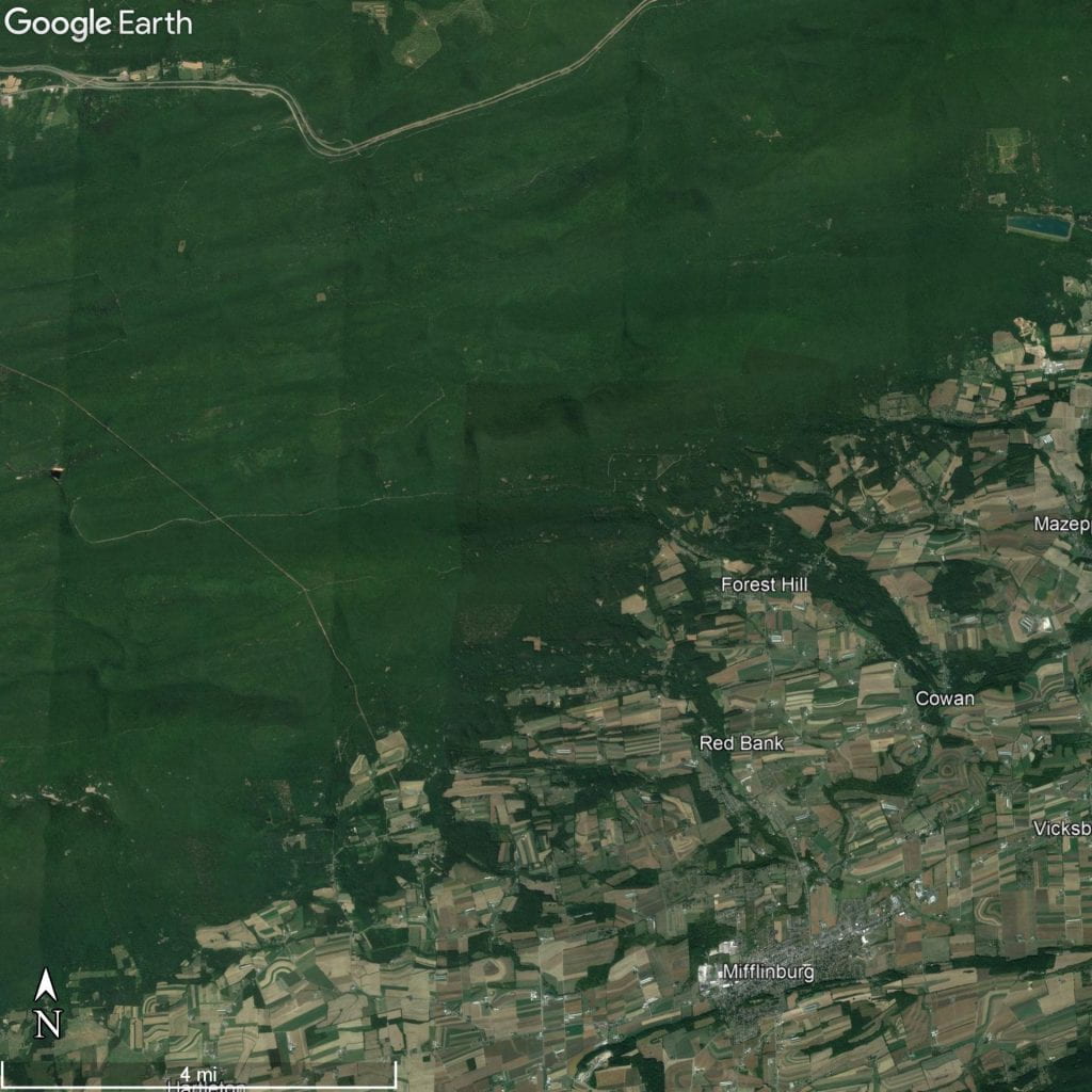
Aerial imagery of one region of Bald Eagle State Forest near Mifflinburg and Lewisburg
Image Credit: Google Earth. 
Satellite imagery of one area of Bald Eagle State Forest near the towns of Lewisburg (east of image border) and Mifflinburg, Pennsylvania. Note the dramatic difference in landscape!

Purple Lizard Maps offer a modernized traditional exploration experience and a break from our digitally mapped world. These paper maps (yes— paper!) are independently mapped by a group of cartographers with an emphasis on exploration. They are rich with details—from a rich curation of hiking trails and camping spots, to water recreation and bike paths. Even some local restaurants and other small businesses with similar quirks are included in the final print. The Purple Lizard symbols themselves represent an area of interest. They symbolize anything that the map makers believed as worthy to experience and explore. From my own usage of the maps, it was clear that thousands of hours went into the accuracy and detail of the mapped regions—offering a rich outdoor experience for those interested.

Of the various Purple Lizard Maps we have to check out at the Donald W. Hamer Center for Maps and Geospatial Information, I received the second edition of the Bald Eagle State Forest Map just a few months back to try out. When the concept was explained, I initially thought it was a great idea; an explorative service with a definitive meaning behind its destinations—unlike the previously viral Randonautica (which easily led one to the middle of fields and borders of private land). Meanwhile, the hundreds of lizard symbols across the series of recreational maps represent actual locations with something worth to explore, and give a motive for even those reluctant to go outside in the Pennsylvanian humidity.

Before going on my first trip using the map, I planned out a loose itinerary noting the general area I wanted to be in. While planning might make the trip a little less spontaneous for some, it helped me feel less overwhelmed from the large amount of lizards on the double sided map. I marked a few Purple Lizard symbols of interest, and additionally curated a list of local restaurants for afterwards that I never tried. The next day, I was finally onto my trek of state forest somewhere northwest of Lewisburg, PA, for my first go at using the Purple Lizard map!

The first lizard I searched for was on the border between civilization and the Bald Eagle State Forest—a massive, multi-county tract of land containing 194,602 acres of wilderness (link to additional state DCNR maps if interested). These maps encourage exploration with little detail on the lizard symbols, and with only the placement of the lizards themselves being your clue onto where to look. This became more of a challenge than I initially anticipated due to how remote some of the Bald Eagle state forest genuinely was.

The woods of the state forest were so dense and never ending— it felt almost otherworldly when compared to the urban and industrialized landscape I knew most of Pennsylvania for. Luckily for my legs, the first lizard I picked was located closer than most to a residential area. Near the shoulder of a rural, residential road, I walked for about half a mile in the woods through trails looking for any indication of something interesting. While searching near a steep bank and stream, I met my first curiosity from the Purple Lizard Map (at least, in an unintentional way). Just a few yards away from me, a baby raccoon rested on a toppled tree. Too fearful to get closer and possibly deal with an enraged raccoon mom, I resumed further into the woods.

A cute baby raccoon resting on top of a fallen tree.
Image Credit: Ben Brosius
A cute baby raccoon resting on a fallen tree.

As an environmental science major, I definitely gain something when I’m within nature like this, and the added joy of exploration made it so much more fun. Old growth trees of hemlock, white birch, oak, and more lined every inch of my view within the forest. Massive ferns and mountain laurel decorated the ground, and bumbling mountain streams painted with mossy stones were frequently placed. In the massive state forest, it is important to stay aware of your surroundings. While the trip was picturesque, a wild tract of land this size will have its accompanied wild animals. Black bears, bob cats, porcupines, rattlesnakes, and so many more animals have the state forest as their home. It is crucial to take the additional measure and learn what to do if an encounter between you and one of these animals did arise, and how to mitigate your impact for them as you explore their habitat.

  After an hour of walking, a beaten path my parents found seemed perfectly placed to take us to the spot of the lizard, using a nearby creek and the direction we walked from to orient our location on the map. Another 10 minutes of walking downhill on this path, we came to a gorgeous intersection of a few mountain streams and behold—a spot that could only be the Purple Lizard itself.

Two chairs sat on a sandy bank at the intersection of streams, allowing those that made the journey a rewarding rest— and with a view! In front of the chairs and streams, miles of undisturbed forest were laid out. Behind the chairs and next to the path we came down on, the hill slope revealed part of itself as a massive, geological wonder. On the hot summer day, the forest canopy and movement of the streams made the air here feel cooler, making it deserve to be a spot of interest in the state forest.

Two chairs on a slight bank facing a stream and forest
Image Credit: Ben Brosius
The first Purple Lizard found: In Bald Eagle State Forest, two chairs sit at an intersection of mountain streams and facing the expansive forest land in front.
If you are interested in trying out a Purple Lizard Map, we have many at the Donald W. Hamer Center for Maps and Geospatial Information available to be checked out!

Ben Brosius is a rising Junior Environmental Resource Management major under the Environmental Science option. He is pursuing minors in GIS and Watersheds and Water Resources. Ben’s interests also include environmental restoration, conservation, and education. He has been working at the Donald H. Hamer Center for Maps and Geospatial Information since January 2021.

Filed Under: General Interest, Hiking, Maps, Uncategorized

Exploring our Purple Lizard Map Collection: Ohiopyle State Park

September 27, 2021 by orn5008 Leave a Comment

Over the summer, the Maps and GIS team has been scattered across the country undergoing various adventures. With some of us still working remotely and meeting over zoom once a week or so, we thought it could be interesting for some of us to go to a nearby park with a trail map by Purple Lizard Maps. This map brand’s creator is a Penn State alumni, so our library has a collection of donated maps. What makes these maps special is that they include backwoods trails, public forests, and little purple lizards indicating “cool spots”. Since home for me is near Pittsburgh, I was sent the Ohiopyle map. 

Ohiopyle Purple Lizard Map

The drive only took about an hour. As I unfolded the map in the parking lot, I felt some shocked faces probably thinking “is she using a real paper trail map?!” I understand it is rare that someone of my age would even know how to use a print map like this. I will also admit, it was a relief to just leave my phone off in my backpack. We walked around some of the trails and found a spot with a purple lizard to have a picnic. It was a big rock overlooking the river and small waterfalls. 

After some snacking and wading in the freezing cold water, we decided to go on the bike trail there, which is part of the Great Allegheny Passage that spans all the way from Pittsburgh to D.C. We biked to a few more of the purple lizards. One was a giant green rock, and another was an interesting little waterfall alongside the trail. 

 I would recommend this brand of maps for any outdoors lover. We have a variety of their trail maps available here at the library. Overall, it was a very enjoyable trip, and I would love to go back and look for more purple lizards! 


Olivia Neill is a 3rd-year Geography major who is also pursuing minors in Spanish, History, and Political Science. Her interests are in human geography, anthropology, and GIS. She has been working at the Donald W. Hamer Center for Maps and Geospatial Information since January 2021.  

Filed Under: Uncategorized

Ancestry and Geography: How 23andMe Determines Heritage

August 27, 2021 by orn5008 Leave a Comment

Genealogy and family history are hobbies and passions that have been around for millennia. However, recent technologies like DNA testing and online record databases have reinvented the search for knowledge of one’s heritage and have made more options available to the general public. The company 23andMe is best known for its DNA ancestry kits that connect you to distant relatives and display the percentage of the different ethnicities that make up your ancestry. But just how does this company predict this information and how can we trust that it is accurate? 

How biomedical ancestry services work: 

23andMe uses modern biological technologies to determine ancestry composition, genetic relatives, and health inclinations for a given person’s sample. When you send in your DNA testing kit, 23andMe acquires your DNA traces through your saliva. The DNA composition is deconstructed to locate individual segments of DNA called genomes. These genomes are compared with their reference pool, which is a set of 14,000 individuals’ DNA whose ancestry and medical data is already known. When 23andMe’s algorithm detects a DNA segment in another person that resembles one in yours, it compares them to determine their position on your family tree. This is obviously not perfect, but it renders relationship suggestions that are close to reality, within practical limits. Your final overall ethnic composition is a result of the system adding up individual comparisons with known DNA samples to produce an overall estimation of your ancestral geographic make-up. 

How the information could be misleading: 

Although this company manages to find incredibly useful biological information, it is important to note that their geographic data is not exact. It is theorized that modern humans have been wandering around the Earth for about 70,000 years, when homo sapiens first emerged as the dominant hominid species and migrated out of East Africa. It was not until around 10,000 years ago that these groups moved away from their nomadic lifestyle and began to settle down in specific geographic locations. Since then, several factors like famine, natural disaster, and political unrest have pushed people to migrate elsewhere. Therefore, it somewhat problematic to suggest that one person is completely from one geographic location, because it ignores the fact that all humans have migrated at one point or another in history. 

While the ancestry results produced are the best we have for now, they are not perfect. It is important to keep in mind the potential sources of error one might encounter in one’s results. What are the ways in which the results could potentially go wrong? There are two ways detailed on 23andMe’s guide. The first is that there is so much admixture between humans that separating distinct categories of ethnicities is a gargantuan task. Haplogroups (descendants of groups that emerged from different migration route out of Africa about 70,000 years ago) are, for now, the best estimate one can make about categorizing different groups. For example, Latin Americans in South America today are likely to have an admixture of European (Spanish, Portuguese, etc.) and indigenous native (Aymara, Quechua, Guarani, etc.) ancestry. There may also be a lot of addition of slaves and indentured workers from West Africa and the Indian subcontinent that were imported to plantations early in the continent’s colonial history. Even those ethnic groups within smaller geographic regions have been intermingling for millennia. 


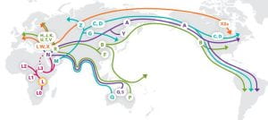
Maternal Haplogroups
Here is 23andMe’s maternal haplogroup map which depicts the migration patterns of various hominid groups of the ancient world.


The second potential for error arises from the fact that current technology cannot make a distinction between which chromosomes come from which parents. Humans have 23 pairs of chromosomes, with 23 chromosomes inherited from each parent. The way the chromosome pairs are linked, current technological limitations do not have a way of definitively determining which comes from the father and the mother. This makes it difficult to discern which side of the family certain features come from, including physical traits as well as ethnic bio-history. 

How this information contains biases: 

A very commonly heard criticism of 23andMe and several other ancestry websites and companies is that their tests tend to be Eurocentric, fostering racial inequity. Considering this, it becomes more apparent that these DNA tests were in fact designed for Americans of European descent. As the country itself is only a few hundred years old, a great portion of the incoming immigrants arrived in the 19th century. Many white Americans are a mixture of ethnicities only going back about two centuries. This makes it much easier to compare the DNA of current Europeans and white Americans, the main customer base of these products. There are other ways in which this test is heavily Eurocentric. For example, most of the reference populations that 23andMe uses to compare DNA are derived from modern day borders of countries. This is an issue for those of African descent as the borders of this continent were drawn primarily by European powers in 1884 at the Berlin Conference. These boundaries completely disregard the tribal ancestry and culture that still exist in Africa today and categorize groups in rather non-uniform and inconsistent ways. 

As much as this has social implications that cannot be dismissed, it is also important to remember that this is more of a practical issue than social. 23andMe does acknowledge the potential for bias in their data and has pledged to constantly improve their database with more diverse samples as available. The problem is, historically, most biomedical information saved has come primarily from European males.  

There are many other problems with the samples too. For example, the sample size for different categories is most certainly not proportional to their relative population sizes worldwide. There are far too less numbers of Indian and Chinese subjects tested in the reference samples to be statistically relevant given that these two “ethnicities” make up about 36% of the world population (what makes up an ethnicity is debatable). Some major groups with severe social influences are left out of consideration entirely, while other minor groups with much less of a compositional influence are included in the samples.  

Alternatives for researching family history and genealogy: 

Although these tests contain biases and some misleading information, we believe that they are still somewhat useful to those who are interested in learning more about their heritage and biological information. The test can be very pricey though, and there are some alternatives to researching your history further. With a Penn State access account, the Ancestry Library database is available through the PSU Libraries’ website. Although the Ancestry database also gravitates towards Americans and Europeans with most of their records being from the U.S. Census, it may be a useful alternative since it is free to Penn State students and faculty. Another free alternative is the website Family Search. It is a free service where you can create your family tree. When entering a name and birthdate of your ancestor, it attempts to match the information to family trees that may already exist on their site. Aside from these more official websites designed for genealogy, our library has some resources that may also be useful in this process: the library’s genealogy guide, Penn State’s State College Census Project with historical Sanborn maps from 1920 and 1930, and the Eberly Family Special Collections. 


Olivia Neill is a rising Junior Geography major who is also pursuing minors in Spanish, History, and Political Science. Her interests are in human geography, anthropology, and GIS. She has been working at the Donald W. Hamer Center for Maps and Geospatial Information since January 2021.  

Ishaan Anavkar is a rising Senior majoring in History and International Politics. He is also pursuing minors in Geography, Linguistics, and Anthropology, as well as certificates in Human Geography and GIS. He has been working at the Donald W. Hamer Center for Maps and Geospatial Information since January 2019. 


Filed Under: General Interest, Maps, Uncategorized

  • « Previous Page
  • 1
  • 2
  • 3
  • 4
  • Next Page »

Copyright © 2025 · Agency Pro Theme on Genesis Framework · WordPress · Log in