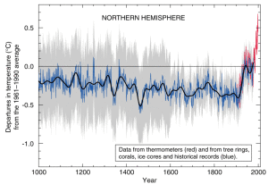
There is an interesting article on Penn State’s sustainability site today about the “hockey stick” graph and the controversy surrounding it.
 This graph, devised by Penn State scientist Michael Mann and his collaborators, shows a reconstructed temperature record for the Northern Hemisphere going back a thousand years. As the Penn State news post explains, this graph became an “icon” of climate change and thrust Mann into an unexpected (and probably unwelcome) public spotlight.
Mann has also written a book-length account of the whole affair, in The Hockey Stick and the Climate Wars.
