Introduction.
The application of gradients in print and digital media continues to evolve with technology and design. Gradients can add subtle depth and visual transition in a variety of mediums such as fonts, illustrations, and image overlays. They can be very simple with two colors, or very complex using 10 or more different hues, saturations and opacities. Really, they are as dynamic as the designer.
If you remember the 90’s, you remember that the guiding principle with technology was – if you can do it, you should, as much as you can! This philosophy brought us some truly terrible website designs, set to the soundtrack of AOL dialup. Some of these zombie websites are still around.
It’s no surprise that as flat design emerged, gradients were effectively laid to rest. In the last few years however, gradients have re-emerged as a design tool for modern and clean design.
Application.
Gradients are a continuous blending along one vector to another another. These transitions can occur between colors of the same tone, different hues, or multiple colors. Gradients are not limited to the transition of like colors, and can be used to create bold color combinations for a modern design.
Take the Instagram logo for example – the logo first began as with a skeumorphic design in 2010, designed to represent a polaroid camera with a rainbow stripe. By 2016, the logo has evolved into a flat design with a bold gradient color range.
In terms of design, gradients can be used to add depth or proximity, guide the user’s visual focus, or communicate a light source. The most common types of gradients are linear, radial, conic, diamond, and reflected. The following definitions were collected from Xd.Adobe.com, and paired with corresponding examples in CodePen:
Linear
A linear gradient creates a band of colors originating from a straight line. Note that the line doesn’t have to be vertical or horizontal or even straight. The gradient transitions smoothly from one color to the next.

Radial
A radial gradient radiates out from a central point. There’s room to play with the center point, size, and rate of transition in a radial color gradient.

Conic
A conic gradient is similar to a radial gradient in that they are both circular and use a center point for the color’s beginning. The difference here is that while a radial gradient transitions from the center to the exterior of the shaded area, a conical gradient shades in a circular, clockwise (or counterclockwise) fashion.
Diamond
A diamond gradient is best used in quadrilateral (square or rectangle) shapes. It forms a diamond shape from a central starting point, and the endpoints are in the corners of the diamond.
Reflected
A reflected gradient is like a linear gradient mixed with a mirror. The color is mirrored from a center line in each direction as opposed to a linear gradient that only shades in one direction.
In the following examples, the three basic gradients with 2 stops demonstrate the most widely known gradient types: linear, radial, and conic. However, by varying the degrees, opacity, number of stops, and other attributes, the transitions can become more dynamic designs on their own, as seen in “Conic, 4 Stops” and “Conic, Repeating”.
Find the CodePen, or:
See the Pen
Gradient CSS by megan (@megandbecker)
on CodePen.
Angles.
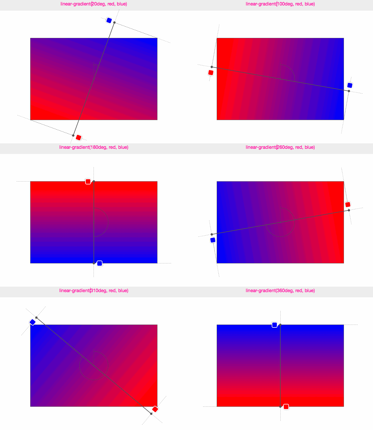
Gradients are infinite until the gradient box is defined. The gradient line is where the gradient color stops are distributed, and the gradient angle defines the direction of the gradient. Instead of the predefined gradient directions, such as to bottom, to top, to right, etc., the angle can be more acutely defined using degree values. For example, 0deg = “to top”, 90deg = “to right”, and so on.
Check out the gif from Medium.com that demonstrates the relationship between the gradient line and angle:

Choosing Color.
Before choosing colors, know the site brand to ensure the gradient will not clash with any logos or other standard color set. The next thing to take into account is the audience – the gradient for Instagram’s audience is far different than a gradient for AARP, which tend to carry the same hue with subtle changes in value. Finally, research color combinations and their interactions. Will the gradient be an overlay for a wedding photo, or confined within another shape? What colors will match the tone of the subject and content?

Best Practices.
- Try to limit the gradient to two or three colors.
- First, determine the light source and it’s effect on gradient areas to ensure consistency.
- Start with light areas at the top, and add any dark colors to the base.
- For most applications, choose colors that will blend well.
- Avoid placing gradients where there will be text.
- If you’re unsure when to stop, less is more.
Resources.
There are many resources for generating hex or RGBA codes, as well as creating numerous stops for patterned or dimension effects.
Webgradients.com is another resource to customize and generate gradient CSS. You can view their gradient use on their home page:


Comments