Weekly Blog #6: Future Goals

So far, I’ve accumulated 7 tasks for myself and possibly for my partner. Some of them are quite easier than the rest… but I wouldn’t say they can be finished in one day either. The number of monsters and miniboss will be enough for the video considering that the gameplay video will come and go at a very fast pace. Of course, my bosses are still relevant and will still show in the video (with new recolored sprites).

What I mean by “adding content on wallpaper” is that they will be more things to look at to show more of an aesthetic feel, even though it is purely pixelated as you can in the image above. Sound effects will not be professionally made, since we are new to everything with this, and will probably sound weird. It will consist of monster death noise, attacks, etc. to feel like a game. I would like to say with current pixelated game trailers that not all of them have sound effects in them and just the music itself which I can understand why; it won’t be a guarantee that they will be sound on every clip.

The most difficult task for me will be learning Adobe After Effects (typo on the image, whoops). After all, I can see that not everything will be possible to be animated only in Aseprite, I would most likely need to help and support of Adobe, like it or not.

That’s it for this weekly blog! Next blog will be introducing more of my character sprites.

See you next time!

Tony

Aseprite Tutorial #2: Color Palettes

With this tutorial, I am going to show you how to make your own color palette. If you want to use the premade color palettes you can read my BASIS tutorial with this link.

Now, let us start with the easy way to do this. There is a website that let you have other people’s color palettes and works using that palette called Lospec. Another website that lets you create your own fully custom colors is OpenGameArt. I have my color palette in this link so you may know what colors I use (even though it’s just a rainbow palette with two extra colors). If you using Lospec, click the download button and they will give you the option of which bits to use; I use the option “PNG image (32x bit)” and save the image they provide. Open that image inside of Aseprite and the tutorial will begin.

So, now you have your image inside of Aseprite. What you have to do is to decide where your sprite icon size location and keep it that way in all your work.

The way how I order the palette is that I tend to keep the dark tones on the left side to be similar for the Hue/Saturation slider.

Now here is the hard part of doing this. What you have to do is to register ALL of the colors to palette from the image. Fortunately, Aseprite has coded in a way that does that all for you like they did here in this image. However, sometimes the palette image has two exact colors in two different colors. Aseprite will register it as one color instead of two like they did in the image. The way to fight this problem is to count the rows and aisles your palette has and put that amount inside your palette.

Aseprite will only register 256 colors when you make a palette. They will also tell you how many colors in the palette. Pre-existing colors inside your palette will change to new colors that are found from the image or change positions while still have the same exact colors because it will already register those colors when opening the file.

Now consider the palette is in a disarray, the way to organize it is the most tedious part of this tutorial.

  1. Start by using the color picker tool. When you have the color picker tool to select a color from the image, it will automatically find its location inside the palette.
  2. Depending on the rows and aisles inside your palette you may need to change the amount of space in your palette. You have the ability to extend or shrink your palette like so:
  3.  After you counted your rows and aisles, now its time to put the colors in! To do this, you have to start with the bottom right corner, no matter if you are vertical or horizontal, and color pick it to find it inside the palette.
  4. Once you found that color in the palette ( the color ALWAYS be highlighted with a top-right triangle on it), you are going to move it on the bottom-right as the same location it has in the image has it. If you start on the top, the color palettes will move accordingly – this is the only method I can assume to prevent yourself from an even more messy palette.
  5.  Eventually, you’ll come to a color duplicate inside your palette. In order to fix this problem, you’ll have to click on the next black color palette and get the color manually. Color pick that duplicated color and go to the color wheel and copy (CTR+C) the HEX code for it.
  6. Once you have the HEX code for the specific color, go to the next block that is black, click on it, and paste the HEX code on there. REMEMBER TO UNLOCK THE PALETTE EDITOR IN ORDER TO CHANGE COLORS!!!Tip: You may also add more palettes to the original image and possibly not affect the palette. However, the colors may be already registered to the palette in many different locations, hence why it didn’t register any new colors.

And you’re done! Congratulations!

You’ve successfully created your own color palette. They will be more tutorials to come but having the basics is always great.

See you next time!

Tony

Aseprite Tutorial #1: Basics

In this tutorial, we will be talking about the fundamental basis of the Aseprite program.

When you first open the program, this will be a screen that will appear in front of you.

Aseprite is constructed in a retro-themed aesthetic to keep it simplistic and nostalgic. What you see in the program is standard for any basic program that lets you create something. It featured: history files/folders, version history, and new/open file as you can see. They also have the option for you “recover files.” While the feature may be nice and convenient, it does not recover a file that crashed instantly; it will most likely recover the file you work with 10 minutes prior. Version updates are kind of annoying. When it comes to “updating” the program, you have to technically reinstall it into the new version of the program.

So, when starting a new file, you will be introduced to the options to the file. Of course, everything is standard to the brim and nothing is complex about it besides the color mode.

In color mode, you have three options: RGBA, Grayscale, and Indexed. RGBA ( means red, green, blue alpha) and Grayscale are self-explanatory if you have used an image manipulation program or an illustration program before – Indexed is the unique color mode. Indexed is basically RGBA with a special ability; when you change a color of the palette, every registered pixel associated with that color with follow suit with the change. For example, you can see in the image that the sprite has a gray coat, a solid gray with a touch of a dark gray tone. If I changed that gray to a specific color, like green in the picture, that gray will no longer exist in the sprite.

Next up is the pixel ratio. They are also self-explanatory but may be confusing for beginners. Square Pixels (1:1) is the normal size when it comes to making an illustration.

Double-Wide Pixels (2:1) is twice the width than your usual brush stroke. In my opinion, the only usage I can think of for this size ratio is for tiles such as water texture.

Double-High Pixels (1:2) is twice the height than your usual brush stroke. This is probably useful when it comes to making buildings or anything that is tall in height-wise.

Inside the workspace

At this point, you have now selected your preferred choices in making a file. I chose the 1:1 ratio with a transparent background. You make the file RGBA transition to Grayscale or Indexed so there is no worrying about that. As you can see, the workspace is plain as it can get; featuring the most minimal elements in a paint program, similar to Windows Paint.

The preview window allows you to watch the live animation during your work. It gives an advantage for you to see any frames or places that don’t seem right for you. Once you change it, it automatically updates it in the preview window.

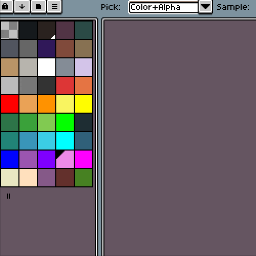
The Color Palette options have four buttons. The lock button is the control button that lets you edit your palette or not. The Down Arrow button is the organizer; it lets you sort out any way to design it to like by luminance or by hue. The folder-shaped button is the official presets that Aseprite provides. They have a lot that came from the actual color choices of game companies such as Nintendo or Atari. The last but not least is the Three-Line button. This customizes your palette by size, color wheel choice, and saving/loading custom color palettes.

The bottom of the workspace is the timeline. This is where you want to make your own GIF or animation sprite. It is somewhat simple to utilize, but it may become difficult once you want to know all of its features. With the five buttons it has on top of the layer/frame layer, 3 out of 5 of them are easy to comprehend. The buttons that are easy to understand are the eye button which the visible or invisible option, lock button which is locking the layer, and the two squares button which allows you to see an onion skin or not.

The buttons with the three bolts are a bit more confusing. The image on top can help you determine which do what. The one I believe is most useful is the onion skin opacity, this can help you see the onion easier or harder depending if you want to see the main layer easier. The three checkpoint options are for the onion skin if you want it to show the past frame or the future frame.

On the second image, there is this two circles option. This gives you the advantage of keeping one layer in a static motion for a specific amount of frames. For example, you may have Layer 1 have 7 frames and each is different, Layer 2 can use this option and use Frame 1 and extend it to Frame 7 to keep a static image. Layer 1 will have an animated sequence while Layer 2 will have a static image all the way from Frame 1 to Frame 7.

That’s it! So now you know a lot of information for Aseprite basics. They are more things to talk about at a later time but now you know how to start up and make your own work!


See you next time!

Tony

Weekly Blog #4: Storyboard

Hello! Tony here!

I would like to say first that the storyboard is not FINAL and have a huge possibility of being changed and improved on.

The music is set in a specific type of order. At the beginning of the trailer, I want the music to be quite mysterious; you wouldn’t know what is going on right now and you are currently investigating the character’s surroundings. It transitions to more of a happy tone to give a sense of tranquility. Nothing, so far, has built up yet and you are seeing that the person in view is having a relaxing time walking around. As the main character starts to build up the story, the music changes its tone to more of a dark tone – this is where the trailer really shows its true value. It features platformer action fighting with monsters, environmental hazards, and dialogue. It will transition to even more of a dark, evil tone to show that it is not a happy merry-go-around situation, the game is portraying as a sinister fighting game with relaxing elements in the mix coming from the overhead view.

Next week’s blog will be the mid-critique powerpoint that shows all our progress!

See you next time!

Tony

Wallpaper #1

First, I drew it on Clip Studio Paint to get the idea of where everything is because I believe doing sketches on Asesprite is difficult for me.

Next, I redraw it on Aseprite with a lower resolution to give it a more pixelated look.

After a realization, I do not think this was a good background for the project. I believe that it was too dynamic for my taste and wanted something simpler and more retro. So, I ended the illustration at this point and started to make a new background.

Weekly Blog #3: The Pixel Creator

Welcome back to my weekly blog! My name is Tony and I will show you one of the tools that I will be using and its purpose.

First off, the main program for the project, Aseprite.

Aseprite is an illustration/animation program that solely based on pixels. The brush strokes can only go as high as 64 bit to keep that low-resolution standard. It was not meant to create high detailed illustrations or animations, it is more of a blocky look to represent what the art was in 90s video games.

Aseprite will also be the animation part of the video. Considering that the program has frames feature, I can make the illustration be in motion. It can also produce the sprite sheet for every frame that was remade. As you can see in the below image, not much is changed on the idle stance of the character but a lot of motion is happening during the walking. The idle stance shouldn’t contain that much motion because they are standing afterall. While the walking stance shows the character that she is walking which is intended.

That is it for this blog. Next week’s blog will be the storyboard and the explanation.

Your digital artist,

Tony

Weekly Blog #2: Data

Hello! Tony here!

As stated from last week’s blog, I would like to talk about the data that I have to come to gather.

I want to explain a bit more of my thesis examples, Bethesda’s Fallout 76 and Re-Logic Terraria. Fallout 76 was going to be the successor of Fallout 4 with new aesthetics, lots of content, and enjoyable gameplay. However, Bethesda did not succeed in the slightest. While it may hold it’s beautiful graphics, the rest of the game was completely rushed to the release; they were glitches, multiplayer was lacking security, and the story can be interrupted with other sources of unintentional interactions such as hearing one recording being skipped by another recording that talks about the lore. The game’s initial release price was $60 but depreciate dramatically in just a week due to the negative impact it gives to the gamers. The release was going so terribly that Bethesda refused to give out refunds. It overall only sold a bit over a million, according to vgchartz, so far as September 2019.

Re-Logic’s Terraria, on the other hand, is a simple sandbox 2D game that continues to sell their game ever since its release in 2011. Terraria is a 16-bit game that lets you have control. There was no story or lore to follow by; it is you who have to make the exploration. On its first initial release, they didn’t sell as much as a triple AAA game due to its simplicity, 200k copies were sold, according to wikipedia. However, after players are having such an enjoyable time making their own 2D journey, the game’s gotten more and more popular as time goes by. In 2015, Terraria had sold 12 million copies with the same game mechanics as it had on its release but with added content. Terraria gamers understand that the aesthetics of a game should not be the priority to attract sales, it should rather be on the aesthetics of gameplay. The game was so successful, it had its final content update in 2019 and have a total of 27 million copies sold currently.

They are other examples as well. You can replace Bethesda to EA with some of their games such as Battlefield V and replace Terraria with another well-known game such as Undertale.

My point is, “don’t judge a book with its cover” while the “book” is actually games.

Next week’s blog will be discussing some of the tools I will be using and it’s advantages.

Your digital artist,

Tony


Weekly Blog #1: The Startup

Hello everyone! My name is Tony, one of the two collaborators in the project!
First off, not everything is going to be final. So, might have to change things here and there. Anyway, if you have read our thesis, our project is going to prove that game aesthetics shouldn’t be a higher priority than gameplay. We want to accomplish this by making a 2D pixel animation video that simulates a retro 2D videogame. It’s a simple idea yet hard to execute. For instance, a general videogame consumer is attracted to the beautiful, advanced graphics of a game as an understanding that it’s a high production game. What the unexpected turn of events for some of these games is that they were boring, lacking content, or simply unenjoyable. Our job is to show the visual look of a game shouldn’t determine the game’s popularity, rather it should be the gameplay.

Some of the programs that we will produce the video with are:

Aseprite for pixel sprites and animations.

Clip Studio Paint for illustrations, concept art, and sketches.

Adobe Premiere for the video.

Adobe After Effects for special effects on the video.

Next week’s blog will possibly talk about the statistics on sales of video games that talk about sales from famous game companies and indie game companies with their games.

See you next week!

Your Digital artist,

Tony

Skip to toolbar