Selling architecture can be hard. An idea has to travel from your creative ideas, to sketches, to computer aided drafting, to structural engineers, to HVAC engineers, to electrical engineers. The list can go on and on. Your architectural forms and functions has to be integrated into multiple disciplines that have their own agendas. Then, finally, it can be brought to the client for their approval. And since the client is usually not familiar with architecture, building systems, construction, they need a lot of help visualizing the final result. This is where architects use visualization techniques to sell their designs. They create pretty pictures that look realist to put the client into their world that they’ve created. And they create these pictures using many depth cues found in visual perception.
This past year, I had to create these pictures for my final thesis project. I noticed I was using a lot of the same techniques found in PSYCH 253. So I thought I’d share some of my iterations in my process and how they relate to the depth cues.
A little background on the images to follow: I am redesigning the lighting for a contemporary art museum. The space I will be going through is an art gallery. All of these added depth cues were done in Adobe Photoshop.
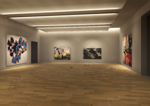
Base Rendering:
Increased contrast and color corrections:
Overlays added: The depth cue aerial perspective is somewhat used here. I added a white overlay to the back of the room which makes it a little hazy and creates a feeling of depth.
Fabric added to ceiling panels: This uses the depth cue of texture gradient. I transformed the perspective of the texture image into finer and finer detail, fading off towards the back of the room to add depth.
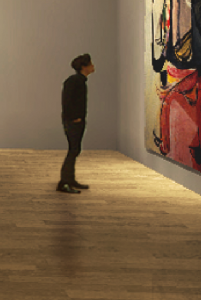
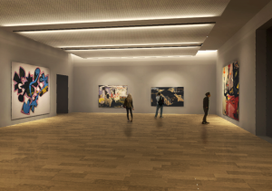
People were added: Adding people uses relative height, occlusion, as well as shadows or shading depth cues. You can see the guy below was transformed to a height relative to the paintings around him, he is occluding further objects, and he casts a shadow around him.
Final image: You can see a lot of different techniques were used to add the feeling of depth and realism from the original picture.


I thought your post was very interesting. It is amazing how something as simple as placing a person in the scene can really bring it to life. Your art observers add scale and help people envision themselves int he space. Your discussion of depth cues in the context of your project was also very good. In doing my own rendering and using photoshop in the past, I have used some of these same tricks but never related them to the concepts learned in Psych 253. I am curious to know how you added shadows to your people. Once again, that is a trick that makes the scene seem so real. Nice job on your post and your thesis submission.
I’m a second year architecture major and have also found myself making these discoveries throughout our time in PSYCH 153. Being that second year is when renderings and actual building design is more integrated into the program, you could imagine that i was constantly yelled at by my professors for forgetting things that i didn’t think were as important like scale figures and shadows and such. I didn’t realize until later that they truly do enhance the rendering not only aesthetically but in order to understand what was actually going on in the picture. I enjoyed the examples too.