Author Archives: jer5224

Architectural Visualization

Selling architecture can be hard.  An idea has to travel from your creative ideas, to sketches, to computer aided drafting, to structural engineers, to HVAC engineers, to electrical engineers.  The list can go on and on.  Your architectural forms and functions has to be integrated into multiple disciplines that have their own agendas.  Then, finally, it can be brought to the client for their approval.  And since the client is usually not familiar with architecture, building systems, construction, they need a lot of help visualizing the final result.  This is where architects use visualization techniques to sell their designs.  They create pretty pictures that look realist to put the client into their world that they’ve created.  And they create these pictures using many depth cues found in visual perception.

This past year, I had to create these pictures for my final thesis project.  I noticed I was using a lot of the same techniques found in PSYCH 253.  So I thought I’d share some of my iterations in my process and how they relate to the depth cues.

A little background on the images to follow:  I am redesigning the lighting for a contemporary art museum.  The space I will be going through is an art gallery.  All of these added depth cues were done in Adobe Photoshop.

Base Rendering:

original

Increased contrast and color corrections:

inccontrast

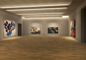
Overlays added:  The depth cue aerial perspective is somewhat used here.  I added a white overlay to the back of the room which makes it a little hazy and creates a feeling of depth.

overlays

Fabric added to ceiling panels:  This uses the depth cue of texture gradient.  I transformed the perspective of the texture image into finer and finer detail, fading off towards the back of the room to add depth.

fabric

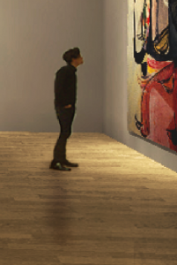
People were added:  Adding people uses relative height, occlusion, as well as shadows or shading depth cues.  You can see the guy below was transformed to a height relative to the paintings around him, he is occluding further objects, and he casts a shadow around him.

guynoshadguyshad

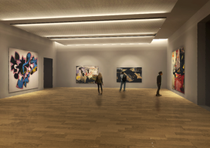
 Final image:  You can see a lot of different techniques were used to add the feeling of depth and realism from the original picture.

 final 

We Don’t Know What We Want

Or we don’t know how much we want.  When dealing with how much light we need to do certain tasks, we usually have no idea how much light we actually need.  This is a major issue in the Illuminating Engineering Society (IES).  They are responsible for creating guidelines in how much light we need for each and every task imaginable; everything from parking your car, to eating in café.

About 50 years ago, when energy was cheap, we thought the more the better.  By blasting lots of light everywhere, we were guaranteed enough light to see what we were doing.  Not only are there numerous aesthetic issues with this, but there are obvious energy issues as well.  This has changed throughout the years and the IES now recommends tailored light levels for each task.  Energy was the main driving force behind this change in thinking.

But in order to convince the general public and the skeptics out there, the IES and lighting designers relied on sensation and perception basics to back up their lower light levels.  In particular they relied on Stevens’ Power Law (P=KSn).  When n < 1, the doubling of physical intensity results in less than a doubling of perceived magnitude.  So when blasting light everywhere and achieving a high light level, you were also creating a high perceived magnitude.  But by just reducing the light level by half, you lessened the perceived magnitude, but by less than half.  So just by getting a little bit more specific with your light levels and lowering them overall, you can actually achieve close to perceived magnitude light levels.  Therefore, they argued, blasting light everywhere is not an efficient use of the human eye’s perception.  A lower tailored level of light with each task attempts to be the most efficient use of energy as well as our visual perception of magnitude.  

DarknessThe photo above is an example of seeing brightness in darkness.  We perceive the lamp as very bright, even though the light level is very low.  This is an efficient use of our eye’s visual perception.