The visual system is a “funny” thing sometimes, which projects a variety of unique functions. These can be related to many things such as simply viewing the words on a large screen or understanding the depth cues that are presented within a simple piece of art. Many times they are designed within these paintings and images, which allow our eyes to adjust to the depth or even the overall artwork itself. Ever wonder why a flat canvas looks like it goes beyond the actual painting or frame? If its just a flat screen or piece of paper why do these objects or things look farther away then others, when really its only 3 feet from my face? It’s because of monocular and binocular depth cues. The image crosses both retinas in each eye, and is the same. There are certain times were there is retinal disparity or even convergence occurring as we look at these paintings or images. For artists, they have been able to create the impression of depth on a 2-dimensonial surface by using the depth cues in which create our visual perception within everyday society. When this occurs it happens so easily, and for us it occurs so frequently that it is never really noticed or appreciated. There are two types of monocular depth cues that depend only on what’s available on a certain page, which are pictorial depth cues. Additionally, there are those that rely on the perception of motion called motion parallax or relative motion. Shown in the images within this article you can see how your eyes will adjust accordingly. For the painting your eyes will observe all the little details within it, while you climb through the painting itself all the way to the very back at the horizon line. Whereas, the other photo illustrates how you eyes will focus on one specific image at a time, because they can’t generate both simultaneously. You will either see a vase or two people facing one another, but not together. Your eyes will simply shift back and forth between the two to produce the image. So next time you get lost in a painting or your eyes generate simple images for you, take a moment and say thanks a lot eye balls for being so awesome!
Category Archives: Uncategorized
Hearing Loss and Rock Concerts
When i was a Junior in high school, i spent a good majority of the winter and spring touring the east coast with a group of 20 other kids my age, playing classic rock concerts everywhere we went. When i first got on stage, with amplifiers stacked behind me turned up to the highest volume and a drum set with microphones in or around every drum or cymbal, the loudness or intensity of the sound was a little overwhelming. I mostly sang when i was on stage, and it can be difficult to hear yourself when so much other noise is around you. The first time i performed on stage, i was blown away by the other instruments and i couldn’t stay in the right key or sing the right pitch. My ears became desensitized over time, and i adapted to be able to control my voice despite the roaring guitars and ground-shaking drums
In February of 2009, we went on stage with Napolean Murphy Brock, whom most of you are probably unfamiliar with. He played jazz flute and the saxophone for Frank Zappa and the Mothers of Invention, a progressive rock band. He was an experienced musician, and i sought to learn from him while performing together. At the first show we played together, i noticed he was wearing earplugs, and asked how he could handle dulling the band’s sound so much to his own ears while still putting on a good show. He told me if i didn’t where ear plugs, i would be deaf in 20 years of putting on loud concerts. Phil collins is a famous musician who thrived in the 70s and 80s, and put on shows until he was almost 60-years-old. In 2011, he announced he would never again be performing on stage, because he could go completely deaf if he suffers any more hearing damage.
I spoke to my father, who was a music guru as a young adult, and he told me about how he has a constant ringing in his left ear that never goes away. He went to a performance by The Who in 1979, who were widely renowned for how loud their shows were, and was standing in the second row, on the far left side, directly next to a giant speaker. He said the ringing started after that show, and he has had hearing problems ever since. I first noticed my father’s hearing impairment when i was boiling water in a tea kettle, and walked outside onto my deck to shovel snow. I heard the tea kettle whistle, and ignored it because i figured my father would remove it from the hot stove for me. After a couple minutes, the whistling did not end, and i walked inside to see my dad watching sports in the same room as the stove. I asked him if he could hear ‘that’, and he replied, ‘hear what?’ The pitch at which the tea kettle whistled was the same as the ringing in his ear that does not go away. I was astounded that he could not hear the piercing sound, and promised myself i would never let my hearing get that bad.
I began to wear earplug whenever i performed, and despite not getting the full effect of hearing each song we played, it did not impair my ability to sing, and more importantly did not damage my hearing. In class we discussed the poor hearing of our generation, mainly attributed to the widespread use of ear buds, but loud shows can have the same detrimental effect on one’s hearing. Whether you are on stage or in the crowd watching, it is very important to wear earplugs during the louder performances, because it reduces the impact of soundwaves entering the ear and prevents damage to the Stereocilia within the inner ear which are very precious. Stereocilia cannot be regenerated, and excessively loud noises will destroy them.
Take good care of your ears, because your hearing becomes worse each and every time your stereocilia are damaged or destroyed. Neil young, Pete Townshend of The Who, Eric Clapton, and Jeff Beck of The Rolling Stones, all have permanent damage to their hearing, and will tell you time and time again that they wish they had worn earplugs on stage.
Fishing Boats by the Shore in a Calm

“Fishing Boats by the Shore in a Calm” (ca. 1660–65) Oil on canvas by Willem van de Velde the Younger (1633–1707)
This is one of my favorite paintings from Legion of Honor, for I always have this obsession with paintings of boats and ships. Willem van de Velde the Younger used many cues to give depth perception to this painting. One being occlusion, I can tell that the two boats on the far left seem to be parallel together, and the first boat is in front of the second boat because the first boat appears to be closer to where I am, and the second boat is further away from me. I also know that all the boats are about the same size based on my knowledge. This is the familiar size cue, even though some boats appear to be way smaller, some bigger, I still know that they are approximately the same size. So are the people in the painting, I know that they are about the same size as well, the two people near the tent are not x5 larger than those on the boat on the far back based on my knowledge. Another cue present in this painting would be aerial perspective, the fainter and the lighter color on the sky indicates that it is further away from me because the distance between me and the object of the background is further. And the bolder colors tell us that it the object is closer to me. Texture gradient tells me that the closer the objects are, the more details I can see. Therefore, I am able to see more details of the first boat that is closest to me than the ones that are further away from me.
Image source: http://www.sfgate.com/art/article/Dutch-and-Flemish-masterworks-at-Legion-of-Honor-2355389.php
Attention to Detail
What is attention? Seems like a simply question doesn’t it? However, no one can seem to give us a definitive answer. It is an arbitrary concept that our brain has seemed to master in order to take in information from our world. Most people think that they can attend to the whole environment around them and that they have a very vivid understanding of the world. Unfortunately for us, this is not true. Our attention is limited to only things that fall in the range of the fovea. Everything else is based on assumptions made by the brain. The reason we believe we can attend to everything is based on our ability to switch our attention from one thing to the next. We had several in class examples to show this. There were the videos where entire buildings were changed slowly but no one noticed until we looked at the original image. There were the gifs of pictures where one element changed. Even after watching the change right in front of us for 5 mins, it still had to be announced before everyone let out an audible “ooohhh!” It is both amazing and a little scary to think that we can miss things that are blatantly taking place right in front of us. It can make one wonder what else are we missing in our everyday life?
Architectural Visualization
Selling architecture can be hard. An idea has to travel from your creative ideas, to sketches, to computer aided drafting, to structural engineers, to HVAC engineers, to electrical engineers. The list can go on and on. Your architectural forms and functions has to be integrated into multiple disciplines that have their own agendas. Then, finally, it can be brought to the client for their approval. And since the client is usually not familiar with architecture, building systems, construction, they need a lot of help visualizing the final result. This is where architects use visualization techniques to sell their designs. They create pretty pictures that look realist to put the client into their world that they’ve created. And they create these pictures using many depth cues found in visual perception.
This past year, I had to create these pictures for my final thesis project. I noticed I was using a lot of the same techniques found in PSYCH 253. So I thought I’d share some of my iterations in my process and how they relate to the depth cues.
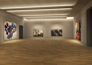
A little background on the images to follow: I am redesigning the lighting for a contemporary art museum. The space I will be going through is an art gallery. All of these added depth cues were done in Adobe Photoshop.
Base Rendering:
Increased contrast and color corrections:
Overlays added: The depth cue aerial perspective is somewhat used here. I added a white overlay to the back of the room which makes it a little hazy and creates a feeling of depth.
Fabric added to ceiling panels: This uses the depth cue of texture gradient. I transformed the perspective of the texture image into finer and finer detail, fading off towards the back of the room to add depth.
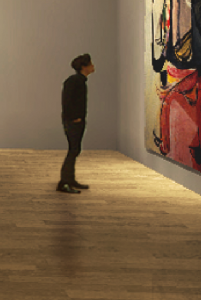
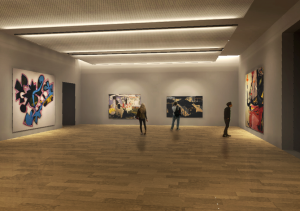
People were added: Adding people uses relative height, occlusion, as well as shadows or shading depth cues. You can see the guy below was transformed to a height relative to the paintings around him, he is occluding further objects, and he casts a shadow around him.
Final image: You can see a lot of different techniques were used to add the feeling of depth and realism from the original picture.
A Euclidian vs non-Euclidian World
While the world around us is constructed with parallel lines running parallel, our eyes never see it that way. What we see on our retina and what is actually there before us are extremely different. Euclidian geometry represents the idea that two parallel lines will stay true to form and remain parallel as they extend into space and is a representation of the real world (Wolfe). What our retina sees though is non-Euclidian in nature and results in parallel lines extending to a common vanishing point. So a drawing using Euclidian geometries is accurate in an object’s actual construction but would never be seen in that same manner by our eyes and in a sense creates a false image.
For my freshman year in architecture I had a class that was entirely focused on accurately hand drafting architectural elements. Throughout the class we did a series of projects that focused on drawing Euclidian shapes and using Euclidian geometries to portray buildings but also did drawings that were non-Euclidian in nature and more focused on the perspective that would also be seen from a person at the building. From an architectural standpoint there are advantages to both types of drawing even though we only perceive one way.
The first drawing below is of Adolf Loos’ Rufer House in Vienna, Austria. This was drawn using Euclidian geometry to give a true sense of the space and accurate dimensions of every element within it. Even though the building would never be seen this way it can accurately portray the buildings true proportions.

 [Image Credit http://www.greatbuildings.com/cgibin/gbi.cgi/Rufer_House.html/cid_20051213_kmm_img_7989.html]
This second drawing uses non-Euclidian geometries to represent what a person would experience if they actually visited the building. The drawing below is of the Palazzo Vecchio from the entrance of the Uffizi in Florence, Italy. If you were to actually visit the Uffizi then the normally parallel lines of the building would appear to converge on a vanishing point at Michelangelo’s David due to the monocular depth cue of linear perspective.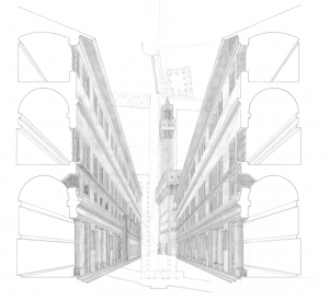
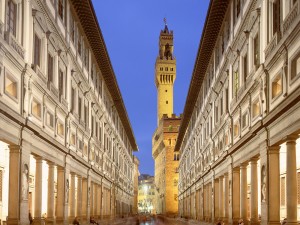 [Image Credit http://miriadna.com/preview/uffizi-gallery-(florence)]
While we may only experience the world from a non-Euclidian perspective, and the world is actually constructed from Euclidian geometries, both forms provide us with a representation of the world around us. As an architecture student it is useful to perceive the world in both ways to get a better sense of space even though our eyes only let us view it from a non-Euclidian perspective.
Works Cited
Wolfe, Jeremy M., Keith R. Kleunder, and Dennis M. Levi. “Sensation & Perception: Eye Structure.” Sensation & Perception: Eye Structure. N.p., n.d. Web. 17 Mar. 2014.
Creating depth
Because one of my passions is art, I constantly relate the things I learn in this class to drawing concepts. At first I was surprised that there was so many similarities and overlaps but the more I thought about it the more sense it made: this class is, essentially, all about seeing. Art is (generally) about looking. In my last blog post I wrote about geons and how they relate to art but in this one I’m interested in the concept of depth. We have pictoral depth cues, which is when 3-D worlds are projected onto 2-D surfaces. How do artists create depth in art? By mimicking the way the eye perceives depth. Occlusion is one of the easiest ways to create depth when drawing or painting. Because the eye automatically perceives the occluded object to be further away or behind, it’s a simple way to create the illusion of depth. A lot of the things artists do in creating depth are less about specific artistic techniques and more about automatic reactions: we don’t consciously think about the fact that smaller objects look farther away or occluded objects look more distant. But as I draw I know that these are essential things to do if I want the picture to make sense spatially.
One of the most important, basic elements of trying to artisitically create the illusion of depth is linear perspective. One of the first things an artist should do when they begin a piece is find their vanishing point. Once those parallel lines are on the paper, it’s a matter of making sure everything you draw follows those lines. While drawing, the diminishing lines guide me in terms of how big or small whatever I draw should be. We learned about anamorphosis, which is purposefully distorting something so it only makes visual sense when viewed at a certain angle. This is something that a lot of artists do and I’ve used this technique a few times myself. But it’s very difficult because before you try to distort depth you have to already know how to create it normally.
Depth Cue picture
I have a picture in my room that I never really thought to much about until this post. It has almost all of the depth cues which we learned about in class in the picture. The picture is of my brother and I standing outside of my house that was drawn by an artist. The first cue that I noticed was occlusion. The house was obviously behind my brother and I because you could see our whole bodies, but not the whole house. Part of the house is blocked by us and also trees that are between us and the house. The next cue I noticed when looking at the picture was linear depth cue. You could see the river behind the house meeting with the horizon and all the rest of the picture kind of going to one spot where it looks to all vanish. The third depth cue I saw in the picture was atmosphere perspective. You could see that the sun which was closer to the horizon looked much farther away than the house or my brother and I. The clouds were higher up in the sky making them look closer. Under the horizon you can see the river which is very close to it and the water looks like it is going very far out while the trees which are drawn lower in the picture seem to almost stick out more. Other obvious depth cues that were in the picture were familiar size. You know how big a person is compared to a house or even compared to the river. We looked bigger because it was the main part of the picture making the house and river behind us look much smaller. You can find these depth cues in almost all of the pictures you will see in your life.
Abbey Road Depth Cues
Monocular depth cues are cues to depth, or to three-dimensional space, which only require the function of one eye. There are nine monocular depth cues: occlusion, relative size, relative height, texture gradient, familiar size, linear perspective, aerial perspective, shading, and motion parallax. Each of these cues provides some indication of the depth of objects in our visual field.
The following image of my favorite band, The Beatles, clearly has depth. However, we’re not standing on Abbey Road seeing the scene take place, we’re just looking at an image, so how do we know that there is depth?: Depth cues!
This image arguably utilizes eight of the nine monocular depth cues listed above and I’ll explain how.
Occlusion, the idea that an object that blocks the view of another object must be in front, is evident in the image. One obvious example is when looking at the trees and buildings on the right side of the image. We know that the trees are in front of the buildings because there is a portion of the buildings that we can’t see; that is blocked by the trees.
Relative size, the idea that smaller objects are further away without knowing the actual size of the objects, is also evident in the picture. For example, we can see several trees in the picture. Not all trees are the same size, but all of the trees in the image appear much smaller than the large tree in the upper left so we can conclude that the other trees are progressively further away.
Relative height is a depth cue clearly evident in the picture as well. For relative height, objects that appear closer to the horizon line are perceived as being further away and objects that appear further from the horizon line appear closer. For example, The Beatles are far from the horizon line and appear much closer to the observer than some of the smaller-looking cars that are just below the horizon line.
Texture gradient can arguably be considered a depth cue utilized in the Abbey Road picture. If you look at the road at the bottom of the picture, you can see the rough texture that the road has. Now, if you look at the road in the middle of the picture, near the horizon line, the road’s texture is less obvious. This is because as a texture gets further away, it forms smaller visual angles, or pictures, on the retina, and is less noticeable.
Familiar size, the idea that knowledge of the normal size of certain objects can provide cues to depth, is also evident. For example, we are familiar with the size of people. In the picture, there is a man standing on the sidewalk beside the black/blue car on the right. We know that this man is roughly the same size as the members of The Beatles because we have experience with the size of people. Our knowledge of the size of people clues us in to the fact that the smaller-looking man is probably just further away from the band members and not actually a miniature person.
Linear perspective, the idea that parallel lines seem to converge as they move into the distance to an apparent point called the vanishing point, is clear in the image. This cue can be seen when looking at the way the edges of the road converge in the distance. We know the road isn’t actually getting narrower; it’s just getting further away.
Aerial perspective is a subtle depth cue in this picture. With aerial perspective, objects that are further away also appear to be hazier and bluer. This is true for the trees and cars in the middle of the picture near the vanishing point.
Shading, as a depth cue, could arguably be considered a depth cue in the Abbey Road image. With shading, objects that bulge outward (convex) are lighter on the top and darker on the bottom and objects that dip inward (concave) are darker on the top and lighter on the bottom. This is a more difficult cue to spot in the picture but it can be seen on Paul McCartney’s suit (second from left). Looking at Paul’s shoulder, the fabric is lighter on top of his shoulder (bulging out) than the darker stripe on his arm (dipping in) where his suit is wrinkling.
Motion parallax, the idea that objects that are closer move faster across the field of vision than objects that are further away, is not a depth cue in the Abbey Road image. This depth cue requires motion and, of course, an image does not have motion.
Image Source: “Beatles Vinyl Record Collectors Online Shop.” BEATLES Abbey Road Capitol Records Beat, British Pop Vinyl Record LP. Web. 29. Apr. 2014. <http://www.vinylrecords.ch/B/BE/Beatles/Abbey_Road/abbey_road.htm>
Attention
This past summer I went on a trip to Paris, France and discovered first hand at the crime that occurred there. In many cities, pick pocketing is a problem, but in Paris pickpocketing is extremely common. Residents have learned to always carry purses close to their body and be aware of their surroundings. When I arrived in Paris, we took the subway called the Metro back to our hotel. I learned before my trip that many immigrants from poor African countries, who are very experienced pickpocketers also have children trained in this craft as well. My mom warned me to securely hold my bag on the Metro to make sure nothing got stolen, because often people leave the metro noticing that there is a hole in their purse or pocket, and there wallet often times is stolen without their awareness. When I was riding the metro to our hotel, I was nervous, because I had to keep an eye on both my backpack and suitcase. Meanwhile, I felt a little tug on my backpack and turned around to see the zipper open and a young boy’s hand about to grab my cellphone. Since my attention was focused on my bags on the subway, I noticed the tug, but if my attention had been directed on my mom and sister, I would probably not have noticed the boy opening my backpack zipper. I was frightened and shocked at how fast the boy did this. I have heard various stories of pick pocketers on these subways cutting into bags and even back pockets without people noticing, because there attention was directed somewhere else. It happens so quickly that people don’t notice until the pickpocketer vanishes into the crowd. This story relates to the concept of Selective attention. If people’s attention is directed on things like talking to friend and family while walking through the city or on the subway, they often miss other things going on in their environment. The concept of selective attention is when attention is restricted to certain locations, objects, or times. For example, in class we watched the video we watched in class of the pick pocketer, the person’s object based and space based attention was directed on one thing while the pick pocketer stole the object that wasn’t being focused on. Pickpocketing is something that is not magic and can be easily learned by learning how to direct people’s attention or taking advantage of them when their attention is already focused on something else, such as on the Metro in Paris or walking through the city.


