At the conclusion of this lesson, students will be able to:
-
-
- Define the portrait’s theme, formality of the occasion, and coordination of colors between multiple subjects to determine appropriate clothing and accessory options.
- Identify problematic clothing options and accessories to remove them from consideration.
- Evaluate remaining clothing options and accessories based on seasonal and weather conditions for outdoor photo shoot locations.
-
Matching Your Background With Clothing
How Complementary Colors Will Add Depth and Ease to Your Photos
Once the location for your portrait has been determined, the next step is to consider clothing options for your subject(s). This task seems deceptively simple. If you think of your photo as a story that you are telling in one frozen moment in time, however, then clothing and accessories play a large role in that narrative. Careful attention should be paid in terms of what your subject(s) should – and should not – be allowed to wear.
Let’s begin with some general concepts around how color will work in a photo. Watch this video to learn about complementary colors and how to use them:
[for our testers, this is where we will have made and inserted a video-please simply note the photo still and the audio transcript]
Audio Transcript:
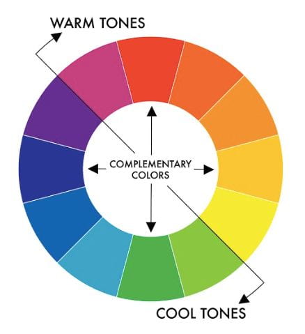
“Color theory can add a lot of impact to your images if you can learn how to use them. If you are looking to take a photo that is professional quality, you will want to get used to using complementary colors in choosing your background, as well as your subject’s clothing. Let’s talk basics: complementary colors are basically colors that are opposite each other on the color wheel. In this chart, you can see the arrows are pointing between complementary colors. They are complementary because the effect of pairing them together makes them less competitive to the eye. Also, if you match a cool tone with a warm tone, it will bring the warm color forward and add depth to the photo.
If this is too much to wrap your mind around, just keep this color wheel handy and simply match along the arrows.”

Audio Transcript:
“Now let’s look at this in action a little bit. Both of these are examples of paired complementary colors. The two squares create a very different effect, however, because one has a warm color in the background and a cool color in the fore. The one on the right is a little straining, because the red is dominating because it is taking up most of the space. This is important to consider when looking at backgrounds: a good rule is to keep your backgrounds as cool colors to keep your subjects as the main focus for the eye. The issue here is not the matching of green with red, because they do complement each other, but rather the amount of red. As we discussed before, neutral and consistent colors for your background/location are going to give you the best options.”

Audio Transcript:
“Here we have a professional photo by Larry Lourcey. Let’s look at the main colors here, next to the color wheel: we have the plum of her dress and her skin tone in the orange/yellow area. Larry has chosen a cool background that is most directly opposite the plum color, which is a green/blue/muted yellow. What you can see is it makes the plum of her dress stand out, and let’s it naturally draw in the eye. It complements the plum, and adds depth to the overall photo.
For our purposes, you are choosing clothing to match the location so you will do this process in reverse. Take your color wheel, find the main colors in your background, and choose clothing which are complementary to those main colors.”
Clothing Options
What to Consider When Choosing Your Subject’s Clothing
As with choosing the photo shoot location, context plays a key role in deciding which clothing and accessories should be considered for your subject(s). Theme and formality are two key aspects of this context. A teenager graduating from high school, for example, should be dressed in formal attire over a cap and a gown to communicate both the nature and level of achievement being celebrated.
Similarly, coordinating colors for portraits containing multiple subjects adds consistency between them so one doesn’t stand out more than the others. Clothing accessories should also make sense contextually. A young child’s Santa sweater is perfect for a Holiday photo, for example, but would confuse viewers if that sweater was worn to celebrate her birthday. Clothing options with large logos should be removed for the same reason. Finally, large accessories such as hats with wide brims should be avoided because of their tendency to cover parts of the subject’s face or cast unflattering shadows on the eyes and face. Take a look at the examples below to see what we mean.
Coordinated clothing
 If you are wanting to take a photo for a specific occasion, such as a holiday, you may consider coordinated clothing. Coordinated clothing can also be great for funny family photos, even without a holiday! Coordinated also does not mean they have to match exactly, but rather are of similar colors, with a unified theme. Take a look at this example on the left of a family Christmas photo. In this photo the family is matching patterns, but the overall theme is family and Christmas. With keeping the same colors for each, though, they did not have to worry about complementary colors as much.
Large Logos
 There are also some things to look out for and avoid, of course. Chief among them is any kind of logo. Unless you are purposefully doing a coordinated clothing option with the same logo variation, with the same colors, the logo will always clash with the other subject’s clothing-even if they are dressed well and in complementary colors.
Patterns
 It is the same when it comes to patterns: even a complementary colored pattern will distract from the others, and unless you are coordinating outfits extremely precisely with that pattern, it will clash and compete for the eye simply because it is difficult to match patterns. As you can see in this photo to the left, they have beautiful lighting, a great neutral and consistent background-but the grandmother and grandfather have patterns that do not match each other, and make them more prominent than the others.
Table 1. Examples of Clothing Options and Accessories for Occasions
| Occasion | Clothing Options/Accessories |
|---|---|
| Graduation | Cap, Gown, Dress, Suit |
| Independence Day | Sunglasses, Shorts, Light Clothing |
| Senior Prom | Formal Dress, Tuxedo, Corsage |
| Christmas | Sweater, Presents, Warm Clothing |
Table 2. Examples of Coordinating Colors
 |
 |
 |
Now that you’ve chosen clothing and accessories in the proper context and have removed any problematic options, you should refine your choices based on the location selected for the photo shoot. In terms of shooting outdoors, clothing and accessory options should be appropriate for seasonal and weather conditions. In both outdoor and indoor locations clothing options should have complimentary colors relative to the photo’s backdrop. These colors create a natural contrast that help to highlight the subject(s) and that viewer’s eyes find naturally appealing. Similarly, choosing clothing options whose colors contrast against the photo’s backdrop help the subject(s) stand out more by drawing the viewer’s eyes to them.
Based on these considerations, your initial list of clothing and accessory options should have narrowed considerably, making the best options relatively obvious. Keep in mind, however, that clothing and accessory options are subjective, so while the considerations provided in this lesson are less rules than guidelines, feel free to bend them to support your artistic vision.
In Summary
The clothing and accessories worn by your subject(s) help tell the story that you want your viewers to interpret correctly. Careful consideration should be paid to context, colors, and eliminating distracting elements to ensure attention is put where you want it to be. In the next lesson we will begin to discuss more technical aspects of portrait photography – arranging subjects and camera equipment for optimal results.
Self Check
| Based on what you’ve learned about selecting the clothing options for your portrait subjects, try it yourself! Be sure to pay special attention to why you are making decisions about clothing options such as color, design, and accessories. Once dressed, have your subject(s) pose and take a photo – don’t worry about getting everything just right. We’ll cover that in future lessons. |
| Although there are many things to carefully consider when selecting clothing and accessories for your subject(s), it’s important to not overthink clothing choices. When in doubt, let common sense be your guide, and don’t be afraid to bend the rules to satisfy your artistic vision. |
| There are some colors of clothing that the experts say should NEVER go together, and while dressing subjects for family portraits is a matter of taste and style, you may want to avoid the following color combinations:
|

Continue to Lesson 3: Subject and Equipment Positioning