![]()
![]()
May 26, 2014 by Leave a Comment
The End
May 5, 2014 by Leave a Comment
Well it look likes I’ve reached the end of the map. There’s no more land to discover, nothing else to talk about.
Just kidding. Really, it’s the end of phenomenal freshman year at Penn State. I still cannot believe that I am 25% done with my Penn State career. But I digress, just because I don’t have to blog for class doesn’t mean that I won’t even blog again. Be sure to stop by johnswab.wordpress.com and check out my blog and find out more about me.
Thank you for reading and commenting on my blogs this past year! It’s been a lot of fun.
What’s Your Perception of Place?
April 24, 2014 by 11 Comments
Hailing from Maryland, I’m somewhat of an outsider (geographically speaking) at Penn State. When my friends talk about where they are from they often say “I’m from ___________ Township “or from “_____________ Borough,” and then follow up with the inevitable “Oh, it’s outside of Philly/Pittsburgh.” Over time I notice that something was different—my PA friends are able to point to a local form of government that exist that is smaller than the county level. This is much different for me in Maryland.
In Maryland, the governmental structure goes as follows: State, County, City/Town. Census-designated places (places that are named but have no governmental authority behind then) also exist but have no legal authority and no “recognition,” like they do in Pennsylvania. School districts are all organized on the county level, and the majority of the water/sewage districts are also organized by the county level.
In Pennsylvania, the government structure goes: State, County, Borough, Township. Villages and Census-designated places also exist for local naming purposes (as highlighted in Figure 1). There are also school districts and municipal authorities for water and sewage that may overlap with several townships or boroughs.
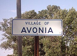
Figure 1: A Village Sign on a PA Road (Maryland does not have these)
In essence, in Maryland place naming is very much focused on the county level and census-designated places. Thus for me I would say I’m from Harford County from the town* of Fallston outside of Baltimore. Fallston itself isn’t a town. Fallston doesn’t have a police force. There is a Fallston school district, however this is for attendance only—all administrative directives come from Harford County Public Schools. Even towns and cities do not have control of schools located within their jurisdictions.
In Pennsylvania, the schools district and the local government is much more important to the average citizen because control of government resources are decentralized lower than the county level. And this presents an interesting geographic question. In Pennsylvania there are no unincorporated territories. In Maryland the majority of the state is unincorporated. How does this effect the ways that local residents perceive their location?
Are Maryland residences more likely to state what county they are from and it’s relationship to a larger geographic landmark (state line, major city, ocean, etcetera), while Pennsylvania residents are more likely to state their township/borough and it’s relationship to a larger geographic landmark? How does this affect the larger idea of place naming, and what problems exist around it due to the differences in systems?
Finally, I want to ask you, what are your opinions?
*Yes, I use the word town, however if I was speaking to someone from Baltimore it would be known that Fallston does not have it’s own government
Making Maps By Hand
April 17, 2014 by 1 Comment
The era of making maps by hand is long over. Compute graphics and GIS systems have freed geography from the shaky and imprecise hands of cartographers allowing for the creation of much better maps. However, to say that the art of making maps by hand is gone would be incorrect.
Over the past decade or so, there has been a rise in what I like to call ‘different maps.” They are unorthodox and artsy, however they are still maps. These “different maps” are things like license plate maps, soil maps made with real soil, stereotype maps, beer maps, and word maps. These maps in so many ways aren’t “true” examples of cartography. What they are is examples of how cartography is both an art and a science.
Graphic artists often make these maps more then cartographers do, and this is not a problem. As discussed earlier, cartography and graphics are tied at the hip. The relationship that exists between them is paramount and helps create an environment for innovation and change.
For me, I see this as a great way to get people more involved with geography and cartography. Making one own maps or buying maps that are artistic help make geography a key part of out everyday lives. Additionally as a symbol of the discipline, it reminds the public that geography is a legitimate field and that it is important for us to know about it.
Personally, I am considering making my own soil map of the US as this guy did. I think that it would be a really cool way to make something special and unique that is important to my discipline but is also functional as a work of art.
What do you think about this? Do you think that this is a good way to get people excited about geography and cartography? What limits might exist that would prohibit this from actually occurring?
Ukraine and the Idea of Place
April 7, 2014 by 4 Comments
Take a look at this map I came across recently. What do you think it’s a map of?

Figure 1: What is this a map of?
I don’t know what you thought it was a map of but if you thought it was related to something about the crisis in the Ukraine you’re right!
Political scientists from Harvard, Princeton, and Dartmouth conducted a survey asking Americans to locate where the Ukraine was, and what they found was that a paltry 16% (17% if you’re rounding) of Americans knew where the Ukraine was. Pretty sad, if you ask me.
But the more striking fact that they found was that the farther away Americans placed the Ukraine on the map (meaning that they put in an incorrect location) the more likely they were to want to send in troops. While I could probably ramble on and on about what this means in terms of society and our apparent lack of geographic knowledge I want to take a different approach to this topic, asking a different sort of question. Mainly, I want to know how does a place become “locatable?”
For many of us, it is easy to name the town that we live in, the towns around us, and their general location in relation to where we are. Most of us could probably label a map with this information. However when it comes to identifying different countries and other major world cities, many of us often fall short. What I want to know is where is this imaginary line? How far away from where we live do we begin to not know the locations of other places? How does this play out on both the micro (towns and villages) and macro (major world cities and countries)? And what are the impactions of this?
Personally, I think that it goes back to one of the most famous rules in geography: Tobler’s First Law of Geography. Tobler’s Law states, “Everything is related to everything else, but near things are more related than distant things.” This would directly explain why these conditions are presenting themselves in many peoples geographic knowledge. It is easier to remember things that are closer to you as opposed to things that farther apart. That still doesn’t answer the question of where this line might be or what its implications are, however I feel that with some research some tentative theories could be formed.
Using the Ukraine as an example, it is clear to see that the knowledge of where places are in the public knowledge is a clear to better understanding the workings of the world.
OpenStreetMap
April 3, 2014 by 5 Comments
Picture this: you’re a doctor from America fighting Ebola in Guinea. Ebola is beginning to ravage the city, and if it breaks out into a full-blown epidemic, it could kills millions of people throughout Africa. You’ve heard that there is a family stricken with the disease across the city. How do you get there? You look at a map. But what do you do when you need a map but you don’t have one?
This is the void that OpenStreetMap (OSM) tries to fill. Founded in 2004, OSM was established to bring the openness of Wikipedia to the closeness mapping. Instead of relying on a large corporation telling you what’s there, it opens the process up to regular people (including locals) to tell you what’s there, what that building/road is, and what it’s called. This increases efficiency allowing maps to become more accurate and more detailed. However this concept didn’t really take off until the 2010 Haitian Earthquake.
When the earthquake struck, aid works realized that they didn’t have accurate maps of Haiti. There was no way they could deliver the necessary aid that was so desperately needed. What OSM realized was that they could crowd source their maps for places that were experiencing extensive disasters. This means that people far away from the disaster could remotely map building and roads by looking at satellite imagery so that aid workers could get accurate information and not shoot in the dark. In the Haitian Earthquake OSM was called out by the Marines and the director of FEMA for how good the data. It is clear that this is an important technology that is needed to ensure that recovery efforts are well coordinated and effective.
Just yesterday, I assisted in the OSM project to help map Guinea in the wake of an escalating Ebola epidemic. I helped marked different roads and building from satellite imagery so that doctors can try to get in and helped these people. This event was sponsored by the Department of Geography allowed me to see how transformative OSM is. It has allowed me to see how important mapping is to world and how I can actually make a difference in the world. Even if the areas that I mapped aren’t used to help stop the outbreak, I can say that I helped contribute to stopping this epidemic.
Resources:
Central Pennsylvania OSM Facebook page
(Both created from geography people from PSU)
Good and Bad Maps
March 28, 2014 by 3 Comments
There are many types of maps—some are good and some are bad. I’ve talked about color choices, font type, and other factors, but sometimes maps just look bad. For whatever reason (or reasons) quite simply, some maps just suck. Here a quick listing of maps that I’ve come across that quite frankly could be done much better:
Population Trends

No, no, no! A number of different factors doom this map including, but not limited to color choice, scale of data, projection, and the title. First off, bright colors like the ones in this map creates major problems for people who are color blind. For those of us who aren’t color blind, just looking at this map hurts our eyes. Don’t use neon colors! The scaling of the data is another key flaw—it’s just random numbers that seems like they were arbitrarily picked to make the map. It makes it very confusing to the reader and lowers the creditability of the map. The projection of the map distortion of states (not because of actual map projection, but because of poor scaling), the elimination of Alaska and Hawaii from the map, and the poor this map become a true horror. What does this map truly say? Being honest, I really don’t know.
Tracking the West Nile Virus

Good ideas for a map, but poor execution. The 3D aspect in this case works, however the lack of numbers indicating how many cases were in that state makes it difficult to understand which areas are more effected. Additionally, the usage of color for how far the state is from the Mississippi River isn’t effective. Where are you measuring from? The state capital, the center of the state, the center of the state’s population? If it isn’t defined, the map isn’t good! Additionally, West Nile Virus doesn’t stop at that “end” of the Mississippi River—what about the Ohio River or the Missouri River? These are major river systems that feed into the Mississippi, so saying that the distance from the Mississippi River is a true indicator of the spread of West Nile isn’t necessarily true.
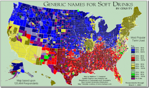
Generic Names For Soft Drinks by County
Another example of a good idea but poor follow-through. The poor execution comes from the fact that that map is too confusing. The data could have been broken into smaller maps, allowing the data to be better illustrated. The country could have been broken up by regions or the data could have been consolidated into more compacted data sets. This would have made the maps looks much better and become more effective.
Overall, it is important to realize that sometimes maps are not good. It isn’t always that the maps have bad projections or don’t highlight what you think it should. Sometimes it goes back to the basic fundamentals of cartography and graphic design. It is important to keep these factors in mind so that when you are looking for a map, you can choose a map that is the most effective.
Further Reading:
How to Lie With Maps by Mark Monmonier
Form and Function: Infographics
February 20, 2014 by 4 Comments
Over the past few years as the field of cartography has changed, so has the manner in which maps are made and created. Maps are increasingly becoming composite images, meaning that they incorporate multiple forms of media (photos, videos, sounds, etcetera) into them, not only in terms of the information that they convey but also in their form as well. These differences between function and form when it comes to creating new maps is an area that it quickly evolving.
A few months ago, an “Audio Time Machine” Map was created. What’s that you ask? It is a map where sounds are distributed geographically. In this case, the cartographer (Historian Emily Thompson) used noise complaint forms and vintage newsreels footage to recreate the sounds of New York City in the 1920’s and early 1930’s. Scenes from the amusement parks at Coney Island, the sound of children playing in a fire hydrant on a hot day, and complaints about loud neighbors are all documented on this site. Instead of just listing these documents, or posting the videos online, Thompson uses a map to graphically display this data. In this case the function allows the viewer to see a new and different perspective on what would normally just be a bunch of dusty old records. Instead of being a regular map, these interactive features allow maps to expand in their function. There are many other examples of these types of maps including applications like Google Maps.
Form is another area that is rapidly changing when it comes to maps. Maps have often been included in info-graphics (graphic representations of data, spatial data, and information in a meaningful manner), however recently they have begun to take on different representations. Historical maps, photographs, and a myriad of other graphics have become spatial in nature. Examples of this include are shown below:


These changes have allowed viewer a way to better see knowledge and understand how different process work on earth. These changes make geography just as important as other areas of knowledge.
Make Believe Maps
February 13, 2014 by 3 Comments
As frequent readers of this blog will know, I consider cartography as a whole an underrepresented field of knowledge. Even those who understand the importance of maps in our every day lives don’t always realize the different cross overs that maps have in everyday lives. We’ve discussed how maps are both an art and a science, but this post will discuss the implications of maps in literature.
The Marauder’s Map. Middle Earth. Panem. All these are mythical places that have significant geographic background. Even though most of these books didn’t come with maps attached to them, they are extremely important parts of the story line. What would the Hunger Games be like if there wasn’t a District 13? How would Harry, Herminie, and Ron have saved the wizzarding world if they couldn’t have spied on Snape? And how does one leave the Shire if one doesn’t know where they’re going? It all goes back to maps and geography!
As Andrew Bardin Williams, one of the co-founders of placingliterature.com says, “The relationship between literature and real, physical places is genuine and helps enhance the reading experience and develop a sense of community where these scenes take place.” This means that place (essentially geography) is key to developing the story, to making the story something that is bigger and more realistic.
In this sense it is place that is key. Thus the argument can go beyond the presence of maps in books, it goes in a discussion of place. Geographers in Switzerland and Australia have begun to research this topic and in 2008 published an article about this entitled Mapping Literature: Towards a Geography of Fiction. This article discusses how the various ways that literature can mapped, and the implications of these new discoveries.
I personally see this as an excellent way to create an interdisciplinary field that scholars of literature, geographers, and the general public can contribute too. While maps like the Marauder’s Map and Middle Earth exist and are available online, what about a map of Panem? Or how about the world of The Boxcar Children? While Panem has hundreds of reader created maps other series have nothing. These reader created maps could even extent to other media like TV shows. Take a look at this map about life in Springfield.
This area of geography is one that is a great way to bridge the gap between the general public and the researchers who make these discoveries.
Maps as Art
February 7, 2014 by 3 Comments
As the common saying goes, “Beauty is in the eye of the beholder.” This is the case not only for art but also for maps. Maps are a form of functional art. While this isn’t something that most people think of when think about a map, cartography is both a science and an art. I’ve discussed the scientific aspect of maps previously; however looking at maps from the perspective of art is something that deserves equal attention.
Some of the oldest maps are works of art in themselves. Maps like the Tabula Peutingeriana from the 4th Century in addition to being hand drawn, are works of art because of how many miniature drawings and pictures there are. Dragons on maps are a historical curiosity, but they make a map a piece of art. Click here to see a high definition scan of the map.
Creating a map that is appealing to the eye is more than just an artistic feature; it is also a functional feature. It’s basic human nature, if something is easy to look at and examine it is more likely that it would be used or bought. Thus there always has been a demand for well-made, attractive maps. This is true especially today. With the rise in computer graphics, maps are now almost exclusively being made on computer. This allows for greater flexibility and opportunity to create and innovate in cartography.
One organization has embraced this change by publishing a new book every two years titled Atlas of Design. This book features submissions of maps from all over the world with short descriptions. Check out some of these examples. Not only are they informative they are modern and look amazing. This larger trend towards better maps will hopefully make maps an important part of our society.
Recent Comments