This blog post will explore one of the CSS properties called z-index. This property deals with the positioning of elements on the z-axis (overlaying multiple elements). The property is very easy to use. First, you need to create multiple HTML elements, like div, images, text, and more. The elements do not have to be the same. Z-index will work with a div and image, text and image, etc. Next, after the developer creates multiple elements, they must decide which elements to overlay and how. Z-index accepts one value that can be auto for the default value or an integer that indicates the priority of an element on the webpage.
Personal Examples
Overlaying Images
Below is a CodePen example for overlaying two images using z-index. First, there is an image of space that has a class of space. Next, there is an image of a spaceship with a class of spaceship. This demonstration aimed to place the spaceship over space to create an effect of a spaceship flying through space.
While it is possible to find an image containing both items, z-index can give an image a more immersive look. For example, the spaceship is moved to the left on purpose. It is positioned in this way to give a webpage a more lively look and feel. The spaceship positioning tries to create an impression of the ship flying from the page into space.
3D Effects
Another way the z-index property can be used is by creating a 3D effect in a div. Below, you will see a pink div that has a class called inner-layer. The z-index of this div is set to 1 to place is in front. Then, there is another div with a class name inner-layer. The inner layer div has a darker color shade and z-index of 0 that places it behind the inner-layer div.
This example demonstrates how the z-index property can be used for overlaying divs on top of each other to create a 3D effect. Such 3D effect is not restricted to div elements with text. It can also be used to create 3D buttons.
Overlaying Elements of Different Types
Finally, the z-index property can be used to overlay elements of different types. Below is an example of an image with a semi-transparent div overlaid on top of it with an image description.
See the Pen Z-index demo 3 by Nikita Petrenko (@codepenuser22321232) on CodePen.
For this example, the idea was to place an image on the page and give it a description. While the description can be placed directly below the image, placing it on top of an image gives that image a much better look. Overlaying a description on top of an image by itself is not always a good idea. If the image contains multiple colors, the description would be hard to see. To overcome this, we can overlay a div with a text over the image. This would greatly increase the readability of the description. To make sure the div does not cover up the image, we can decrease the div’s opacity and make it semi-transparent.
CodePen
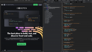
Finding examples of z-index property in production is a simple task. Most common examples of the property use it to overlay two div elements. Below is an example of how CodePen uses the property (highlighted in red) to overlay multiple elements on the main page.
In fact, CodePen uses z-index eight times just on their homepage. This example shows how the z-index property can be used to create a composition using multiple elements.
Browser Games
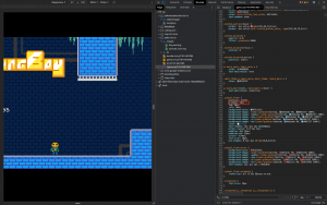
Another example where the z-index is used is browser games. Below is an example of a browser game called Swing Boy. This game is a platformer in which you play for a character who runs through the sewers to get outside. In this game, z-index (highlighted in red) is used to position elements such as ground, obstacles, and character in front of sewers’ background image.
After doing some research, most web games use the property to overlay various items within the game. This example demonstrates how multiple elements can be placed on top of each other to create an immersive game.

