As a writer, being able to fully maximize the use of your visuals is an important tip that I’ve previously mentioned in my blogs. Though it’s just so important, that I thought it deserved it own post. Visuals can range from the use of items such as images to the font. It may seem like an afterthought, but these components can really bring a piece together.
Example: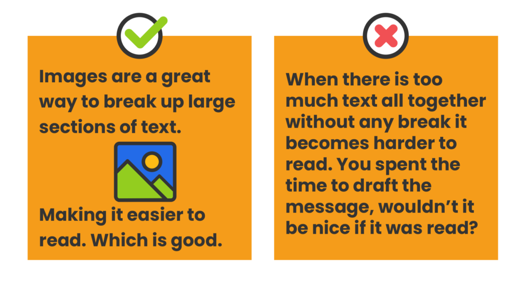 I mean just look at the image above, the use of a picture really improves the readability and (potentially) the content if done right. To get started here’s a few common steps in incorporating images:
- Label, number and title every graphic.
- Place the graphic in the right spot.
- Introduce and explain every graphic.
- Document your graphics.
- Make your graphic stand out.
- Make it easy to find your graphics.
Reading this you may be thinking that there are sooooo many more steps than you originally assumed (as did I), but that just goes to show how all these minute factors work to help your writing. They mainly delve into the more technical aspect, though that should be something to keep in mind as you improve your professionalism. Remember to always cite your work and give credit to the source for information you found, and always include images that enhance the substance. There is no use in adding a picture that serves no purpose in the greater scheme of your messaging. After finding that image, fill in details like assigning a title, reference, and connect it to your writing.
On top of images, another visual aspect is the font you chose. Reading an article by Mikael Cho, he goes into how fonts can elicit certain emotions and associations from your audience. Just consider the text below:
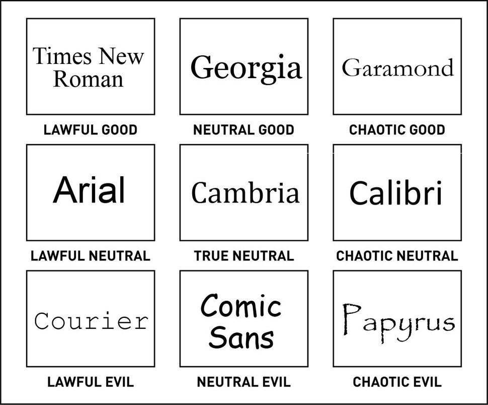 There are so many different variations/ styles of font in which people can use to express their writing. Some, like comic sans, will forever be societally viewed as “less than.” So it’s important to understand the connotations of fonts and the appropriate circumstances of using specific fonts. Don’t solely think about how legible a font is, as comic sans is very readable but it can also say a lot about the author’s character (things that may not be good).
Overall, take a second look at your writings and see where is are any lulls. It could be the perfect time to include an image or two to elaborate or visually explain content rather than blabbing on for paragraphs. Images will always be a welcomed break for your reader, and in respect to your font choice you can never go wrong with Times New Roman.
 You can remedy this issue with
  A simple tactic is implementing an