Step 1: Clickbait your audience
Alright not really, but let’s be honest, when we’re online our attention span goes out the window. If something is uninteresting in the first 5 seconds, what are the odds that it’ll get interesting? ZERO. Personally, I find it unlikely that I’ll continue giving whatever I’ve glanced at my time of day if I’m not immediately curious about the content. Clickbait-y headers and titles are seemly the way the internet has decided to draw people in. Though, it’s never really effective, and so I’m here to share two major tips I’ve come across about the art of paragraphs.
Step 1 (for real): Appearance
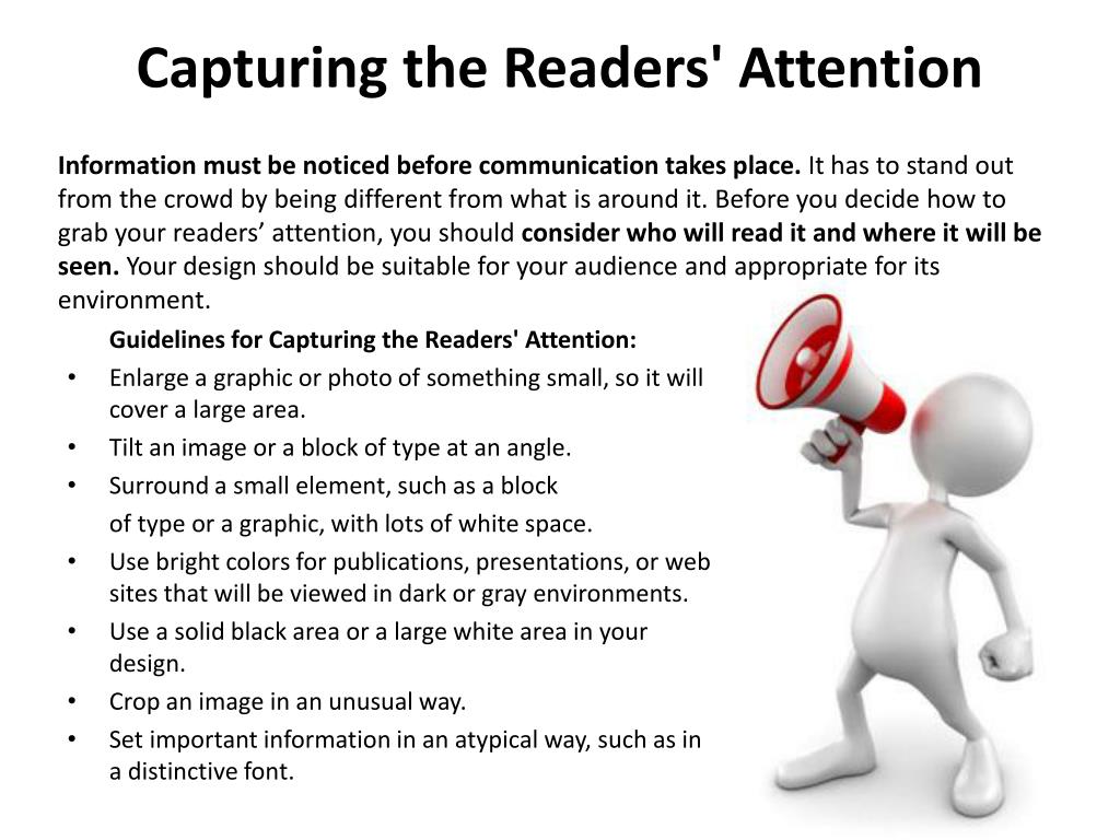
To captivate an audience, you really should work on making it look compelling to read. Skimming is a tool that we all use to quickly evaluate whether something is worth our time. If nothing is grabbing your audience’s focus then you’ve doomed yourself to being obsolete and unremarkable.
 You can remedy this issue with tactics I’ve previously discussed in other blogs such as: varied sentence lengths, special characters, and etc. By including additions such as easy short paragraphs, bolded lettering, clear sections and headers, you can more transparently advertise your material and invite readers to learn more. Don’t worry about keeping something too formal and remember that visuals play a key role in written material as well. Any links, images, videos, and interactive components will help stimulate your audience and liven up your material.
Step 2: Quality of Content
After your hard work of appealing to your reader, you now have to prove that your work was worth reading. A few things to keep in mind when catering to your audience is keeping things short and concise. Don’t overexplain and repeat yourself, nothing is worse than redundancy. It’s a waste of your time and theirs.
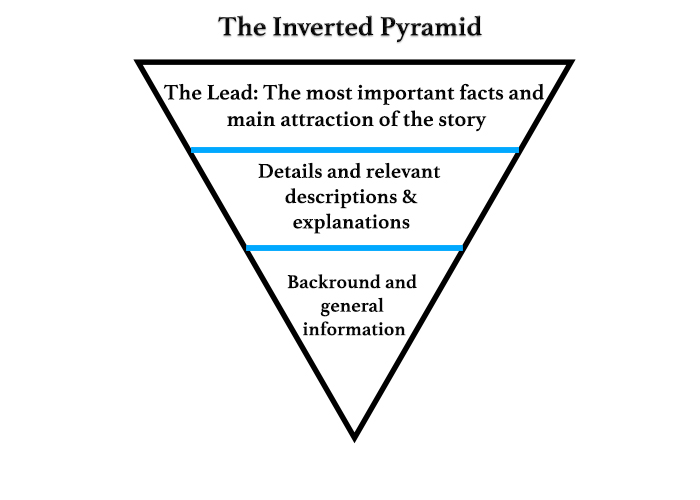
 A simple tactic is implementing an “inverted triangle.” By starting off with a general statement/conclusion you can draw in a larger audience and strategically narrow in on your agenda/thesis. This further helps give an allure to the reader and is an easy structure to format that will enhance readability and the flow of your material.
Takeaway:
Everything mentioned here is merely a suggestion, though it’s incredible to see the transformations made when applying such obvious steps. If you decide to take more consideration and thought into the appearance and quality of your content it’ll definitely help improve your connection to an audience. I am someone who is stuck in their ways of using the same methods I’ve learned in middle school/ high school. Though just because it was fine then, doesn’t mean that is the limit and the best work you’ll ever do. There’s always room for growth and using these tips can help!
Very informative blog post. Your blog post reminded me that in today’s age appearance is almost, if not more, important than actual content. In the constant influx of “content” we see online we have to pick and choose what to read or watch, so grabbing attention has become the primary focus. Do you see this has declined the quality of content we receive as consumers?
I think you did a great job on providing emphasis by italicizing, capitalizing, and bolding. I think you could better explain what your whole post is about in the first paragraph. For example, instead of saying you will be providing tips about the arts of paragraphs. You could state what the tips will be and how they are effective. Besides that, I think your images helped explain further ways to capture the readers attention and to provide more ways on how to have better quality Content.
I believe you did an excellent job on blog post 7! I really enjoyed your use of boldings and headers. I also liked your use of sarcasm in your post. I found it very amusing and the first “Step 1” was a good attention getter. I also really enjoyed your image. I felt that it did a good job of giving the information while also catching my attention. Do you find it hard to read articles if there aren’t images or bolded words?