Monetize Your Calligraphy

Fair readers, our last week of Calligraphy Corner is upon us. I am certainly going to enjoy it while it lasts, and I hope you do too!

This week’s closing discussion on the multitude of interesting facets found in the core topic of calligraphy and decorative mark-making will focus on the possibilities for monetization of the craft. Fair warning: I have not completed the next set of tips in totality so take my advice as you will. Everything I will discuss is the product of several years of research as I approach following through with a small calligraphy business venture myself.

Tip #1: Understand the variety of clientele needs and niches

As we have already seen, calligraphy is an aesthetic-based artform that ideally prompts a reaction of the viewer. Different hands/styles, placement and positioning, sizing, and color can cause such a reaction to drastically change. The aspiring calligrapher must be aware of the desired reaction as stated by their clients and guide their artistic choices to fit this expectation.

Most people are familiar with the traditional calligraphy used for wedding and party invitations. Calligraphy can also be used for reception needs, like placeholders, centerpieces, and gifts for guests.

Fig. 1. John Stevens Design. Honorary Documents.

Beyond weddings and parties, professional calligraphers are also often tasked with completing professional documents and honorary certificates. Check out a few samples of calligrapher John Stevens, who designs such specialized documentation.

Tip #2: Set pricing upon employment

One of the main things emphasized throughout the calligraphy community is that if you are hired for a job, prices should be agreed upon by both parties at the beginning of the contracted period. This way, neither client nor calligrapher are hit with unexpected costs or bills. The pricing should also be accompanied by deadlines for both final day of full payment and day that all work should be submitted or given to the client. Consistency and reliability in business practices are key!

Fig. 2.  Lauren Perry Studio. Envelopes.

Tip #3:  Become a king or queen of customer service

Because calligraphy is often a freelance occupation, calligraphers do not typically have large corporations that have customer service departments dedicated to taking complaints and feedback from clients. This means that the calligrapher must become adept at handling all concerns from clients. If a client is upset with the quality of submitted work or a listed specification was not followed as they asked, they have a right to follow up with their calligrapher. The calligrapher should respond courteously and with the upmost professionalism, offering to fix any mistakes. This will do two things: keep the client happy, and uphold a stellar professional reputation.

Tip #4: Choose an appropriate platform to sell on

Anyone interested in starting a business should understand their strong suits and the type of clientele they wish to attract. Therefore, they should put heavy consideration into the type of platform they wish to attract customers on. I have seen calligraphers find success on Etsy, Facebook, Instagram, and their own hosted websites. The Gen-Z calligrapher who wants to sell to their peers may have more success on a combination of Instagram and Etsy, linking their seller’s page through their social media. Plenty of professional calligraphers, however, host their own websites with great success. It really depends on what one finds easiest to both list their products and services and engage the appropriate audience.

Fig. 3. Etsy. SimpleScribe.

Thank you for checking out the above tips and reading the final edition of Calligraphy Corner. I have garnered great enjoyment through publishing this blog week by week. It has made me even more excited about my passion for art and handwriting. I hope that any readers are able to do the same with their interests.

Have a wonderful rest of your spring and summer!

This entry was posted on April 15, 2022. 3 Comments

Improving Your Calligraphy Skills

Another week of Calligraphy Corner is upon us! I am very excited to see you back here to learn more about calligraphy and decorative handwriting strategies. Today, we will be diving into how to take some different calligraphy skills to the next level. Let’s begin!

  1. Find the Correct Hand Positioning

Fig. 1. Postman’s Knock. How to Hold a Calligraphy Pen.

Before you do anything else, finding and perfecting the correct hand position to hold your pen is going to be one of the more important steps in increasing the quality of your calligraphy. Many people might assume that the way you hold a calligraphy utensil is the same as you would hold a regular pen or pencil, but that is incorrect. The pen should not be held in any sort of death grip – it is better to leave the hand relaxed to allow for a greater flow of movement. It should also rest in the curve of your hand between your thumb and index finger. In this way, the pen is not held perpendicular to the page. Ideally, your fingers should not have much movement because the goal is to allow the arm to control the lines drawn on the page. The role of the fingers is more so to control the ink flow in the nib instead.

      2. Understand the Structure of Calligraphy Lines

Once you have your pen grip down, gaining an understanding about the structure of this art form is something that I myself have found incredibly helpful in improving my calligraphy. When I say “structure”, I refer to the balance of invisible guidelines between letters to either keep things uniform or establish a general flow to a word.

Fig. 2. Faber-Castell. How to Learn Basic Calligraphy Techniques.

As you can see in the above image, calligraphy is based in a set of symmetrical and well-proportioned standards. To review, the baseline is the bottom line on which every letter is based. The main body of the letter rests on this line. An ascender (part of the letter going above x-line) or descender (part of the letter going below the base line) can exist, but all letters will for the most part sit on this line in a basic traditional style. In contrast to the base line is the cap line. This line dictates the topmost height of a capitalized letter. There is also the slant line. This may be best explained by asking you to imagine the slant of an italicized font on Google Docs or Microsoft Word. Calligraphy styles generally follow the same slant or angle to which letters are to be tilted throughout a piece of writing. Finally, the x-line is the line for which letters without an ascender will be limited. This would be like the top of the circle portion of a “b” or the top of an “r”.

3.  Experiment with Different Pens and Tools

Fig. 3. Postman’s Knock. Calligraphy Pen Comparisions.

I’ve made mention of this in previous posts, but I truly think one of the best things you can do to improve your calligraphy is to find what works for you! There are so many different types of pens, tools, and avenues to learn calligraphic techniques out there. You can try faux calligraphy with a brush pen or jump onto Adobe Illustrator to create your own digital patterns. You can head to YouTube to watch a variety of tutorials or buy a couple of instruction books at your local bookseller. If a refillable fountain pen does not work for you, try a dip pen! The skies are the limit for what you can find. I am a big believer in everyone having their niche that they have very strong skills in. Practicing and adjustment are the names of the game here.

4. Seek Advice From Professionals

Finally, following professional calligraphers and trying to gain insight into their processes would be a good move to enhance your mark-making. Dozens of professionals keep blogs across the internet and provide free instructions and tutorials for the benefit of aspiring calligraphers. YouTube is also an easy place to go to find advanced techniques in any subject of art. Some of my favorite blogs and sites are as follows:

The Postman’s Knock

Laura Hooper Calligraphy

Molly Suber Thorpe’s Calligraphy Blog

Loveleigh Loops

Calligraphy Gems

I’m so glad to have another week of Calligraphy Corner in the books! Thank you for reading. See you next time!

This entry was posted on April 1, 2022. 1 Comment

Introduction to Chinese Calligraphy

Welcome back to Calligraphy Corner!

Today, I want to tackle a topic that I am rather excited about: Chinese calligraphy! My personal experience as relates to Chinese calligraphy involves seven years of Mandarin Chinese classes and interim instruction in 法 (shūfǎ). As I am most familiar to simplified characters, I will be referring to simplified characters instead of traditional characters in this blog post. If you want to check out early Chinese logographs, read this previous blog post.

Fig. 1. The Met Museum. Quatrain on Spring’s Radiance.

法 (shūfǎ) is the most basic Chinese word for calligraphy or, otherwise, handwriting. 法 represents the cornerstone of traditional visual art from historic China. In Ancient Chinese history (中国古代史), the actual art of calligraphy first appeared with prominence during the Han dynasty (206 BCE-220 CE). The eventual development of ‘regular script’ around this time contributed to later requirements of the Tang dynasty (618-907 CE) that civil service examinations had to be completed in regular script by a skilled hand.

Fig. 2. China Online Museum. Autobiography (自敘帖).

So – how does Chinese calligraphy work?

Materials needed include a brush and ink. In Ancient China, brushes were most often made of a bamboo (or wood) handle attached to a section of animal hair. Modern brushes often offer synthetic alternatives, but bamboo and animal hair are still used. Historically, calligraphy ink was created by the calligrapher using cakes or sticks of animal matter, water, and inkstones. A dark paste was produced with the use of all of these items.

Fig. 3. The Met MuseumInkstone.

It is important to recognize the value of the flexibility of the brush and ink when it comes to artistic expression. These tools are highly responsible for altering the weight and visual display of each stroke of a given character. The ink just mentioned could be watered down or bolded in consistency to produce emphasis on certain parts of characters. Additionally, the easily changed state of the brush and ink allow for characters to take on different appearances. The character could appear rigid and upright or spirited and dynamically inclined. The general art form could quite literally alter the meaning of the written word if a certain effect is achieved correctly.

The easiest way for beginners to get started with Chinese calligraphy is to become familiar with some easy strokes in the Chinese language. Of course, having even a very limited knowledge of the written language would help in this artistic endeavor. Several radicals (specific strokes written together) and components can be used to build characters.

Check out these websites for additional information on strokes and radicals:

Hacking Chinese

214 Chinese Radicals

Common Chinese Radicals Explained


Fig. 4. Sapore di Cina. Chinese Radicals – Strokes.

Fig. 5. Asia Society. Radicals.


This form of visual art from Ancient China remains one of the most valued forms of art in Chinese culture. I look forward to exploring more of this branch of calligraphy in future blogs! Thank you for reading yet another week of Calligraphy Corner.

See you next time!

This entry was posted on February 25, 2022. 2 Comments

Faux Calligraphy

Welcome back to Calligraphy Corner, everyone! This week, I want to talk about everything faux calligraphy.

What is faux calligraphy, you might ask?

Faux calligraphy is a way to manipulate a non-calligraphy pen into achieving an aesthetic result similar to traditional calligraphy. The alternating thin and thick strokes found in regular calligraphy are accomplished by repeating the same strokes a few times over the same place to create a thicker line than the pen is supposed to create. Faux calligraphy exists in the realm of hand-lettering. Both end products of each type of lettering look similar. The main difference can just be seen in how each type is completed.

Fig. 1. The Postman’s Knock. How to Make Faux Calligraphy.

In traditional calligraphy, the artist has control over the weight of their lines. They can press harder into the paper and turn the pen at various angles to get the look they want. Though fountain pens (and others) like these are extremely helpful in creating the beautifully formed letters we typically associate with calligraphy, they are not the only tools that can be used. As mentioned, faux calligraphy repeats the same strokes to duplicate the result of the traditional calligraphy pens. The fun thing about faux calligraphy is that you can become skillful at lettering and use whatever writing utensil you want. You are not limited in choosing a specific type of pen and ink. Many artists who are fans of faux calligraphy will simply use regular, office-quality ballpoint pens or markers.

Fig. 2. Instagram @magichandlettering. Talk to Yourself Like Someone You Love.

My current best suggestions for writing utensils to use in faux calligraphy include the Prismacolor Premier Illustration Markers, the Tombow Dual Brush Pens, and the Pigma Micron 01 Fine Line Pen by Sakura. My own personal preferences most often include fine line pens and pens/markers with a brush tip. I think the brush tip pens are easiest to get control over in terms of the weight of the letters you create with them. With these pens, you are able to create thick lines more organically as you can apply force and movement to the brush. Both Prismacolor and Tombow have awesome lines of brush pens available that I have seen many people have success with. Fine line pens are nice too in that the way they release ink is extremely controlled; you will not find ink beyond the initial drawn line of the pen unless you smear the page accidentally.


Fig. 3. Tombow. Pumpkin Spice Dual Brush Pen Art Markers.

Fig. 4. Prismacolor. Marker Set, Fine Tip.

I want to point out some high-quality tutorials and introductions that you can watch if you have an interest in this type of lettering. The Postman’s Knock is a great source for beginner faux calligraphers to do some light research on how to create letters with weighted lines. Lindsey Bugbee, who runs the site, has a really fun tutorial on using faux calligraphy to address envelopes. Another resource you could try would be Loveleigh Loops. I have mentioned this site on this blog before and I am referencing it again because they have a host of excellent teaching videos. One video in particular relevant to this topic is their video on “How to do Faux Calligraphy for Beginners.”

You can also find good information on the websites of reputable pen brands. One professional site that I like is Staedtler. They make a variety of art products and technical instruments, including some high-quality fine line pens. Zebra USA also has a good page for a simple faux calligraphy tutorial. They chose one of their Artist Ambassadors to create this how-to. They have a boatload of fun products that I really enjoy as well, including the Mildliner line that is used by professionals and teenagers alike. Faber-Castell, the most historic brand listed thus far, also paired up with Michael’s to create multiple hour-long classes on YouTube to explain faux calligraphy.

Fig. 5. Zebra USA. Bouncy Lettering Tutorial.

Thanks for reading this week’s edition of Calligraphy Corner! Feel free to let me know if there is any topic you want me to cover specifically. See you next time!

Getting Started

Greetings!

I have returned, dear readers, for a post that is probably long due. Welcome to another week of Calligraphy Corner! Today, I would like to discuss how someone could potentially get started in decorative writing.

For anyone interested in calligraphy, I would first suggest that you do your research on what you want to explore! There are so many different types of pens and writing styles to choose from. You can go for brush pen calligraphy, digital calligraphy, use a traditional fountain pen, and more .Browse Youtube and Instagram tags like #handlettering and #letteringart to figure out what intrigues you the most.

Fig. 1. Zebra. Modern Calligraphy Styles Using Zebra Pens.

Once you pick a style that captivates your interest, you want to pick a set of good tools to use as a beginner artist. These tools are dependent on whatever style you choose to explore. For brush pen calligraphy, you really only need the pens themselves and your paper of choice. Brush pens don’t usually come in different components like fountain pens, so you don’t have to worry about meticulous preparation. Digital calligraphy is a bit different; you obviously don’t need to use a real pen and paper with this style. Instead, getting a compatible stylus and tablet will make your goals go off without a hitch. The Adobe Suite has multiple apps that make digital calligraphy a breeze. Adobe Illustrator is quite commonly used for lettering of this method. Procreate is another popular option among calligraphers. If fountain pens are more your style, check out the previous blog for a look at how you can assemble them.

Fig. 2. By Dawn Nicole. Procreate Lesson: Lettering On Photos.

When you have your tools settled, you should make a decision on how you want to proceed based on your learning style. If you love to read, I would definitely suggest you take a look at calligraphy how-to books to really get a feel for the shapes you want your hand and pen to be able to form. When I started practicing, I would read these types of books to understand why I had to press the pen in ‘x’ way with ‘y’ amount of pressure. I found them incredibly helpful. Most of the books I’ve read choose to introduce a basic alphabet designed to be learned using a fountain pen. If you are interested in trying out a different type of pen, I would definitely make sure to do your research on a book’s content before purchasing it. The one below is an example of a book using fountain pens as part of its calligraphy instruction.

Fig. 3. Amazon. Calligraphy Workbook For Beginners.

If you are more of a visual video learner, I would point you to YouTube and its thousands of calligraphy tutorials! For any type of lettering you want to try, there is guaranteed a tutorial out there that matches your needs. These are very nice when pictures don’t seem to cut it. There have been plenty of times where I needed to watch someone complete a specific stroke before I could figure it out myself. I found some here for you to check out:

Digital Calligraphy Tutorial

Brush Pen Tutorial

Fountain Pen Tutorial

Whatever method you choose to go with in learning basic alphabets and strokes, you will end up needing some form of a guide or practice sheet to add accuracy to your characters. These guides often come in those calligraphy how-to books I mentioned earlier, but you can also find them for free all across the internet. To improve one’s calligraphy, I want to strongly emphasize how helpful these sheets can be.

Fig. 4. Tombow. Lettering Practice Worksheets.

Above all, once you have the tools and some base knowledge, you just need to practice, practice, practice! It is always advantageous as well to expose yourself to new things in order to find what you are really passionate about or good at. Take a few minutes to browse some of the above links and see if you find anything interesting!

Fig. 5. Instagram @elena.sol.calligraphy. Home Is Where The Pen Is.

Thanks again readers, and see you next time!

This entry was posted on January 28, 2022. 3 Comments

How To Put Together A Calligraphy Pen

Hello, readers!

I am back at it here at Calligraphy Corner ready with some fresh posts for the spring semester. As some of you may be familiar with, Blogs 1-10 on this site focused on the rich history of decorative handwriting and its relationship to humans as an artform and means of expressive communication. This semester, I want to branch out and introduce some practical knowledge that will help any aspiring calligrapher or interested citizen to broaden their horizons when it comes to script.

Therefore, today I wish to discuss a subject that I am most often asked about when I tell people that I love learning about calligraphy: how to put together a calligraphy pen. In my experience, people tend to describe a fountain pen when they refer to a “calligraphy pen”. The assembly of the fountain pen is not overtly complicated. One must just be aware of the fragility of the parts involved.


Fig 1. Montblanc. Meisterstuck Gold-Coasted 149 Fountain Pen.


First, let’s consider the components.  The basic fountain pen will typically contain a cap, a type of reservoir for ink, a nib, and a barrel. The cap is the same as the cap to a regular pen; it protects the nib of the fountain pen. The ink reservoir simply holds the ink that is anticipated for use. It does not necessarily have to just be an ink cartridge; the reservoir may also be a converter. The converter allows you to use ink from a bottle if you prefer that over a premade cartridge. The nib of a pen is a detachable piece of shaped metal that attaches to the ink reservoir and the barrel. They come in various sizes to choose from and change the width of lettering that the pen can achieve. The ink flows through the cartridge or converter towards the nib as influenced by gravity when the pen points down towards the page. The barrel houses the ink reservoir and is the part of the pen that you hold on to.


Fig. 2. Faber-Castell. Fountain Pen 101.


So, how do we put such a pen together?

I would always recommend following the directions of whatever brand of fountain pen you buy, but we can make a general guide for this here. For pens with ink cartridges, you want the pen completely disassembled. Once you have all of the parts separated, you can choose which ink cartridge and nib you want to use. There are all sorts of colors and finishes you can choose from if you are interested. After you pick out your preferences, you should find the end of the cartridge that has a tiny hollow section (see below). This hollow section will be pierced into nib. Make sure that you feel a puncture of the cartridge so that the ink can properly flow through the pen. The combined nib/cartridge can then be screwed onto the barrel and thus, you have a complete pen!


Fig. 3. Fountain Pen Love. Fountain Pen Nib Options For Beginners.

Fig 4. Jet Pens. How To Install Ink Cartridges.


For pens with converters, the converters should also be attached to your chosen nib. To fill one with ink, you would first place the nib in the ink bottle. There is a little knob on the converter that you twist left to force any air out of the reservoir. Little air bubbles will appear in the ink that the pen is dipped into (there is a problem if this doesn’t happen!). Then, draw ink up into the converter by turning the knob right. The barrel can be attached when this step is finished.

One brand that I really recommend for fountain pens is Faber-Castell. This is a historic brand with over 250 years in the business. Their hundreds of years of experience in the manufacturing and sale of exclusive writing products enhances the experience of using their pens. I think they have a great website set-up as well. It goes through the details of their various products for sale and offer a variety of facts and tips for the interested artist.

Thanks for reading! I am so excited to explore the subject of calligraphy further.

This entry was posted on January 14, 2022. 3 Comments

Grandiosity of Graphic Design

Welcome readers!


It is Blog 10 of Calligraphy Corner and I am beyond excited to share today’s topic with you all. We will be delving into the modern developments of typography and font design as relates to calligraphy. Graphic design and marketable characteristics are the name of the game for this blog.


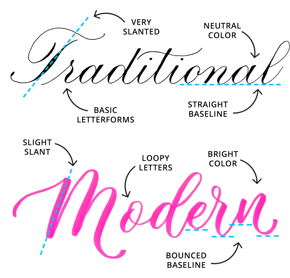
Differentiating from traditional and modern calligraphy is one important distinction we must make before returning to the rest of the discussion. The 21st century has allowed various interested parties to play with long-standing rules and alter them to fit their personal aesthetic. Whereas traditional calligraphy appears consistent and follows specific rules for spacing and letter formation, modern calligraphy does not necessarily obey particular formations. It may not have the normal guidelines and axes of symmetry that one would see with a traditionally established calligraphic hand.


Traditional vs. Modern Calligraphy: What's the Difference? — Loveleigh Loops

Fig 1. Loveleigh Loops. Traditional vs. Modern Calligraphy.


Modern calligraphy is characterized by the very fact that it is not necessarily characterizable beyond its inability to conform. In the age of graphic design and greater access to information via the internet, savvy professional calligraphers have utilized the web and social media to advertise their products. It is in this way that nontraditional calligraphy has been allowed to thrive.


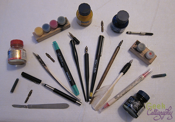
One large move made in the field of hand-lettering in the modern day is the discovery and popularization of alternative writing tools. People associate calligraphy with the typical pointed pens and ink – dip pens and oblique pens were all the rage. Though these pens are still very prevalent today and available for purchase, different options are available now for people to experiment with. A few that come to mind include felt-tip markers, brush pens, fountain pens, and digital design tools. Felt-tip markers and pens can be purchased in most craft and office supply stores. They are the typical pens that one would use as a beginner when first learning how to handle lettering. Felt-tip markers are best for beginners because they require low maintenance and typically no input of fresh ink cartridges. Brush pens are highly popular in the artistic writing world at the moment. They are tapered to the shape of what a fresh paintbrush may look like. Because many versions have bristles, this type of pen is prone to fraying. Fountain pens may seem the fanciest out of the bunch. They contain a type of metal tip called a nib that can be changed out by the more practiced calligrapher to try out different stylistic choices. The inside of the fountain pen has a space in which different cartridges of ink can be placed into. This way, the pen can be refilled if need be, or a new color of ink can be applied to a project.


That's a lot of pens.

Fig 2. Geek Calligraphy. Guide to Pen Types.

In regards to the digital design tools mentioned, tablets and computers are both commonly used to achieve personalized digital fonts as well as a variety of designs. Distinct software has been shaped to allow for a variety of artistic endeavors. Programs from the Adobe Suite are used extensively in the graphic design and marketing industry. From Photoshop to Illustrator, so many mechanisms can be molded around someone’s artistic goal. For example, in Adobe programs, designers can upload their designs, hand-draw them with digital pens and pads, trace previously done sketches, create their own brushes, and adjust existing fonts already present in the applications. The options are pretty much endless! There are so many interesting features that can be applicable to writing-specific design processes.


Vectorizing Hand Lettering and Calligraphy || How to Vectorize Lettering with Adobe Illustrator - YouTube

Fig 3. Youtube @ElisaAnne Calligraphy. How to Vectorize Lettering with Adobe Illustrator.


So, what does this mean for businesses?


Both digital calligraphy and modern hand-drawn calligraphy represent a growing space in the graphic design market. From left and right, creators are coming up with ways to monetize their hobby. One way that some calligraphers have done so is through social media. Creators have seen their bright, catchy designs become popular on platforms like Pinterest and Instagram. One Instagram account that I particularly appreciate is @littleredbirdlove. Marita Clark’s designs on this page are evident of the modern style of lettering and calligraphy. She uses videos of her creating her designs as part of her marketing strategy. These videos are entirely engaging and entertaining in nature.


Fig 4. Instagram @littleredbirdlove.


Creators have also put out professional websites with the goal of appealing to a wide audience of clients. Calligraphers like Virginia Lucas Hart have set up successful businesses with the help of online pages. Check out the photo below of one of her beautiful brand work projects. Many freelance calligraphers and artists show off their amazing work with digital galleries and give potential clients the chance to peruse their services. Potential freelance services might include wedding invitations, business card designs, customized stationary, certificates, and more!


photo by EL team

Fig 5. Virginia Lucas Hart. El Team Brand Work.


The increasingly popularity of modern calligraphy and handwritten products has allowed a comfortable space to exist for creators to develop their artistic passions and pursue potential business opportunities. It is a wonderful time for beginners to get started in the craft as well. Thank you for learning about calligraphy with me! It has been my pleasure to cover all sorts of history and be able to discuss a variety of artistic aspects regarding this subject.

Fantastic Fonts

Hello readers!

I am so glad that you have returned once more for Week 9 of Calligraphy Corner! I am excited to announce that today we will be transitioning into the development of fonts and word processing systems.

We are all familiar with the vast degree of fonts available on, say, Google Docs or Microsoft Word. Across Google software, there are currently 1297 font families available for use. As for Microsoft software, there are 700 font options available on Word with more in development. That’s a lot of fonts! So, when did the first computerized fonts come about?

The first electronic typeface was designed and implemented by a man named Rudolph Hell and his Hell Design Studio employees. It was named “Digi Grotesk,” and was actually a bitmap. A bitmap is a type of image file that often has color information in its rows of pixels. So, Digi Grotesk was basically a grid-like pattern of pixels and was used in computerized typesetting machines. Britannica defines computerized typesetting as a type of typesetting that involves “characters [that] are generated by computer and transferred to light-sensitive paper.” Impressively, Digi Grotesk is still in use today.


Digi Grotesk Font | FontShop

Fig 1. FontShop. Digi Grotesk Font.


One of the next steps in the history of typography was the development of Apple’s TrueType fonts in response to Adobe’s Type 1 fonts in the 1980s. Adobe developed their Type 1 fonts to use in their PostScript programming language. Apple, on the other hand, created their TrueType fonts to replace the use of PostScript in their products. Apple’s TrueType fonts firstly involved four families: Helvetica, Courier, Times Roman, and “Symbol”. This degree of competition was a big deal at the time, and was informed by the rise in popularity of the internet in the 1990s.


True Type

Fig 2. Virtual Exhibition. True Type.


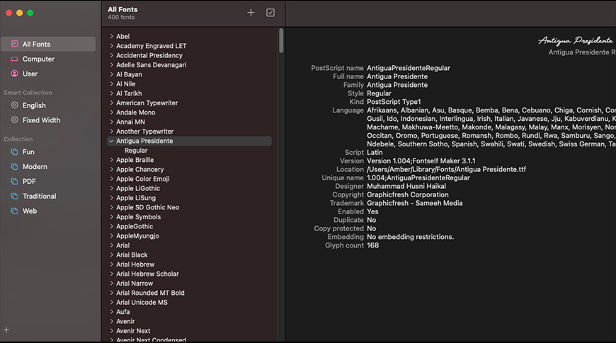
OpenType fonts were then developed jointly by Adobe and Microsoft in the mid 1990s as the rivalry between Apple, Adobe, and Microsoft continued to increase. OpenType opposed both Adobe’s PostScript types and Apple’s TrueType fonts. According to Adobe, they still share the rights to this font file format with Microsoft. OneType was built on the original working version of TrueType. It is special in its ability to work across platforms; OpenType is currently accessible on both Macs and Windows computer systems. It is still relevant today as thousands of Adobe fonts have been developed and implemented using it!


FontBook, showing a Type 1 font entry

Fig 3. Apple Insider. Font Book, Type 1 Fonts on OpenType.


So, let’s talk about fonts specifically. The turn of the century was the time in which many significant changes took place in regards to fonts and typography. Font formats were reconsidered with a modern lens and font developers took charge to introduce hundreds of new typefaces throughout the 2000s and 2010s. In 2009, the first draft of the Web Open Font Format (WOFF) was published. It is usable with both TrueType and OpenType fonts. WOFF helped standardize how fonts could be used on web pages. The interesting thing about WOFF is that anyone’s font design can be saved or converted to this format and be used across the web. At this time, font developers and others alike came to the realization that they could create their own fonts for web use! Different web-based companies took advantage of the open access to font development on the internet and thus sought to involve their brand.

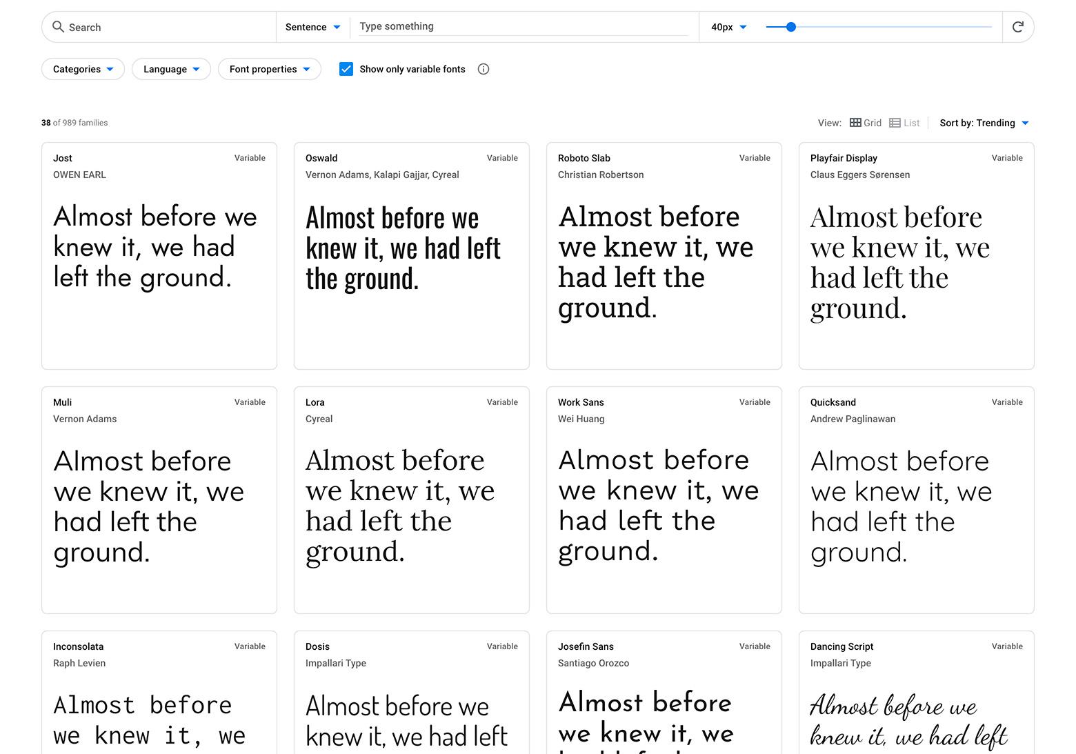
Google Fonts, originally Google Web Fonts, was founded in 2010. At its inception, it was applauded for being an open source resource for fonts and web design. As previously mentioned, it currently offers 1297 families of fonts. Check out their website to find a style that interests you!


Variable fonts are an important recent development in typeface history

Fig 4. Toptal. Google Fonts.


Microsoft also has a group dedicated to typography and web design. Microsoft Typography emphasizes legibility and creativity in font development by both their employed team members and independent designers. They primarily hire outside talent to work with program managers in creating new fonts for their Microsoft Office products.  Hundreds of fonts are currently available, and that number only continues to grow as their TrueType and OpenType font base expands with various additions from different parties.

Adobe has their own fonts to consider as well. Like Google, they have their own web page listing some of their usable typefaces. Adobe Fonts has over 20,000 fonts available with a subscription and 1,000 fonts available for their basic free signup. I would recommend anyone interested to check out their website. There are multiple free features that are easily accessible and fun for the curious observer. They even have a feature that allows you to drag and drop and image, after which the computer will come up with a font design that matches your picture.

Multiple large corporations took advantage of technological improvements to bring these fonts to light. The future holds many more opportunities, however, to expand fonts based on language. It appears that much in recent design history has forgotten to include lesser used languages. Hopefully, designers will expand their fonts to include characters from a wider variety of the written word. It has been wonderful to review updates in writing from the lens of electronic fonts and typefaces. Though this is not exactly calligraphy, this blog post creates a base from which we will next be able to discuss greater creative control by graphic designers on marketing and font selection and how calligraphic writing has influenced the profitable side of the typography field.

Thank you for reading! See you next time.

Contemporary Changes

We have returned for Week 8 of Calligraphy Corner! It is so good to have you back…

Calligraphy has taken on many different changes over its long history. On the previous blog, we covered some shifts that occurred primarily from the mid-19th century to the beginning of the 20th. Today, we will be focusing solely on the 20th century and the developments that occurred before the world transitioned into World War 2. Because so much was happening in this time frame, I would like to introduce a few separate developments before offering a final opinion.

Many new artists began to get involved in the western calligraphic landscape with the turn of the century. Schools across Europe began to offer courses in decorative handwriting in the image of Edward Johnston. The artists who learned and taught at these schools include the likes of William Graily Hewitt (Graily Hewitt) and Rudolf von Larisch.

William Graily Hewitt was a figure whose contributions to the field were so great that they compare with Johnston’s large impact. He learned under Johnston at the Central School and later taught his own classes based on Johnston’s previous instruction. Graily Hewitt’s professional life even consisted of collaborations with Johnston in the 1920s and 1930s. His main focus in the arts concerned the practice of illumination. He used gold leaf in gilding, a process that ultimately results in the application of illuminated gold to calligraphic letters. His role as Johnston’s successor in the comeback of calligraphy was made evident in the appointment he was given to create the announcement for Prince Phillip that his new title would be styled as the Duke of Edinburgh upon his wedding to the future Queen Elizabeth. Until Hewitt’s death in 1952, he continued practicing calligraphy on commission and wrote numerous books on making typefaces with pen and ink.


LOT:31 | Calligraphy & Private Press.- Hewitt (Graily) Truth, calligraphic  manuscript, [c. 1920]; and a small quantity of letters and postcards from  various Private Presses and artists (c. 35 pieces).

Fig 1. Forum Auctions. Calligraphy & Private Press – Hewitt.


In the years between the first and second World Wars, calligraphy experienced extreme influence from English and German cultures.  Schools in London like the Central School, as well as the Vienna School of Art in Germany, had instructors who wrote and published handwriting books to practice with. In Germany and Austria specifically, the Gothic hand still had a high relevance on official papers and the arts. The revival of calligraphy in these countries in particular had some interesting twists and turns. Rudolf von Larisch, an archivist from Austria who worked in Vienna, applied the concepts of past materials in discovering how tools influence writing and vice versa. He made multiple typefaces in his exploration of his so called “language of materials.” His highly technical approach influenced the modernization of calligraphy in Germany for years to come.


Rudolf von Larisch

Fig 2. Luc Devroye. Rudolf von Larisch.


The growing interest in traditional handwriting techniques stemming from the Arts and Crafts movement in England (previous discussed last week!) eventually led people who shared this passion to come together and form a group called the Society of Scribes and Illuminators. This society was created in 1921 for the purpose of understanding calligraphy and illumination as both a historical and a contemporary type of art. Several of those who were formerly taught under the leadership of Edward Johnston wanted to celebrate technical prowess and dedication to the craft. Graily Hewitt, one of these former students, was one of the Society of Scribes and Illustrator’s original founders! This society has prolonged the influence of calligraphy by publishing textbooks, establishing a membership program, setting up a library for use of its fellows, and spreading the art’s influence in various workshops and exhibits. It remains in existence today, largely under the same purpose as its founders intended.


GThomsonGerard1

Fig 3. The Society of Scribes and Illuminators. George Thompson Gallery.


Overall, we can definitely see how a small growing interest in this topic led to a wider degree of knowledge and attraction to the art of calligraphy. Different societies and organizations had formed in this time in celebration of the written word. Beyond professional groups, people from around the world were given access to a variety of handbooks and instructional guides that allowed them a means of entry into a highly professional and technical world. Different typefaces were even used as part of promotions and important announcements! As a whole, the modern calligraphy movement began to grow a substantial base during this time. This is heavily indicated by the fact that some of Europe’s most prestigious institutions had teachers willing to show interested pupils how to write in different hands and how to maintain specific skills sets for a variety of writing tools. In World War 2 and its aftermath, the landscape changed dramatically in a way that typefaces and fonts were used for marketing techniques to persuade consumers to join a cause or buy a product. We will cover more about calligraphy’s impact on marketing on the next blog!

See you next time!


Calligraphy’s Comeback

Welcome back, fair readers, to another week of blogging at Calligraphy Corner!

In the last few blogs, we have discussed the general transition of much of Europe into the Printing Age – i.e., the time corresponding to the rapid spread of printing press technology in the 16th-17th centuries. Between the creation of Gutenberg’s most famous invention in the 1450s and the arrival of the new century in 1500, 9 million books had already been printed using his new technology. This new form of recording information led to widespread dissemination of this technology and general knowledge all over the world through the next several centuries.


Fig 1. Our World in Data. Production of Printed Books 1475-1775.


Today, I would like to make another jump in time to reflect on the changes in calligraphy and typography as seen in the 19th century. This may seem like a rather large jump to consider on the blog, since we have barely covered anything in the 18th century. To sum up things in a very general sense, the art of decorative handwriting had fallen by the wayside as printing became increasingly popular and less expensive. However, the 19th century saw the preferential attitude towards the printing press decrease among a few interested artists and historians. Books were surely printed in quantities larger than ever in this time, but that did not stop those excited about handwriting in their restless search for source material to base their inquiries on.

To contextualize this interest, I must introduce the Arts and Crafts Movement. In the mid-1800s, the Arts and Crafts Movement began in Britain in response to quality and craftsmanship concerns arising out of the mechanized production of goods in factories. This movement focused on refining art techniques so that products would no longer appear artificial or novel, and instead be heavily focused on quality. If something was ornamental but lacked true recognition of the art medium’s original properties, many of the artists within this movement grew upset. In their view, ornamentation meant nothing if the actual construction of the piece was not carefully mulled over.

Let’s introduce a couple of new influential historical figures to this equation.

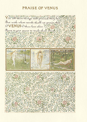
William Morris, firstly, was one of the prominent originators of this movement. He was an artist and worked in book production, textiles, and writing – a true creative soul. While he was at Oxford University, he fell in love with medieval manuscripts and illumination. Learning how to understand the manuals of scribes centuries before and actually applying those tools fostered a great passion for the creation of his own illuminated manuscripts. Morris ended up creating over 1,500 pages of manuscripts by 1875. His ties to different scholars and historians led him to the personal conclusion that calligraphy and all of its gilded, extremely decorative forms is an actual type of art, something that few had ever considered.


Morris as Calligrapher | William Morris

Fig 2. University of Maryland University Libraries. “Praise of Venus” from A Book of Verse, 1870.


Edward Johnston was another one of the interested parties that brought calligraphy back into the limelight. He was born in Uruguay and moved to England in his childhood. Although he began studying medicine in Europe, Johnston changed career paths and focused his attention on reviewing old manuscripts and works of the likes of William Morris and William Harrison Cowlishaw. He ended up studying at the British Museum where he did commissions and thus began experimentation with broad-edged pens. Various happenstance meetings with those like the former secretary to William Morris exposed Johnston to a variety of new calligraphic techniques and quill making.


Edward Johnston - Person - National Portrait Gallery

Fig 3. National Portrait Gallery. Edward Johnston.


Today, Johnston is widely considered to be the “Father of Modern Calligraphy.” His access to different manuscripts and styles of handlettering brought him enough knowledge that he began teaching classes in calligraphy at the Central School of Arts and Crafts and the Royal College of Art at the turn of the century. These classes spread the art of decorative writing in a way that encouraged curiosity and experimentation among younger generations.

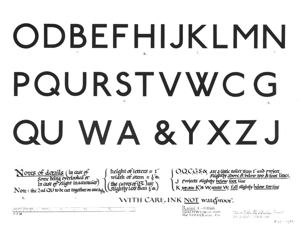
Johnston’s work beyond that of an instructor represents another huge contribution to calligraphy’s survival. In his most active years, Johnston published multiple works detailing all that he learned. Of those published, perhaps the two most important were his Writing & Illuminating & Lettering from 1906 and Manuscript & Inscription Letters from 1909. In these, he gave advice on various writing procedures that made it easy for people to learn and follow. His written works made access to calligraphic techniques that much more obtainable. Besides his publications, Johnston is also often cited as as the creator of the modern sans-serif typeface. The Johnston typeface was made on commission for the London Underground in 1913. Its easy readability was inspired by old Roman capitals and was designed with no characters in italics. This typeface had such an impact on society that London’s public transport has used it since the early 20th century as its official corporate font.


Johnston Sans: The Tube typeface that changed everything - BBC News

Fig 4. BBC. Johnston Sans.


It seems amazing that just a curious few could walk a path that brought an entire art form back to life, but that is truly what happened when it comes to calligraphy.  Using the influence of the Arts and Crafts Movement in Britain, Morris and Johnston’s interests in illumination and handlettering inspired others to become captivated by the same topics. Their contributions in this time can not go understated; they were just two people whose sharing of their life-long passions allowed others to discover this type of art for themselves.

Once again, thank you for reading! Stayed tuned for future updates on contemporary lettering and the impact of calligraphy on graphic design.

This entry was posted on October 24, 2021. 2 Comments