Archive | September 2021

Illuminated Manuscripts in Ireland

Welcome back to all of my readers! I am super happy that you are here again.


From the origins of decorative characters to the rise in religious-based writing during the Early Medieval period, calligraphy has developed through the context of its writers’ environments. This remains the same in the case of the Irish-Christians in the British Isles. The discussion of the Christian monasteries in the previous blog post (The Early Role of Religions) can be investigated further by considering the role of Ireland in the evolution of embellished longhand.


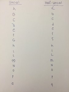
From the middle of the first millennium, Christian monasteries were established across the isolated hills of Ireland; this meant that the practice of bookmaking, which arguably saved much of the remnants of Roman influence, was largely based in this section of the world. The general insular script (related to the uncial and half-uncial scripts) discussed last time was the major ‘font’ base in play. For religious-based texts like the Bible, the half-uncial became the preferred script following the 8th century. These scripts were applied to Christian texts (particularly in Ireland and beyond in the British Isles) with the addition of another layer of artistry. This additional piece to be included in calligraphic writing was the practice of illumination.


The Book of Mulling, 2nd half of the 8th century (TCD, MS 60, ff. 81v-82). © The Library of Trinity College Dublin.

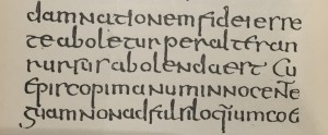
Fig 1. The Book of Mulling, 2nd half of the 8th century

(TCD, MS 60, ff. 81v-82) © The Library of Trinity College Dublin.


The illumination that decorated the insular calligraphy further was most often done on parchment – a choice that historians today can be thankful for because it lasts much longer than the alternative of papyrus. A third medium, vellum, was used only if the occasion was significant enough; ceremonial manuscripts were given preference over ones for daily use. As far as scripts go, both the insular majuscule and minuscule (uncial and half-uncial) scripts were used in Ireland and Britain (where Irish missionaries spread their bookmaking processes to). Illumination of a manuscript occurred after the calligraphy was written and dried; it involved leaving a proper blank space on areas of a folio (a folded leaf of the medium). First, metalpoint techniques were applied to the folio to map out the planned design. Clay and sap would next be rubbed on the medium to create something for gold leaf to stick to. Gold leaf was then painted on, followed by the addition of a number of colored paints made from a variety of materials. Check out the top left corners in the photo below to see an example of this!


An aerial view of the book, which is spread out on a table, displaying its ornate text. Two pairs of white-gloved hands hold the book on either side

Fig 2. Smithsonian Magazine. The Book of Lismore.


The most famous illuminated manuscript to come out of Ireland by far was the Book of Kells. Still in existence today, the Book of Kells is now on view in the Old Library of Trinity College in Dublin, Ireland.


Qv33rx04n?file=thumbnail

Fig 3. Trinity College Dublin Digital Collections. Book of Kells Folio 187v: Mark.


The Book of Kells is a Latin-based Celtic version of the Christian New Testament (four gospels in the Bible describing events after the birth of Christ). Produced at the start of the 9th century, it features some of the most well developed aspects of Irish calligraphy from the time. The insular majuscule script fills its many folios, with complicated early versions of the Celtic knot introducing each gospel. It is estimated that multiple scribes were responsible for the copying of the text (as noted by slight differences in writing style and pressure). The Book of Kells is so intricate in motifs surrounding the written word that some folios only have short phrases written on them with the amount of room that the embellishments take up. The manuscript’s style is particular; it demonstrates one of the finest examples of the insular first initial in recorded history. The first letter of the page, or the initial, is consistently the fanciest on any given folio. The image below is of the famous Chi Rho page, which according to BBC Culture uses Ancient Greek to denote the first two letters of ‘Christ’ (click here to learn more). Motifs surround it, encouraging the viewer to appreciate the broader and more beautiful meaning of the written word.


The Book of Kells: Medieval Europe's greatest treasure? - BBC Culture

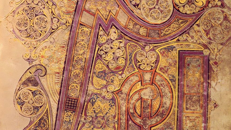
Fig 4. BBC Culture. The Book of Kells: Chi Rho.


It should be noted that Ireland was not the only country experiencing a national development of the calligraphic hand. Italy established a national hand of its own called the Beneventan script. Out of France came the Merovingian minuscule. In the Holy Roman Empire, the influence of Irish monks led to the creation and use of the Carolingian minuscule. Spain saw the advent of its Visigothic script. National styles were created under the circumstances facing a given region. As previously discussed, Ireland’s monasteries were pushed in the direction of bookmaking after the Christian Church took responsibility for it after the fall of Rome. The intense and elaborate decorations on top of the insular script were in observance of the power of religion and religious institutions.


Once again, thank you for exploring embellished writing with me once more. I hope you look forward to next week’s blog post – it will be centered on the internationally recognized gothic style developed in the centuries ahead. See you next time!


This entry was posted on September 17, 2021. 1 Comment

The Early Role of Religions

Today, I want us to jump to another period in history inherent to the evolution of calligraphic writing. By another period in history, I mean hundreds of years past the initial stages of logograph development. The years between the 6th-8th centuries have been long characterized by historians as lacking in cultural development. These few hundred years actually exist within the larger historical period commonly dubbed the “Dark Ages.” In this blog post, I’d actually like to spurn this idea when it comes to decorative writing. In fact, reflecting on these few centuries will showcase how some key aspects we associate with calligraphy today initially came to be. 


To give some context, the developments and techniques we will be discussing occurred simultaneously with the height of the Byzantine Empire and its distinguishing Eastern Orthodox Christianity. In the Middle East, the Umayyad Caliphate and rise of Islam dominated, affecting Byzantium and the Franks. In Europe, the Early Middle Ages were well underway, with the Carolingian Empire of Charlemagne and the feudal system being well known components of the period. Islamic and European contribution to the art of calligraphy will be our main two focuses here.


Religion in this period was so crucial to practically any development within society. Islamic calligraphy is literally named after the religion of Islam; it is almost entirely based off of the main Islamic text (the Qu’ran). Islamic calligraphy is also known as Arabic calligraphy because of how the Arabic language was able to flourish so closely with the spread of Islam. The kalam (qalam), or dried reed pen, was the traditional utensil applied to the medium at hand in this type of calligraphy. In a broad context, Islamic calligraphy had multiple branches in which it was used in daily life; education, religion, and government all utilized complicated script.


Reed Pen (qalam) - Collections - Antiquities Museum

Fig 1. Bibliotheca Alexandrina Antiquities Museum. Reed Pen (Qalam).


In these centuries, Islamic calligraphy had two unique styles: Kufic and Naskh/cursive. Kufic is typically associated with use on dignified occasions and purposes. It is distinguished by the dramatic unyielding appearance of its script. The angular lines exhibited were made by precision on the horizontal plane, and were almost always accompanied by complicated emblems in celebration of religion. Intricate designs were favored in copies of the Qu’ran, but have also been found in coinage, architecture, and on burial sites. Naskh, or cursive script, was used informally (as casual as one could be when practicing calligraphy). It became standardized as the main Islamic script in the late years of the first millennium.


Folio from a Qur'an Manuscript, Ink, opaque watercolor, and gold on parchment

Fig 2. The Met Museum. Folio from a Qu’ran Manuscript.


Calligraphy also experienced moments of weighted consequence in Europe. The Latin script began dominating the dark rooms of monastic institutes when monks withdrew from questionable external developments in society after the fall of the Roman Empire. Monks allowed decorative writing to thrive when cultural conditions (as referenced earlier) were not welcoming to the advancement of variations of the written word. The Bible and additional Christian literature were copied as the Islamic world copied the Qu’ran. Monks removed from the outside world took advantage of their religiously-determined remoteness to advance existing scripts as the Christian Church took responsibility for all book-making without the Romans in play. Some European religious institutions still retain volunteer scribes to keep the historical background of calligraphy relevant. All in all, the proliferation of copies of the Bible essentially encouraged fancier scripts. 


Uncial and half-uncial scripts are the primary form of European examples of longhand (writing down with a pencil or pen-like utensil rather than a keypad) calligraphy in the 6th-8th centuries. They are sometimes referred to as “book hands.” The uncial script was the more prescribed of the two and used majuscule letters (uppercase) almost exclusively. The half-uncial script was not used widely in religious writing but survived centuries longer than its counterpart. It is differentiated from uncial script with its use of the miniscule Latin alphabet (lower case). Both scripts survived by use of quill pens with cut nibs; the pen being cut at angles meant that each section of a letter had to be completed in different strokes. This made the creation of manuscripts and documents with decorative writing very time consuming. The aesthetic appearance of this work, however, led to manuscripts with these styles becoming precious and desired. 


IMG_6013

Fig 3. Dartmouth Ancient Books Lab. Uncial / Half-Uncial.


In the uncial script, curved letters take the stage rather than ones of strictly angular design. New mediums like parchment instead of harsh papyrus allowed this to occur. Observation reveals the script to be wider than the basic Roman scripts and rustic capitals of the past. Unlike the letters we use today, the uncial style’s majuscule letters are all proportional in length to each other; one letter rarely extends above or beyond the next (for the most part).


Recent Photos | Book of Kells, 8th C Irish manuscript | Patrick Lordan | Flickr

Fig 4. Lordan, Patrick. Book of Kells, 8th C Irish Manuscript.


On the other hand, the half-uncial script differed in proportionality. The new style showcased diverse ascenders and descenders that we would be able to recognize today. It is often considered the more beautiful of the two scripts. Interestingly enough, it is this script that the Old English Latin alphabet was based off of!


IMG_6011

Fig 5. Dartmouth Ancient Books Lab. Half-Uncial.


Beyond the uncial and half-uncial script styles, unique national brands of calligraphy and scripts soon developed around Europe. We will discuss more of this in a future blog post. Thanks for exploring calligraphy in the Dark Ages with me today! I hope you learned something new. See you next time!


This entry was posted on September 10, 2021. 3 Comments

The Conception of Characters

Hey all!

Wow – I’m super glad you’ve made it to this first post. If you’ve gotten the chance to browse around the couple pages on my blog thus far, you will have seen that we will be focusing on the art of calligraphy. Keep an eye out for further developments where I will describe a step-by-step (but pretty general overview) of its complicated history.

Today, we are going to take a look at calligraphy’s not-so-humble beginnings, starting across the Pacific in China during the Shang Dynasty (1600-1046 BCE).

Ancient China saw a diverse culture often tied to the religious or mystic. This influence also impacted the development of language and its expression in the written form.  Early logographs (i.e. characters or symbols which represent something) were derived from cultural practices that attempted to tell truths about the future. “Oracle bones” were the first true medium that logographs were applied to in a way that connected people to written language in society . To employ the practice of divination, animal bones (most often from an ox) and tortoise shells would be broken and characters would be written along the cracks. This would determine a sought-after answer. Recent discoveries of scrawl-covered bones show that they cover all types of topics – making divination on the bones perfect for people to choose to find out about luck in partnerships, war, or the weather.


Fig 1. National Museum of Scotland. Chinese Oracle Bones.


The logographs themselves are written in what is commonly referred to as “oracle bone script.” In Chinese, it is known as jiaguwen. This script has many interesting characteristics that are shared by its descendants, including the basic idea that certain parts of one logograph can be applied to many to underscore a type of shared meaning. In Mandarin Chinese today, we see this with the use of different radicals added together to create new meanings!  Late-stage oracle bone script also featured indications of phonetic sound beyond pure symbolism.


Glyph origin of some radicals, and the semantic connection between... | Download Scientific Diagram

Fig 2. Tao, Hanqing. A Radical-Aware Attention-Based Model for Chinese Text Classification.


In comparison to its descendants, the oracle bone script was more simplified so that people could have an easier time physically writing and carving the script into the ox bone and shells. Of course, this simplification is also due to the fact that oracle bone script was one of the earlier forms of logographs initiated around the world.  The characters used in the divination ceremonies would either be isolated to depict a specific meaning or paired up to suggest a new message.

The physical strokes and stroke order that traditional script writing utilized had extreme significance. The brush or tool taken to the medium was expected to be fluid in application, with curved lines and a lack of adherence to an unyielding and stiff structure. Perfect symmetry is not what you would see by taking a look at any recent find. If you observe this sample from the late Shang Dynasty that currently resides in the Penn Museum, you might take notice of the fact that the characters are not without flaw but are perfectly able to convey meaning to the right observer.

The widespread prevalence of the oracle bone script birthed more modern developments like the famous bronze-ware from the (same) Shang dynasty. This bronze-ware prompted a huge shift from preliminary characters to more defined calligraphy techniques that have been preserved into today. During the later portion of the dynasty, bronze materials were the medium of choice for a new script dubbed jinwen. This script’s introduction brought forth elaboration on the original oracle bone script. Jinwen‘s logographs were similar to those of its predecessor but instead fashioned intricately with closer attention to aesthetic appearance. The use of calligraphy in ceremonial affairs continued with this script as it was often used in ritualistic offerings to the heavens.


Fig 3. National Museum of Scotland. Chinese Oracle Bones.


China saw multiple editions of oracle bone and jinwen scripts be revised and standardized in the dynasties that followed. Greater unification of the country favored wider use of more consistency in decorative writing. As the years went on, new versions of written Chinese with a certain form and connotation were developed for use by those in society who held specific positions. Lishu was used by clerks commonly in the Han dynasty (206 BC-AS 220), and the “regular script” or “standard script” was required in the Tang dynasty (619-907 AD) for those engaging in civil service examinations. The Chinese language as a whole went through thousands of years of history before arriving at its fascinating current stage with multiple dialects and forms.

The contributions of China to the art of calligraphy as well as the worldwide development of written language among modern civilizations should by no means be oversimplified. As always, we have the people of the past to thank for the society we have today. It is important to recognize the work of the people who came before us as we come to learn about a topic.


Thanks for learning about one of the origins of calligraphy with me today!

This entry was posted on September 3, 2021. 3 Comments