Archive | October 2021

Contemporary Changes

We have returned for Week 8 of Calligraphy Corner! It is so good to have you back…

Calligraphy has taken on many different changes over its long history. On the previous blog, we covered some shifts that occurred primarily from the mid-19th century to the beginning of the 20th. Today, we will be focusing solely on the 20th century and the developments that occurred before the world transitioned into World War 2. Because so much was happening in this time frame, I would like to introduce a few separate developments before offering a final opinion.

Many new artists began to get involved in the western calligraphic landscape with the turn of the century. Schools across Europe began to offer courses in decorative handwriting in the image of Edward Johnston. The artists who learned and taught at these schools include the likes of William Graily Hewitt (Graily Hewitt) and Rudolf von Larisch.

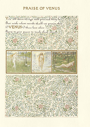
William Graily Hewitt was a figure whose contributions to the field were so great that they compare with Johnston’s large impact. He learned under Johnston at the Central School and later taught his own classes based on Johnston’s previous instruction. Graily Hewitt’s professional life even consisted of collaborations with Johnston in the 1920s and 1930s. His main focus in the arts concerned the practice of illumination. He used gold leaf in gilding, a process that ultimately results in the application of illuminated gold to calligraphic letters. His role as Johnston’s successor in the comeback of calligraphy was made evident in the appointment he was given to create the announcement for Prince Phillip that his new title would be styled as the Duke of Edinburgh upon his wedding to the future Queen Elizabeth. Until Hewitt’s death in 1952, he continued practicing calligraphy on commission and wrote numerous books on making typefaces with pen and ink.
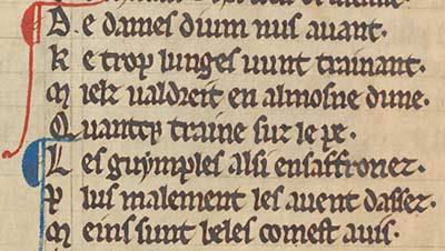
 

LOT:31 | Calligraphy & Private Press.- Hewitt (Graily) Truth, calligraphic  manuscript, [c. 1920]; and a small quantity of letters and postcards from  various Private Presses and artists (c. 35 pieces).

Fig 1. Forum Auctions. Calligraphy & Private Press – Hewitt.


In the years between the first and second World Wars, calligraphy experienced extreme influence from English and German cultures.  Schools in London like the Central School, as well as the Vienna School of Art in Germany, had instructors who wrote and published handwriting books to practice with. In Germany and Austria specifically, the Gothic hand still had a high relevance on official papers and the arts. The revival of calligraphy in these countries in particular had some interesting twists and turns. Rudolf von Larisch, an archivist from Austria who worked in Vienna, applied the concepts of past materials in discovering how tools influence writing and vice versa. He made multiple typefaces in his exploration of his so called “language of materials.” His highly technical approach influenced the modernization of calligraphy in Germany for years to come.


Rudolf von Larisch

Fig 2. Luc Devroye. Rudolf von Larisch.


The growing interest in traditional handwriting techniques stemming from the Arts and Crafts movement in England (previous discussed last week!) eventually led people who shared this passion to come together and form a group called the Society of Scribes and Illuminators. This society was created in 1921 for the purpose of understanding calligraphy and illumination as both a historical and a contemporary type of art. Several of those who were formerly taught under the leadership of Edward Johnston wanted to celebrate technical prowess and dedication to the craft. Graily Hewitt, one of these former students, was one of the Society of Scribes and Illustrator’s original founders! This society has prolonged the influence of calligraphy by publishing textbooks, establishing a membership program, setting up a library for use of its fellows, and spreading the art’s influence in various workshops and exhibits. It remains in existence today, largely under the same purpose as its founders intended.


GThomsonGerard1

Fig 3. The Society of Scribes and Illuminators. George Thompson Gallery.


Overall, we can definitely see how a small growing interest in this topic led to a wider degree of knowledge and attraction to the art of calligraphy. Different societies and organizations had formed in this time in celebration of the written word. Beyond professional groups, people from around the world were given access to a variety of handbooks and instructional guides that allowed them a means of entry into a highly professional and technical world. Different typefaces were even used as part of promotions and important announcements! As a whole, the modern calligraphy movement began to grow a substantial base during this time. This is heavily indicated by the fact that some of Europe’s most prestigious institutions had teachers willing to show interested pupils how to write in different hands and how to maintain specific skills sets for a variety of writing tools. In World War 2 and its aftermath, the landscape changed dramatically in a way that typefaces and fonts were used for marketing techniques to persuade consumers to join a cause or buy a product. We will cover more about calligraphy’s impact on marketing on the next blog!

See you next time!


Calligraphy’s Comeback

Welcome back, fair readers, to another week of blogging at Calligraphy Corner!

In the last few blogs, we have discussed the general transition of much of Europe into the Printing Age – i.e., the time corresponding to the rapid spread of printing press technology in the 16th-17th centuries. Between the creation of Gutenberg’s most famous invention in the 1450s and the arrival of the new century in 1500, 9 million books had already been printed using his new technology. This new form of recording information led to widespread dissemination of this technology and general knowledge all over the world through the next several centuries.


Fig 1. Our World in Data. Production of Printed Books 1475-1775.


Today, I would like to make another jump in time to reflect on the changes in calligraphy and typography as seen in the 19th century. This may seem like a rather large jump to consider on the blog, since we have barely covered anything in the 18th century. To sum up things in a very general sense, the art of decorative handwriting had fallen by the wayside as printing became increasingly popular and less expensive. However, the 19th century saw the preferential attitude towards the printing press decrease among a few interested artists and historians. Books were surely printed in quantities larger than ever in this time, but that did not stop those excited about handwriting in their restless search for source material to base their inquiries on.

To contextualize this interest, I must introduce the Arts and Crafts Movement. In the mid-1800s, the Arts and Crafts Movement began in Britain in response to quality and craftsmanship concerns arising out of the mechanized production of goods in factories. This movement focused on refining art techniques so that products would no longer appear artificial or novel, and instead be heavily focused on quality. If something was ornamental but lacked true recognition of the art medium’s original properties, many of the artists within this movement grew upset. In their view, ornamentation meant nothing if the actual construction of the piece was not carefully mulled over.

Let’s introduce a couple of new influential historical figures to this equation.

William Morris, firstly, was one of the prominent originators of this movement. He was an artist and worked in book production, textiles, and writing – a true creative soul. While he was at Oxford University, he fell in love with medieval manuscripts and illumination. Learning how to understand the manuals of scribes centuries before and actually applying those tools fostered a great passion for the creation of his own illuminated manuscripts. Morris ended up creating over 1,500 pages of manuscripts by 1875. His ties to different scholars and historians led him to the personal conclusion that calligraphy and all of its gilded, extremely decorative forms is an actual type of art, something that few had ever considered.


Morris as Calligrapher | William Morris

Fig 2. University of Maryland University Libraries. “Praise of Venus” from A Book of Verse, 1870.


Edward Johnston was another one of the interested parties that brought calligraphy back into the limelight. He was born in Uruguay and moved to England in his childhood. Although he began studying medicine in Europe, Johnston changed career paths and focused his attention on reviewing old manuscripts and works of the likes of William Morris and William Harrison Cowlishaw. He ended up studying at the British Museum where he did commissions and thus began experimentation with broad-edged pens. Various happenstance meetings with those like the former secretary to William Morris exposed Johnston to a variety of new calligraphic techniques and quill making.


Edward Johnston - Person - National Portrait Gallery

Fig 3. National Portrait Gallery. Edward Johnston.


Today, Johnston is widely considered to be the “Father of Modern Calligraphy.” His access to different manuscripts and styles of handlettering brought him enough knowledge that he began teaching classes in calligraphy at the Central School of Arts and Crafts and the Royal College of Art at the turn of the century. These classes spread the art of decorative writing in a way that encouraged curiosity and experimentation among younger generations.

Johnston’s work beyond that of an instructor represents another huge contribution to calligraphy’s survival. In his most active years, Johnston published multiple works detailing all that he learned. Of those published, perhaps the two most important were his Writing & Illuminating & Lettering from 1906 and Manuscript & Inscription Letters from 1909. In these, he gave advice on various writing procedures that made it easy for people to learn and follow. His written works made access to calligraphic techniques that much more obtainable. Besides his publications, Johnston is also often cited as as the creator of the modern sans-serif typeface. The Johnston typeface was made on commission for the London Underground in 1913. Its easy readability was inspired by old Roman capitals and was designed with no characters in italics. This typeface had such an impact on society that London’s public transport has used it since the early 20th century as its official corporate font.


Johnston Sans: The Tube typeface that changed everything - BBC News

Fig 4. BBC. Johnston Sans.


It seems amazing that just a curious few could walk a path that brought an entire art form back to life, but that is truly what happened when it comes to calligraphy.  Using the influence of the Arts and Crafts Movement in Britain, Morris and Johnston’s interests in illumination and handlettering inspired others to become captivated by the same topics. Their contributions in this time can not go understated; they were just two people whose sharing of their life-long passions allowed others to discover this type of art for themselves.

Once again, thank you for reading! Stayed tuned for future updates on contemporary lettering and the impact of calligraphy on graphic design.

This entry was posted on October 24, 2021. 2 Comments

Important Impact of Garamond

Welcome!

This week, we will be discussing the impact of another person on the development of calligraphy. Through this person, we are able to make the connection between the art of decorative handwriting and the development of one of the most recognizable modern typefaces.

The person I refer to is Claude Garamond (1499-1561). Notice anything familiar about the last name? Possibly in the fonts available on many word processors?

Garamond (the person) was a 16th century publisher, engraver, and typeface designer based in Paris, France. In Garamond’s time, France became the new center for handwriting development after political developments in Italy, especially after the sack of Rome in 1527. Certain historical events across Europe prepared the world of print for the rise of typeface designers, and France provided the closest cultural safe haven to develop new styles.


Portrait: Claude Garamond

Fig 1. German Museum of Books and Writing. Garamond.


Garamond’s work as an engraver allowed him to punch certain matrices into a metal-type using both Gothic and Roman styles. He began to experiment beyond the typical recognizable styles of the time with heavy influence from an earlier typeface designer named Aldus Manutius. Manutius helped replace the Gothic style, preferring his own curved Italic style. Garamond was additionally influenced by Angelo Vergecio, a Greek royal scribe in the French court, later in his career in the creation of his Grecs du roi style for a monarchic-funded book project. During his approximately forty year career, Garamond was responsible for a total of 34 typefaces in Greek, Roman, Hebrew, and Italic styles. His Grecian styles were some of the most enduring typefaces in history, and remained exceedingly relevant through the 19th century.


How Claude Garamond Changed the Type Industry | by Brandy Willetts | Medium

Fig 2. Medium. Garamond.


So, what characterizes the general Garamond typeface?

The Garamond typeface is a serif typeface. This typeface (which is a collection of fonts) makes specific unique contributions to certain letters. For example, in the letter “e”, the Garamond typeface allows for the horizontal slant in the middle of the letter rather than a curved or angular line striking northeasterly. In the letter “R”, Garamond showcases an extended leg beyond the bounds of the character. The typeface communicates an elegance of sorts, relaying a need for readability in combination with the traditional flow that physically hand writing a message takes on. In comparison to the previously discussed hand of humanism, the Garamond typeface has an exaggerated difference between thin and thick strokes.


Garamond Font Poster

Fig. 3. Proof Positive. Garamond Font Poster.


To relate this to the modern day, the influence of the Garamond typeface in the 16th century carried on into calligraphy’s revivalist period between the 1800s and early 1900s. We will discuss this in further detail in a later blog post, but to sum it up, a few designers in Europe began taking an interest in old-style typefaces so much that Garamond’s masterful work was rediscovered and spread all over again.


We can thank both Garamond and those of the revival period for the fact that so many word processing fonts are used on the computers of today. Microsoft has its own Adobe Garamond package which features a six font collection put together by Robert Slimbach. There are multiple additional Adobe fonts labeled “Garamond” beyond this official package. As far as Google goes, Google’s website Google Fonts lists up to ten total font choices in an “EB Garamond” style. Claude Garamond’s role as one of the best master typeface designers of his time has continued to be magnified with the use of his name tied to so many recognizable fonts. He, like Johannes Gutenberg, had great influence over the art of calligraphy and typography. The reigning magnitude of his work is seen in every paper, article, and book published in a Garamond font. Claude Garamond is thus a relatively unknown but very important designer of mid-century Europe!


Thank you for tuning in to another week of blogging. See you next time for blog #7!


Hand of Humanism

And we’re back!


Welcome back to Week 5 of Calligraphy Corner! I’m glad to see you’ve returned. Today, we are going to be discussing the resulting calligraphic style after the lens of humanism was applied in 15th century Europe. 


Let’s first define humanism. Humanism was (is) a philosophy system based in curiosity and inquiry that rose in the 14th century after its founders began to look towards the ideas of antiquity for an understanding of humanitas, or human virtue. Basically, mid-century scholars found value in the philosophical basis of ancient civilizations (primarily Greece and Rome). They considered the words of ancient philosophers like Aristotle and tried to apply previous modes of thinking to what went wrong in the Dark Ages. Humanist thought contributed immensely to the general societal reawakening recognized as the European Renaissance. 


Petrarch was one of the great humanist scholars of the Renaissance – in fact, he is considered to be the “Father of Humanism” for his status as one of the first to begin collecting the ideas and manuscripts of the Ancients. In a letter he imagined sending to a great scholar of the past, he wrote “Among the many subjects which interested me, I dwelt especially, Upon antiquity, for our own age has always I repelled me, so that, had it not been for the love of those dear to me, I should have preferred to have been born in any other period than our own.”


Here’s the issue. While humanists thought they were collecting Roman manuscripts with Roman writing for their inspirations, they had in reality actually found 9th-12th century examples of the Carolingian miniscule hand. We haven’t really discussed this hand, but it was an important precursor to the Gothic script to give you a sense of its place in history. It is an easily readable script characterized by rounded letters with decent space in between characters. Petrarch was a main contributor to this mistake, funnily enough. It led many of the movement to appreciate the style of the Carolingian hand, thinking it to be much older than recent history.


Gospel Book, Ink and opaque watercolor on parchment; modern leather binding, Carolingian

Fig 1. The Met Museum. Gospel with Carolingian Hand.


Petrarch’s value in the history of calligraphy is embedded more deeply than not because of his desire to do more with his distaste for the cramped Gothic black letter than just wallow. Petrarch was one of the creators of the new humanist minuscule, descended from the Carolingian script that humanists took for the scripts of ancient Rome and Greece. The humanist minuscule is quite different from the Gothic script that we considered in the previous blog post. It is recognizable by its tendency to trend away from the cursive look of the past. This miniscule moved towards a current, more “printed” appearance. Letters no longer appear so fancy they are nearly unreadable. Things are simpler and retain a more symmetric beauty within this script.


Fig 2. Universities of Cambridge and Oxford. De Infelicitate Principum.


The desire for a simpler, more legible script reflects the general impact that humanism had on the creation of art. As a technical mode of expression and creation, calligraphy can exist under the “art” label. The humanist movement, above all, encouraged artwork to reflect the ideas and values of antiquity. The pursuit for understanding human virtue and the role of humans in the world is an idea heavily explored in humanist artwork. The human form and experience was always something to be appreciated. This kind of thinking is evident in pieces from famous artists, like Leonardo da Vinci’s Vitruvian Man.


Vitruvian Man on display in a museum

Fig 3. BBC. Vitruvian Man.


The humanist minuscule demonstrates that new styles within the field of calligraphy did not always happen within a religious setting. Developments in handwriting often occurred without religious influence. However, new aspects of decorative writing (like most art) do tend to appear with the birth of new modes of thought, new paths to survival, new people in power, and new technology. Because this humanist script is a direct ancestor to some of the serif fonts we currently use today, it is important to truly understand the movement it was born from.


Thanks for returning to my blog for a fifth week! I am excited, as always, to begin working on the next.

This entry was posted on October 8, 2021. 2 Comments

Price of the Printing Press

Welcome back! I’m looking forward to talking to you about another step in the history of calligraphy. Today, we will be discussing how Johannes Gutenberg’s printing press impacted the art of stylistic handwriting.

Ahh, the mid-15th century. A time rife in new powers rising to defeat old ones, and religions struggling to maintain organized systems. Johannes Gutenberg was a German goldsmith who lived during this time. He is famous now for creating a new-and-improved version of the movable type version of the printing press. Now, printing presses dating back to Ancient China were in existence at this time. However, this new metal movable type caught on throughout Europe. It was refined from earlier versions in Korea and East Asia, and employed similar mechanisms as a wine press and used a hand mould to cast letters. Gutenberg initiated the use of an oil-based ink in his printing press for greater consistency, which later evolved into what is known as “printer’s ink.”


Glencairn Acquires Replica Gutenberg-Era Printing Press — Glencairn Museum

Fig 1. Glencairn Museum. Replica of Gutenberg-Era Printing Press.


Gutenberg used a specific style to cast his letters using his hand mould: the Gothic script, or the “black-letter.” The Gothic script is thought to have been invented in the 6th century by the Lombards, a primarily German group that ruled a portion of Italy during the middle of the first millenium. However, the Gothic script only became visibly used past the 12th century. The descriptor “gothic” is a word with a negative connotation in the eyes of history. The Renaissance humanists and historians through the beginning of the 20th century associated the word “gothic” with barbarism. Anything attached to the gothic name was considered to be particularly uncivilized and inappropriate for formal use in society. This rings true for the Gothic script. Those same humanists did not see any value in the emerging Gothic script, strongly preferring to stick to a more traditional Roman typeface.


The Gothic script features a more uniform strategy than some previously popular scripts. It is recognized to have more angular strokes rather than any overly fluid or circular motion. Commonly, certain character (letter) combinations can be seen to be connected in a melding of sorts. One of the most recognizable (and most widely used around the advent of the printing press) forms of the Gothic script is called Textualis, or Textura. Gutenberg himself used Textualis for the printing of his famous Bible (keep reading on to learn more about this!). Textualis features a general lack of ligatures (the connection between most letters that you often see in English cursive, for example), ascending characters with non-curved finials (tapered end of a letter), and fewer characters with descenders. Letters written in the Textualis form are usually skinny and sometimes appear to be stretched in the vertical.


Detail from WLC/LM/4, f. 8v

Fig 2. University of Nottingham. Detail from WLC/LM/4, f. 8v.


Gutenberg’s Bible, as referred to in the last paragraph, was a Textualis (Gothic!) based piece of work produced by one of his original printing presses. There are approximately 48 copies that survive today. It is a version of the famous Latin Vulgate Bible that has between 40 to 42 lines written per page of its folios. The Gutenberg Bible is also known as the 42-Line Bible for this reason. Interestingly enough, the practice of illumination talked about in my previous blog post was applied within printed copies of the Gutenberg Bible. For its beauty and uniqueness, the printing of this Bible became wildly popular. Copies were sold immediately after being finished. The appreciation and popularity of this printing masterpiece resulted in an explosion in the use of the printing press in the coming decades across the continent.


Fig 3. Library of Congress. Gutenberg Bible.


This popularity in a new medium of sharing information led to an increased reliance on the printing press, away from timely expense of handwritten manuscripts. Though illuminated manuscripts were still in production at this time, the spread of printing technology contributed to a wider and faster dissemination of news and other information than ever before. Those traveling around the world, on the continent, or through a given nation were now able to easily bring along with them a pamphlet of written information. News from another part of the world could now be shared with citizens all over. It became common to listen to public speakers now that literature and information were not solely to be shared with the elite who could commission it.


So, where does this large change in the recording of information leave us in the realm of calligraphy’s importance?


Well, calligraphic scripts were still of great value, even in the printing world. In the Gothic script, several new forms besides Textualis were perfected and used as typefaces in print. The script became standardized in printing, especially out of Germany and France. It fathered multiple calligraphic hands with new, distinguishable characteristics influenced by their environments. Writers still experimented with the decorative writing art, as the rise of humanism and interest in Roman antiquity led those intrigued back to writing styles similar to ancient manuscripts. Calligraphy continued to have relevance in all aspects of the written and printed word. For my next blog, we will revisit the impact of humanism on stylized scripts!


Thanks for returning to learn something new with me!