Welcome back! I’m looking forward to talking to you about another step in the history of calligraphy. Today, we will be discussing how Johannes Gutenberg’s printing press impacted the art of stylistic handwriting.
Ahh, the mid-15th century. A time rife in new powers rising to defeat old ones, and religions struggling to maintain organized systems. Johannes Gutenberg was a German goldsmith who lived during this time. He is famous now for creating a new-and-improved version of the movable type version of the printing press. Now, printing presses dating back to Ancient China were in existence at this time. However, this new metal movable type caught on throughout Europe. It was refined from earlier versions in Korea and East Asia, and employed similar mechanisms as a wine press and used a hand mould to cast letters. Gutenberg initiated the use of an oil-based ink in his printing press for greater consistency, which later evolved into what is known as “printer’s ink.”

Fig 1. Glencairn Museum. Replica of Gutenberg-Era Printing Press.
Gutenberg used a specific style to cast his letters using his hand mould: the Gothic script, or the “black-letter.” The Gothic script is thought to have been invented in the 6th century by the Lombards, a primarily German group that ruled a portion of Italy during the middle of the first millenium. However, the Gothic script only became visibly used past the 12th century. The descriptor “gothic” is a word with a negative connotation in the eyes of history. The Renaissance humanists and historians through the beginning of the 20th century associated the word “gothic” with barbarism. Anything attached to the gothic name was considered to be particularly uncivilized and inappropriate for formal use in society. This rings true for the Gothic script. Those same humanists did not see any value in the emerging Gothic script, strongly preferring to stick to a more traditional Roman typeface.
The Gothic script features a more uniform strategy than some previously popular scripts. It is recognized to have more angular strokes rather than any overly fluid or circular motion. Commonly, certain character (letter) combinations can be seen to be connected in a melding of sorts. One of the most recognizable (and most widely used around the advent of the printing press) forms of the Gothic script is called Textualis, or Textura. Gutenberg himself used Textualis for the printing of his famous Bible (keep reading on to learn more about this!). Textualis features a general lack of ligatures (the connection between most letters that you often see in English cursive, for example), ascending characters with non-curved finials (tapered end of a letter), and fewer characters with descenders. Letters written in the Textualis form are usually skinny and sometimes appear to be stretched in the vertical.
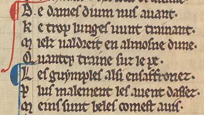
Fig 2. University of Nottingham. Detail from WLC/LM/4, f. 8v.
Gutenberg’s Bible, as referred to in the last paragraph, was a Textualis (Gothic!) based piece of work produced by one of his original printing presses. There are approximately 48 copies that survive today. It is a version of the famous Latin Vulgate Bible that has between 40 to 42 lines written per page of its folios. The Gutenberg Bible is also known as the 42-Line Bible for this reason. Interestingly enough, the practice of illumination talked about in my previous blog post was applied within printed copies of the Gutenberg Bible. For its beauty and uniqueness, the printing of this Bible became wildly popular. Copies were sold immediately after being finished. The appreciation and popularity of this printing masterpiece resulted in an explosion in the use of the printing press in the coming decades across the continent.

Fig 3. Library of Congress. Gutenberg Bible.
This popularity in a new medium of sharing information led to an increased reliance on the printing press, away from timely expense of handwritten manuscripts. Though illuminated manuscripts were still in production at this time, the spread of printing technology contributed to a wider and faster dissemination of news and other information than ever before. Those traveling around the world, on the continent, or through a given nation were now able to easily bring along with them a pamphlet of written information. News from another part of the world could now be shared with citizens all over. It became common to listen to public speakers now that literature and information were not solely to be shared with the elite who could commission it.
So, where does this large change in the recording of information leave us in the realm of calligraphy’s importance?
Well, calligraphic scripts were still of great value, even in the printing world. In the Gothic script, several new forms besides Textualis were perfected and used as typefaces in print. The script became standardized in printing, especially out of Germany and France. It fathered multiple calligraphic hands with new, distinguishable characteristics influenced by their environments. Writers still experimented with the decorative writing art, as the rise of humanism and interest in Roman antiquity led those intrigued back to writing styles similar to ancient manuscripts. Calligraphy continued to have relevance in all aspects of the written and printed word. For my next blog, we will revisit the impact of humanism on stylized scripts!
Thanks for returning to learn something new with me!