Welcome!
This week, we will be discussing the impact of another person on the development of calligraphy. Through this person, we are able to make the connection between the art of decorative handwriting and the development of one of the most recognizable modern typefaces.
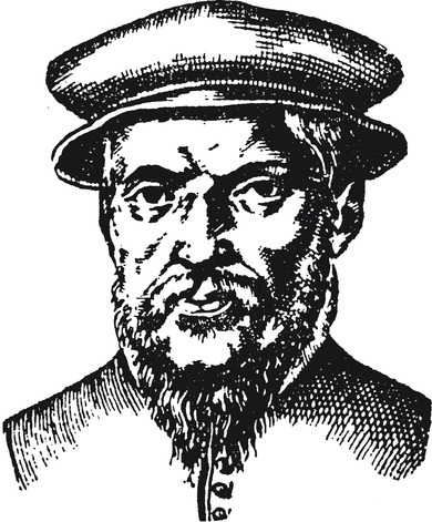
The person I refer to is Claude Garamond (1499-1561). Notice anything familiar about the last name? Possibly in the fonts available on many word processors?
Garamond (the person) was a 16th century publisher, engraver, and typeface designer based in Paris, France. In Garamond’s time, France became the new center for handwriting development after political developments in Italy, especially after the sack of Rome in 1527. Certain historical events across Europe prepared the world of print for the rise of typeface designers, and France provided the closest cultural safe haven to develop new styles.

Fig 1. German Museum of Books and Writing. Garamond.
Garamond’s work as an engraver allowed him to punch certain matrices into a metal-type using both Gothic and Roman styles. He began to experiment beyond the typical recognizable styles of the time with heavy influence from an earlier typeface designer named Aldus Manutius. Manutius helped replace the Gothic style, preferring his own curved Italic style. Garamond was additionally influenced by Angelo Vergecio, a Greek royal scribe in the French court, later in his career in the creation of his Grecs du roi style for a monarchic-funded book project. During his approximately forty year career, Garamond was responsible for a total of 34 typefaces in Greek, Roman, Hebrew, and Italic styles. His Grecian styles were some of the most enduring typefaces in history, and remained exceedingly relevant through the 19th century.

Fig 2. Medium. Garamond.
So, what characterizes the general Garamond typeface?
The Garamond typeface is a serif typeface. This typeface (which is a collection of fonts) makes specific unique contributions to certain letters. For example, in the letter “e”, the Garamond typeface allows for the horizontal slant in the middle of the letter rather than a curved or angular line striking northeasterly. In the letter “R”, Garamond showcases an extended leg beyond the bounds of the character. The typeface communicates an elegance of sorts, relaying a need for readability in combination with the traditional flow that physically hand writing a message takes on. In comparison to the previously discussed hand of humanism, the Garamond typeface has an exaggerated difference between thin and thick strokes.

Fig. 3. Proof Positive. Garamond Font Poster.
To relate this to the modern day, the influence of the Garamond typeface in the 16th century carried on into calligraphy’s revivalist period between the 1800s and early 1900s. We will discuss this in further detail in a later blog post, but to sum it up, a few designers in Europe began taking an interest in old-style typefaces so much that Garamond’s masterful work was rediscovered and spread all over again.
We can thank both Garamond and those of the revival period for the fact that so many word processing fonts are used on the computers of today. Microsoft has its own Adobe Garamond package which features a six font collection put together by Robert Slimbach. There are multiple additional Adobe fonts labeled “Garamond” beyond this official package. As far as Google goes, Google’s website Google Fonts lists up to ten total font choices in an “EB Garamond” style. Claude Garamond’s role as one of the best master typeface designers of his time has continued to be magnified with the use of his name tied to so many recognizable fonts. He, like Johannes Gutenberg, had great influence over the art of calligraphy and typography. The reigning magnitude of his work is seen in every paper, article, and book published in a Garamond font. Claude Garamond is thus a relatively unknown but very important designer of mid-century Europe!
Thank you for tuning in to another week of blogging. See you next time for blog #7!