All posts by Stephanie Osorio

DD Review: Lojean Alali

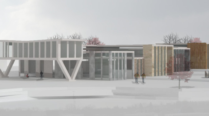
At Lojean review, she discussed how her project is focused on the individual characteristics of each program. She has decided to use different materials for each training space to create different environments for each trade. She has also gone about, placing the programs at all different heights, of floor level and ceiling level.

Personally at her review, I’m not exactly sure how the use of materials has been incorporated into her design. I think her drawings hasn’t shown in it clearly nor did she explain that part well. She stated it but I didn’t see it going farther from there. Are the rooms going to be made specifically out of that material that’s involved in the program or is she exposing the material that would have been there regardless in the construction of the room but now you will get to see it’s use in the room’s structure? This is not to say that she hasn’t put this into thought but t really didn’t appear clear to me in her presentation.

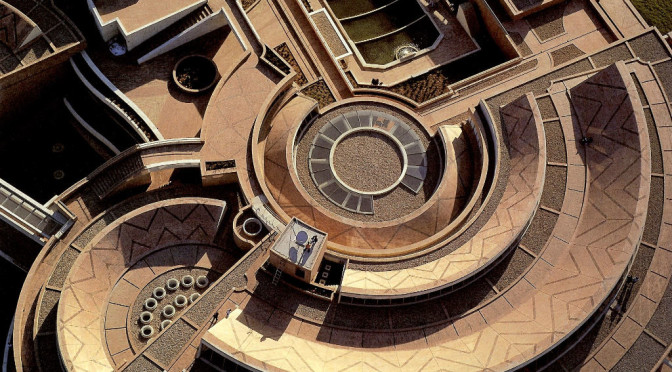
Since the beginning, Lojean has always stated that her project is very stressed on the incorporation of natural lighting. This in itself determined the layout of her building. She has each training space jut out as a way that she calls “chasing the sun.”

However, as last time, the spaces of her programs is rectangular. Also, the programs have been laid out one right after the other, and are not orientated at all around the path of the sun. First off, I would recommend if she would explore curves. The sun does not follow a linear path and if she wants to optimally incorporate the sun light that hits her building, I would strongly suggest not only having curved walls in her building but also changing that layout of her programs so that they could receive much better lighting through out the day. Or what if the time that class usually is taught would determine the placement of the building so it would receive direct sunlight as the time class was in session? I don’t know, these are just thoughts.

Lojean went into explaining that her design involves all alternate pathway at the entrance that elevates you and bring you to height that is high enough for you to see above all the programs. It is here that you also reach the conference center.

This pathway she speaks about seems to be a very long slim corridor that does not bend at all but rather just cuts through that programs. So seeing all of the programs at once seems nearly impossible since they are all set up next to one another is a linear fashion so it would be a vast amount of territory they would have to cover to see all the programs then reach the conference center. I think this is a problem that could be easily resolved with the incorporation of a curved layout of her programs. So even if she kept it as a pathway, it would be a much shorter one.

She also mentions how reaching the conference room is the end of the “journey.” But it appears to me that their journey involves walking down this corridor, reaching the end of the corridor which is the conference room, and then back out the same corridor to leave the premises. So it’s not the end of their journey but a significant one. I would say she should consider a better layout for this as well. what if the conference room was placed halfway into the corridor. So it would almost be a partial exploration, then informative session, then followed by a continued exploration of the premises. Maybe at least provide two corridors, one for entering and another for exiting.

As far as the critics go, I think Daniel and Felicia were both thinking with an industrial state of mind. The suggestions they gave Lojean dealt more about efficiency and convenience for the students that would be using the space.

They both had suggested that Lojean incorporate some method of the students reaching her building without the need of having to go outside. On Lojean’s plans, she has actually split the existing building in the middle. I would suggest if she brought her proposed building closer to the existing one and then had corridors that ran to each segmented portion of the existing building that would wrap around the parking lot.

I agreed with them when they complimented her on her terracing. One of them in particular, I believe it was the largest one, provided for a strong connection between the old and new building.

They were critical about how Logan’s building need to appear more pronounced in her drawings but the thing is, she hasn’t done anything to them. She hasn’t changed them at all and are what were existing there before she ever designed. So I agree with them that in her drawings her parking lot should be more pronounced but she should really do something about changing it. I think it’s such a simple change and I would suggest that she change it in a way to manipulate the course in which a visitor may take when arriving to the site.

Another critical point that they made is that she should exaggerate the glass material in her building. I agree because this would definitely work to show off the different heights in her program buildings and show that they are not identical in one another from program to program.

They also mentioned that she should show materials in her drawings, but not only how I had mentioned before but even in the construction because the plans just show lined but I grasp no sense of materials that are being used on the site.

Lastly, Felicia got all inspirational in one of her last suggestions. She took notice that the wall of the collaboration space and one of the wall of the existing building faced one another. Felicia said that she should take this moment as an opportunity for conversation between the two buildings and design it.

A Curved Axis

What simply began as a strong central axis that had bent out of shape of follow the path of the sun, has now transformed into a project that not only connects the two farthest points of the existing building but proposes various new forms of circulation throughout the property.

The existing building features a prominent straight central axis that runs down the center of the building, ultimately creating isolating fragments throughout the building’s layout. The addition of my building will connect the two farthest ends of the existing building. Taking inspiration from the Lleras building at Los Andes University in Bogota, my building is significantly embedded into the ground and it’s roof becomes a common walkway for pedestrians.

As I continued on with this curve, I decided to look at currently existing curved buildings that could possibly serve as precedents for my building’s form. I came across the the Virgilio Barco Library, also located in Bogota, whose form followed sets of circular and radial geometries, a characteristic that was the brought into my current design. My entire designed site, not just the building itself, fits within circular and radial geometries revolving from one common center point. The terraced courtyard, the parking lot and even the individual steps from every stair follow these same geometries.

The center point is located at the center of one of the segments of the existing building. Here, I have proposed an entirely new Career Resource Center for the existing building. Not only is this enhancing the circulation from the existing building onto the new site but promoting students to visit this end of the building and bring about more interest and concern about the career they may choose for their futures.

Lastly, within the structure itself, I have left one large open central work space that all five programs will share. This was intentionally done to serve as a unified, open, collaborative space. However, within the structure, there is leveling that occurs at five different moments. This leveling is what differentiates the spaces of each program from one another, without cutting off any interaction between the programs.

Peer Design Review: Lojean Alali

For Lojean’s schematic design, her concept dealt with playing with the use of light and the curves of the structure. This was clearly evident in her concept model where she played with almost “ribbons” of paper to create different forms and frame all kinds of different volumes within this model. Her precedents for her concept were the Hagia Sophia by Isidore of Miletus and the Wolfsberg Science Museum by Zaha Hadid.

I believe her conceptual exploration was very much, not evident in her schematic design. During the weeks of conceptual design she presented this very beautiful paper model. When the person were to hold the model, you could tell that the placement of each paper ribbon was intentionally placed and not as spontaneous as it initially seemed. There were great moments found within that paper model. There were moments of great light by allowing numerous openings within the mesh of ribbons were as other places were smaller and allowed for less lighting. Her building design however was very much out of the blue. Her building appears as just one large rectangular building on the site and her rooms are all rectangular. The placement of the rooms is just simply one right after another in a continuous room with no distinction between the next.

I don’t believe her building should be rectangular. Actually far from it. It would be great if her building offered no straight walls at all. and I don’t think the material for her building should be made of curved concrete walls or maybe she could work with steel sheets. The wall from one room should shoot across the site into another space and provide a barrier for another space. Her current walls seem stiff and heavy, which was not all express in her concept model. But again this issue could be fixed in some of the ways I stated just before.

Maybe the different training rooms can be set apart from one another by their structural form. Possibly, if the idea of this ribbon like barriers were elected into your building, then the way the walls come together to enclose the space could be entirely different. What if you possibly made the training space all one large space and the flooring, more specifically the leveling, is what is  distinguishing one program’s training space from the next.

Her site plans appears have it’s main entrance leading into one of the training spaces. That seems like it would be really inconvenient to the students that will be designated to work there. Absolutely anyone entering the building would have to cut through their training space, which ultimately would cut off some of the room for them to work. Then those entering would have to cut across diagonally to enter the large corridor off to the side. The main entrance needs it’s own room so that when people first step in, they are is no one’s way. I would consider moving the main entrance to the right so it is directly connected to the main corridor to avoid this awkward situation. Also, the rooms are all lined up, one right next to the other and each one looks not different to the other in dimension. I’m unclear as to why thesis the case. If all the training spaces are lined up to one another, you could make the argument that you were aiming for one unified program. However in the this case I would question the use of the walls. Having walls around each one of the training spaces defeats this purpose. Maybe she intentionally wanted these spaces to be isolated from one another. In that case, I would consider playing around with the placement of each training space. In addition she could play around with their location in relation to the side of the corridor that they’re on. Now what is she had a unit that she worked with? Maybe a unit that holds the dimensions of the current training spaces. In a diagram she could also show the one of the units was placed across the corridor but the corridor split the unit in two, creating two individual spaces, the classrooms perhaps? Just throwing ideas out there.

Considering your conference room, something seems wrong with the scale. The room is much much larger than it should be. I strongly consider once again that you break away from the rectangular shape especially for the conference room because it’s not doing her any favors here. She consider different forms for this space, and I would recommend an almost cone shape for this space. At the most narrow end of this shape is where the presenter could stand and the audience would all be facing this end.

As I think about your precedents, I think it’s very important for her to look back at what exactly her precedents did to solve the issue of lighting. In the case of the Hagia Sophia, a dome was incorporated to allow for great lighting to enter the space. I could see how her entire building could itself be a series of overlapping domes. In the case where we look at the Wolfsberg Science Museum by Zaha Hadid, there are a series of windows located, what appears to be placed sporadically along it’s facade but of course it was all intentional. Which all just brings me back to her original paper concept model. This model possess both of these qualities found in her precedents but failed to carry over onto her schematic design.

Critique on Critique:

I agreed with the overall concerns of the critiques. The critics were going down a more inspired path and desired that her building form be much more related to the light and curves studies that she had initially done. Also they were concerned that her building doesn’t much of a relationship to the site. I don’t even see how this building actually sits on the ground. It needs to be more clear if the building is cutting into the ground or floating above.

Dropping Crime Rate, Steph Osorio & Lili Alali

Periodical: CityLab

Thesis:

Innovative architecture possesses the power to drop crime rate in urban environments.

1000w Draft:

The mountainous city of Medellin is the second largest in Colombia. It’s the home of 2.44 million citizens with various social classes, many of which have migrated from Spain and West Africa. During the 1980’s, this city was the world capital of homicide. (state source: in text citation)
Continue reading Dropping Crime Rate, Steph Osorio & Lili Alali

On Critique

Scott’s Commentary on “Value”:

Thomas A. Markus and Deborah Cameron collaborate in this book. Chapter 5: Value, was a well written and concise theory on the appropriation of value. The authors claim “our experience and understanding of buildings are always and inevitable mediated by language and discourse” and go on to differentiate the ways in which the public, professionals, and journalists all partake in this dialogue. The authors use case studies of different buildings and article types from various styles of publications. Varying from Homes & Gardens to a UK weekly Design Journal, the authors bring up evidence about how different audiences are targeted using multiple strategies.

Specifically, Markus and Cameron show the potency of pre-conceived opinions on architecture before seeing it oneself. They also show the importance of choosing one’s audience and relaying relevant information to them through appropriate levels of language. The authors continue to give examples of ways an author can inform a reader on architecture; comparison, a selection of objects, and sounding authoritative, promotional discourse, and appealing to aesthetic and social values. The authors are explicit in their assumptions and their omission of some techniques. They admit there are ways to blend methods and that there is no clear one way to evaluate architecture. I especially liked how the authors included a negative evaluation in their examples, as this made sure it was clear that evaluation might be positive through the lens of a guidebook, but a building may also be ‘bad’ and ‘significant.’

This is extremely relevant to architecture, because as the authors cite, the evaluative nature of the field is cyclical. Once the public has an opinion on architecture it is a lot harder for designs to break that mold, and therefore the public remains comfortable with the same style until a revolution happens.

Steph’s Commentary on “Strategizing in pluralistic contexts: Rethinking theoretical frames”:

In this reading, the authors J.L. Denis, A. Langley, and L. Rauleau illustrate this idea that in a world with many individuals who carry different competing value systems, we somehow manage to coexist.. (mostly). The authors desire to inform the reader as to why that is and do so by referring to the works done by Boltanski and Thevenot.

Boltanski and Thevenot are French sociologists who created this concept that each individual fit into one of six worlds: ‘inspirational’, ‘domestic’, ‘opinion’, ‘civic’, ‘merchant’, or ‘industrial’. Each of these worlds serves as a social frame work for the individual that almost outlines how they reciprocate in any circumstance they’re placed in. For example, in the case of an individual coming from an ‘inspirational’ world, they have a spontaneous and creative view for what’s ahead of them. Their superior principles are inspiration and originality. Those living in this world find themselves having to take risks and are put to the ultimate test by solitude and introspection. So in the case where conflict has come about within an organization by individuals coming from different “worlds,” the optimal solution is one that fits that needs of each individual’s ambitions. Everyone’s happy.

I can see why both readings are relevant to this time now for our theories class. We’re just at the initial stages of writing our term papers and this week’s readings stressed the importance of suiting our papers to best fit the audience. Based on the theses I decide to further expand on, I need to think about who I want to speak to. Based on that alone would change a lot of things about my paper, such as what information I provide (it has to be something they specifically have interest in) to how I even word my paper. It could also impact the way I write my paper in that I have the potential to portray it in a perspective that they would best understand.

Our presentation is found here.