Don Norman’s The Design of Everyday Things
People do not normally think to much about how design concepts affect their lives on a constant bases, their main objective is how an object looks and if it works properly. Reading this by Don Norman helped shed some light between human interaction and design. Personally the example about doors in chapter 1 was amusing but informative. Thinking about all the countless and different interactions I encountered with opening doors was baffling because something this simple were unnecessary troubles we all face.
1. Affordance
Affordance is primarily an object that tells the user how it functions.
It was intriguing differentiating the difference between affordance and signifiers at first. However, after further reading it became clear to me that affordances is primarily an object that tells the user how it functions. They are the relationships between the thing and the user .For example, in the picture below that expands on Don Dorman example on doors. In both pictures you have signifiers in the form of signs that tell the user whether to PUSH or PULL to open the door. One is an example of good UX(user experience) and another is an example of bad UX. When you analysis the image closely the affordance in this example are the handles. Handles with this design are ergonomically attributed to the pulling motion because the user needs to grip the handlebars making it simpler for them to pull it closer to themselves. Furthermore, the cellular smooth design of the handles align perfectly in the hand when a user tries to pull an object.
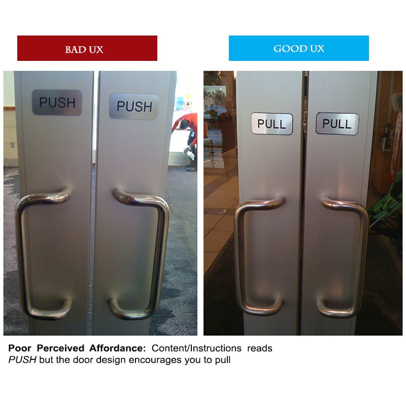
Unlike pulling an object, when it comes to pushing something, we generally push by having our hands open flat and pressing against an object with a greater or equivalent surface area. So having handles, that are meant for pulling while using a PUSH signifier is a bad example of design and human interaction.
Similar to doors, taps are good examples of real-world affordance. Handles, nobs or sensors on taps make it easier for the user to gain access to water. Some taps have the red and blue colors to indicate hot and cold.

Another example of great use of affordance are sidebar buttons. By utilizing color change and amination the user is able to tell what the function of the icon is and how to know when such icon is turned on or off.
2. Signifiers
Signifiers inform the user what an object is for and how to use an object. This communication is done generally though a form of text, icon or symbol. According to Norman, “Signifiers communicate where the action should take place. We need both. People need some way of understanding the product or service they wish to use, some sign of what it is for, what is happening, and what the alternative actions are.”
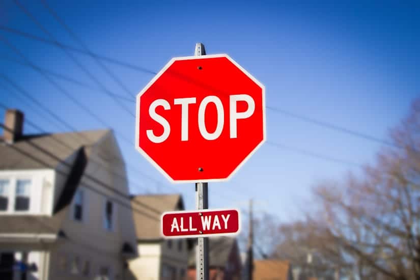
Great example of signifiers we encounter on a daily bases are stop signs. Stop signs indicate to drivers when and where to stop. Once a driver sees a stop sign at an intersection the sign with the bright red color and bold text instruct him or her to stop before crossing. In this image it also includes the sign All the way, which is meant to tell the driver and other drivers approaching the intersection, that they also have a stop sign and also they need to stop completely instead of slowing down before crossing the intersection.
Another example of signifiers are SEND buttons during texting. After we are done tying out our message we need some form of indicator that tells us how to transfer the message to our friends. The send button is simple but effective in assuring people where to click to “send” their message.

3. Mapping
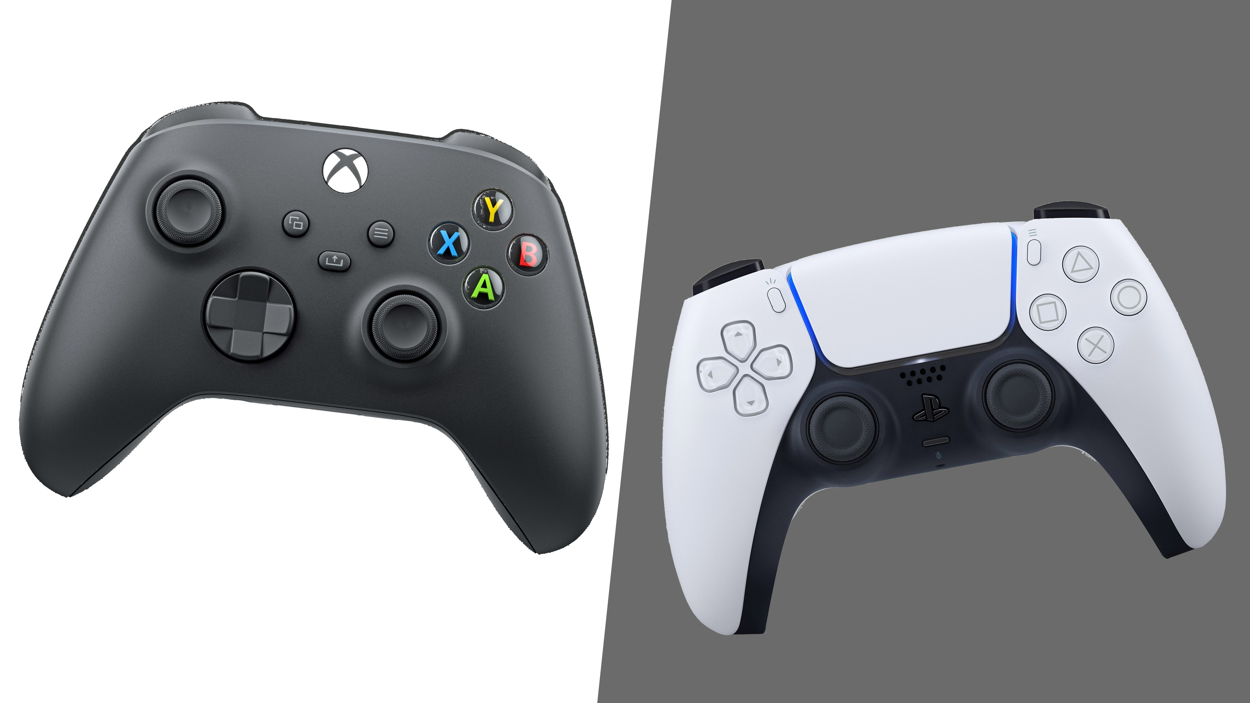
Mapping is the relationship between the elements of two sets of things. This is a very important design concepts because it helps in not only in an organizational aspect of a setting but helps improve accessibility for users. An example of Mapping in the real world is video game controllers. Knowing what buttons to press when playing a call of duty game is extremely important. These buttons make it convenient and easier to use without having to heavily think about where they are positioned. This form of mapping is natural to the users because the buttons are placed in position that is easily accessible by users.
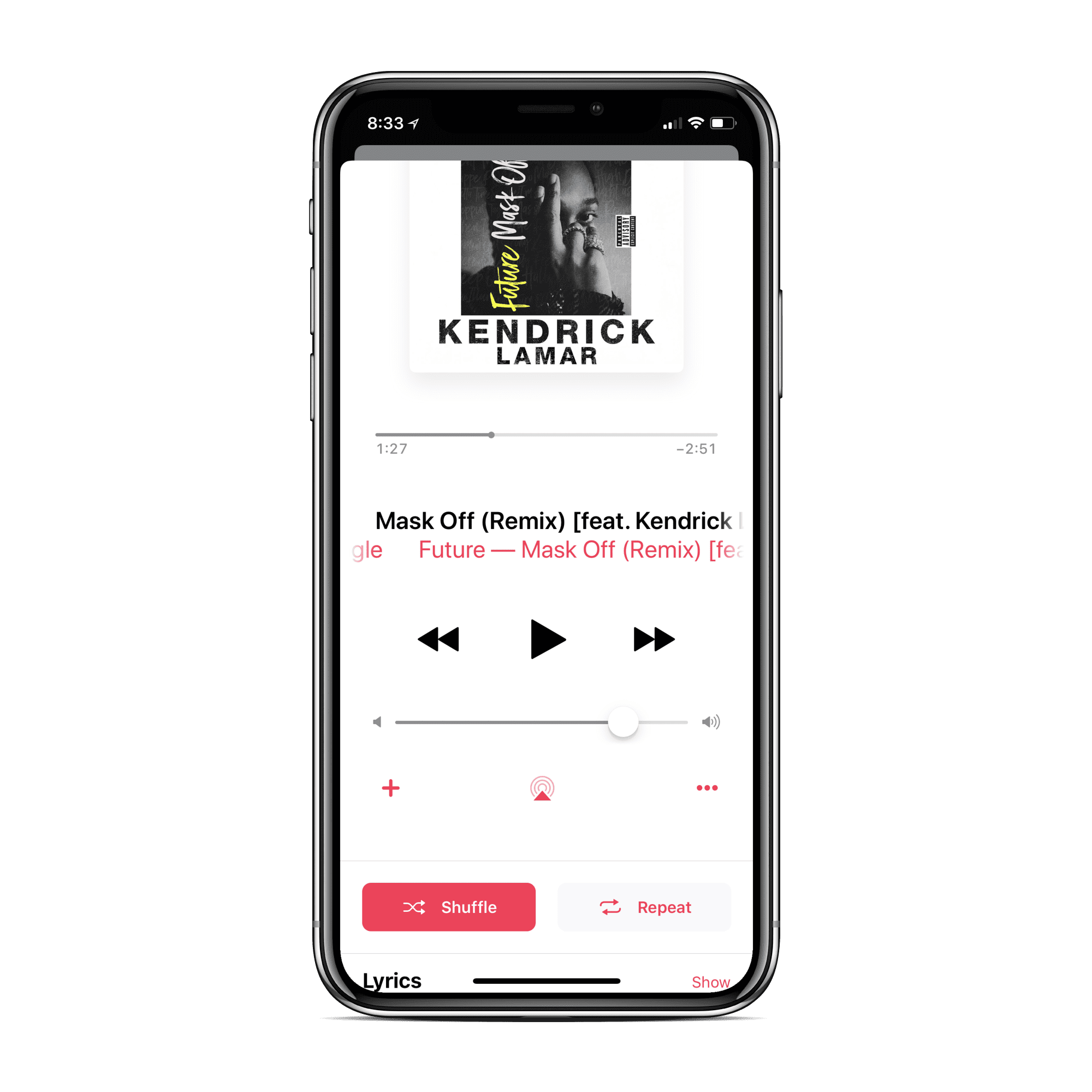
Another example of mapping is showcased whenever we listen to music on an app such apple music. The placement of the music cover, song length, song title/album , the pause/play, the forward and back buttons are all in combination great example of mapping within an application. For instance, the placement of the back and forward buttons look the same but are place in different positions. However, since these buttons were utilized correctly, the user is able to differentiate the forward and backwards directions.
4. Feedback
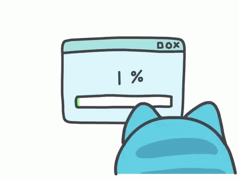
Feedback is a form of response that informs a user when something is in action or in the process. A common example of feedback is the loading bar and the percent count down. This tells the user their application is in the process of (loading, downloading or uploading) the content they wish to access.
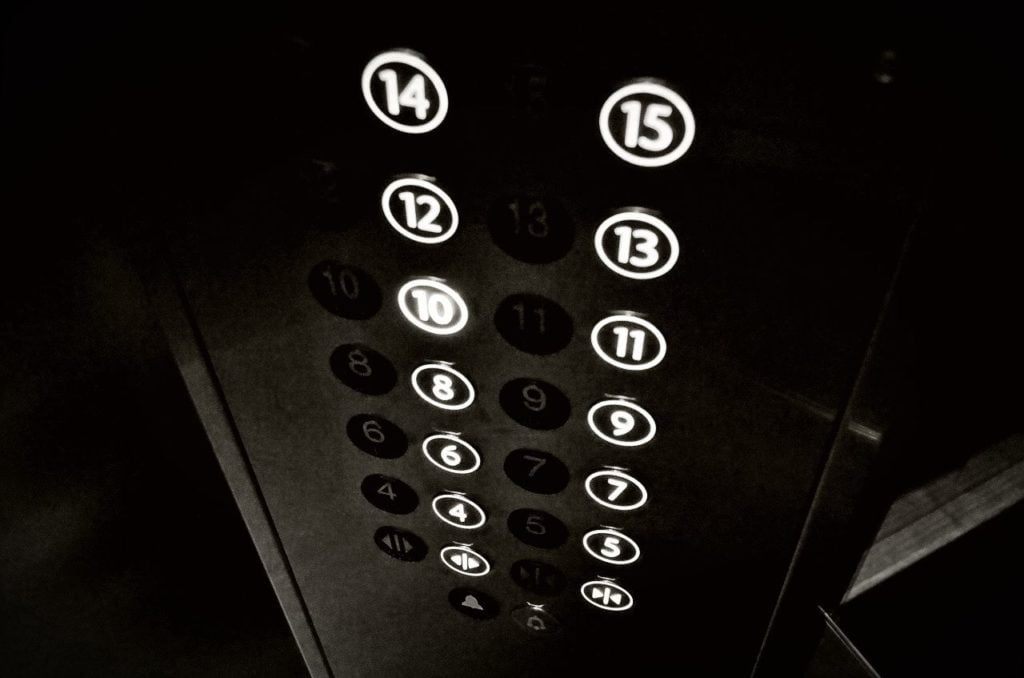
Another great example of feedback in the real-world are elevators. When you click a button to the floor you are going, then the door closes and the elevator starts to move. How do you know what floor the elevator is passing by or taking you to? The answer in most cases are the floor count down within the elevator.