Design Details:
I am making my final website a personal online portfolio. The purpose of this portfolio is to show the amount of work I have done in and out of this course. This would be useful to show to my prospective employers as evidence of the range of knowledge, skills, experiences, and projects that I have acquired throughout college. There will be a home, about, projects, skills and contact page on my website. For the “Projects” page, I will be making it into a grid format since it helps keep everything neat and organized. The flower background on my homepage is a digital drawing I made on Illustrator. The color scheme and fonts I will use will combine creativity and professionalism very well as well as something very simple and clean.

Artist Statement/Design Philosophy:
My work is inspired by a lot of people’s portfolios and websites. One individual however inspired me the most. Adam Ho is a brand designer and he delivers an unforgettable first impression through his portfolio. His use of custom interactions and animations make his portfolio stand out from the rest of other portfolios I have seen. To view his website, click here.

I am really interested in User Experience and User Interface (UX/UI) design and I hope that in the future I could get into that field even though I am and Advertising major with a double minor in DMTA and IST. I really enjoy looking at websites and think about what I would do to that website to make it more appealing and better.
Next year, I will be exposed to a lot of projects like creating advertising campaigns, and redesigning websites. By being exposed to these projects, I want to document them into my portfolio. I want to be able to show my projects to anyone who is interested, especially future employers.
ONE PAGE DESIGNS
A one page website is single page website. When clicking on navigation links, the user scrolls down the page or jumps to a particular section. Parallax website is a technique in computer graphics where background images move, creating an illusion of depth and adds a sense of immersion in the virtual experience. Here are three examples of websites using a one page design layout:
EVERY LAST DROP
Every Last Drop is an interactive website which takes a detailed look at how much water we waste on a daily basis and how small changes can make a big difference. The website guides you through a day with nice informations, about how we waste water. I think it is a very nice use of HTML 5 and CSS. I absolutely love the illustrations and the slickness of everything as you scroll. To view the website, click here.
In my opinion, I think that Every Last Drop’s website is amazing because most people are visual learners. Because of this, I think that they used that to their advantage by using powerful visual content to get their story and message across. No matter how brilliant your text is, most people will likely lose interest if there are not any images or videos. They use photos, videos and slideshows to captivate their audience. With the use of parallax scrolling, they are able to take their viewers on a journey to spark interest on a very important issue.
MAKE YOUR MONEY MATTER

Make Your Money Matter is an informational one pager that is packed with glorious colorful illustrations that animate as you scroll. Make Your Money Matter uses very colorful illustrations to make it more engaging to viewers. The goal is to educate people about all the benefits they can enjoy when you deposit into a credit union in your community. They effectively expose what happens to your money when you put it in banks. They have a great first impression when you enter the site. They tell their users why they are there right away. They use strong visuals and stick to their goals. Their theme of their site relates to their overall topic. Overall it is a beautiful and informative site with wonderful visual design.To view the website, click here.
TRIONN

In today’s world where technology is always changing, most people use their mobile devices (smart phones) to access the internet. This means that it is essential for designers to make their one-page website responsive to different devices. Trionn is a creative and innovative digital agency that creates solutions for startups and companies. They have a good one-pager that offers an easy and enjoyable experience for their users. All you have to do is simply scroll through their website and you will be able to find all the information you need! The mobile version of Trionn works as well. To view their website, click here.
Overall, I think that one page design websites are unique, clean, and fun. It shows you all the important information that you can find on a normal website without having to search through confusing directories. They are a clear and concise way for web designers to organize their work, and provide an easy experience for viewers, without them being lost or overwhelmed.
Text Decoration
The text-decoration CSS property sets the appearance of decorative lines on text. This could be underline, overline, line-through or a combination of lines. The text-decoration property is also a shortcut for setting the following:
- text-decoration-line: accepts values of underline, overline, and line-through
- text-decoration-style: is used to define the type of text decoration
- text-decoration-color: Changes the color of the text
This means that the text-decoration-style, combined with text-decoration-line and text-decoration-color can be specified with the text-decoration property!
The text-decoration property can be declared without specifying values for the color and style properties.
Here are the values for the text-decoration property:
- none: there is no line drawn and any existing decoration is removed
- initial: sets this property to its default value
- inherit: inherits this property from its parent element
- underline: draws a line across the text
- Underlines are a way to bring attention to important text. Sometimes, underlines are most often associated with hyperlinks. Underlined text has become one of the most common feature of our online experience. Off the web underlines are great for emphasis since they draw attention to important parts of the message.

You can view the website here.
- strikethrough/line-through: draws a line across the text at it’s “middle” point
- A strikethrough is an effect that causes text to appear as though it is crossed out. It is mostly used to mark text that is mistaken or text that needs to be removed. Legislators often use this to show where laws have been modified, printing new portions of the law with a strikethrough as seen below.

(Please note that this screenshot was taken from a PDF version of a New Jersey law revision)
- overline: draws a line directly across it’s “top point”
- This might not be the most common typography effect, but it is interesting. It could also be used as a horizontal rule that is used to break up sections of texts. (The example below is what I would do to break up section of notes when there is a new topic in class)

Example of different text decoration values:
See the Pen CSS Text Decorations by Isabel Gleyze (@isabel-gleyze) on CodePen.
You can also combine the underline, overline or line-through values together to add multiple decoration lines:
See the Pen CSS Archaeology by Isabel Gleyze (@isabel-gleyze) on CodePen.
If you want to get a little fancy, there are other styles of lines you can do:
- wavy: creates a wavy line
- dotted: a dotted line
- dashed: a line consisting of dashes
- double: a double solid line
See the Pen Fancy Text by Isabel Gleyze (@isabel-gleyze) on CodePen.
The text-decoration property is supported by the following browsers: Chrome, Explorer, FireFox, Opera, and Safari.
The text-decoration property can be used to make your text a little bit more interesting. The text-decoration property is very easy to use, allowing users to add lines through or around your text. There are of course other ways to mess around with the appearance of text, but I thought this was a really fun and simple way of doing so.
Successful Grid-Based Design
A grid can make everything clean and organized on your website. It helps keep everything neat and organized. I think that one of the most successful and common grid-based designs in apps and on websites is Instagram’s layout. Instagram has a very simple layout that is easy to follow along and understand. A grid layout helps users think about their overall look of their Instagram feed. Users can create a consistent layout by carefully planing each square. An example of an Instagram feed that has been carefully curated is Lydia Marceau’s. Popular Instagram feeds have 1 or 2 prominent colors, this helps users achieve their consistent look.

To view her Instagram page to look at the layout click here. As you can see, Lydia posts photos that have a minimalist black and white aesthetic. In addition, even though some people do not follow a color scheme or theme, the grid layout still makes it look good.

Successful Layout Design that “Breaks The Grid”
Although the grid is an effective design technique in web design, sometimes breaking the grid can be an effective way to create a visually appealing design to attract users. I feel like it gives designers the freedom to explore and make their brands/products/websites stand out. I found a website called ‘Yelvy”. The layout immediately caught my attention as I found it to be quite interesting and different. Unusual colors have become very popular. This shows that a webpage can be simple and attractive when the design breaks the grid. It is still important that the layout does not look messy. Yelvy’s design is simple and clean.

In addition, Yelvy uses retro and modern effects on their online shop to create fun and dynamic interactions. They have animations, gifts, broken grids and much more! Although this may seem that a lot of things are happening at once, it gives a nice effect.

To visit their website click here.
An Unsuccessful Grid-Based Design
Although some websites are divided into rows an columns, they still fail to help people navigate through the website. An example of a bad website design is Gates N Fences.
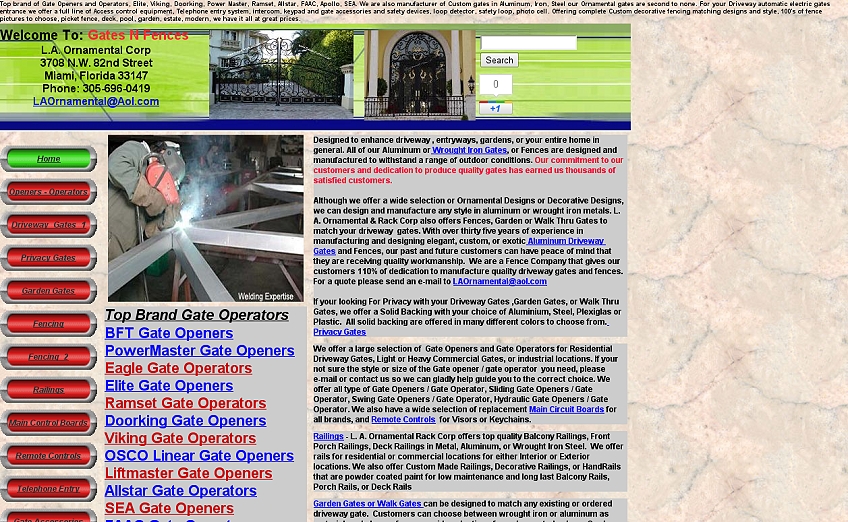
As you can see, the amount of content is a lot to take in. I was immediately overwhelmed by the content. There are massive walls of text, text colors are inconsistent, and there is too much to take in at once on every page. Gates N Fences design makes navigating through the website much harder than it needs to be. There is too much content, zero white space, and the “View Cart” does not respond when clicked. In addition to the horribly colored texts, the homepage has too many hyperlinks. These problems distract users from the enjoyment of browsing their website and hinder the users from purchasing anything.
Overall, I think grids play an important role in the field of design. Grids can be used in websites, posters, logos, books, magazines and more! The grid system when applied brings more efficiency because it allows you to place and align your content right.
The Design of Everyday Things by Donald Norman is a guide that explores the fundamental design principles through human interactions with everyday things. According to Norman, the two most important characteristics of good design are “discoverability and understanding”. I have always agreed that great designers produce pleasurable experiences, and that complexity of modern day technology is increasing. My parents have a hard time using their remote for their smart television. There are too many unnecessary buttons that do not need to be added on to the remote. My parents tend to have a negative experience when figuring out how to change channels on cable or switch to Netflix.
There are four fundamental principles of interaction identified in the reading: affordance, signifier, mapping, and feedback. Affordance is the relationship between two matters. This could be a relationship between a human being and an object, or a human being and an idea. For example, a Fitbit is a tracker that understands your motions to motivate individuals to reach their fitness goal (Figure 1). It is designed to make the individual more active. This is a positive thing for the users. However, if an individual is just wearing the Fitbit and is just using it as a watch or is not eating right, then the Fitbit does not have affordance. Another example related to affordances in apps or websites is the submit button on Canvas (Figure 2). If it was just in blue text, individuals would not know if it was interactive. It probably would just look like any other text on the website. However, if it was surrounded with a kind of border that made it look more like a button, then individuals would know that it is interactive.
-

-
Figure 1
-

-
Figure 2
Signifiers make the affordance clear. It signals things. It describes what something can do, or if an action should take place. For example, in an airplane there are multiple exit signs near the exit door and arrows pointing to the door (Figure 3). This signifies where people should exit if an emergency were to occur. This will allow individuals to safely exit the plane. On the Snapchat application, the purple fully filled in arrow represents a Snap with audio, and the blue filled in arrow means a sent Chat message. The red arrow means you have sent a Snap with no audio. Any opened icons indicate that a friend has opened your Snap or Chat. The square icons with the any of the colors mentioned above means that you have received something (Figure 4).
-

-
Figure 3
-

-
Figure 4
Mapping is another principle of design that Norman talks about. He describes it as a “technical term borrowed from mathematics, meaning the relationship between the elements of two sets of things”. An example of mapping are stove tops. In figure 5 there is no natural mapping between the burners and the controls. The placement of the knob does not visually suggest which burner it will turn on. However, in figure 6, there is clear mapping between the two. With this layout, it is clear that the lower left knob controls the lower left burner.
-

-
Figure 5
-

-
Figure 6
Another example of mapping is the volume sliders on the iPhone. It is clear that moving it to the up will increase the volume, and moving it to the down will decrease it.

Figure 7
Lastly, feedback is the principle of communication the results of an action. For example, a microwave makes a noise when your food is ready. This can be a negative feedback when your parents are sleeping and you are getting a midnight snack and do not want to wake them up. A digital example of feedback are the reactions on Facebook. This allows the users the ability to express themselves. In the images below, it shows that I “loved” the video that my friend shared. This shows feedback.


Overall, I really enjoyed reading the excerpt from Don Norman’s The Design of Everyday Things”. It really made me understand why some objects please more user while others frustrate them. As an advertising major and my interest in UX (user-experience) design, this will allow me to look at any projects I will have in the future in a new light.
This is a site for my ART 203 class: The Art of Web Design


