Feb
2019
Blog Post 2: Grid Examples
Successful Grid-Based Design
A grid can make everything clean and organized on your website. It helps keep everything neat and organized. I think that one of the most successful and common grid-based designs in apps and on websites is Instagram’s layout. Instagram has a very simple layout that is easy to follow along and understand. A grid layout helps users think about their overall look of their Instagram feed. Users can create a consistent layout by carefully planing each square. An example of an Instagram feed that has been carefully curated is Lydia Marceau’s. Popular Instagram feeds have 1 or 2 prominent colors, this helps users achieve their consistent look.

To view her Instagram page to look at the layout click here. As you can see, Lydia posts photos that have a minimalist black and white aesthetic. In addition, even though some people do not follow a color scheme or theme, the grid layout still makes it look good.

Successful Layout Design that “Breaks The Grid”
Although the grid is an effective design technique in web design, sometimes breaking the grid can be an effective way to create a visually appealing design to attract users. I feel like it gives designers the freedom to explore and make their brands/products/websites stand out. I found a website called ‘Yelvy”. The layout immediately caught my attention as I found it to be quite interesting and different. Unusual colors have become very popular. This shows that a webpage can be simple and attractive when the design breaks the grid. It is still important that the layout does not look messy. Yelvy’s design is simple and clean.

In addition, Yelvy uses retro and modern effects on their online shop to create fun and dynamic interactions. They have animations, gifts, broken grids and much more! Although this may seem that a lot of things are happening at once, it gives a nice effect.

To visit their website click here.
An Unsuccessful Grid-Based Design
Although some websites are divided into rows an columns, they still fail to help people navigate through the website. An example of a bad website design is Gates N Fences.
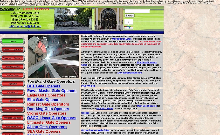
As you can see, the amount of content is a lot to take in. I was immediately overwhelmed by the content. There are massive walls of text, text colors are inconsistent, and there is too much to take in at once on every page. Gates N Fences design makes navigating through the website much harder than it needs to be. There is too much content, zero white space, and the “View Cart” does not respond when clicked. In addition to the horribly colored texts, the homepage has too many hyperlinks. These problems distract users from the enjoyment of browsing their website and hinder the users from purchasing anything.
Overall, I think grids play an important role in the field of design. Grids can be used in websites, posters, logos, books, magazines and more! The grid system when applied brings more efficiency because it allows you to place and align your content right.
Ibnu Mubaraq
August 6, 2023 at 3:52 am (1 year ago)Goog article
Thank you
https://www.cahayaweb.com