Why I Started Doing Calligraphy

For my last post on this blog, I’ve decided to take a different, more personal direction. As anyone who has read my blog can probably tell by now, I am passionate about calligraphy. If I wasn’t, I probably wouldn’t have written about it for ten weeks. I personally think calligraphy is a beautiful art style and is something I want to keep improving on and exploring. Even though this is the basic reason, there are other reasons why I greatly enjoy calligraphy and ways it helps me.

In general, I have always been a very stressed out person. With every little thing would cause me stress. Nothing has really changed in all honesty, it has actually probably gotten worse. When I feel like the assignment are piling up or I have an example coming up, I get so stressed that it causes me physical pain (it’s weird, I know, but whenever I’m super stressed, my back gets super sore. I don’t know what up with that). Even if something happens to someone I’m close to, any stress they are (or should be) feeling replicates onto me. For example, if my boyfriend leaves an assignment for the last minute, I stress about it even though it has nothing to do with me. Anyone I’m close to would be able to verify this. I’ve probably been stress continuously since freshman year of high school and I gotta say, college isn’t helping solve the problem.

Early on, I didn’t really have an avenue to relief my stress. It made me really anxious at times and I couldn’t stop thinking about what I had to do in what time frame to get it all done and how if I went over that times frame I wouldn’t get everything done and how I wouldn’t do well in school and how I would fail the class and would fail out of school and end up living in a box. I’m sure many of you know how it goes.

This is where calligraphy comes in, as you have probably predicted, but, surprisingly, I didn’t start doing calligraphy as a stress reliever. It really just started with seeing calligraphy and thinking “that looks nice, maybe I can do that, too,” so I took a crack at it. My first calligraphy (which was pictured in a previous post) definitely took me a few days to complete because I measured out all the lines to make sure the letters were the same, then drew the letters in pencil, then traced the letters, then erased all the lines, cut everything out precisely, and glued it down. I later realized that while I was doing it, I was only focused on the calligraphy. I focused so much on making the letters event, getting the lines right, cutting close enough to the letters that there’s not too much space, but not too little that I didn’t think about anything else for a while. It was therapeutic to say the least, as it continues to be. Even now, I continue to use calligraphy as a mode of quieting my mind, even if only for a little bit, to give myself some time to relax.

So that is the story of why I do calligraphy. I hoped you have enjoyed these past ten weeks of calligraphy and maybe that you have tried the art on your own!

Benefits of Calligraphy: It’s Better Than You Think!

I have been talking about calligraphy for weeks now, but I never stated why calligraphy you should do calligraphy. Of course, people can do calligraphy just to do calligraphy, but there are added benefits. These benefits were taken from here because they summarize the benefits of calligraphy nicely.

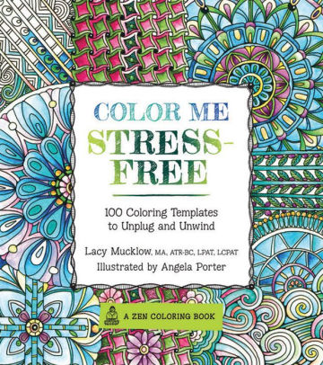
Firstly, calligraphy is good for mental health. People’s minds are often occupied by the many stresses of life. For us college students, these stresses are probably homework, exams, work, etc. Calligraphy gives us something to focus on. This quiets our minds, if only for a little bit, and allows it to relax. Personally, when I do calligraphy, I feel the weight of my stresses lifted off of me. This is similar to how adult color books have become popular for their stress relieving properties.

Color Me Stress-Free: Nearly 100 Coloring Templates to Unplug and Unwind

Adult Coloring Book

Calligraphy can also be learned at any age by anyone. Because of neuroplasticity, the ability of the brain to change to learn something new, people of any age are able to learn calligraphy. This is also because it does not require much memory. Calligraphy requires more motor action (physical movement) than mental ability. The only limitation that can be put on doing calligraphy could be serious physical disability. Even people with minor disabilities would still be able to do calligraphy, which makes it the perfect activity for many people. Also, calligraphy is a skill rather than a talent, so it can be learned by anyone. You do not need to be born with a special ability to learn calligraphy.

You can also save money on hosting events and making logos. When hosting events, you are often looking to have a nice invitation. However, printing invitations can be expensive. Calligraphy can allow you to make your own invitations for much cheaper than hiring a printing service. It may take a lot of time, but with all the added benefits of calligraphy, it may be worth it. Also, the money you save could be put toward other aspects of the event. Logos can also be made using calligraphy. It may be difficult to think of a logo and may require hiring someone to do it for you. Or you can use calligraphy to make a logo yourself! Calligraphy gives your business or organization a professional and appealing logo, which would attract people.

Image result for handwritten calligraphy invitations

Handwritten Calligraphy Invitations

Another benefit of calligraphy is that it is not an expensive hobby. Unless you are buying really high quality supplies, calligraphy is relatively inexpensive. You don’t even need to buy separate supplies to do casual calligraphy. You can use any pens, pencils, or markers lying around. Even if you do go for expensive supplies, they generally last for a long time. For example, I spent $50 total on embossing powder, embossing pens, and a heat gun. These tools have already lasted months and I still have plenty of ink in my pens, powder for my embossing, and heat in my heat gun. In the long term, $50 will not be that much. Also, the heat gun costed half the total amount and it will last a very long time.

Even with these benefits, you don’t need a reason to do calligraphy. If you want to do calligraphy, then do it! Just know that you are getting more than you signed up for (but in a good way).

Finding Inspiration

This post is going to go in a slightly different direction than other posts. Here, I will discuss how to find inspiration for calligraphy in more detail.

The first thing I want to say: inspiration can come from anywhere or from anything. Although I take much of my inspiration from music, there are many other places inspiration can stem from. I am not big on reading, but book quotes can serve well for calligraphy. If you are religious, quotes from religious texts may also inspire calligraphy art. The main part of finding text to make calligraphy out of is being open to sources of inspiration. Also, I tend to not go looking for words to make calligraphy out of. Most of the time, rather than searching for quotes, when I happen to come across a inspiring quote, I keep it in my mind for when I decide to make more calligraphy. As cliche as it might sound: inspiration cannot be forced, it must be felt.

The next part of inspiring calligraphy is allowing the words to inspire the artistic choices made in the piece. There are a few questions you must ask yourself about the words you plan to make art out of.

  1. How do the words make you feel?
  2. What images do you associate with the words?
  3. How detailed do you want your art to be?
  4. Are you looking to make a full piece of art or do you want to make something quick to release stress?
  5. How proficient are you in your calligraphy abilities?

With these questions in mind, you can decide what you want to do with your art. Deciding how the words make you feel is the most important part in my opinion. Emotions decides many of the aspect of the calligraphy. It dictates the font of the text, the color of the text and the background, and what words you want to emphasize. Emotion often mentors a successful piece of calligraphy, so I would suggest that if the quote does not draw out any emotion in you, you should consider I different quote, but this is just a suggestion. Images that you associate with the word will allow you to think of backgrounds and pictures to add to the art. Deciding how much detail you want to add can help you determine your game plan for you art. For example, it will help you decide if you want to emboss or simply do calligraphy with pencil.  Your proficiency can also help decide what you want to add to you calligraphy (embossing, images, etc.).

An important part of finding inspiration is pushing your calligraphy abilities. Even if you aren’t very good with using a felt tip pen, for example, make some calligraphy using a felt tip pen! Calligraphy takes a while to master, so don’t get discouraged. Just keep practicing! I still have my first piece of calligraphy and even though it’s not the best piece I’ve done, I still like to look at it as a reminder of how far I’ve come.

My first calligraphy

Being in the background isn’t always a bad thing

As a part two to my previous post on enhancements to calligraphy, in this post, I will be talking about another way to enhance your art through backgrounds. I personally feel that backgrounds are an extremely important part of calligraphy. Even though calligraphy doesn’t require a background, adding one can help make your art more appealing to the eye and add an extra creative element. In my opinion, adding a background makes calligraphy more pleasing to look at because it breaks the sharp contrast between the lettering and the plain background.

When looking for inspiration for a background, I often try to come up with something simple so that it will not distract from the main focus, the lettering. My default background is a tie-dye style that I make using markers (I will describe the process for making these types of background later in this post). However, backgrounds can be as complex as an actual painting or as simple as just a different colored paper. I try to think of the mood of the words of the calligraphy and match the colors accordingly. For example, for lines with sadder meanings, I tend to use blues, purples, and blacks while for happier words, I use brighter colors. I also try to use colors that are similar or that blend well so there are not sharp contrast between colors, which would otherwise be detracting. In order to keep the words visible, I usually make the background on a different piece of paper, cut out the calligraphy, and glue it onto the background. However, if you would like your calligraphy to fades more into the background, the words can be written right on top of the background.

Example of tie-dye background

As I have been teasing for a few posts, I will now explain how to do tie-dye backgrounds simply using Crayola markers. This technique is fairly simple and definitely helps elevate your artwork. I learned this technique from an Instagram video and have used it with other material to make unique backgrounds. In order to make tie-dye backgrounds you will need cello gift wrap (that clear wrap that goes over gift baskets), markers (not permanent markers, they will not work!), water, paper, and a paintbrush or stray bottle.

The first step is to get a piece of cello wrap the size of the paper or bigger. Next, using the markers, color the cello wrap in the design you want. The design can be straight line or random blotches of color. Next, spray the design with water (or dab water onto the design with a paint brush). Make sure that there is enough water to soak up the markers. If there is still marker ink that has not been soaked up by water, it will not have the tie-dye effect. Note that it takes practice to know how much water to add for the correct saturation of color! Press the paper onto the cello wrap and using the palm of your hand, gently rub the paper to spread the color. This allows the color to blend on the paper, making the continuous tie-dye pattern. Lastly, carefully lift the paper and lay it out to dry! It may take a while for the paper to dry because it is soaked in water.


Disclaimer: This is certainly not the best background I have 
achieved using this technique, but it is a good example of
 how the general process is done! 
Plus, often the words cover any imperfections!

The same technique can be done with paint for another interesting background! More liquid paints work better when using this technique.

Background using same technique, but with paint

Much like adding drawings to calligraphy, finding the right background takes creativity. It is important not to think too hard about what background you want to use and just allow the words to inspire you!

Making your calligraphy look Snazzy!

Although this post may appear to be similar to a previous post, it will be slightly different. In this post, I will describe the process of implementing embossing and drawings into a work of calligraphy.

Let’s start with embossing because it is one of my favorite aspects of calligraphy. Even though embossing is not required for calligraphy, it definitely adds an element of texture and shine to the words. In a previous post, I already described what embossing is and the tools needed to do it, so here I will describe how to emboss and give tips which are most relevant to those just starting off.

The first step in embossing is, of course, deciding what you want to emboss. Although embossing is usually used on words, it can also be used on drawings and patterns. The next step is the write/draw the image to be embossed. I would recommend that beginners first write in pencil, so they are able to erase any mistakes. Once one becomes more familiar with calligraphy, it is unnecessary to write in pencil. The next step is the trace or write the letters in embossing pen. This pen allows the embossing powder to stick to the paper so it will not scatter when being heated. I would recommend that beginners use a black embossing pen rather than a clear one. This is because the black ink is easier to see, so the writer has more control and is less likely to make a mistake, especially when tracing.

Sketching words in pencil then tracing with embossing pen

Once the letters are prepared, the next step is to apply the embossing powder. The embossing powder does not need to be applied precisely to each letter. In fact, I usually dump the whole jar out over the letters! This is to ensure full coverage. The excess powder should then be dumped onto a blank piece of paper and funneled back into the jar so that the powder is not wasted. Any excess powder can be dusted away with a paint brush. The next step is to place the calligraphy on a flat surface and heat it with a heat gun. Applying heat will reveal the beautiful embossing! Note that heat guns should be held at a 45 degree angle, should only be used in short intervals (maximum of 10 minutes at a time), and should be allowed to cool before storage to ensure safety.

Adding embossing powder, applying heat, and the final product!

Another way to enhance calligraphy is with drawings. This aspect is much more open to the imagination. Adding draws can emphasize words or add a focal point to the work. As a mentioned before, it is important to let the words speak to you when deciding what drawings to add. I tend to take inspiration from the words themselves or from the source where I got the words. For example, in one of my piece that was of song lyrics, the music video included a Ferris wheel. I used this image as the focal point of the piece and put the words around it. Another example is when writing a name, the picture could be of the person’s favor animal or object.

Ferris Wheel focal point

Implementing calligraphy enhancement may be hard at first, but when you let the creativity flow, the possibilities of what you can add are endless!

Mastering Fonts

Now that we have established the basic tools needed for calligraphy,  it’s time to move into the components of the art itself. In this post, I will be talking about different fonts and how I decided which to use.

The first thing I do when picking a calligraphy font, as strange as it might sound, is letting the words speak to me. I usually make calligraphy out of song lyrics, so I try to interpret the emotion of the song to the font. For example, if a song or words are more intense or harsh, I tend to use fonts with straight lines and edges. If a song is sad or soft, I usually go for a more curvy, cursive like font. If I’m not writing song lyrics, I will just go to Google Images, type “calligraphy alphabet”, and use one of those alphabets as reference.

Image result for calligraphy alphabet

"Calligraphy Alphabet" from Google Images

This is the reference I use most often

Especially for beginners, it is important to use references when writing. This ensures that the letters look of a consistent font. Otherwise, the art may look scattered and incoherent. References can also be very useful when trying to memorize different font types. I, for one, didn’t know how to write all the letters of basic calligraphy fonts, but after using a reference alphabet, I know memorized it! However, I still sometimes will go back and have a reference in front of my when writing.

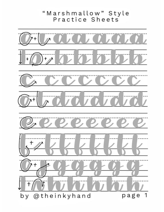
Another key to mastering fonts is practice. That cliche “practice makes perfect” really does apply when it comes to art, especially calligraphy. There are traceable print out sheets that can be used to practice. Also, because it is rather discrete,  if you’re bored in class (as we all are at some point), you can write out the calligraphy alphabet in your notebook. The bottom line is PRACTICE, PRACTICE, PRACTICE.

Image result for calligraphy practice

Example calligraphy practice sheet

Other way to perfect calligraphy fonts is writing out guide lines and making rough sketches of the letters before going over them with a more permanent writing utensil. By this, I mean make lines using a ruler across the paper at the height you want the letters to be. This will give you a point of reference for the size of the letters, so they will remain consistent. Writing out the letters in pencil will also prevent mistakes, so you don’t have to start all over if you mess up. When I first began doing calligraphy, I would sketch out ever letter then trace it with marker or pen. I am sure this saved me from redoing many works of calligraphy. Even though it’ll take longer, it will help you improve in the long run.

After mastering the fundamentals of fonts, feel free to take artistic liberties with them! For example, what I tend to do instead of keeping a constant font size is make words I want to emphasize larger or in a different font. I will also make my strokes a little different than reference letters if I do not particularly like how a certain letter is written.

Using different fonts is one of my favorite parts of calligraphy! I hope to memorize many different fonts and maybe even come up with a font style of my own!

Calligraphy Basics: Other Enhancement Tools

I am particularly excited about this post because, for the first time, I will be posting pictures of some of my own calligraphy!

First, I will start by talking about my new found favorite part of calligraphy: embossing. Embossing is used to give texture and shine to the calligraphy. Embossing powder is made of powdered plastic and, when heated, the plastic melts to create a continuous line. There are several different types of embossing powder. These range from original to ultra thick, though they all basically have the same effect. However, in order to use embossing powder, you will need a few other supplied. The first of these supplies is embossing pens. These pens hold the embossing powder to the paper, but, in my own experience, the embossing powder can easily be removed from the marker line if there is a mistake. Embossing pens usually come in either black or clear. I have yet to see a colored embossing pen, but they may be out there! Another tool needed for embossing is a heat gun. A heat gun, as the name suggests, heats the embossing. This melts the powder and gives it its shiny finish. A heat gun seem pretty similar to a blow dryer, but in use, a heat gun has a weaker air flow which keeps the embossing powder from being blown off the text. Using embossing in calligraphy may be a little expensive, though. Heat guns usually cost around $25. For my embossing set, I got a set of two markers and three powders which together cost another $25.


 Valentine's Day Embossing

Other tools I like to use is, surprisingly, markers. I am not talking about high end, professional artist grade markers. I use Crayola brand, easy wash markers. Another surprise is that I don’t use them to write with. I instead use them to make backgrounds for my calligraphy. These markers can be used to write those. Their slightly firm but also flexible tip makes them good for beginners who are looking to learn calligraphy. They also can easily watered down to make a tie dye effect on paper. I will demonstrate the technique for doing so in a later post. They can also be used to add designs around the calligraphy such as hearts, flowers, or simple swirls. The best part about these markers is that they are cheap! A ten pack of Crayola markers costs only $2.49 at Target, yet have the quality to enhance artwork.

Paint is also another valuable background making tool. It can be used to make a painting to put behind your calligraphy. There is also a technique that I have developed myself that is similar to the technique used for the markers to make a background that can add an interesting element to the calligraphy. This will also be described further in a later post.

   
Background using paint

Glitter can also be used to enhance calligraphy. It can be used as a background, to just enhance a background, or even to make the actual words of the calligraphy. Everyone is probably familiar with glitter, so I feel that I don’t need to elaborate much further.

Glitter glue calligraphy

This concludes my discussion of tools used for calligraphy. Further posts will discuss techniques and fonts!

Calligraphy Basics: Paper

Yes, that’s right, this whole post will be dedicated to paper. I know it may be pretty boring, but it is as important to calligraphy as any other part of it. Different types of paper can affect the art and the longevity of the artwork.

First, let start with an important part of calligraphy, the types paper, because if you don’t have the right paper, what are you going to do calligraphy on! There are several types of paper, some of which work well for calligraphy and others that do not. The most common type of paper (and the one I and most people use most frequently) is copy paper. This is the type of paper is used to print as well as to write on. and is smooth and thin. Art paper, which is probably the best option for calligraphy, is thick and more textured than copy paper. This type of paper is also good for backgrounds because it can hold paint and watery substances more readily. The only down fall of art paper is that it is more expensive. Another higher quality paper is cardstock. This type of paper is very stiff, yet smooth and thin. The durability of the paper is good for different projects such as making cards. Construction paper is similar to cardstock but it is not stiff. Ink will soak readily into this paper and may even soak through, so it is a good idea to have something protecting the writing surface when using this type of paper.

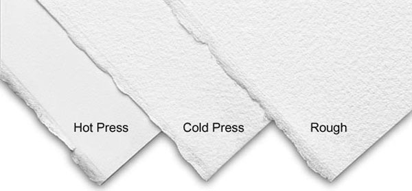
I mentioned paper thickness and surfaces of paper, but I feel I need to expand on that a little bit. Thickness of paper is described by the weight of the paper, meaning heavier paper is thicker than lighter paper. Thicker paper can have it advantages. It is handle more erasing, which is beneficial especially for beginners, and liquid-y substances including ink and watercolor that can be used for backgrounds. There are also different types of paper surfaces. With rough paper, the texture is visible and can be easily felt. This type of paper is good for dry and powdery substances, such as embossing powder or glitter, because the texture is better for holding the powder. There is also cold pressed paper. This paper is made the same way as rough paper, except it is smoother because it is pressed more than rough paper. Cold pressed paper is also good for holding powdery pigments, but does not hold them quite as well as rough paper. This paper is good for watercolor used for backgrounds of calligraphy and for other drawings. The smoothest type of paper is hot pressed paper. Hot pressed paper has a harder surface, so it won’t absorb substances quite as well, but is still good at holding ink. Different material used to make paper can affect how long it will last. Recycled paper is made of bigger pieces of pulp, so it will not last very long and will eventually begin to decay. There are also acid free papers that will not be as susceptible to the browning that occurs when paper is exposed to air for long periods of time.

Image result for types of paper

Types of paper surfaces 

Even though this post was rather dull, paper is important to good calligraphy. Next post, and a post I am particularly excited about, I will be discussing supplies for enhancing works of calligraphy!

Calligraphy Basics: The Pen

Surprisingly, there are many more aspects to calligraphy than just writing. One of these aspects is the supplied needed to create calligraphy. The next few posts will focus on the various supplies needed to create calligraphy art. One of, if not the most, important calligraphy tools is the pen. Without it, we would be left with using our fingers which wouldn’t really look that great.

There is much more to calligraphy pens than you may there. There are several different types of pens, pen tips, and inks.

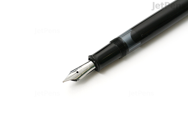
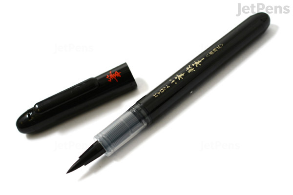
The pen types that are most often used for calligraphy are a traditional dip calligraphy pen, a cartridge filled pen, or a brush pen, but regular writing pens and even pencils can also be used. The traditional dip pen resembles that classic “feather in ink” writing tool used in many movies. This pen allows for more options when it comes the tips and inks. However, for beginners it might be more difficult to use and is messy in comparison to other pens. The benefits of cartridge pens is that they tend to smudge less and are more compact, requiring the user to carry less tools. The downside of cartridge pens is that there is less options of tips and that they usually don’t work traditional pen inks. Brush pens, on the other hand, can best be described as a paint brush tip on a pen body. These types of pens have become popular recently because they are compacts, meaning they don’t require carrying of other supplied such as ink, and they work well for modern calligraphy that is more rounded than traditional italics calligraphy (a font style that will be discussed in a later post). Another advantage of brush pens that there are a wide variety of tips options that can “customized” by the artist for their specific style or skill level. One disadvantage of brush pens is that tips cannot just be replaced, so a new pen must be bought if the artist decides to try a different style.

Image result for traditional calligraphy penImage result for brush pen

Traditional calligraphy pen vs Brush pen

Traditional and cartridge pens tend to have less tip variation than brush pens. Traditional and cartridge pens have two basic types of tips: italic and flex. Italic tips have a straight edge where the ink flows from, are used for square fonts, and and to make straight rather than curved lines. Flex tips, on the other hand, are more triangular in shape and the ink flows from a slit in the middle of the tip. These tips allow for varying thickness of lines depending on the amount of pressure. Curved fonts tend to use this type of pen because it has the ability to produce curved lines. Brush pens have a wide variety of tips with many different characteristics. Synthetic and natural hair tips are usually more flexible, but require more control. Felt tips, on the other hand, are usually more firm and good for beginners who are still learning to control the pen. These tips also vary in thickness to make fine, medium, or broad lines.

Italics vs Flex tips

Inks do not have as much variety, but can be important to the calligraphy work. Some inks are more glossy and thinner while others are, in comparison, more matte and thicker. Some inks are not compatible between pens. For example, some traditional pen ink is too thick for cartridge pens and will clog them. There are a large variety of colors of inks, but most traditionally, some shade of black is used.

I’ve emitted embossing pens in this post because I plan to discuss in my art enhancement tools post. Next week, I’ll be continuing with the basics and blogging about writing surfaces!

The History of Calligraphy

Welcome to my passion blog! For my topic, I decided to focus on the art of calligraphy. Over the past year, I have become very interested in calligraphy and decided to use this blog to share my love of calligraphy and learn more about the art. For my first post, we should start by learning how calligraphy came to be with a brief history.

Many different parts of the world have developed their own forms of calligraphy. Calligraphy’s main purpose was to ensure clarity of words, but in some religions and in modern times, it is used as an art form.

In Europe, calligraphy was used to write Latin script in Rome. As early as the first century, calligraphy came in three forms: Roman imperial capitals, Rustic capitals, and Roman cursive. These three forms of writing were used in different aspects of life. Charles the Great, emperor of Rome, promoted writing and gathered together scribes who developed  Carolingian minuscule style around the year 800. In the following centuries, uncial lettering (writing in all capital letters) was used by monasteries to transcribe religious texts such as the Bible. Once the Roman empire fell, monasteries preserved calligraphy writing, which then developed into other writing forms around Europe that varied by regional monastery.  By the eleventh century, Gothic script, which was more compact, was developed and was used by the first print and press. English script was developed in the 18th century and spread across the world.

Calligraphy in Latin Bible handwritten by Gerard Brils in Belgium*

Eastern Asia, specifically China, saw a development of many different forms of script with every kingdom having its own set of characters. These characters were often written in Bronzeware script and Large Seal Script, which were cursive forms of writing. Around 220 BC, emperor Qin Shi Huang conquered China and unified its characters to the Xiǎozhuàn and  Lìshū characters. The writing style used in China today was developed by  Wang Xizhi around the first half of the 300th century and was spread by Emperor Mingzong of Later Tang in the early 900th century.

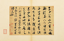
Chinese calligraphy by Mi Fu, from the Song Dynasty*

In the Muslim religion, calligraphy takes on a different role. Rather than being used for writing, calligraphy is used as an art to adorn mosques and books. Islamic lettering developed in Andalusia (modern Spain to China) and uses the Arabic alphabet for its letters.  Known as the art of the spiritual world, it is meant to connect the language to the religion of Islamic people.

Modern calligraphy has its roots in 19th century Britain. Edward Johnston was inspired to develop modern calligraphy and began teaching it at the Central School in Southampton Row, London in 1899. He also developed Foundational hand style. Other calligraphers inspired by Johnston, including Graily Hewitt, Stanley Morison, Eric Gill,  and Alfred Fairbank developed aspects of calligraphy including gilding, development of various typing fonts, and handwriting textbooks.*

Modern calligraphy by Graily Hewitt*

Even in the 21st century, calligraphy has taken a modern twist. Recently on social media, videos of people doing calligraphy have become very popular for their satisfying aspects. Embossing has become popular as have rounded cursive fonts.

This is only a brief history of calligraphy and some parts have been excluded to keep this post from turning into a novel.

Now that we have a basis of how calligraphy came to be, the following posts will focus on actually doing calligraphy! Next week, we’ll be looking at the tools needed and the various forms they come in as well as other tools that can be used to enhance calligraphy, so stay tuned!

*Source of all information and images: “Calligraphy.” Wikipedia, Wikimedia Foundation, 23 Jan. 2018, en.wikipedia.org/wiki/Calligraphy.

Skip to toolbar