Mastering Fonts
Now that we have established the basic tools needed for calligraphy, it’s time to move into the components of the art itself. In this post, I will be talking about different fonts and how I decided which to use.
The first thing I do when picking a calligraphy font, as strange as it might sound, is letting the words speak to me. I usually make calligraphy out of song lyrics, so I try to interpret the emotion of the song to the font. For example, if a song or words are more intense or harsh, I tend to use fonts with straight lines and edges. If a song is sad or soft, I usually go for a more curvy, cursive like font. If I’m not writing song lyrics, I will just go to Google Images, type “calligraphy alphabet”, and use one of those alphabets as reference.

"Calligraphy Alphabet" from Google Images

This is the reference I use most often
Especially for beginners, it is important to use references when writing. This ensures that the letters look of a consistent font. Otherwise, the art may look scattered and incoherent. References can also be very useful when trying to memorize different font types. I, for one, didn’t know how to write all the letters of basic calligraphy fonts, but after using a reference alphabet, I know memorized it! However, I still sometimes will go back and have a reference in front of my when writing.
Another key to mastering fonts is practice. That cliche “practice makes perfect” really does apply when it comes to art, especially calligraphy. There are traceable print out sheets that can be used to practice. Also, because it is rather discrete, if you’re bored in class (as we all are at some point), you can write out the calligraphy alphabet in your notebook. The bottom line is PRACTICE, PRACTICE, PRACTICE.
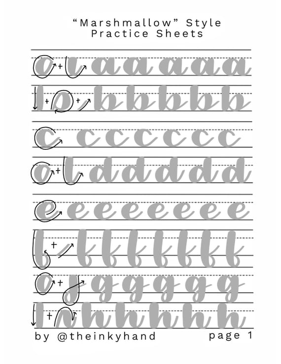
Example calligraphy practice sheet
Other way to perfect calligraphy fonts is writing out guide lines and making rough sketches of the letters before going over them with a more permanent writing utensil. By this, I mean make lines using a ruler across the paper at the height you want the letters to be. This will give you a point of reference for the size of the letters, so they will remain consistent. Writing out the letters in pencil will also prevent mistakes, so you don’t have to start all over if you mess up. When I first began doing calligraphy, I would sketch out ever letter then trace it with marker or pen. I am sure this saved me from redoing many works of calligraphy. Even though it’ll take longer, it will help you improve in the long run.
After mastering the fundamentals of fonts, feel free to take artistic liberties with them! For example, what I tend to do instead of keeping a constant font size is make words I want to emphasize larger or in a different font. I will also make my strokes a little different than reference letters if I do not particularly like how a certain letter is written.
Using different fonts is one of my favorite parts of calligraphy! I hope to memorize many different fonts and maybe even come up with a font style of my own!